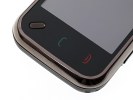
Nokia N97 mini review: Less is more
Less is more
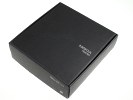
Retail package is nothing to rave about
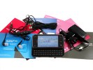
There isn't too many differences between the retail packages of Nokia N97 mini and the original N97. There are a few omissions in order to keep the price lower but hardly anything a regular user would notice. Basically the content inside is covering all the essentials, without providing too many surprises.
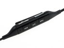
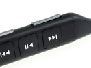
You have the charger plus a data cable and a nicely designed handsfree that we see for the first time. It looks pretty cool but unofortunately is one-piece only so replacing the headphones while keeping the remote is not an option. At least there are several different ear-buds so you can find the one that best fits your ears.
There isn't a stylus included in the Nokia N97 mini retail package but we hardly miss that too much.
Nokia N97 mini 360-degree spin
Nokia N97 mini measures 113 x 52.5 x 14.2 mm, totaling a volume of 75cc. Those numbers don't sound too impressive in isolation but compared to the 117.2 x 55.3 x 15.9 mm of the original N97 they certainly are great.
Of course some trade-of were inevitable - like cutting down on display estate or losing the D-pad on the QWERTY keyboard, but all the main functionality is still there and you get a much more compact package.
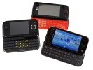
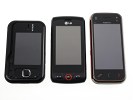
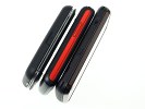
Nokia N97 mini compared to LG GW620 and Nokia 6760 slide
In the smartphone QWERTY side-slider class the Nokia N97 mini easily ranks among the compact handsets. The non-touch E75 is the only handset that is noticeably more compact but it has quite a lot of other features discarded to reduce size.
The weight of 138g is another improvement over the original N97, which weigh the hefty 150g. The mini version still maintains its solid feel but weights less in your pocket. Yet the 12 gram difference will hardly be decisive for anyone. Obviously Nokia thought the same way - otherwise they would have used plastic for the battery cover again and reduced the weight even further.
Design and construction
Slid-close and in isolation you will hardly recognize that the N97 is a different model at all. There wasn't too much time for redesigning and the Nokia engineers preferred to spend it on the back panel.
We were happy enough with the original N97 design and our only regret was that its all-plastic construction was unfit for its high-end status and pricetag. Obviously Nokia paid attention and this time the battery cover material is metallic. The camera lens cover has also been removed.
We are also really pleased with the quality of the plastic used for the rest of the N97 mini body. It's the same as the one used for N86 8MP and the original N97. It is a real fingerprint-repeller, while at the same time looks sturdy enough to survive without many marks and scratches (under regular usage, of course).
The Nokia N97 mini front is mostly about the 16M-color resistive touchscreen. It has the same resolution as its bigger brother (360 x 640 pixels) but as we mentioned, its diagonal has shrunk from 3.5" to 3.2". That nHD resolution seems pretty sufficient to use for virtually any use but some users might still find it disadvantageous compared to the WVGA that some of the competitors have to offer.
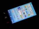
The 3.2" display is pretty good
The image quality of the Nokia N97 mini display is about the same as on the original N97. The smaller size makes it less impressive, of course, but the contrast and brightness levels are equal. Mind you, we won't be mad if Nokia chose the Samsung way and went to AMOLED screens for more of its flagships. Having that extra bit of contrast is a nice thing.
The Nokia N97 mini uses a resistive touchscreen, just like every other S60 touch-enabled Nokia so far. This means a bit of pressure on the screen is needed for a tap to be registered but allows the use of stylus and gloves.
The sensitivity of the Nokia N97 mini is on par with the competition, and save for the Samsung Jet and Pixon12, we haven't seen a resistive-touchscreen handset perform much better. Nokia seem to have done some tweaking to the screen so that now its responsiveness with fingers is better than the original N97. There is also haptic feedback with adjustable intensity, which we find really comfortable.
The sunlight legibility is equal on the two Nokia N97s - they are both excellent. We are glad that it has nothing to do with the mediocre sunlight legibility of Nokia 5800 XpressMusic and 5530 XpressMusic.
Touch-sensitive call and end keys plus a regular hardware menu key sit right below the screen. Their layout in the Nokia N97 mini is an exact copy of what we saw in the original Nokia N97.
The earpiece and video-call camera are at the top of the Nokia N97 mini front, along with an ambient light and a proximity sensor. The proximity sensor makes sure that the display is switched off when you hold it next to your ear.
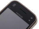
A couple of sensors, a video-call camera and the earpiece are on top
Reader comments
- teddybear
- 19 Oct 2017
- mrC
i also have both, but nokia n900 is not good for carrying around, too heavy, and is more like pc, not mobile, only if you want to hack stuff in home
- Prakash
- 28 May 2016
- YQQ
I want this phone
- Wongndeso
- 25 Apr 2016
- tDR
Bought it on august 2010, lost it oN November 2012. This is My first smartphone. Then BlackBerry 9850, several Android Gadget, BlackBerry Z10 (BB10 OS), and now iPhone. Nice tO witness the Mobile phone world revolute.
