Nokia N97 mini review: Less is more
Less is more
Widgetized S60 UI
We stand by every word we said about the S60 5th and its approach to touchscreen. Long story short, the direct translation of D-pad and soft-key action into touch has its benefits but the result is hardly the most fluent and intuitive touchscreen interface.
Scrolling has been changed, thanks to a firmware update, and it's a great improvement over the previous scheme. Now you have kinetic scrolling (or flick scrolling as Nokia call it) and it's really smooth with nice elasticity at both ends of the scroll.
List menus still require a double click to activate, though, while icons do great with a single one. Really - go figure!
If you know your way around S60, you'll be quite at home with the N97 mini interface and you'll swear by it. But if you look at it more objectively maybe, just maybe, you will realize some things come out a tad better on other touchscreen handsets than they do on S60 5th.
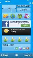
The Nokia N97 mini, being the slightly shorter sibling of the N97, uses a widget-enabled homescreen, just like its taller bro. This is the only significant change since the 5800 XpressMusic and for now is the trademark of the N97 pair - other S60 5th edition phones don't have them.
They are the fad these days and their usability is unquestioned. They can't be the dramatic improvement you've been waiting for though.
It is also worth mentioning that, compared to the 5800 XpressMusic, Nokia N97 mini has a tad snappier UI (thanks to the faster ARM 11 434 MHz processor perhaps). There weren't any major lags or holdups for the time of our review.
The S60 UI has made another go at touchscreen
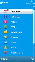
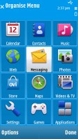
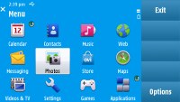
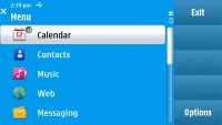
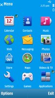
While the widgets are something new for the S60 5th edition, the menu structure is a d?j? vu - the same as in Nokia 5800 XpressMusic and not that different from 3rd edition. Icons are organized in a 3 x 4 grid or a list and you can freely reorder. Screen orientation can be set to change automatically. Sliding out the QWERTY keyboard makes the screen rotate as well.
Opening an item in any of the list submenus calls for two presses - one to select, and another one to confirm the action. Now that's something that you don't normally see often in touch phones. You get used to it with time, but the main issue here is that the interface logic is different when you deal with icons instead of lists - there just a single click does the job.
A scroll bar is also available in both list and icon menus.
Here comes the homescreen
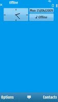
The homescreen layout of the N97 mini (not counting the widgets) is similar to the Nokia 5800 XpressMusic version - all the status indicators are at the top, plus the clock and the calendar.
A single press on the clock starts the clock application (with an option for setting up an alarm) while tapping on the date opens a drop-down menu where you can either enter the calendar application or change the currently active profile.

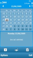
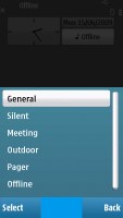
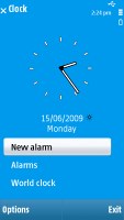
Calendar, profiles and clock just a touch away
Now, let's take a closer look at the widgets. If they are hidden, just sweep a finger across the screen and they'll show up. Another sweep will make them disappear.
You can have up to 5 widgets at a time displayed on the homescreen (you can't change the clock) and you can arrange them according to which you use most.
There are plenty of widgets to choose from - there are tools like the WLAN wizard, music player controls, a calendar or a widget with four favorite contacts (you can have two of those). The other widgets are linked to various sites and services - Amazon, Facebook, AccuWeather, Associated Press, CNN, Elle and quite a few more.
The Ovi Store comes in when you get bored of the preinstalled widgets, but will cover that in more length later.
Arranging widgets is easy and fun. You can remove some of them, add others, change their order (just drag and drop). If all 5 slots have been taken, you have to remove one or more widgets to make room.

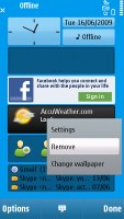
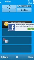
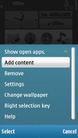
Arranging the widgets is easy and fun
Nokia N97 mini comes with 4 preloaded themes and most of them are really appealing. You can also download third party themes from the internet. As before, you can switch the themes effects on and off. Unfortunately, even if the transitions look kinda cool, they cause occasional lags when browsing the menu.
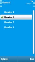
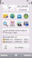
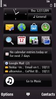
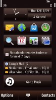
Some of the preloaded themes are a real eye-candy
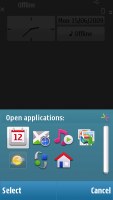
Nokia N97 mini features a task manager, which is launched by a press-and-hold on the menu key. The task manager itself is identical to the one found on Symbian S60 3.2 devices. Also much like in the previous version of the UI, it appears on top of every pop-up menu.
Reader comments
- teddybear
- 19 Oct 2017
- mrC
i also have both, but nokia n900 is not good for carrying around, too heavy, and is more like pc, not mobile, only if you want to hack stuff in home
- Prakash
- 28 May 2016
- YQQ
I want this phone
- Wongndeso
- 25 Apr 2016
- tDR
Bought it on august 2010, lost it oN November 2012. This is My first smartphone. Then BlackBerry 9850, several Android Gadget, BlackBerry Z10 (BB10 OS), and now iPhone. Nice tO witness the Mobile phone world revolute.
