Nokia X3 review: Music X-three-M
Music X-three-M
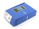
Nokia X3 unboxing
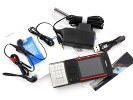
The retail package of Nokia X3 covers the basics. In the box you'll find a charger, a shortish microUSB cable, a 3.5mm headset and a BL-4CT battery. The headset is one piece, which means you’ll have to give up the remote if you want to use another set. There's a user manual of course, and a 2GB microSD card to get you started.
Nokia X3 slide 360-degree spin
Nokia X3 measures 96 x 49.3 x 14.1 mm for a volume of 65.8 cc. The handset is neat, with very clean lines and simple styling. The X3 is a compact slider with a pleasingly solid feel and likeable materials. The weight of 103 g is in the sweet spot for a phone of that volume.
Design and construction
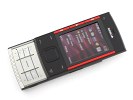
The Nokia X3 moves away from the rounded corners of most recent Nokia handsets, and goes for bold, straight lines. The soft plastic on the back and the faux brushed metal finish of the keypad and backside of the slider combine comfort with style.
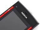
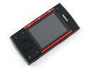
The front is a classic Nokia slider. It houses the display with two colored stripes on each side, the left of which comprises the three dedicated music keys. The red color accents are a familiar XpressMusic styling cue. Below the display are the S40 standard D-pad, surrounded by the soft and call keys.
The notch of an earpiece is centrally placed right above the Nokia logo up front. The handset lacks an ambient light sensor and display brightness is non-configurable. The music keys are thin but easy enough to hit.
The 2.2” screen seems tiny compared to the overall size of the Nokia X3 and spoils the looks of the phone – it just makes it look cheap. Cheap it is, but most of the exterior does a pretty good job of masking that.
When you turn the phone on, disappointment with the display grows even bigger. The contrast is poor and the colors are way off. The viewing angles are atrocious – if you’re not looking at it dead on, the colors begin to wash out. And sunlight legibility is very poor as well rather surprisingly for a Nokia phone.
Overall, the display performance just about beats an entry level color screen from a few years back (think CSTN quality).
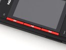
Beneath the display are the D-pad, the soft keys and the Call and End keys. The navigation frame of the D-pad is nicely projecting over a very spacious and responsive confirm key. The soft and call keys are flat, the whole plastic deck sinking when they are pressed. The keys have a satisfying click.
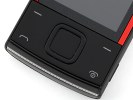
The standard assortment of soft and call keys
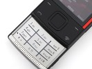
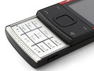
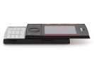
Sliding up unveils the alphanumeric keypad, which takes the entire lower deck of the phone. The keypad is flat, with the symbols etched out on a plastic plate with brushed metal finish. Vertical and horizontal ridges separate the keys, making touch orientation very easy.
The top row is actually taller than the other rows, leaving plenty of headroom. Still, it’s not a heavy texter’s keyboard, but casual users will find it quite comfortable. And the speaker grill bellow the brushed metal looks quite appealing.
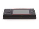
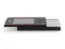
Speaking of sliding, it’s time to talk about the second major disappointment with the Nokia X3 hardware after the display. The slider’s spring is assisted, but the two parts of the chassis rub against each other too much to making the spring nearly useless.
The feel of plastic-sliding-over-plastic is not very pleasant either. The strangest thing is there’s about a millimeter between the two parts of the slider, which also makes a bad impression.
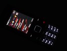
The strong and even white backlighting is nice and usable
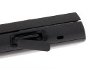
On the top side of Nokia X3 you'll find the microUSB data port under a neat plastic cap. Next to it is the 3.5mm audio jack and the standard Nokia charger port, both of which are left out uncovered. Charging off microUSB is possible, but the standard issue charger has the regular 2mm charger plug.
The grill of one of the stereo speakers separates the two parts of the slider at the top. The bottom is clear, save for the second loudspeaker grill.
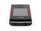
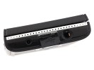
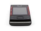
The top and bottom sides of Nokia X3
The right and left side of the handset are quite neat – the left side has the microSD card slot hidden under a flap, just above the lanyard eyelet, and the right has the volume rocker and camera keys.
The back is made of soft matte plastic, which is pleasant to the touch and fingerprint-immune. A dotted pattern on the top and bottom break up the plain look – the only other things of interest are the engraved Nokia logo and the camera lens, framed by a thin line of brushed metal.
When open, the top part of the slider reveals more of that brushed metal finish on its back to reinforce the overall solid feel of the phone.
The glass covering the camera lens is exposed at all times, so you have to handle the phone with care or risk scratching it.
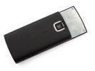
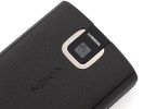
The battery cover and camera lens
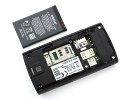
The battery cover slides out easily, and doesn’t wobble when in place. Below it you'll find the 860 mAh (BL-4CT) Li-Ion battery and the SIM compartment bellow.
The Nokia X3 feels good in the hand, though the rough slider action spoils the experience. That and the awful display, of course.
The fingerprint-hiding matte plastic on the back along with the brushed metal make the X3 look good, and perhaps a bit too serious. The overall looks closely mimic those of the Nokia X6, but the X6 has the high-tech sophistication, which, the X3 can’t quite pull off.
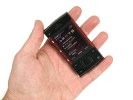
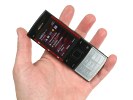
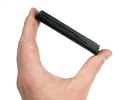
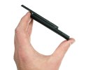
The Nokia X3 handles nicely and looks solid, but has a few build issues
Reader comments
- Anonymous
- 18 May 2020
- rJq
Yea me too. It was smooth
- Jameden
- 08 Mar 2019
- 3aY
I never experienced any "plastic-on-plastic friction" when using the slider on my Nokia X3. That is very weird, actually.
