Nokia XL Dual SIM review: Start to Finnish
Start to Finnish
Android like you've never seen before
With Windows Phone, Nokia purposefully gave up control of the platform after spending piles of cash to make Symbian competitive and failing. Series 40 with its long history had accumulated too much baggage along the way and lacked developer support.
That's why Nokia looked to Android - the OS was well developed, had great developer support and was completely open for Nokia to tinker with. The result is a custom software that mixes good ideas from the Asha UI (Fastlane), Windows Phone (Live tiles) and Android (almost everything else).
Nokia has brought Glance Screen on the X platform - it keeps the display on, but in a low power mode so that it can display the time an notifications. Glance Screen is the marketing name for the Lumia handsets that Nokia phones (both S40 and Symbian) have had for a long time.
Double-tapping the phone (it doesn't have to be on the screen) will wake it just like pressing the power button will. This reveals a simple but functional lockscreen with the time and date, plus widget-like notifications for missed events. Depending on which side you swipe such notification it will either take you to the relevant app (right) or it'll be dismissed (left).
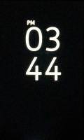
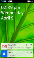
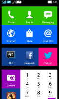
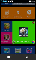
Nokia X Software Platform user interface - Glance, Lock, Home, Fastlane screens
Swiping the lockscreen itself reveals one of the two homescreens - the app drawer and the Fastlane.
The app drawer on Nokia X looks like a Windows Phone homescreen - all apps shortcuts have the flat, two-color appearance of Live Tiles. They are resizable and you can even change the base color of each tile. What's different is actually none of those tiles is "live" due to the hardware limitations of the device.
This homescreen will list of all your installed apps, so it might get really long if you are lazy not to organize your shortcuts in folders. There is a search field at the very top of this homescreen to help find a shortcut or widget if it gets lost in the mess or is hiding in a folder you forgot to check.

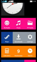

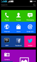
The app drawer homescreen • changing a tile's color • search is available too
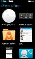
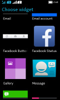
Standard Android widgets are also supported and apps that come with a dedicated widget, such as the BBM, will also appear in the widget menu too. We suggest not to use too many widgets though because they may noticeably impact the overall system performance. Another downside of widgets is that virtually all of them were designed with Android aesthetics in mind, not Windows Phone.
Swiping horizontally from the app drawer will take you to the other homescreen called Fastlane. Those of you familiar with the Asha user interface will recognize it immediately.
Fastlane keeps track of all your recent activity, opened apps go there, recent web pages, along with contacts you've called, messages and emails, calendar events (birthdays, to-dos), recently installed apps, recently shared content, recently taken notes and pictures, radio stations, and even social network posts, replies, likes and goings-on. The music player and the FM radio, if active, will also appear here.
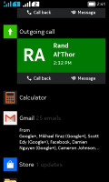
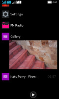
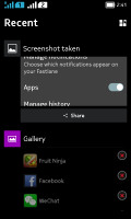
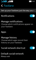
Fastlane homescreen • Personalizing Fastlane
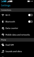
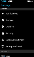
Fastlane is basically a mix between an app switcher, notification area and a history list. It can be personalized from the Settings menu where you can opt out of some of the services and notifications in case you are getting overloaded with content.
Items from the Fastlane can be dismissed by long pressing the screen and hitting one of the X buttons that appear. This way you can dismiss both apps and other items here.
Note that the single button below the screen is a back button, but if you long press it, it will jump straight to the homescreen, bypassing other screens you might have visited.
There is a separate notification area, which you can pull down form the status bar. It shows notifications for missed events and quick toggles for sound profiles, Wi-Fi, Bluetooth and mobile data.
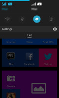
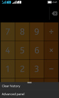
The Notification area • A contextual menu
Contextual menus, if available, are marked with three short horizontal lines at the bottom. They areaccessible by swiping up from the bottom of the display, just like the notification area.
The so-called Nokia X platform 1.0.1 UI is based on Android 4.1 Jelly Bean. The core of Android may be unchanged and relatively old, but at least it got in on Project Butter. There's not much processing power to spare on the Nokia X so Butter is essential.
Performance is good, though not as snappy as Android on a more powerful chipset (especially a newer Android version). We examine performance in more detail on the next page.
Reader comments
- Solomon
- 02 Jun 2020
- xtS
Please store app on my Nokia xl dual sim is not working again, what can I do to make it working?
- franc wan
- 03 Jan 2020
- Nvw
Software update
- suyog
- 21 Jul 2019
- rJd
Even in India Nokia store stopped working so getting help from other platforms to update apps. Though if Nokia works better than other brands then I think it's one of the best and sturdy smartphones. Still waiting for good reviews on its new handsets...
