Nothing Phone (1) review
Design, build quality, handling
The Nothing Phone (1), being the company's first smartphone, had to make an impression, and it had to make it right. The expectations for the design were particularly high, and we are happy that Nothing indeed succeeded in making an outstanding first impression!
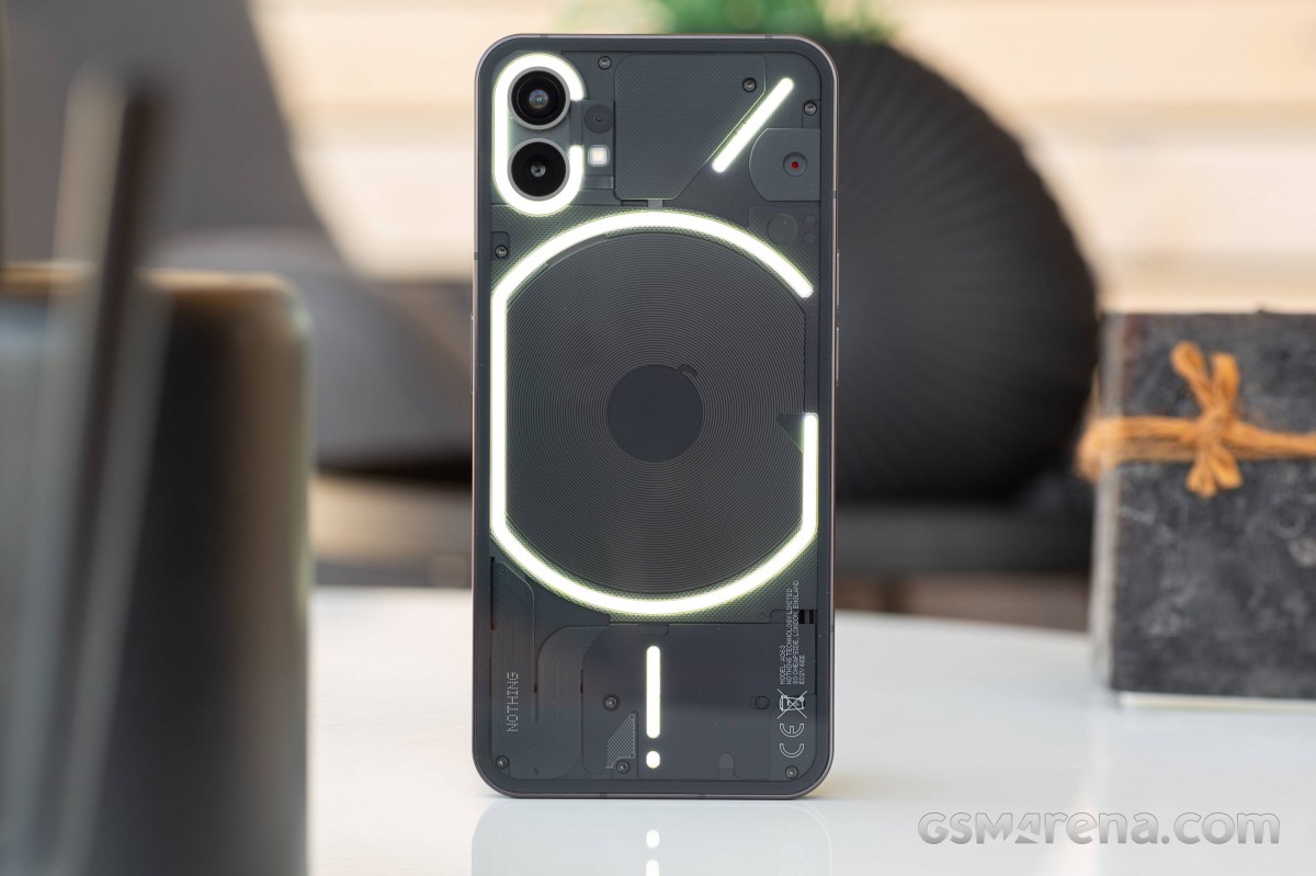
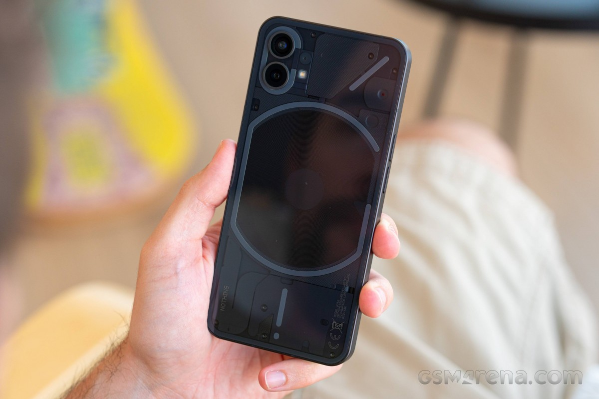
Nothing Phone (1) has two signature bits that will probably remain for at least a few generations - the see-through rear glass and the Glyph LEDs under that glass.
Besides the unique looking back panel, the Phone (1) features the usual high-quality build of two flat Gorilla Glass 5 pieces and an aluminum frame and chassis in-between. The whole thing is IP53-rated for dust and light splash resistance. It would have been nicer to get complete water protection, IP67-rated or more, but it is what it is. After all, we are not looking at a flagship here.
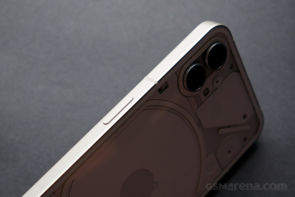
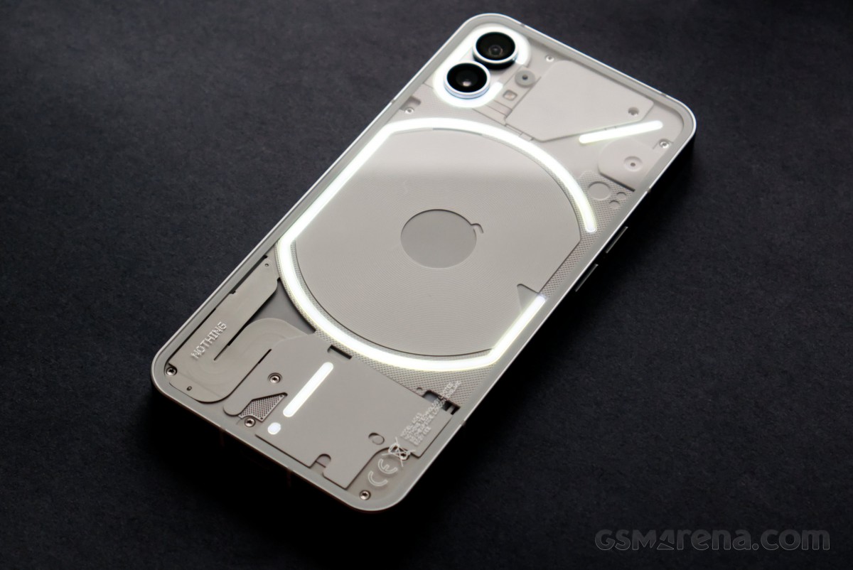
The Nothing Phone (1) is available in either Black or White colorways, and we have them both. The main difference is obviously the design of the backside. The frame on both variants has a matte finish and is painted dark gray.
And speaking about the frame, it's incredibly flat, and the Phone (1) can stand on its own, like some iPhones. It's not an achievement of any importance, but it speaks well for the overall balance of the device's design.
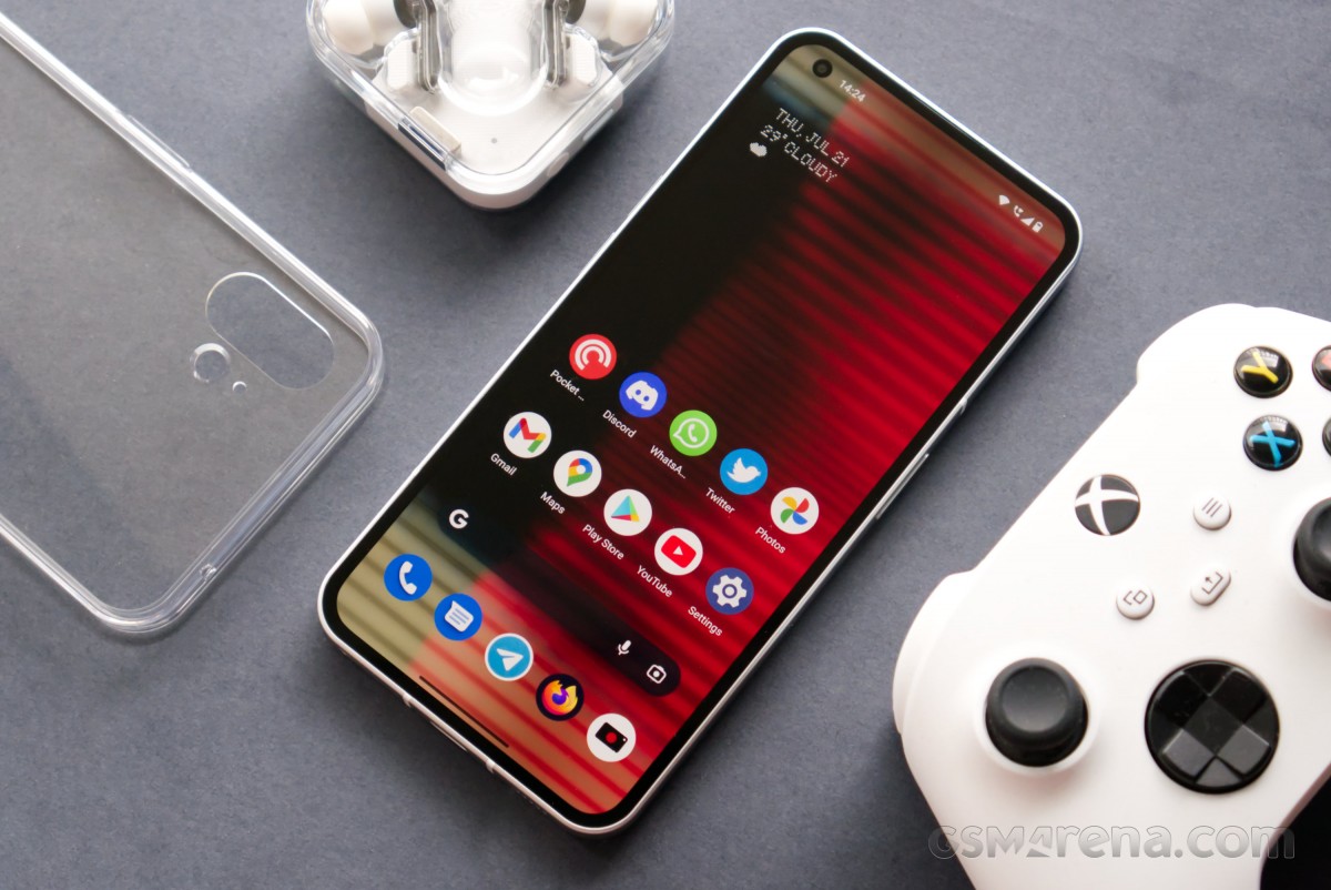
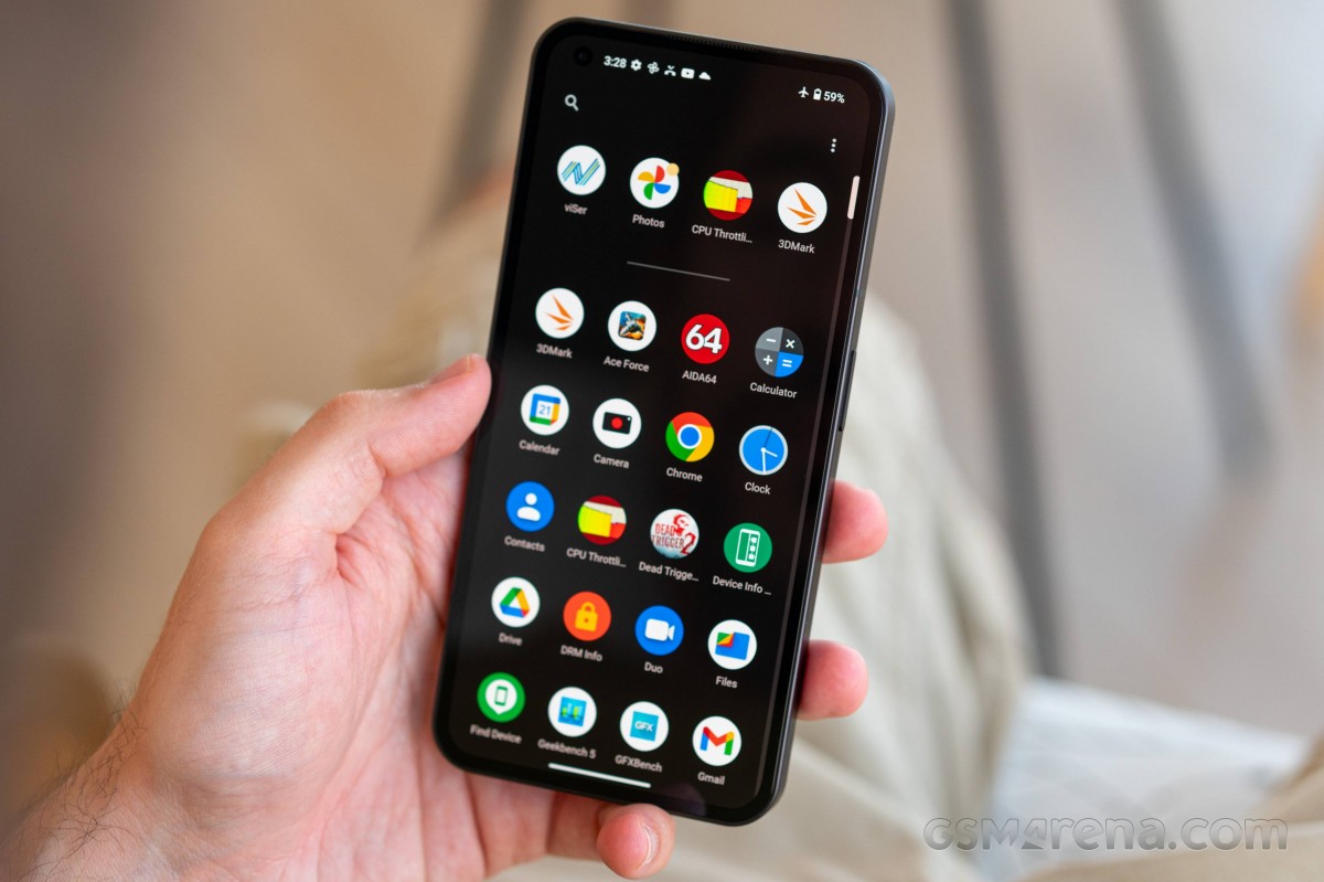
Starting with the front, we can see that the Phone (1) has more than a passing resemblance to modern OLED iPhones. The Gorilla Glass 5 is completely flat and perfectly flush with the frame. The bezels around the display are uniform, and Nothing is using the same flexible OLED tech that Apple uses to curve the display controller under itself in order to reduce the size of the bottom bezel. The only real difference is the presence of a hole punch camera in the top left instead of Apple's infamous notch.
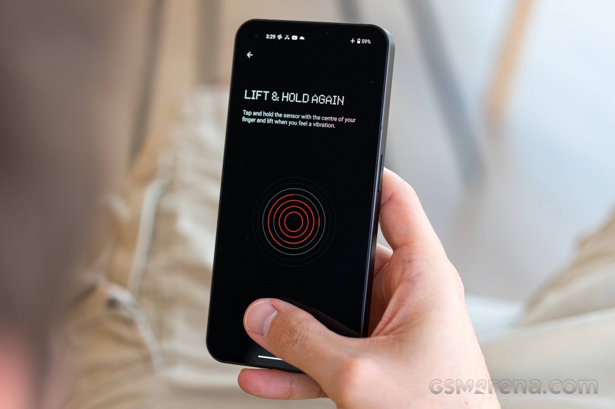
Nothing has used an optical fingerprint scanner placed under the display. It's about 1cm away from the bottom, a bit lower than on most phones, but we found its placement comfortable. Plus, the scanner is always-on and offers notably good speed and accuracy.
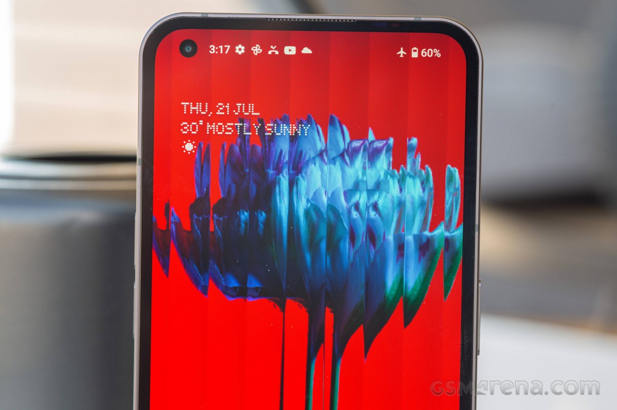
Above the screen, right next to the top part of the frame, you can spot a small outlet with a barely visible grille. This is where one of the stereo speakers, also acting as an earpiece, goes. An actual proximity sensor is hidden within the black bezels, so you don't have to worry about mistouches during calls.
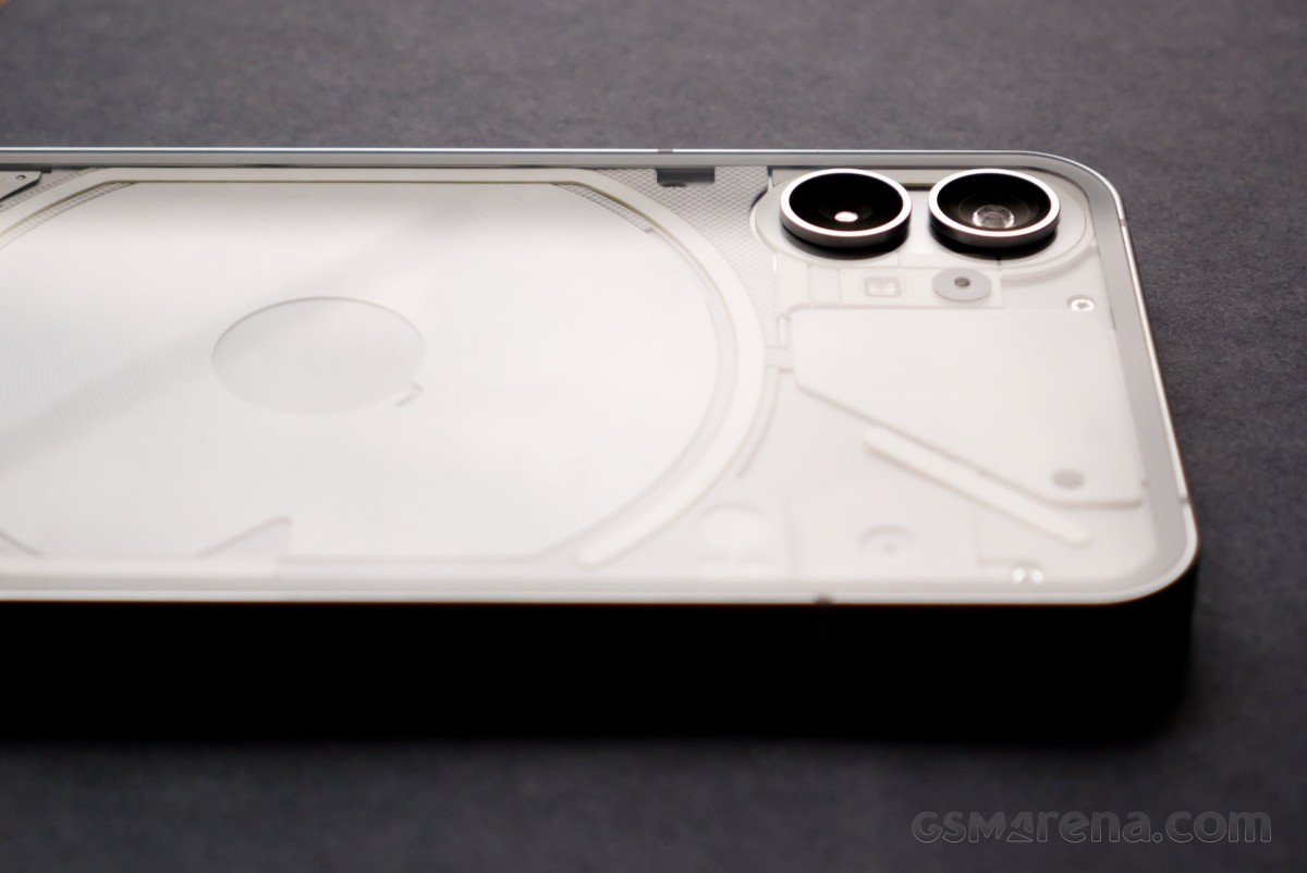
The back is where things get interesting. A transparent Gorilla Glass 5 panel covers the entire surface, giving a view of some of the components. It also lets the Glyph Interface lights shine through.
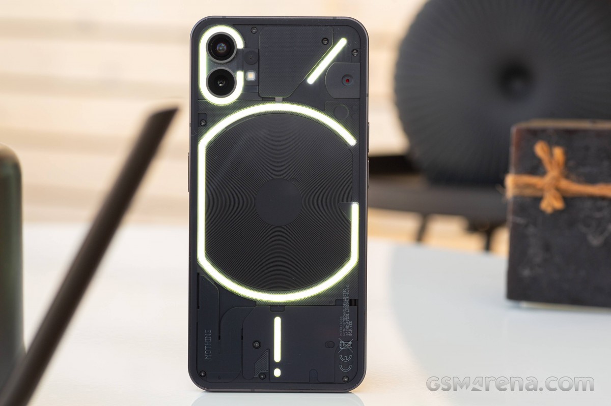
Of course, the clear design is mostly window dressing. You don't actually get to see the phone's internals because most of it is hidden behind plastic covers. The only identifiable components visible are the induction coil for the two-way wireless charging and a ribbon cable, presumably for the battery.
If you were expecting to see actual components like motherboard, battery, and speaker, you might end up disappointed, though. What you get is a sea of oddly shaped bits and pieces.
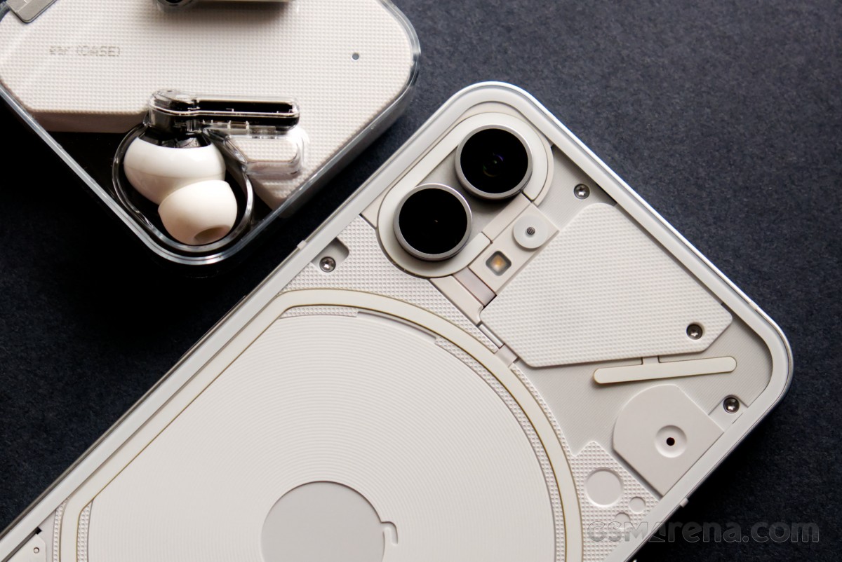
The black version looks more subdued, while the white model looks busier and somewhat flashier. Both have a certain charm to them; you just need to pick the one that you like better.
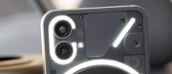
The only practical reason for the back to be transparent is for the Glyph Interface lights to shine through. These four sets of LEDs can be controlled through the software (more on that later) and are essentially used to indicate calls, notifications, and charging status. They can also be used as a fill light for the camera.
The LEDs can get extremely bright, to the point where we don't recommend keeping the phone near your eyes when they are about to light up. Their color is somewhat inconsistent, and there is some yellowing noticeable on some of the strips. However, this is not usually noticeable as they normally blink very rapidly.
And something you won't see right away is a small red LED that can flash while you are capturing videos. It's turned off by default from within the Camera app.
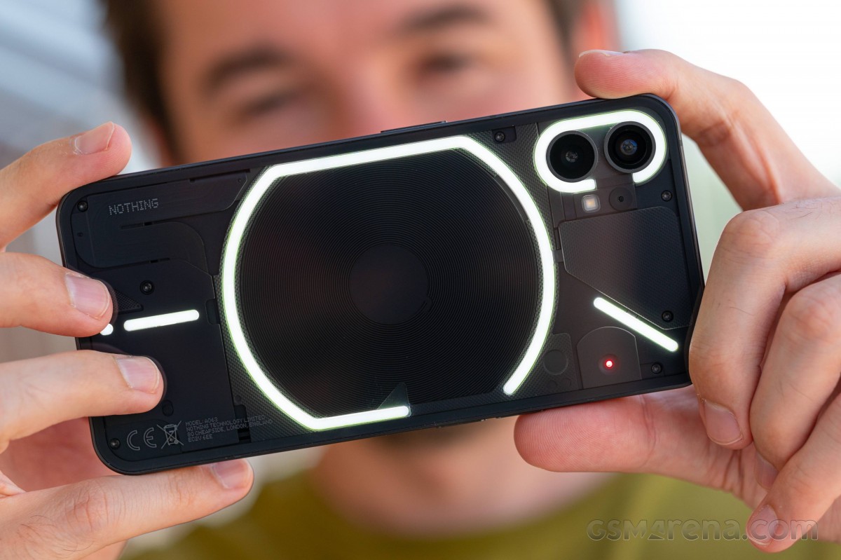
The Glyph is unique and useful; no two ways about that. But, to get any value out of it, you have to be someone who puts their phone face down, which is not something most of us do often. With the advent of always-on displays, there really is no reason to put your phone face down, as you'd miss out on quite a lot of useful information. With AOD, you get up-to-date information on all incoming calls and notifications whereas the lights on the back can only really identify a certain caller using custom ringtones but are otherwise quite vague as a notification system.
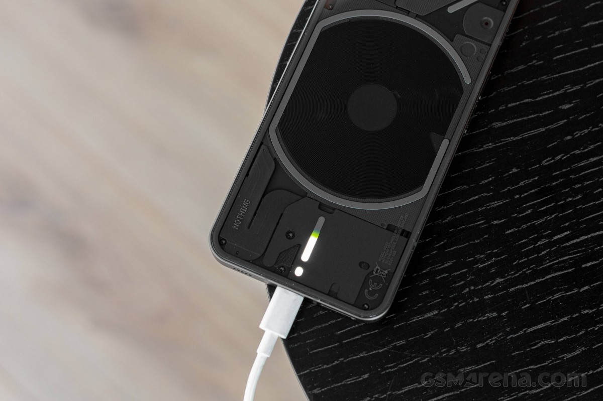
We do admit it's cool to wirelessly charge headphones or smartwhatches, or simply charge the Phone (1) and enjoy the slowly increasing battery indicator. The different notification Glyph patterns are cool, too. But for that, you will have to completely change your habits. And probably leave the factory screen protector on or even apply a higher-grade one.
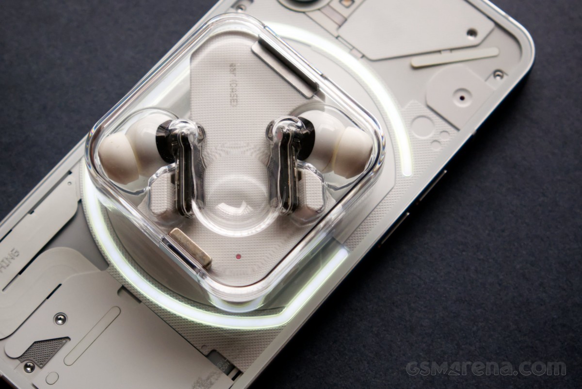
There are two jutting-put metal rings on the back - each circling a 50MP camera. The top one is ultrawide, while the bottom one is the primary wide-angle camera with OIS. A single LED flash is also around. The Nothing Phone (1) is wobbling a bit on a table because of that, but not as much as many recent phones. Though, since you are supposed to keep it lying on its face, that will hardly be an issue, right?
The sides of the Nothing Phone (1) also remind us of the regular iPhone models. They are completely flat, while the power and volume buttons are split across them in a similar fashion. We would have appreciated it if Nothing had gone all the way and also borrowed the alert slider, coincidentally also found on OnePlus phones.
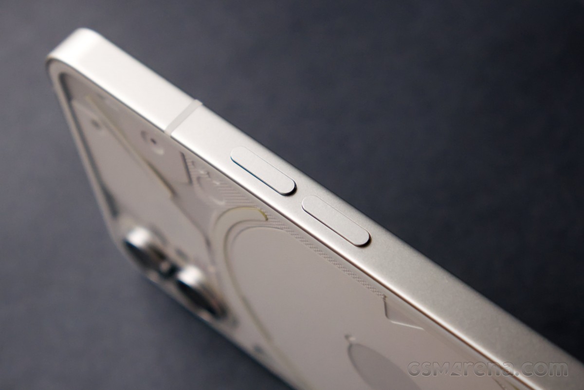
And there is the power/lock key on the right side.

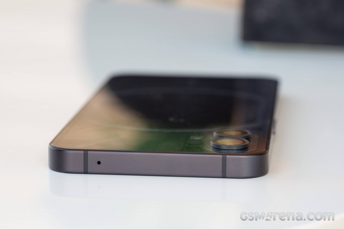
The top of the phone houses a lonely microphone, one of three actually. Another one sits next to the dual camera on the back, and the primary one is at the bottom, next to the USB-C port.
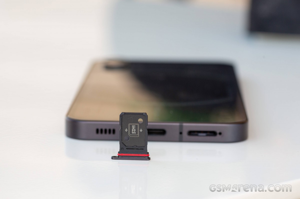
The bottom is also where you'd find the dual-SIM tray and the second stereo speaker.
In terms of usability, the Nothing Phone (1) is quite large, almost as much as the iPhone 13 Pro Max. This, coupled with the flat sides, does make the phone awkward to use if you are used to smaller phones.
The build quality of the Phone (1) is solid. The glass and aluminum surface feels premium, and things like panel gap tolerances are very tight. The buttons on the side feel firm and have good tactile feedback. Another positive thing we found is the incredibly easy-to-clean glass panels - a single wipe is enough to bring them back to pristine condition. Even better, fingerprints and smudges are not as easy to stick as on other phones. We'd go and throw a wide guess that maybe the Phone (1), just like the iPhones, comes with oleophobic coating.
The Phone (1) also has IP53 rating for dust and water resistance, which is somewhat of a bare minimum as far as IP ratings.
Overall, we credit the Nothing Phone (1) for being interesting and standing out from the sea of black and gray phones on the market. Some can argue it would have been cooler if we had a look at the actual insides of the phone instead of this prettied up, sanitized version.
But complete transparency could have costed the beauty of the Glyph UI, which needs all the attention it can get as its coolness and usability may fade rather fast.
Long story short - the Nothing Phone (1) marks the beginning of a brand-new series of devices, and it does it the right way. Only time will tell if Glyph leaves a mark in the history books, but as a phone - this device has a solid, no-nonsense build with a premium touch that is easy to like right out of the box.
Reader comments
- Gghj
- 04 Oct 2024
- mZD
How?
- rafnov
- 09 May 2024
- L66
The most mistaken design I have ever seen. Ever. It is terrible nonsense that makes me puke.
- Ashish
- 03 Feb 2024
- GQ2
Video camera 4k 60 fps available