Nothing Phone (2) review
Design, build quality, handling
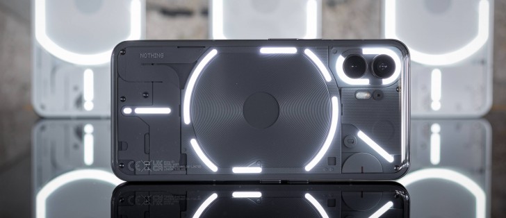
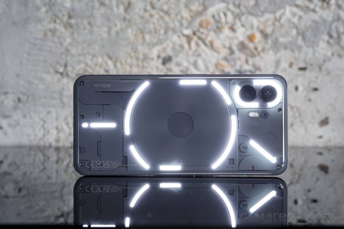
The Nothing Phone (2) looks a lot like the Nothing Phone (1), and that's not a bad thing. It is all screen at the front, there is a flat metal frame, and transparent glass at the back. The Glyph LEDs are the same shapes as before, and so is the wireless charging coil.
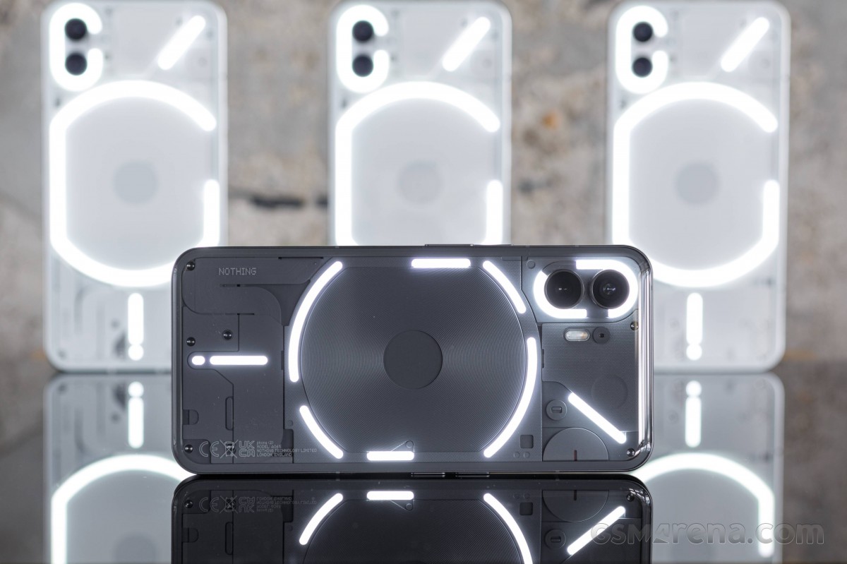
There are a couple of differences, of course. First, Phone (2) is larger than Phone (1) due to the slightly bigger display. And then there is a slightly curved glass, which makes the Phone (2) feel more natural in your hand, more comfortable. The glass is bent towards the frame across all sides.
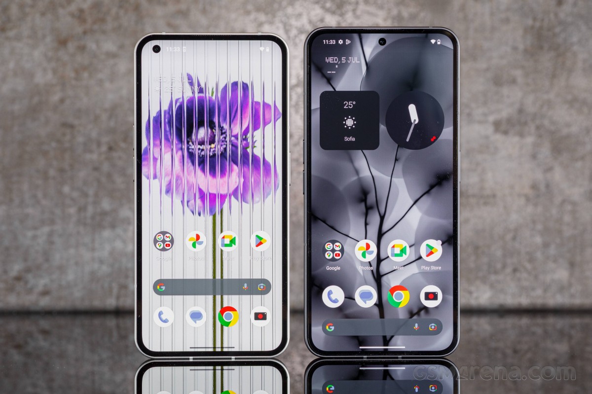 Phone (1) and Phone (2)
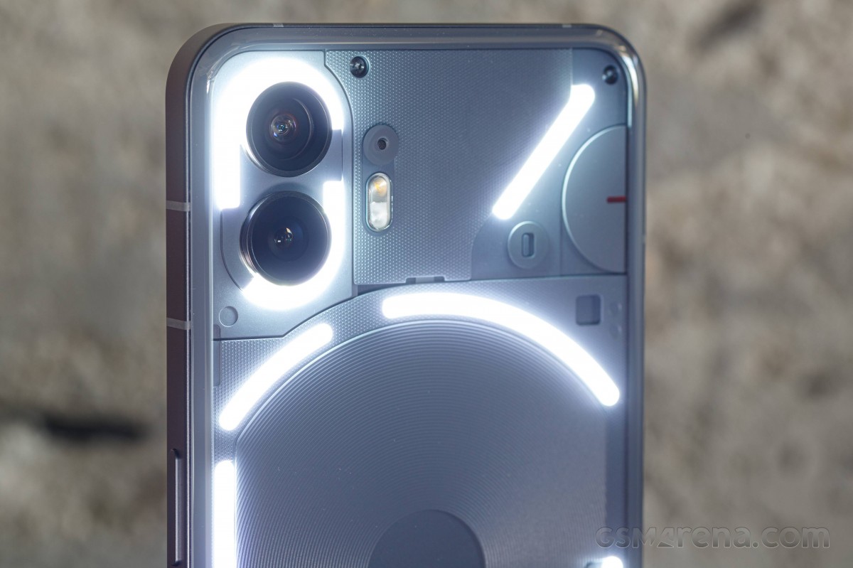
The Glyph LEDs are clearly visible, and they appear to be of the same shapes as before. But that's not exactly the case. There are now three interruptions - on the C around the camera and on the G around the wireless charging coil.
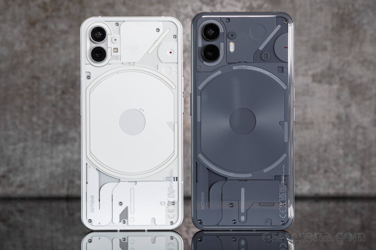 Phone (1) and Phone (2)
While the back panel is transparent, you will not see beyond the LEDs, though, as the rest of the phone's internals are cleverly hidden to avoid overcrowding the rear panel and thus ruining the cool experience.
You can control the Glyph lights from the software, and there are some new features we will talk about later in our software section. What you need to know right now is that those LEDs are multi-purpose and quite useful. And unique, of course.
The back panel is made of Gorilla glass 5. The screen glass is all flat and is Gorilla glass 5 again.
The midframe is made of recycled aluminum and has a pleasant matte finish. It's also slimmer than last year.
The Nothing Phone (2) is IP54-rated for dust and splash resistance. The Phone (1) had an IP53 rating, meaning the new model has improved water protection even though it is still not fully waterproof - it can do splashes, but it cannot survive a submersion.
Let's explore the Phone (2) up close now.
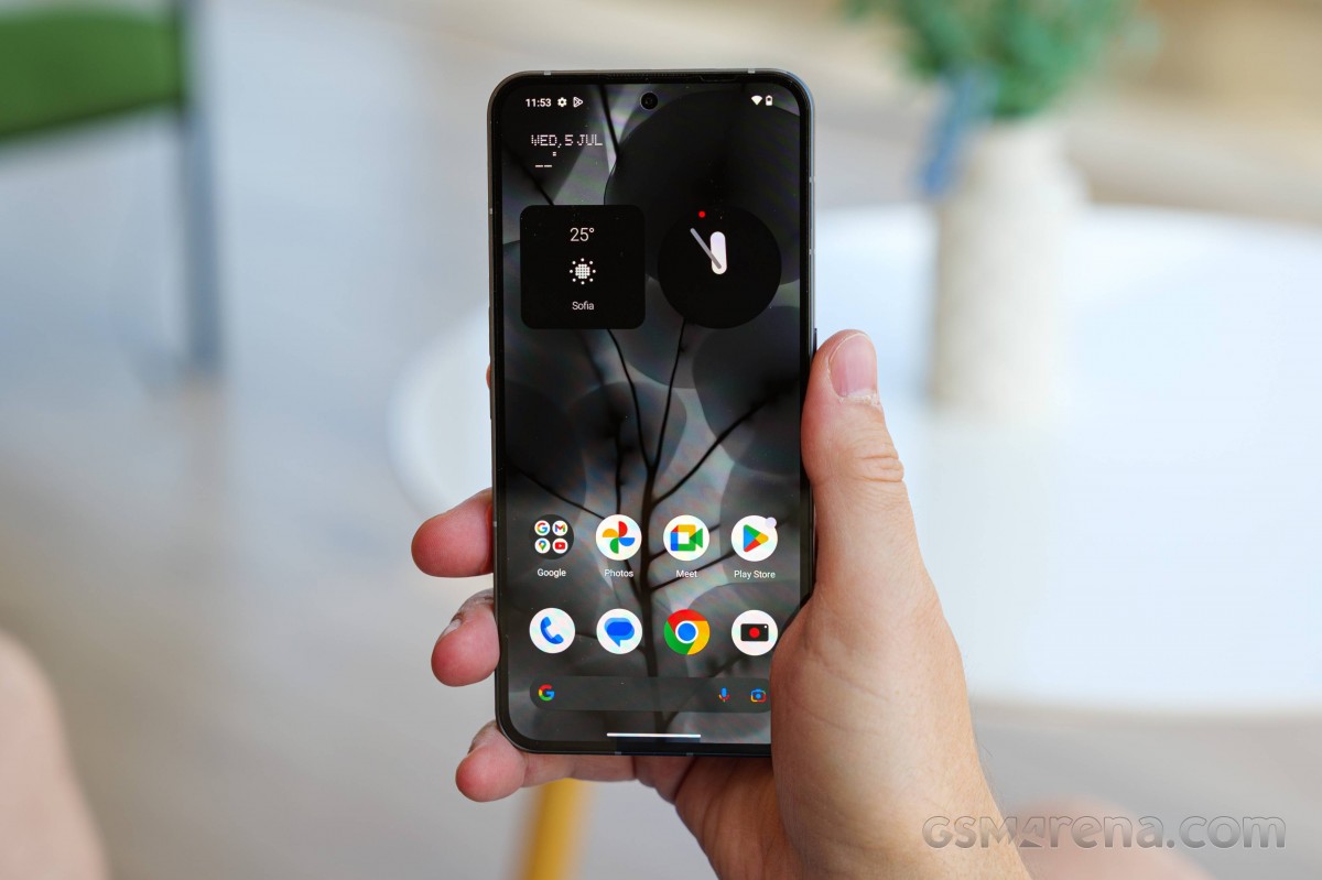
The 6.7-inch LTPO OLED occupies most of the front - it has an improved refresh rate handling and higher brightness compared to the previous one. The bezels are even across all sides and as thin as on a recent iPhone.
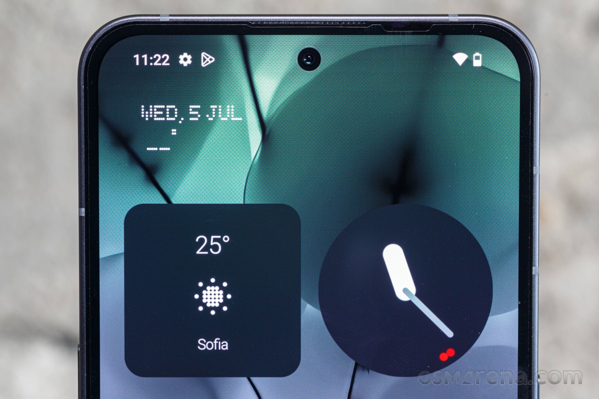
The screen panel has a small perforation around the top - here you can spot the 32MP selfie camera, up from 16MP on the Phone (1).
Above the screen is the earpiece grille, which also doubles as a stereo speaker.
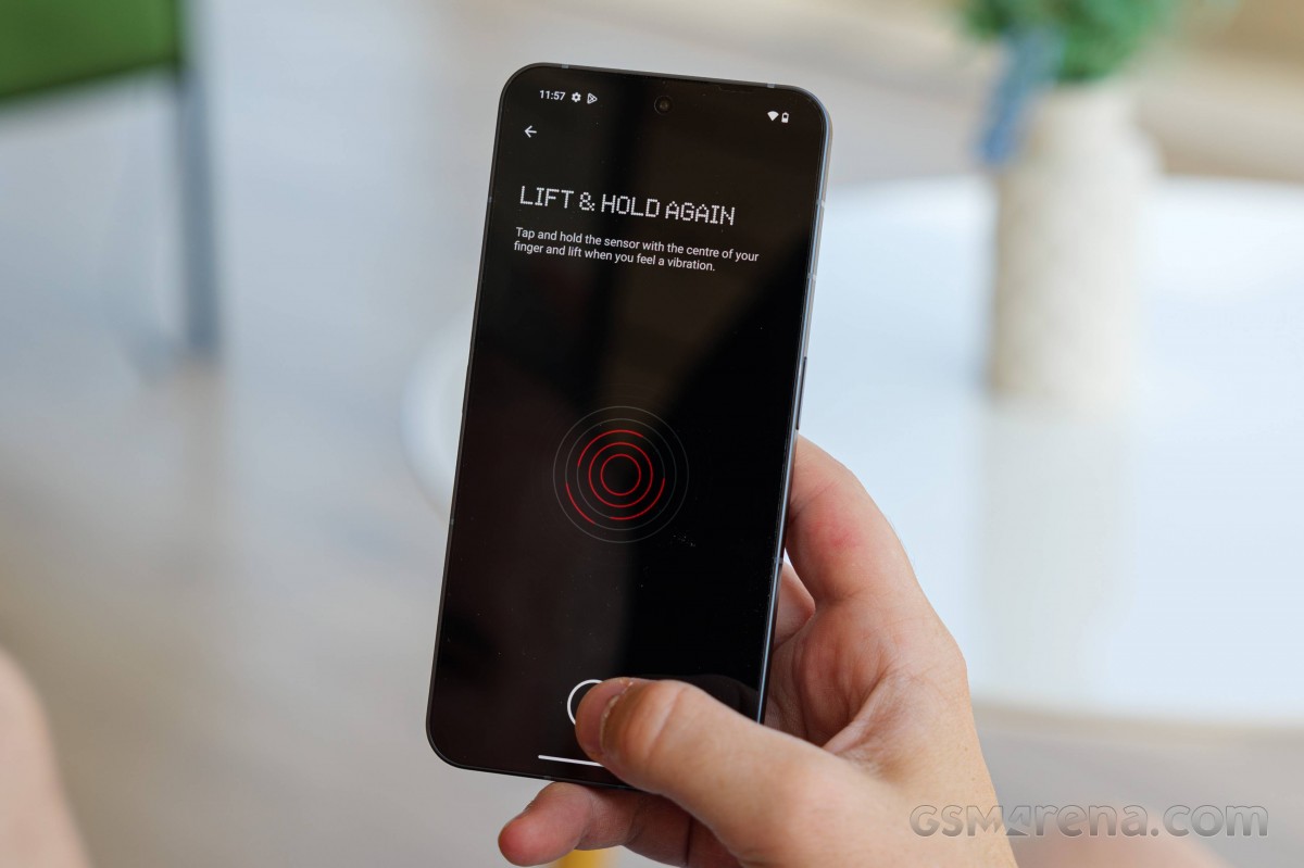
Underneath the display is hidden an optical fingerprint scanner - it is among the fastest and most accurate we've experienced since those came to be, and we are happy with its performance.
The back is slightly curved, and the Glyph LEDs are subtle, yet visible even when they are not flashing. There is a C-like around the dual camera, / one next to the camera, a G-like around the wireless charging coil, and an i-shaped around the bottom. All internals are covered with either black or white plastic/cable/film pieces depending on which model you get.
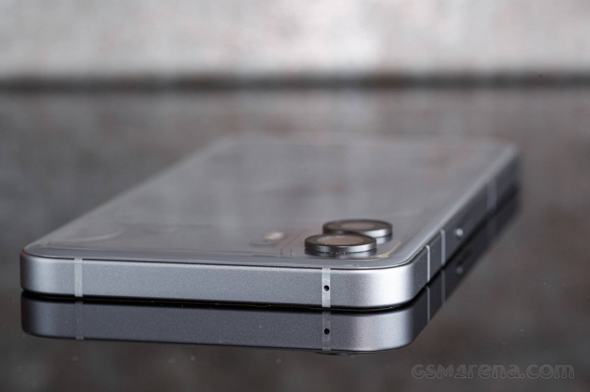
The two 50MP cameras have jutting out metal rings surrounding them, and they make the phone a bit wobbly when used on a desk or table. Next to the two cams is a single-LED flash and what appears to be a sensor, probably a color temperature one. And above the flash you can spot a barely visible microphone.
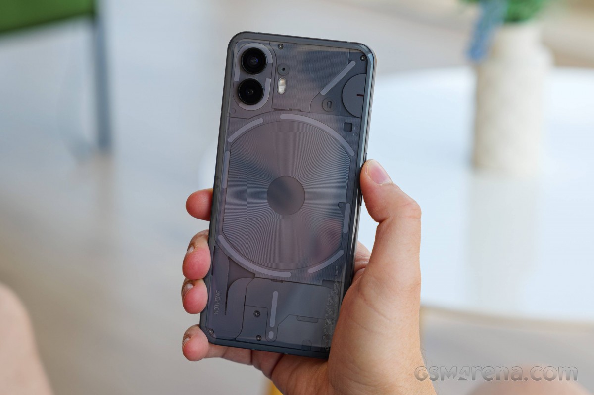
There is another thing you cannot see immediately - a small red LED that can be active during video capturing. You can enable/disable it from within the camera settings.
The matte metal frame is grippy enough and makes the Phone (2) comfortable in your hand.
The two separate volume keys are on the right.
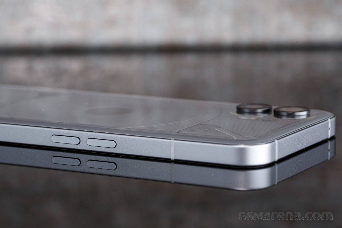
The power/lock key is alone on the right side.
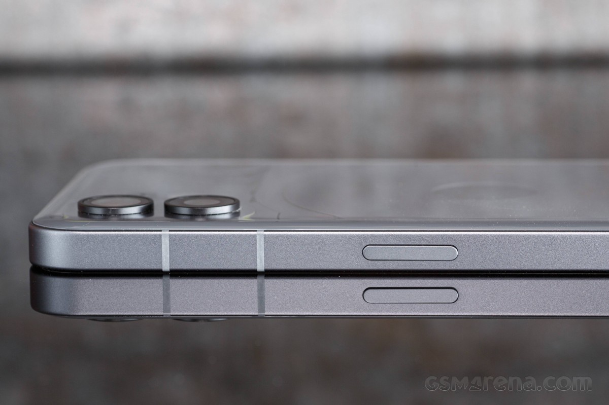
The top houses another microphone.
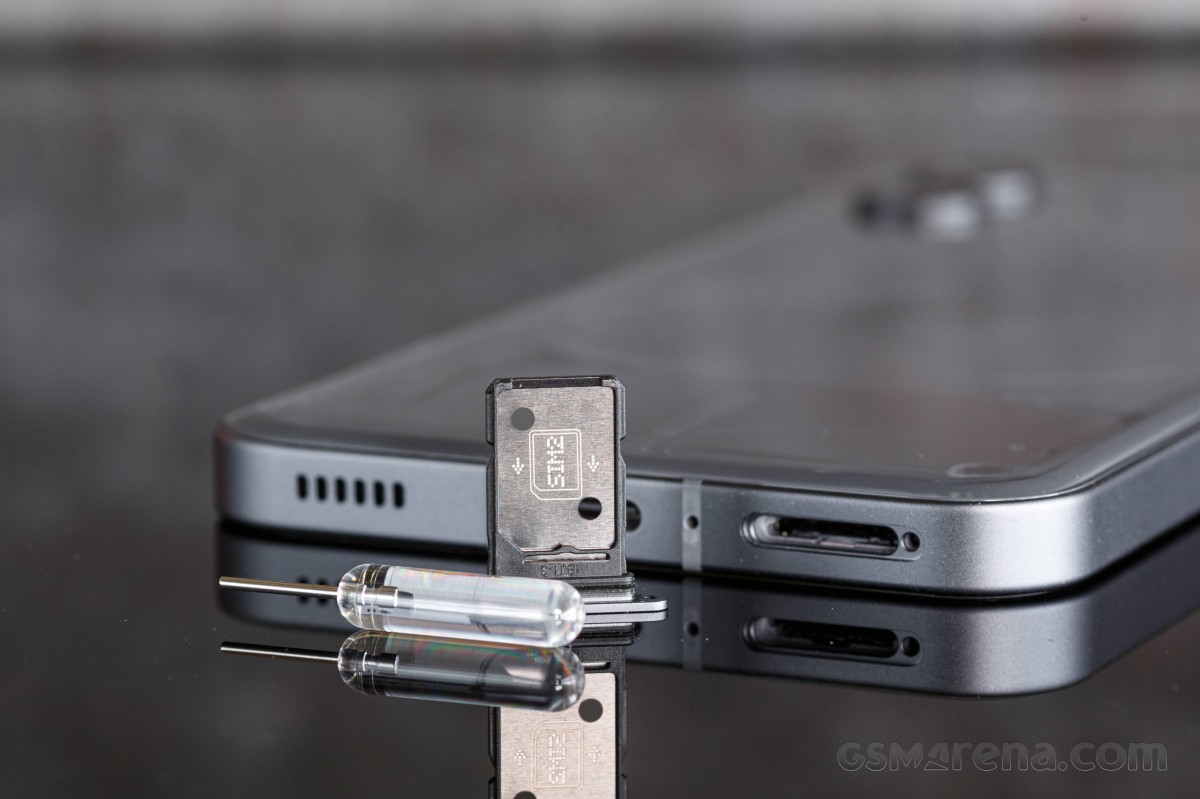
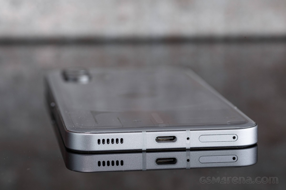
And finally, you can see the SIM tray, the primary microphone, the USB-C port, and the other stereo speaker at the bottom of the Phone (2).
The Nothing Phone (2) measures 162.1 x 76.4 x 8.6 mm and weighs 201 grams - meaning it is 3mm taller, a hair thicker and 8 grams heavier than the Phone (1).
We found the Nothing Phone (2) to be a well-built phone with an attractive and unique design, a bit industrial, yet still charming. It offers a good grip, not the most secure, but let's say, better than the average, and we didn't feel like shopping for a case right away.
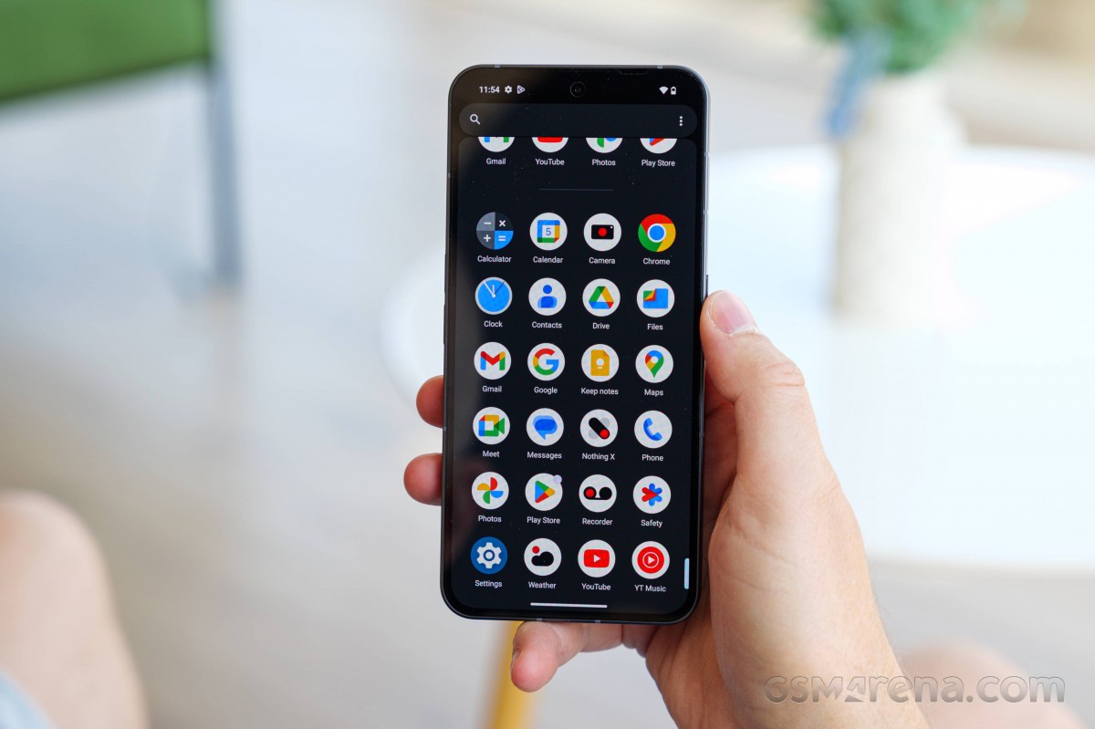
The new curved shape of the back made the Phone (2) feel more natural when handled, and the improved splash resistance is surely something we do appreciate. Overall, we have nothing but positive impressions of our time spent with the Nothing Phone (2).
Reader comments
- Anonymous
- 28 Sep 2024
- nwR
Used the Nothing Phone (2) for two weeks now; it's AMAZING. I have no issues with it, no lag in day-to-day usage, haven't experienced any glitches in the OS, Nothing customer service is great as well (at least in warranty inquiries). Defini...
- Anonymous
- 28 Sep 2024
- nwR
Source: trust me