OnePlus 10T review

Design, build quality, handling
The OnePlus 10T adopts the design language laid out by the 10 Pro, the two differing somewhat significantly from the rest of the company's lineup - the 9th gen and the Nord series alike. Naturally, the standout bits are on the back.
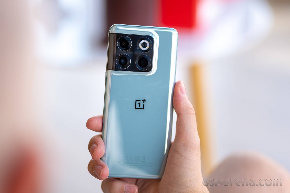
It's the camera island that is the signature OnePlus 10-series design touch, the oversized island with spread-apart modules dominating the top of the phone. Knowing the actual cameras inside, the arrangement is hardly mandated by the hardware's dimensions - it's clearly form over function here. If anything, the cameras were needlessly far apart, even on the OnePlus 10 Pro.
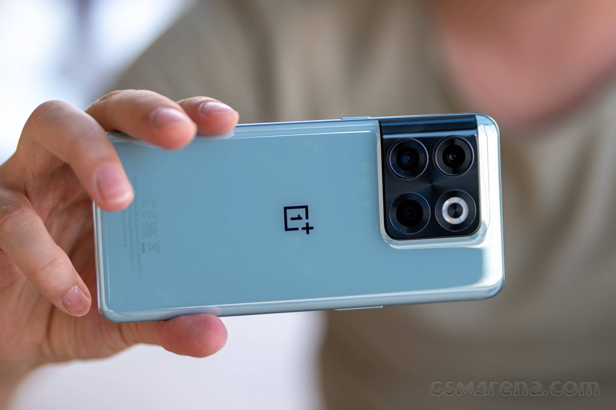
Despite looking a lot like the 10 Pro at a passing glance, the 10T's panel is actually different in at least a couple of ways. Still made of the same Gorilla Glass 5, the panel is now molded in one piece to curve over the camera section - the 10Pro had a separate piece for the camera island. The cameras themselves do still have their own cutouts with slightly protruding rings. Believe it or not, these rings have an outer diameter of 16mm, compared to the 15mm ones of the 10 Pro, despite the new phone featuring inferior imaging hardware.
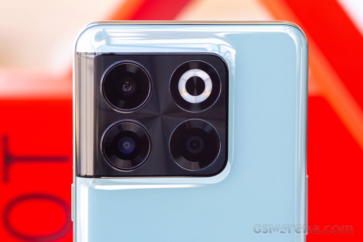
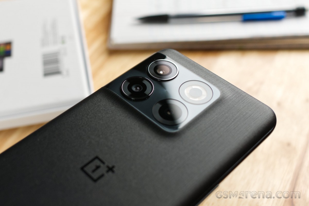
The other key difference is in the finish of the 10T's back. Where the 10 Pro went for a frosted treatment with a shimmery effect when out in the bright sun, regardless of which of the two main colorways you picked, the surface of the 10T's panel is first different from the old model's and then different between the two color options.
The Moonstone Black variant has a rough, stone-like texture that OnePlus says is inspired by the texture of basalt. It's quite unlike anything we have seen being done with glass before and is very unique. As a bonus, it also does not show any fingerprints or smudges.
The other color goes by Jade Green, and it has a glossy, ceramic-like finish. What that means is a lot of fingerprints, though wiping them is easy enough, and the pale color has an understated elegance to it. We can't help but wonder if a subtler, color-matched 1+ logo like on the Emerald Forest 10 Pro would have looked better instead of this contrasting black one. 'It is what it is' and we quickly snap out of it.

What is color-matched to the back of the phone is the frame. It's made out of plastic as opposed to the aluminum of the 10 Pro and has a glossy finish. One positive spin to the change of material is that there are no antenna lines spoiling its look - if those still bothered anyone, that is.
And speaking of things that won't be spoiling its look, the alert slider is gone on the 10T - though admittedly, we can see this move angering a lot more people than it will please. A staple of OnePlus design and feature set since the OnePlus 2, the slider was a symbol of the company's identity, and a lot of OP loyalists see its omission as betrayal and a symptom of the brand's becoming just a mirror branch of Oppo.

So with the alert slider gone, the 10T is left with the usual two physical controls - a power button on the right and a volume rocker on the left. We say usual, but this kind of separation is becoming increasingly rarer with most makers now having both the power button and the volume rocker on the right.


No alert slider on the left • Power button on the right
The rest of the bits are where you'd expect them to be. The USB-C port is on the bottom, flanked by a mic and a loudspeaker. Also, here is the SIM slot, with the tray accepting two nano SIMs and no microSD, as usual. It's one of those instances where we need to point out that the red gasket on the tray's outer end does not mean an IP rating - there's no official dust and water resistance on the 10T.
Up top, there's another mic and an extra opening for the top speaker.
That top speaker also fires forward, towards the front of the phone, through a slit above the display - back in the day of phone calls, that was dubbed the earpiece. A punch hole cutout of reasonable size nearby is where the selfie camera peeks through.
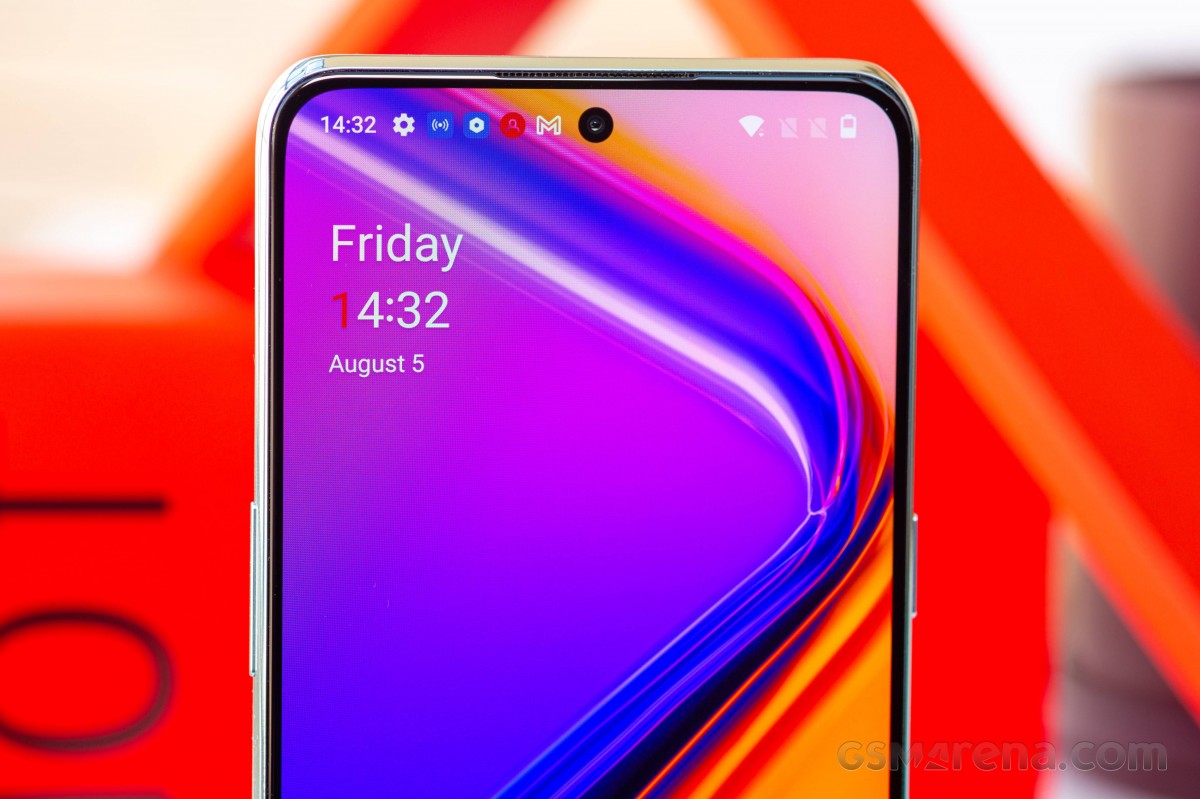
The 6.7-inch OLED display is surrounded by minimal bezels, if not quite uniformly thin all around. It's a flat panel, too, unlike the one on the 10 Pro, and we can already hear the curved screen haters rejoicing.
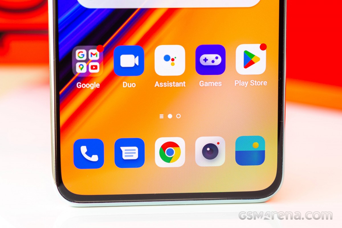
One slightly questionable decision is the placement of the fingerprint reader - an optical one as is the norm. It's a lot closer to the bottom edge of the phone than what we saw on the 10 Pro, though admittedly, this low position is also what the OnePlus 9 had. It's the same on the Nord 2T as well, by the way. The sensor itself works with no issues.

The OnePlus 10T measures 163x75.4x8.8mm and weighs 204g. It's on the thick side of average for the class, and that's with no wireless charging coil inside - the dual-cell battery does take some extra space, we gather. It's nearly identical in dimensions to the Pixel 6 Pro, while the Xiaomi 12 Pro is the same footprint but is slightly thinner. The Galaxy S22+ is a lot thinner and also slightly shorter and lighter. So the 10T is a relatively large handset though it doesn't necessarily feel like it - the curved rear edges do soften its impact on your perception of size.
Reader comments
- gganzarolli
- 28 Aug 2024
- P6g
Allright, Apple fanboy... lololol
- Anonymous
- 27 Feb 2023
- JcU
Maybe for you the fastest but it's not the fastest what i use :) its not a OnePlus and never will be OnePlus brand. OnePlus is dead!


