OnePlus 11 review
Design and ergonomics
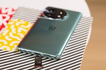
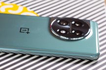
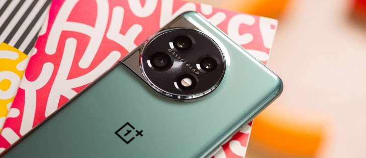
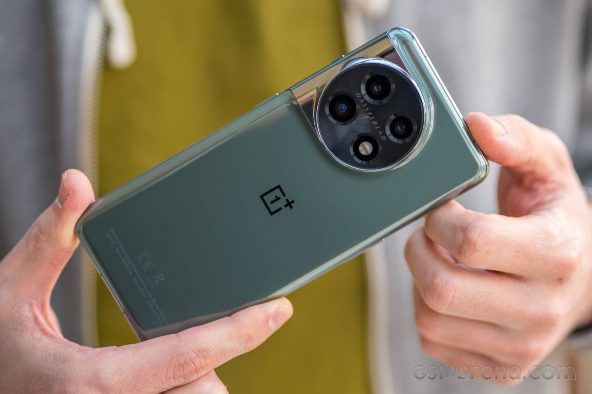
The OnePlus 11's looks are quite similar to last year's flagship, but there are some noticeable changes, mostly related to the camera bump. The square-ish island that transitions into the side frame is now circular, with a chromed-out stainless steel bump sitting beneath the camera ring. The rest of the back plate remains clean and minimalist. OnePlus says that designers draw inspiration from classic sports cars and Swiss watches, and we can kind of see the resemblance.
This year, the OnePlus 11 also gets an official IP64 rating and even though this wasn't made clear during the Chinese launch of the handset, all regions get the same versions of the handset. However, the phone allegedly has IP54-equivalent protection against dust and water in India, but it's not officially certified.
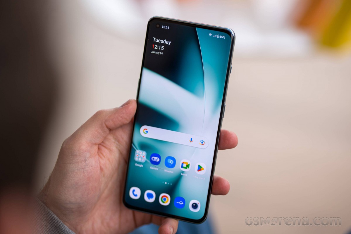
The back panel is protected by a Gorilla Glass 5 sheet with subtle 0.16 curvatures to the side. They help achieve a smooth and sleek appearance, аnd even though the handset is 8.5mm thick, it doesn't feel as hefty in hand. The weight of 205 grams is pretty standard for a 6.7-inch phone, but it seems to be well-distributed, so it doesn't feel heavy at all.
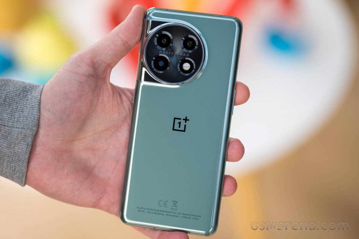
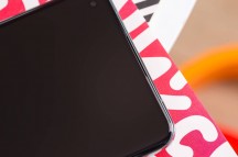
The choice of materials is anything but cheap, though. While the back glass is Gorilla Glass 5, the front is protected by Gorilla Glass Victus, and the side frame is chromed aluminum. The front is curved, and it's no surprise, given the flagship status of the phone. While the 10T got the flat display, the 11 was bound to have a curved one as a spiritual successor to the 10 Pro from 2022.
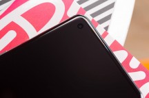
The OnePlus 11 compensates with thin bezels all-around and small punch-hole for the selfie camera in the upper-left corner of the display. Nothing out of the ordinary.
The frame on the right houses the power button along with the returning alert slider. The slider won many die-hard fans' hearts over the years, and it's nice to have it back. It's responsive, pleasantly clicky and super easy to feel and reach. On the left, we have the volume rocker. And since the power button and the volume keys sit opposite of each other, you can often take an unwanted screenshot instead of locking the device. It takes a bit to get used to.
The bottom is reserved for the loudspeaker grille, USB-C connector and SIM card tray. The second loudspeaker sits behind the earpiece grille at the top, which is very discrete. Similarly to other phones, the top and bottom parts of the frame are flat with curved edges as opposed to the completely curved left and right sides.
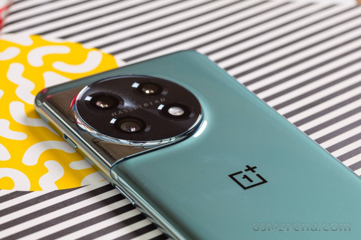
All in all, it seems that OnePlus has introduced minor, mostly aesthetic, changes to the design. It follows the usual design trends from the past couple of years, and somehow, OnePlus has made this big device feel thin and light in hand, which is not an easy task. We leave it for you to decide whether the camera bump on the back is more aesthetically pleasing than last year's blocky piece. This aspect is strongly subjective.
Reader comments
- Rajesh Phadke
- 26 Feb 2025
- U{B
Which part are you considering con? Brightness, Stuttering, curved display or something else? Please share. How is lowlight performance?
- Nickname
- 22 Apr 2024
- Lec
Read the screen review again. To me that's a big con
- Bill J.
- 10 Apr 2024
- Y68
Was interested until I see it's another curved edge. Please! NO!!!!!!!!
