OnePlus 3T review: Digitally remastered
Digitally remastered
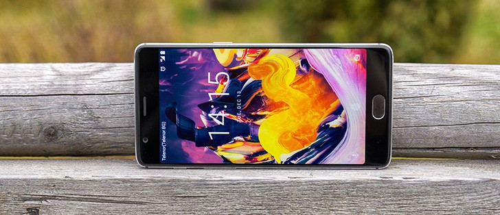
Oxygen 3.5.3 on top of Android 6.0.1 Marshmallow
The original OnePlus One came running on CyanogenMod but in the end OnePlus had to come up with an original launcher and drop the Cyanogen entirely. In hindsight, this was probably a nail in the now struggling custom ROM's coffin. But, on the flip side, at least the move played out well for OnePlus.
This is how the Oxygen OS was born and although the ambitious ROM has come a long way now that it is on version 3.5.3, little has changed on the surface and most improvements are behind the scenes. The Oxygen OS community is actually among the most active out there and the team is always hard at work developing what are typically pretty useful features. In fact, that's one thing OnePlus has become famous for, so much so that a few of said custom features have already made their way into the core Android OS.
It is also important to note that OnePlus plans to bring the regular OnePlus 3 up to speed with all the new software features and even, eventually, merge the two device's software branches. Currently, the OnePlus 3 is running OxygenOS 3.2.8 OTA, which is still a separate branch and is busy catching up with features. For instance, the 1080p 60fps video recording mode has already trickled down. The aforementioned merge is said to happen by the end of the year, or early next year, as Oxygen OS gets updated to Nougat. From that point on, both devices will likely get updated on same schedule.
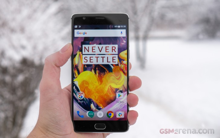
Apart from these few useful software features, sprinkled here and there, Oxygen aims to bring a nearly vanilla Android experience. Most of the Android interface is intact - it's the Material design and icons we first met in Android Lollipop. All stock Android fans will be pleased to find out OnePlus touched almost nothing as far as homescreens and menu visuals are concerned.
But, lets dial things back a bit. Even before you unlock the device, there are a few experiences to be had. First off, there is the superb fingerprint reader, we already talked about. It is nothing short of excellent in both speed and accuracy and the only grudge we see some people having with it is the fact that it is not implemented inside an actual button.
Since fingerprint readers are now part of the core Android code, that is one thing less OnePlus has to worry about in terms of custom implementations. The handset relies on the standard manager interface to get the biometric security all set-up.


Standard fingerprint manager interface
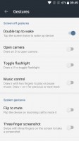
While the screen is still off, there are also quite a few gestures to enjoy. There is the popular double-tap to wake and you can also do some drawing to open certain apps. For instance, draw O for the camera, draw V to toggle the flashlight on/off, or draw < > for previous/next track. Current OnePlus users will already be familiar with these and pleased to see they are untouched. Beyond that, there is also flip to mute and a three finger swipe down gesture to capture a screenshot.
Moving on to the actual lockscreen itself - it is the usual affair. Missed notifications show up here. Swiping left or right will fire up the dialer or the camera.
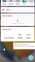
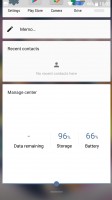
The Oxygen launcher is incredibly clean and very close to vanilla Android indeed. There are, however, a few notable tweaks. For instance, the launcher has a feature called Shelf, which takes the form of your leftmost homescreen. Here you can see the weather, your most used apps, and frequent contacts. You can also add widgets and change the header image. When you first setup the phone it asks if you want to use Shelf. You can also disable or enable it later.
Shelf has now morphed in style quite a bit. There are a few less-than-intuitive controls here worth mentioning. For instance, the only way to remove a widget once added is to swipe it away to the right. In OnePlus's defense, there are no other panes to the left of Shelf for you to swipe to, but it still feels like a duplicated control. Plus, there is no indication for the action.
The vertical space within Shelf also seems to be limited. This is not bad in itself, but the way you increase said space is to click and hold the last widget until a very odd slider-looking thing appears on screen. You then have to slide said control left or right for less or more room. Quite unintuitive. Hopefully, these kicks get worked out soon.
The notification shade is standard as well. You can lower it with a single swipe from anywhere in the UI and an additional one will reveal the quick toggles. You can also use two fingers to bring down the whole thing in a single swipe. As for the toggles, they include Wi-Fi, Bluetooth, Night Mode, Airplane mode, screen auto-rotate, flashlight, location on/off and a few others. These can all be rearranged and hidden easily. Of course, you can also adjust the brightness of the screen and go into the settings menu.
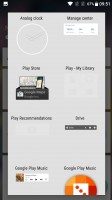
The app switcher has a neat card interface that allows you to select the app you need by swiping up or down. You can close apps by swiping left or right, or by hitting the dedicated button on the top right corner of each card. Google Chrome, which is the default browser, no longer presents each tab as a view in this interface, but it can still be enabled in Chrome settings. The bottom of the tab switcher now has a single button to clean the recent apps stack and potentially even more.
Hidden away in the advanced settings menu, along with a few other things, like the scheduled power on and off features (great to have, by the way), is a new menu that lets you choose how your recent apps get cleaned. The default mode does just what you would expect on any other Android device - clear the stack of recent foreground apps. Selecting deep clear goes after background services as well.
This is a truly great power-user feature to have, since the only traditional way to see the background services running on your device is through the Developer menu. And, believe it or not, a lot of your favorite apps tend to have a quite relaxed attitude towards what services and how many of them they can leave hanging back there hours on end. Naturally, this eats through your resources, battery and potentially data plan behind the scenes.
Select Deep clear and they will be no more. However, this does also mean that many messengers and other real-time apps will likely stop functioning correctly until relaunched manually. That being said, OnePlus is off to a great start with the added feature and all it needs now is a whitelist.
OnePlus has always put great emphasis on customizability and like previous models, it is still woven right into the device from hardware, all the way to software. We already mentioned that Oxygen OS lets you easily chose between using the phone's capacitive keys or on-screen controls for navigation. Not only that, but you can also remap and rearrange said controls respectively - the Menu and App Switcher keys can be reversed, plus you can assign them custom actions upon double-tap and hold.
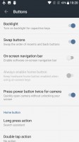
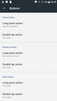
Lots of customization options for the various inputs
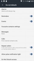
OnePlus didn't leave out its iconic three way mode slider either. As already mentioned, it now toggles between three Alert modes - silent, do not disturb and ring. Each mode actually has some additional configuration that can be applied. For Ring, there is currently only a vibration toggle. But if you go under Do not disturb, you can really fine-tune who and what can and can't get to you while in the mode.
Oxygen OS offers a lot of granular control over notifications and permissions on a per-app basis as well.
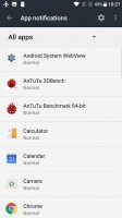

Granular notification and permission control
Last, but not least, the launcher also has quite a few style customization options. There is the simple Dark mode toggle, that should probably be your fist choice, since AMOLED power consumption decreases greatly, the darker the UI gets. There are also other trivial options, like wallpapers. But also a few less than standard ones, like changing the style of the Google Search widget, tinkering with the icon size or even selecting a different icon pack.
Of course, if the default Oxygen launcher still doesn't quench you thirst for customization, you can always just download and set-up a launcher of your choice. The thing you can't just go in and change is the OnePlus 3T's hardware and how it performs. We already know it is more than powerful enough to handle any load, since that is the case with its vanilla sibling as well. However, there are a few hidden details that might make a difference in the user experience after all. Follow along in the next section for our two cents on that.
Reader comments
- Gattu
- 19 May 2022
- 7kg
Now u know the value of op??
- Sayeed2699
- 21 Jan 2020
- X$3
Bought one on January 2017, Now it is January 2020; Still going strong-No issues-2 day battery life.
- Annkay
- 04 Jan 2020
- GX%
My android phone oneplus 3T just got locked up and it's requesting for a password but I can't remember using a password for it. Kindly help me
