OnePlus 7T Pro McLaren Edition hands-on review

Software
The final piece of this McLaren puzzle is the software. Again, it's basically the same OxygenOS 10 running on top of the latest Android 10 as on the standard 7T Pro. They are essentially on the same release cycle so they will get all updates simultaneously and the updates themselves will be the same since they are - and we cannot stress this enough - the same phone.

However, the 7T Pro McLaren Edition does have a few extra things in there. It's really just four things: theme, icons, wallpapers and clock.
The McLaren theme was something we saw last year. It's basically a dark theme with orange accents. If you look closely, you will also see the same repeating parallelogram pattern on the notification shade as the one found on the outside of the box. You can, of course, choose a different theme or accent color on this phone if you get tired of the black and orange.
The icons are new this year. OnePlus has included an icon pack that turns all the stock app icons dark. It follows the same black and orange theme and where it works it looks good.
Unfortunately, this is also possibly the laziest icon pack in history. Only OnePlus' own apps that come pre-installed on the phone, along with Chrome, get a proper icon. The rest of the apps, including the ones that also come pre-installed on the phone, get a black circle surrounding their icon. This includes most of Google's apps and Netflix.
And then it gets worse. The icon pack does absolutely nothing for any app that you install, so they just have their default icons. No custom icon, not even a black border. Just a bright icon looking like a swan in a murder of crows.
This just defeats the purpose of an icon pack. Even $1 icon pack you buy off the Google Play Store will come with more custom icons than this. And the icons aren't all that great either so eventually we just switched back to the default icon pack so they all look uniformly different. Of course, you can always install a different icon pack, which works just fine with the default launcher.


McLaren edition exclusive features
Next, there are the wallpapers. We have four from last year and four new ones, including an animated one. They are decent but there's nothing particularly McLaren about them other than the orange color. The animated one does look nice though.
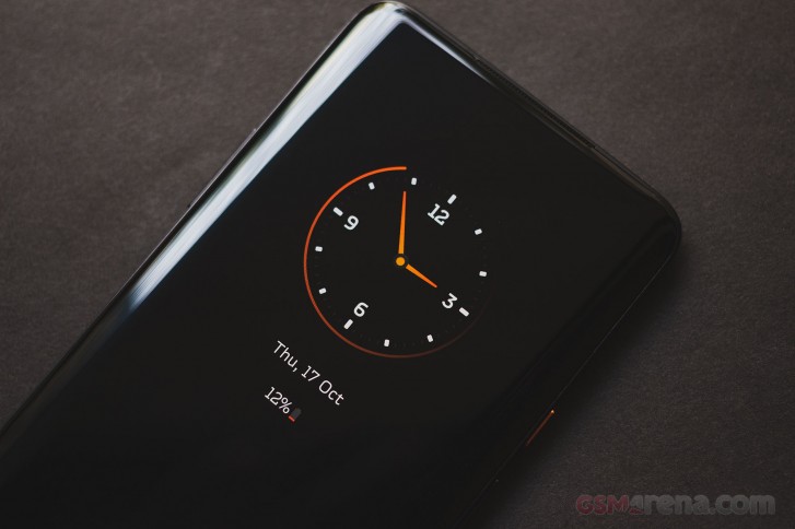
Lastly, there's a new clock face that appears on OnePlus' half-hearted always-on display implementation that they call Ambient display. The clock has a glowing orange ring around the clock face and orange hands and looks stunning. You can easily imagine this being on the dashboard of a McLaren and is one of the coolest things that they added to this phone.
There are actually a few more things unique to the McLaren Edition that are too small to get a special shoutout but worth noting anyway. The fingerprint sensor animation is carried over from last year's McLaren Edition and is unique to these phones. The clock widgets have different typeface as does the text on the Ambient display mode. The Horizon light color strip gets a special McLaren orange option. Lastly, when you bootup the phone, you get a special McLaren animation with a honeycomb pattern often seen on the company's grilles.
Conclusion
The OnePlus 7T Pro McLaren Edition is a fair bit more expensive than the standard OnePlus 7T Pro, which itself is more expensive than the phone before it. We are not in the cutthroat OnePlus pricing era anymore so let's not even talk about why it costs as much as it does and let's focus on whether or not it brings any additional value over the standard 7T Pro.
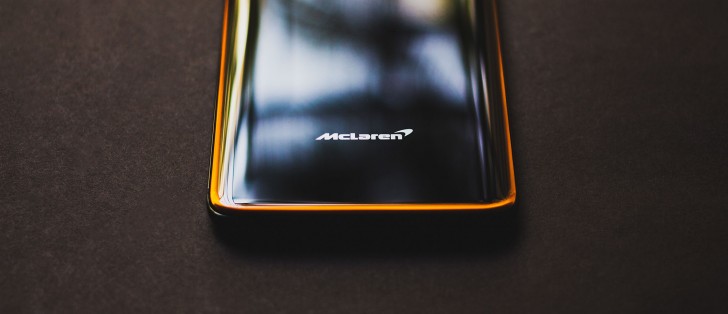
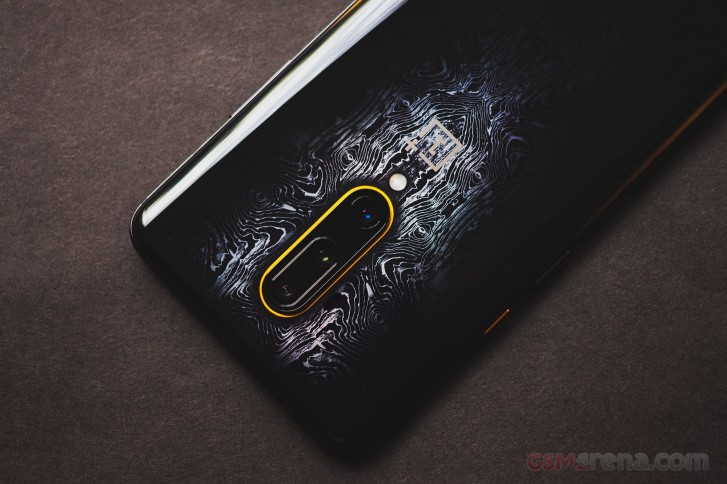
The reasons why you would want to get this phone over the standard 7T Pro is if you want something different that stands out or if you're a McLaren fan. If you want something that stands out then this does, for better or for worse. The design might not be to everyone's taste but it's unique and we really do like the case (especially since it covers up the pattern on the back). Even the little things like the black charger and the bright orange cable are excellent touches.

As a McLaren fan, this is tougher to sell. We think the black and orange colorway is a very timid and derivative way to represent this iconic brand and wish OnePlus had done something more representative and focused, like a Speedtail edition or a Senna edition. The new phone seems like a rehash of last year's model and somehow it now comes with even less McLaren memorabilia in the box. As it stands, the 7T Pro McLaren Edition is a very wishy-washy way of making a McLaren branded phone and we don't think McLaren fans would be quite thrilled with this.
However, as underwhelming as it is, we think the 7T Pro McLaren Edition is actually the 7T Pro to get. The standard 7T Pro by itself doesn't really make a strong case for itself next to the standard 7T, which is way too buff to get bullied by its bigger brother anymore. However, the 7T Pro McLaren Edition does add a few extra bells and whistles and makes spending extra money over the 7T worthwhile. If you must have a 7T Pro, we think you should just spend a bit extra and go all out for the McLaren Edition instead.


