OnePlus One review: When opportunity strikes
When opportunity strikes
Minimalist retail package
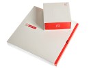
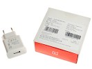
The OnePlus One's packaging looks simple and yet, tasteful. It follows the OnePlus color scheme of white and red accents and has two separate boxes - one for the phone, microUSB cable and another for the A/C adapter.
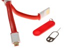
The microUSB cable is the most stylish accessory in the retail package. The flat cable is bright red and the USB plug (the one that connects to a host) is flat with exposed pins. The microUSB port looks as usual.
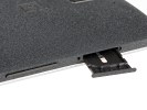
Finally, you get the proprietary pin for ejecting the SIM card tray. The pin has its own rubber vest that doubles as a keychain pendant.
OnePlus One 360-degree spin
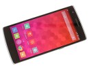
The OnePlus One is a big handset but overall size is reasonable, considering the screen is 5.5". The One isn't that much bigger than a Sony Xperia Z2 - which has dual speakers each side of a 5.2" screen. On the other hand, a Note 3 is a tad shorter and slimmer, with a 5.7" display diagonal.
The One's screen has minimal side bezels and the space top and bottom has been used with consideration. The OnePlus One has good ergonomics for a device with capacitive keys under the display. These can be disabled and you can opt for on-screen navigation buttons instead.
That said, the OnePlus One is well into phablet territory. At 152.9 x 75.9 x 8.9mm it's very tall and very wide - it's a little taller and thicker than a Samsung Galaxy Note 3 (that has a 0.2" bigger display) and a good 6.6mm taller than the LG G3, which fits the same screen diagonal in a smaller frame.
The OnePlus One is a little lighter than the Galaxy Note 3, a lot lighter than the Oppo Find 7 and a lot heavier than the LG G3. It weighs 162g, which isn't intolerable but definitely something you'll feel.
Design and build quality
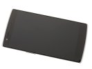
The design of the OnePlus One is very subtle with no flashy accents or excessive decoration. The front is clean and simple, even the three capacitive buttons under the screen are invisible when off and barely visible when on.
There's a silver, aluminum-like frame running around the front and sides of the OnePlus One that acts as a foundation for the screen, which sits slightly elevated over it, reminding us of the design of the Oppo Find 5, which too is a distant relative - and the first 1080p smartphone in the world.
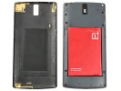
Although built like a unibody smartphone the OnePlus One has a removable back cover. You'd need to eject the SIM tray first and then pry the cover off. You can put on any of the optional rear covers, including ones that look like wood or denim (for real!).
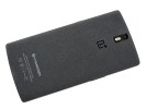
The cover of our review unit is very interesting - the finish is something we've never seen on a smartphone. It's matte and has plenty of grip, the texture looks a little like sand paper.
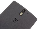
OnePlus has etched-out a logo on the back, under the camera lens and LED flash, the Cyanogen logo at the bottom.
The edges of the One are very sharp, the sides flat, the overall shape quite reminiscent of the Oppo Find 5. The corners are subtly rounded and the back gently curved for a more comfortable feel in the palm.
The buttons of the OnePlus One are also thin and sharp - all adding up to the minimalist look and feel of the device. And while this is strictly the hardware chapter of the review we feel compelled to say that the software, right out of the box, complements the sharp, flat exterior of the One.
Controls and handling
Above the huge touchscreen are the earpiece in the center, a 5MP front-facing camera, proximity and ambient light sensors.
Under the display, three capacitive keys serve menu, home and back. The keys have very subdued backlighting, almost invisible under bright light, but they're sufficiently spaced and easy to hit without looking. You can also disable them in favor of on-screen buttons, a la stock Android.
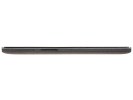
On the left side, the OnePlus One has a volume rocker and the microSIM card tray above. The right side, at around thumb-height, has the power button and nothing else.
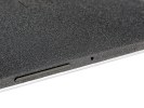
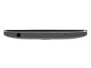
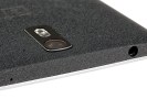
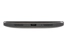
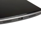
The 3.5mm headphone jack sits at the top next to the noise-cancelling microphone. At the bottom we have the main microphone, the microUSB port and two speaker grilles that actually have speakers under them. The speakers don't offer stereo sound and we would have preferred them to be placed further apart, on different sides perhaps, even if not front mounted like on a Sony Xperia Z2 or an HTC One.
Moving on to the back cover, the 13MP camera lens and a dual-LED flash share a metal plate dead center at the top. The plate has black matte finish, the actual glass covering the LEDs and lens slightly recessed to make it less vulnerable to scratches.
Interestingly there's a third microphone next to the camera lens - OnePlus is very proud of its tri-mic noise-cancelling setup.
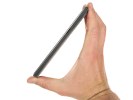
Handling the OnePlus One is comfortable enough but you better have bigger hands, there's just no getting around that. OnePlus has done what it can to make the device feel nice in the palm, softening the corners a little. The flat sides favor a more secure hold but are harder to wrap your hand around.
The peculiar finish of the back cover offers almost unparalleled grip - almost completely ruling out accidental drops.
The OnePlus One sits better in the hand than most devices with a display of this size, except the LG G3. That's saying a lot and we have to say OnePlus did a good job there. But at a certain point beyond the 5-inch barrier, you have to accept that a phone is just big.
Reader comments
- Anonymous
- 15 Feb 2020
- 4Yk
That’s correct . I faced the same problem and had to get rid of it
- Anonymous
- 08 Apr 2019
- P%C
One plus one 360 cover want
- Anonymous
- 21 Feb 2019
- pdu
My oneplus 1 phone is very good, I have it already 5 years and it's still working perfect
