Oppo F17 Pro hands-on review
Design and ergonomics
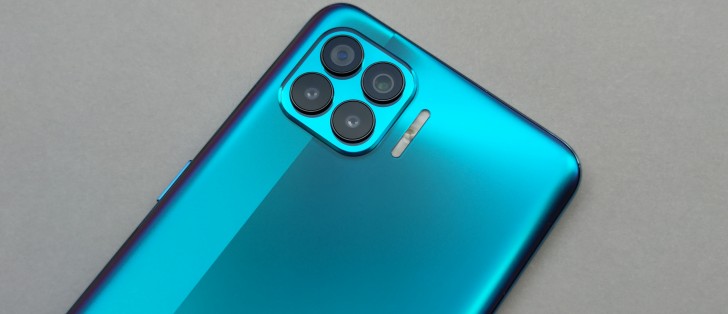
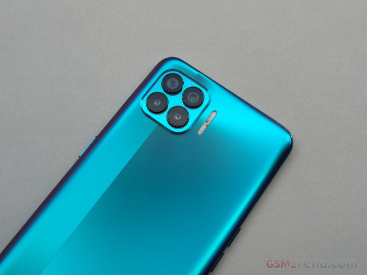
Undoubtedly, the design of the F17 Pro is one of the standout features. Although with a plastic back, the handset feels sleek. Really sleek! Even sleeker than the Reno4 Pro with a small strip coming down from the camera module that feels glossier. The best part is that the finish provides better grip and didn't pick up nearly enough fingerprints to call it a "fingerprint magnet". There's a reason Oppo says it's a "fingerprint-proof finish".
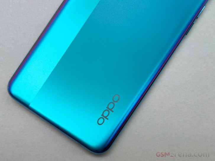
Additionally, there are subtle purple-ish accents around the sides of our Magic Blue color and they look amazing. The blue color itself also comes in different shades depending on the lighting. The frame that puts this all together strongly resembles the one on the Reno4 Pro.
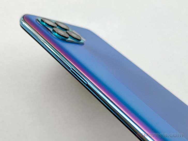
Speaking of the Reno4 Pro, the finish on the back feels smoother on the F17 Pro and, it's a pleasure to hold and type on. It gives you a pleasant sense of secure and comfortable grip. It's strange to see a more premium appeal on a cheaper phone from Oppo. It's rather unusual for a slim phone like the F17 Pro. The thickness of the device is just 7.48mm, and one would expect the side frame to dig deep into your palm. But this is not the case.
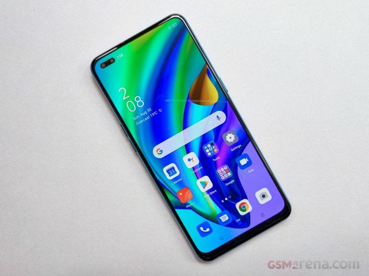
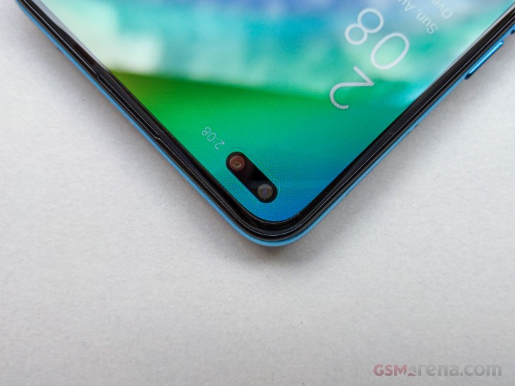
The front surprises with rather thin side bezels and more importantly, with an impressively small cutout for the dual-front facing cameras. We can't cite any numbers, but it definitely looks smaller than most of the punch-hole implementations we've seen. Oppo says the diameter of the hole is just 3.7mm.
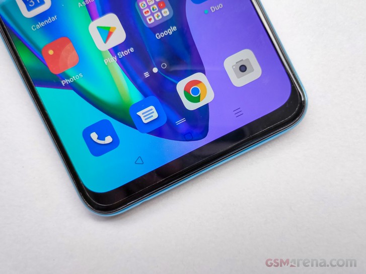
There's also a fingerprint reader placed under the screen, which works well judging by the short time we've used it. It's fairly accurate but drags behind in terms of speed compared to conventional capactivie ones. That's not always the case, especially with Oppo smartphones. So far, most of Oppo's smartphones have offered blazing-fast and reliable under-display fingerprints. Still, our only complaint would be the positioning. The sensor should have been placed a bit higher because the current implementation requires some finger gymnastics.
Hardware
With the design out of the way, now let's make a quick overview of the hardware. The first thing that stands out is the Super AMOLED display. A Full HD+ (1080 x 2400px) resolution fits in a 6.43-inch diagonal and accommodates a rather small dual-punch hole for the front-facing cameras. Nothing out of the ordinary, indeed, but when you add the advertised 800 nits of peak brightness, the panel suddenly makes an impression. In our experience, the display gets bright enough to comfortably read text outdoors, but photos still tend to lose a lot of their color and contrast.
In a budget phone like this one, a proper OLED panel is always more than welcome. You also get Widevine L1 certification with the display so you can enjoy Amazon Prime Video and Netflix content in Full HD.
Unlike its non-Pro counterpart, the F17 Pro offers just one memory configuration - 8GB of RAM with 128GB of expandable storage. A MediaTek P95 sits behind the wheel and we feel like this would be one of the few setbacks of the phone as a whole. The rather competent and nicely put together hardware will drag behind the Helio P95. We are not saying it's a bad SoC, it just feels like it doesn't fit into the picture. And it poses an incremental upgrade over its predecessor, the Helio P90 from 2019 anyway.
Reader comments
- Buga
- 13 Jun 2023
- NsE
I lost mine but best ever is this F17 Pro
- shiblee
- 24 May 2023
- MQr
Cool
- Anonymous
- 12 Oct 2022
- rwn
Mine broke the screen and hard to find the screen guys.