LG G3 vs Oppo Find 7: Resolution wars
Resolution wars
User interfaces
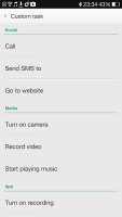
When it comes to the user interface on Android, different manufacturers take the time to add a fair dose of visual flair and functionality. In the case of LG and Oppo, the Korean manufacturer can be seen as following the more standard approach in its Android 4.4 KitKat build with Optimus overlay, while Oppo's ColorOS UI on top of Android 4.3 is slightly more unconventional.
To give you a better idea of what we mean, here are two short videos showing off both interfaces:
The Color OS lockscreen is almost identical to the stock Android one. There's an unlock ring, which you slide to get to the homescreen. You can have widgets on the lockscreen, which are located to the left of the main window, while on the right there's a camera shortcut.
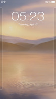
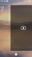
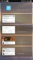
The lockscreen on the Oppo Find 7
LG lockscreen features the company's proprietary Knock Code feature, which lets you get straight into the lockscreen via a series of taps on certain places on the screen - even when the screen is off. Otherwise, the other standard unlock methods as well as lockscreen widgets and shortcuts are also available.
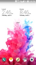
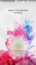
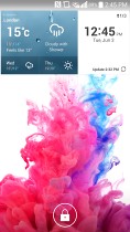
The G3 lockscreen has Knock Code support
Past the lockscreen, you'll find Oppo's Exclusive homescreen panes. Currently, there are two available - Photo and Music. Photo space takes up a whole homescreen and features a live viewfinder so you can take shots straight from your homescreen plus a shortcut to the full camera app. Below you get a timeline with all your recent photos and you can share them very easy.
The second Exclusive space homescreen pane is Music. It features a cool, if slightly intuitive design with a vinyl for changing the currently playing song and stopping/resuming playback. You can change songs, go directly to the music player or the Phone app.
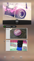
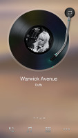
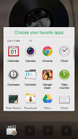
Both Exclusive spaces allow customizable docked shortcuts
The leftmost homescreen pane of the LG G3 is reserved for the so-called Smart Bulletin, which is a special space similar Samsung's My Magazine (except not as robust). Smart Bulletin posts at-a-glance info from LG's Health app and Smart tips that highlight aspects of the phone's technology and usage, but nothing else beyond that.
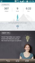
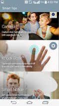
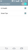
LG's Smart Bulletin is very limited
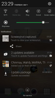
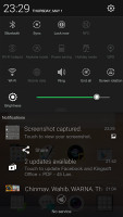
On the Find 7, the notification area will show one row of quick toggles, a brightness slider and a shortcut for enabling auto brightness mode, the current notifications plus a shortcut to go into settings. If you do a drag gesture from the quick toggles row you get two more lines of toggles. There's also a Kill all apps button there. At the bottom of the notification area sits a clear button to remove all your notifications at once.
LG's notification area is more customizable. You can remove the brightness and volume sliders, or any of the toggles in the topmost row.
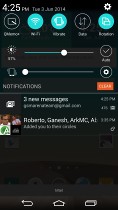
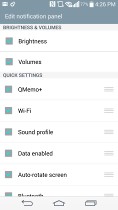
LG's notification area with Quick Settings
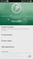
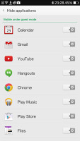
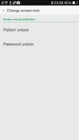
The Oppo Find 7 includes a special Guest mode that only gives access to apps that you've pre-selected, so you can share your phone without worrying about private data or settings getting messed with. In order to use Guest Mode you'll need to set up a pattern or password unlock for regular access and a seperate one for Guest Mode.
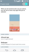
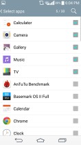
LG provides its own Guest mode feature, which is virtually the same thing. It lets you pick which apps the guest has access to, including a custom Guest gallery of photos and videos, while restricting access to the settings or multitasking features of the G3.
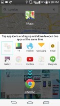
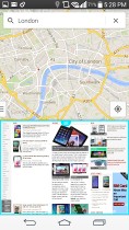
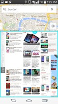
For multitasking, LG pushes its Dual window feature that puts two apps side by side. You can copy and paste text between them or snap a screenshot in one and use it in the other. Apps that go well together can be grouped into a single shortcut for added convenience.
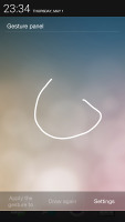
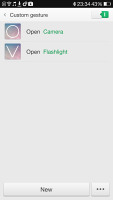
While the Find 7 doesn't have Dual window, it does have a special Gesture panel. You access it just like you would open your notification area, but you need to start your swipe in the left quarter of the bar at the top, just as if you were pulling down the notification area. You can perform various gestures in the Gesture panel to open different apps. For instance drawing a circle would open the camera app, but you can assign any apps to any gestures you want.
Oppo's Color OS supports themes, one of which changes the appearance and functionality of Color OS to match that of stock Android 4.3 Jelly Bean. There are also several nifty visual flair effects, such as changing the wallpaper with live or static ones and change the scrolling effect of the homescreens. There's one more option - Live Weather - it can flicker snow, rain, dandelions, etc. over the screen. The effect is very impressive, like snow piling up on your dock icons and the bottom of your homescreen.
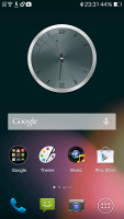
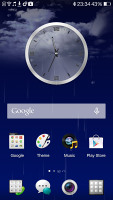
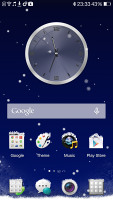
Jelly Bean theme • Live Weather effects
Winner: Tie. Each interface offers features that the other lacks, such as LG's Dual window feature and Oppo's Exclusive spaces. It ultimately comes down to whether you'll prefer the more stock approach that Oppo takes while adding some visual flair with its ColorOS, or if the feature-ridden KitKat optimizations with Optimus UI are more to your liking.
Reader comments
- Feride LG G3
- 24 Apr 2016
- SHp
LG G3 forever and ever! I love it.
- Gborgbor
- 04 Oct 2014
- fsT
To me an impressive multi-function with low battery life is just a doll phone
- Anonymous
- 08 Aug 2014
- 5Er
What is the point of having a 2K resolution on a 5.5 inch display which is a ppi of 534? For a display of that size a ppi of 400 is more than enough. You will need higher resolution as the display scales up. For normal eyesight, there is no differenc...
