Oppo Find 7a review: A-lister
A-lister
Color OS atop Android Jelly Bean
Oppo Find 7a runs on Oppo's proprietary Color OS v1.2, which is another name for a heavily skinned Android 4.3 Jelly Bean. The Oppo's launcher customizations run very deep, they keep all Google apps and services, and even bring quite a few of its own - themes support, new lockscreen, homescreen, app drawer and settings menu among others.
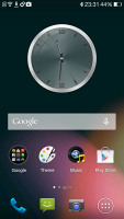
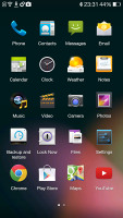
If you are not into custom UIs, there is a preinstalled theme called Jelly Bean, which would replicate the stock Android Jelly Bean UI for you as close as possible.
Here's a quick Color OS rundown on video to get you started:
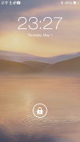
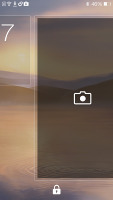
First off, let's cover the Color OS lockscreen. It's almost identical to the stock Android one. There's an unlock ring, which you slide to get to the homescreen. You can have widgets on the lockscreen, which are located to the left of the main window, while on the right there's a camera shortcut.
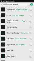
The screen supports double tap to wake gesture and it also works on the Home key. By the way the lockscreen has a hidden flashlight shortcut - a press and hold of the Home button (the screen needs to be awake) turns on the dual-LED flash. It goes out when you let go of the Home button.
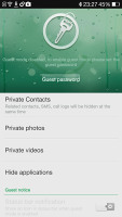
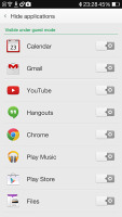
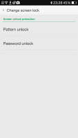
Similar to the LG G2, the Oppo Find 7a has a Guest mode. It only gives access to apps that you've pre-selected so you have no problem sharing your phone without worrying about your private data or your settings getting all messed up. In order to use Guest Mode you'll need to set up a pattern or password unlock for regular access and another one for the Guest Mode.
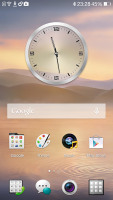
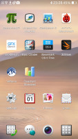
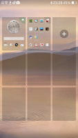
The homescreen of the Oppo Find 7a likes to keep things huge - its apps above the dock are organized in a grid of 4x4 and the widgets are hardly optimized for the large, high resolution screen. On the up side, you can add up to 9 homescreen panes, whereas most custom launchers top out at 7 (the stock Android one is fixed at 5).
The bottom of the screen is reserved for the dock. You can have any shortcuts or folders you like here - you can even move the app drawer shortcut (but not remove it altogether as you won't be able to access it). The dock has four default shortcuts (Dialer, Messaging, App drawer and Camera) by default, but you can actually fit a fifth one.
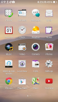
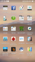
The app drawer is pretty simple - it has horizontally scrollable pages of 20 shortcuts or folders. A small green dot marks newly installed apps that haven't been launched yet. You can re-arrange or add to homescreen shortcuts by tap and hold.
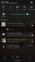
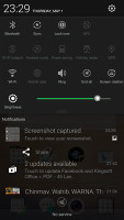
By default the notification area will show one row of quick toggles, a brightness slider and a shortcut for enabling auto brightness mode, the current notifications plus a shortcut to go into settings. If you do a drag gesture from the quick toggles row you get two more lines of toggles. There's also a Kill all apps button there. At the bottom of the notification area sits a clear button to remove all your notifications at once.
A long press on a toggle will bring up its respective settings entry. By the way you can access the notification area even if you slide down from any empty part of the homescreen (not just the top), which helps single-handed use a lot.
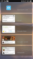
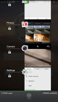
The task switcher is pretty close to stock Android. All your apps are shown in a vertically-scrollable grid of thumbnails, which you swipe either side to close or tap to open. Oppo has added a Kill All toggle at the bottom.
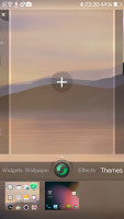
By holding a finger on an empty spot on the homescreen or performing a swipe up from the dock you open up the contextual menu. It lists widgets, wallpapers, effects and themes. You drag widgets upwards to place them on the homescreen.
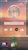
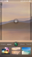
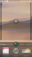
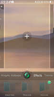
Customization menu - exclusive features, wallpapers, widget menu and homescreen effects
Exclusive space is Oppo's custom homescreen page. Currently, there are only two available - Photo and Music. Photo space takes up a whole homescreen and features a live viewfinder so you can take shots straight from your homescreen plus a shortcut to the full camera app. Bellow you get a timeline with all your recent photos and you can share them very easy.
The second Exclusive space homescreen pane is Music. It features a cool, if slightly intuitive design with a vinyl for changing the currently playing song and stopping/resuming playback. You can change songs, go directly to the music player or the Phone app.
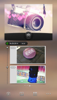
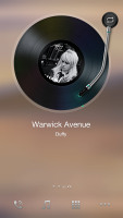
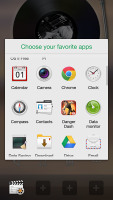
Exclusive spaces - Photos, Music, customizing docked shortcuts on an exclusive Space
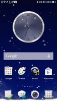
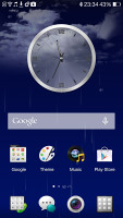
Oppo's Color OS supports themes, but besides the default Color OS, you only get one extra. It changes the appearance of the homescreen, app icons and app drawer to match what you would get on stock Android 4.3 Jelly Bean.
You can change the wallpaper with live or static ones and change the scrolling effect of the homescreens. There's one more option - Live Weather - it can flicker snow, rain, dandelions, etc. over the screen. The effect is very impressive - for instance, snow would pile up on the bottom of your homescreen.
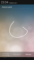
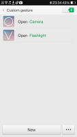
Then there's the Gesture panel. You access it just like you would open your notification area, but you need to start your swipe in the left quarter of the bar at the top, just as if you were pulling down the notification area. You can perform various gestures in the Gesture panel to open different apps. For instance drawing a circle would open the camera app but you can assign any apps to any gestures you want.
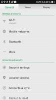
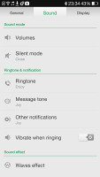
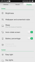
Besides the homescreen, the Settings menu is another part of the UI that has seen a lot of changes. It is divided in three tabs - General, Sound and Display. The tabbed design is intuitive and works pretty well.
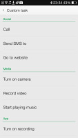
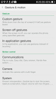
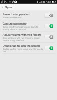
Finally, the Gesture & motion menu deserves our attention. It holds all the various gesture and motion tricks to make your life with the Find 7a easier.
For one you can swipe with three fingers across the screen to capture a screenshot or pinch with several fingers to launch the camera and more.
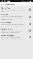
The Motion options are very useful, too - flipping the device will mute the ringer, raising the ringing Oppo Find 7a to your ear will automatically answer the call and more.
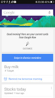
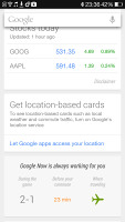
Google Now is here too - it integrates with your Google account info and can access your daily routine, internet searches, email, etc. and give you information relevant to your interests and daily needs.
It provides traffic information to your work or home, knows the scores of sports teams you follow and gives you the weather forecast for your location. It's great for at-a-glance info, but can handle voice input as well.
Overall, Color OS strives to be more feature rich than stock Android and has been customized quite deeply. It is still Android though, so users, who are familiar with the OS won't have trouble knowing their way around Color OS. In fact most of Oppo's additions are quite welcome and improve the user experience.
Reader comments
- Acehadi
- 20 Feb 2016
- y$d
I just bought new Find7a a week ago for 2.7M IDR previously i used LG G2. I loved the Find7a. Plus 1. The gesture is helping for fast access 2. Sound during calling is very good Minus 1. Still on Jellybean, need service centre to upgrade....
- dermmagic
- 04 Jun 2015
- 6PF
Do consider lenovo P 70 before buying this
- 309
- 31 Mar 2015
- tue
Best phone compare to others for the price...
