Oppo Find N3 review

OxygenOS ColorOS 13.2 on top of Android 13
The Find N3 runs Android 13 with the company's latest ColorOS 13.2. If those numbers ring a bell, it might be because of the OnePlus Open we reviewed recently that's on OxygenOS 13.2 over Android 13.
Indeed, the look and overall experience is essentially the same, only the two companies call the same feature by a different name in their promo materials. That's not a bad thing at all, though - we were pretty thrilled with the software package on the Open, and it's nice to see the same capabilities here as well.
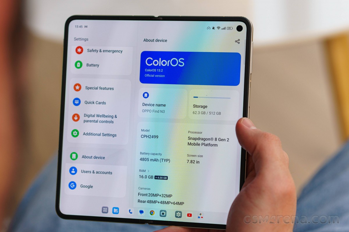
Starting from the security and biometrics that let you into the handset, the Find N3 unlocks via the side-mounted fingerprint scanner or a less secure camera-only Face unlock, with a PIN or a password also available options.
There's an Always On display feature, of course, and it's a good example of something that works identically on both displays, regardless of whether the Find is open or not.
That actually applies to most of the display settings, including refresh rate, brightness, and color mode. The ColorOS team has done an excellent job of aligning the user experience between the two where it makes sense in order to minimize breaking the general UX flow.
The AOD can be always-on/off, scheduled, or in power saving mode (shows on move/tap). There are enough themes to choose from, an there is support for Spotify controls and some food delivery apps, too. Edge Light is an option as well.


Personalization hub • Always-on Display
The lockscreen is also shared between the two displays in pretty much all of its aspects, including the clock style, widget selection, and notification logic. All except for the wallpaper selection, which can be done on an individual basis for the two panels (but doesn't need to).

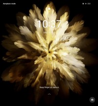


Lockscreen: Cover display • Main display • Wallpapers
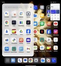
The same goes for the main user interface. The homescreens are identical on either display; it's just that the main one shows two homescreen panes at all times instead of one.


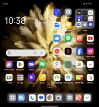
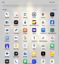
Cover home screen • Cover app drawer • Main home screen • Main app drawer
The notification and control centers, as well as the optional app drawer look normal on the cover display, and they are expanded on the main foldable display.


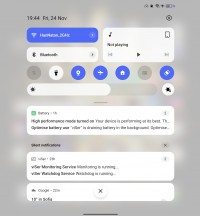
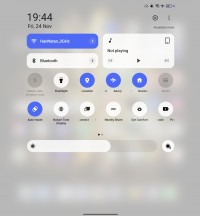
Notifications • Toggles • Notifications • Toggles
The task switcher on the cover screen is a familiar implementation. You scroll between app cards, lock them, and use split-screen and floating window options on supported apps.


Multi-tasking on the cover screen
The taskbar is one of the main features of Android's foldable/tablet branch - it's a bar that shows a minimized view of the dock icons when you're away from the homescreen. It displays two shortcuts to the left of the dock icons - App Drawer and Recent Files. It also shows recently used apps (up to three) on the right side of the four Dock shortcuts.
One of the major strengths of Oppo/OnePlus' software package on the large screen is the ability to have several apps displayed simultaneously in a number of configurations - OnePlus calls this the Open Canvas, but here in Oppo's world, it goes by Boundless View.
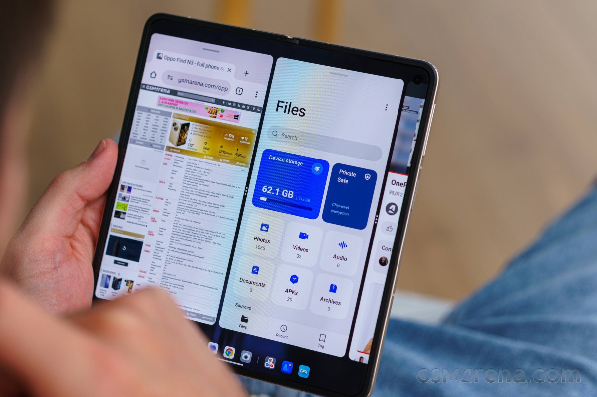
The casual split-screen multi-window with two apps side by side is here, of course. But then you can add another app next to those two and just scroll between the three. You can also have the third app in fullscreen-like view above or below the two-app split - that's what Oppo calls 15" Boundless View.
You cannot have more than three active on-screen apps. You can save multi-app configurations and open them later the same way from an app-like icon on the homescreen or within the Task Switcher.
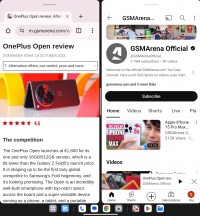
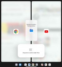
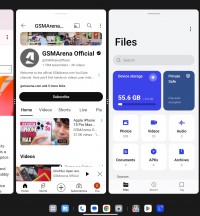
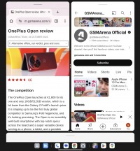
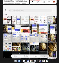
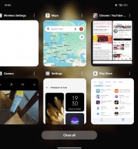
Multi-tasking on the large screen
The UI across various system apps has been optimized to make use of the large screen with a classic two-pane interface with categories on the left.
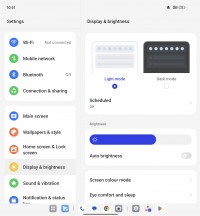
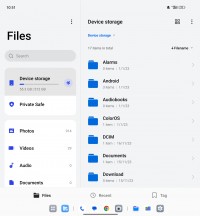
OxygenOS apps on the large screen
The Find N3's hinge allows it to stay in a semi-opened state, and there are certain apps that can make use of that. We found it to work only on YouTube and within the Camera app.
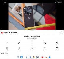

Flex-like view: YouTube • Camera
There are a few proprietary ColorOS apps in addition to the Google suite. The in-house gallery is called Photos too, there's a File Manager, and also an IR remote.
Finally, there is also a dedicated Games center with a special performance mode, game toolkit, and granular game management. There are some new features like the Championship mode and music playback control.
Benchmarks and performance
The Find N3 is powered by the standard version of the Snapdragon 8 Gen 2, as opposed to the slightly overclocked variant that high-end Galaxies and some other phones get. The CPU in this SoC has a 1x3.19 GHz Cortex-X3 prime core, 2x2.8 GHz Cortex-A715 heavy hitters, 2x2.8 GHz Cortex-A710 medium cores and 3x2.0 GHz Cortex-A510 power-saving units. The Adreno 740 GPU is in charge of graphics.
The Find N3 uses LPDDR5X RAM and UFS 4.0 storage. Our review unit is the 16GB/512GB spec, but 12GB/512GB and 16GB/1TB versions also exist.
Then there's the matter of the High Performance Battery mode that the phone has. We tested the Find N3 in both its default state and in High Performance mode. The latter allows the CPU to run at its full potential with higher thermal thresholds and little consideration for battery efficiency.
That affects mostly single-core loads on the prime core (GeekBench) and in turn the overall score in compound benchmarks (Antutu). The GPU isn't affected by this setting, and it's always working at full power, though unleashing the CPU can add an extra frame or two per second to the GPU scores.
The 'regular' mode (not a setting, strictly speaking, just with 'High performance' turned off) imposes some limitations on the processor, and the phone returns CPU benchmark scores lower than the expected for the Snapdragon 8 Gen 2 and more in line with the SD8G1.
As we mentioned earlier, GPU scores are only mildly affected by that pesky 'High Performance toggle. In fact, in 3DMark it's only in the Wild Life test that we're seeing any difference at all, and it's to the tune of 5% - the more demanding tests remain unaffected.
In GFXBench we're observing a similar, mostly inconsequential bump in the scores, whether it's the offscreen or onscreen tests.
It's worth pointing out that in the onscreen tests on the cover display, the Find N3 hits the 60fps imposed by ColorOS's continued reluctance to enable high frame rate gaming.
The 'High Performance' mode also affects how the Fold N3 behavess under continued load. With the toggle switched on, around 12 minutes into the CPU Throttling test, the phone goes into a pattern of short high-performance bursts followed by dips to a little over 60% of peak performance. Wth the toggle turned off, the behavior is a lot more stable and the CPU is able to maintain results at a little under 80% of peak performance.
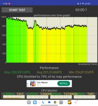
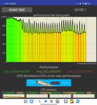
CPU Throttling test: Regular mode • 'High Performance' mode
The 'High Performance' mode does not have a meaningful impact on the overal GPU stability results with the 3DMark's stability rating being 66% and 67% in the two instances. In both cases, the phone is able to maintain a stable level of perfomance for the fist 10 minutes of the test, at which point there's a sharp drop to the sustainable 66-ish percent level.
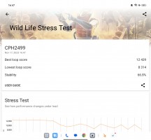
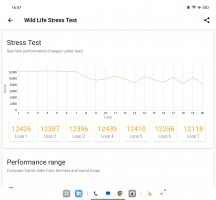
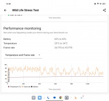
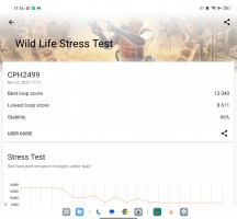
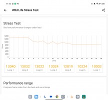
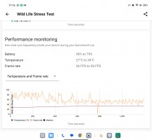
3DMark Wild Life stress test: Regular mode • 'High Performance' mode
Reader comments
- Mann
- 10 May 2024
- wHU
How to rectify folded double screen when opened only show one half screen.
- Darth Caesium
- 29 Apr 2024
- H5x
Just a quick, perhaps slightly dumb question, but since the ultrawide can do macro, does the software allow you to do macro selfies using the cover screen mode? If so, would you guys at GSMArena be willing to try macro selfies with foldables that sup...
- The Impaler
- 25 Dec 2023
- Ibx
You guys mention the pixel fold in this review but still haven't reviewed it. When will that be reviewed?


