Oppo Find N hands-on review
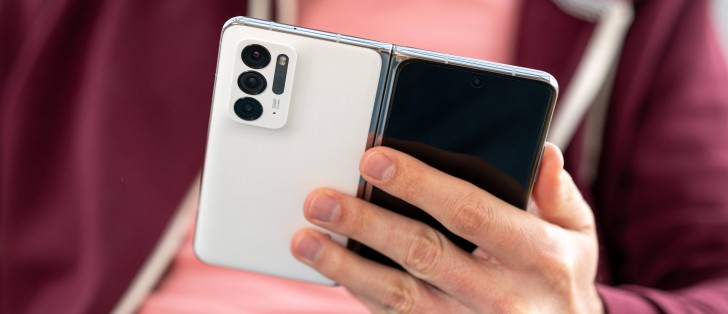
Android 11 and ColorOS 12
The Oppo Find N is the first smartphone to boot ColorOS 12 out of the box. Interestingly, it is based on Android 11 instead of 12, but we guess Oppo will update the core later on.
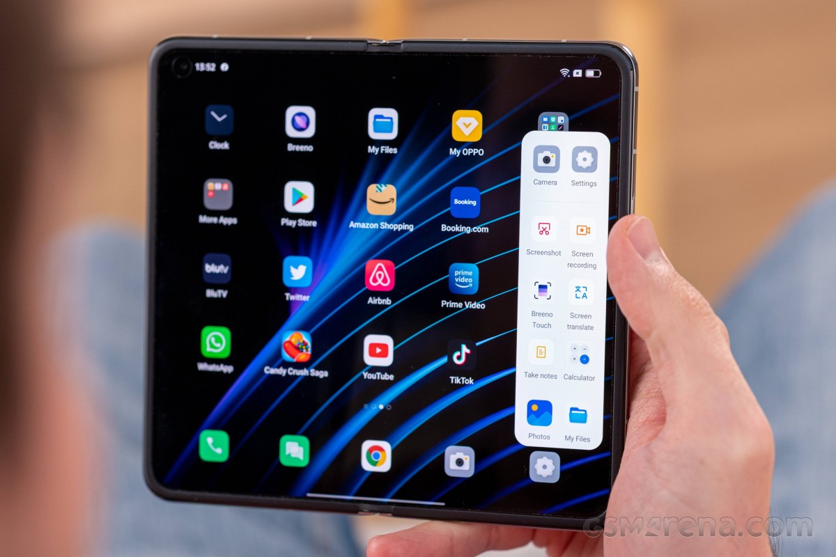
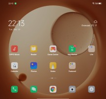
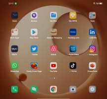
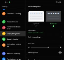
The ColorOS 12 brings a lot of improvements over version 11. For starters, the interface has been refreshed with a brand-new look - there are new icons, new color options, much smoother animations and transitions, and various tiny redesigns here and there. If we are to compare it, we'd say that Oppo has gone the OneUI way.
ColorOS 12 also brings Omoji - you can create your personal avatar and use it system-wide. There is also new PC Connect functionality - you can mirror your phone on to your Windows-based PC and transfer files seamlessly.
Another novelties part of this update are the smarter sidebar and the anti-peeping notifications (when you need privacy in public).
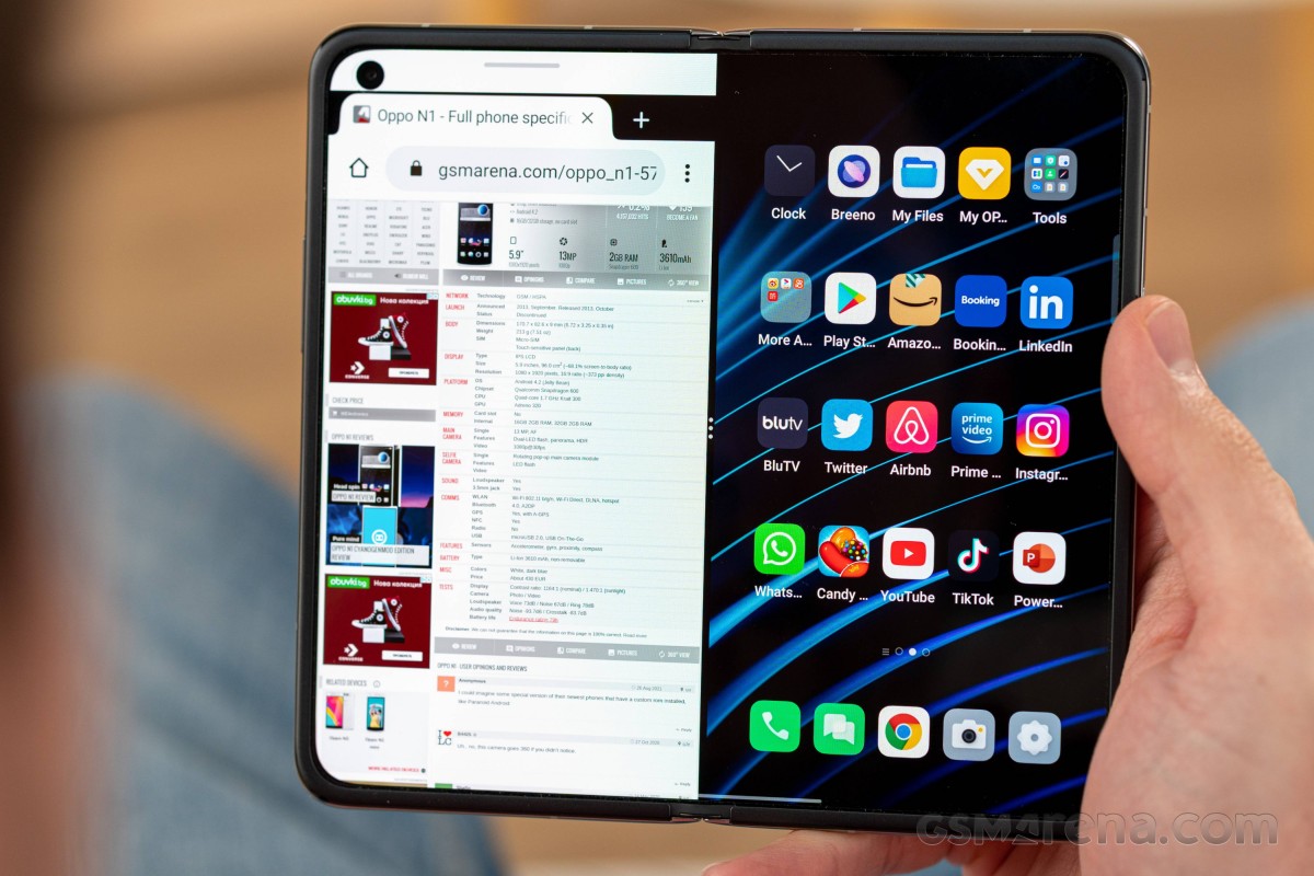
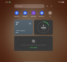
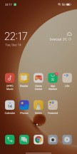
The ColorOS launcher is indeed quite clean and simple to use - apps and widgets go to your homescreens, there is a leftmost page with integrated system-wide search.
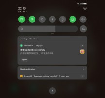
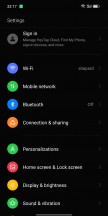
The notification area with expandable toggles is familiar even if refreshed a bit.
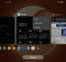
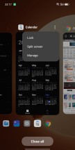
The task switcher is also a familiar affair. From here, you can close or lock apps, as well as initiate split-screen multi-tasking or floating window (one at a time).
The Find N offers a couple of exclusive gestures and view modes to make use of its foldable design.
There is a new gesture - swipe with two fingers from the top of the (unfolded) screen to split it in half. There is a cool animation that literally cuts the screen in half and moves the active app on the left, while you can choose which app to open on the right side.

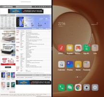
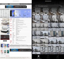
Cutting the screen • Split Screen
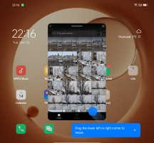
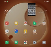
You can use four-finger pinch outzoom gesture to minimize an app into a floating window.
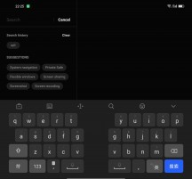
Oppo has also designed a new custom keyboard with split mode.
The camera app heavily utilizes the new screen, and it moves the viewfinder to the top part and the controls to the bottom part if the phone is halfway folded. Or you can have the bottom part of the screen as a photo explorer so you can review what you've already shot and the other one as an active viewfinder, so you don't miss anything important.
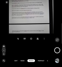
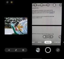
Semi-folded interface • Recently taken and camera in one place
Of course, you can also turn on the outer screen to act as a preview screen or transfer the camera app there entirely so you can use the triple-camera setup as a selfie kit. Cool!
Of course, the outer display supports ColorOS and Android in their entirety, too.
We liked what Oppo has done with the ColorOS interface, and even if it looks a lot like OneUI, it's a big step in the right direction.
Reader comments
- AnonD-762416
- 26 Dec 2021
- Sec
The customer service representative write consumer protection law now? I know my rights. You should learn to know yours,too. Stand up for your rights.
- MinWiz
- 21 Dec 2021
- IbE
The Mate X was my favorite phone ever, and it's a horrid thing to see these tall skinny tongue depressors that are called phones. I'd still use my Mate X but in a month it won't be usable on any service in the US because of the 3G shu...
- Anonymous
- 21 Dec 2021
- B}H
There isn't any free country and every thing is not just black and white so we have grey too
