Oppo Find N long-term review
Connectivity
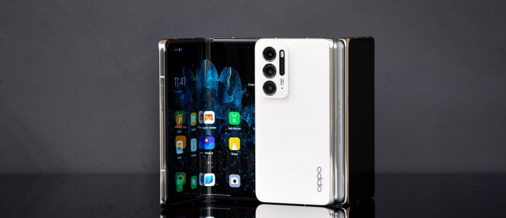
As we've mentioned before, the Find N has so far not been launched outside of China, and the unit we have used for this feature is the Chinese model. While it's unclear if the Find N will ever get a global version, we wouldn't recommend importing the Chinese one for a few reasons.
First off, there are no Google services on it, but that's not a hard thing to get around with a little bit of Googling. And yet, adding Google services to this device doesn't magically make it a 'global' model - there are a ton of Chinese bloatware apps preinstalled, for example, and the software itself is tuned to the Chinese market in a lot of ways we'll discuss below.
But perhaps the most important limitation has to do with connectivity. Depending on where you live, you may not be able to use 5G on the Find N, nor even get 4G carrier aggregation (CA) even if you do get 4G. 4G CA is usually marketed by some carriers as "4G+" or "4.5G" or "LTE-A" or "LTE+" or similar and allows for the combination of different bands to improve speeds.
Throughout our use of the Find N, we got no 5G and no 4G CA, just 'vanilla' 4G, limited to one band at a time. While you may not care about missing 5G if your country doesn't have such networks very well spread, the lack of 4G CA is much more concerning. Let's exemplify: with CA, we usually get around 50-100 Mbps download from our carrier, while without, it's less than a third of that at best, and can drop to as low as under 10Mbps. These numbers are not intended to be comparable to your carrier's speeds directly, just keep in mind the sort of drop in speed you'd encounter if you didn't have CA to rely on.
While we're on the connectivity topic, we have to mention that the Find N is one of those phones that doesn't like to always reconnect to previously paired Bluetooth speakers and car systems. It does so automatically around 8 times out of 10, but sometimes you'll have to manually dig through the Bluetooth devices menu and select the one you're trying to connect to. We haven't seen this happen on flagship tier devices lately, so it's a bit disconcerting to have this issue here. Normally it is, for whatever reason, something that only happens on some mid-rangers.
Software
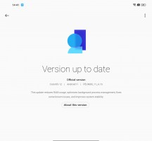
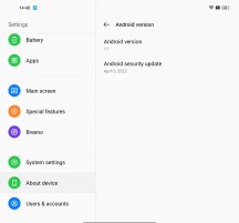
The Find N we have here is a device intended for the Chinese market, and as such, it has a lot of quirks, when viewed from an international perspective. Like the fact that it runs Android 11 with ColorOS 12 on top. Globally, the ColorOS version number correlates with the Android version number, so it should either be Android 11 with ColorOS 11 or Android 12 with ColorOS 12. But no, we get this weird combo instead.
In fairness, ColorOS 12 does look and feel a lot like ColorOS 11, and we're happy to see that its bug-free reputation (at least on high-end devices) is well deserved. We've encountered zero bugs, stutters, or crashes, in our time with the Find N, aside from some weirdness in the camera app - which is described in the appropriate section.
We've received a few updates during this time, but they were all minor, and we didn't see any obvious changes. Nor, for that matter, did any of them introduce any bugs (take note, OnePlus!). ColorOS 12, as seen on the Find N, is definitely one of the smoothest Android skins around, which combined with its bug-free nature really makes it a joy to use. And yet, there are issues having to do with the fact that this build isn't intended for consumption outside of China. We'll get to those right after we tell you how Oppo has adapted ColorOS to the foldable form factor.
Foldable adaptations, issues
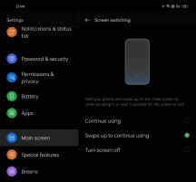
There's a neat section in Settings that basically details all of the features that are connected in some manner to the folding nature of the device. This is called Main screen rather confusingly, but we still appreciate how Oppo has organized these here - it's your one-stop-shop if you're wondering about what you can do.
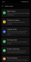
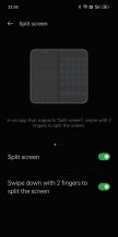
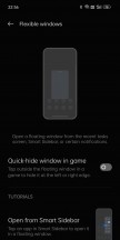
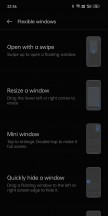
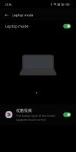

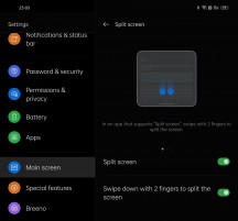
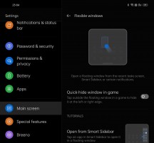
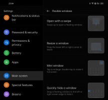
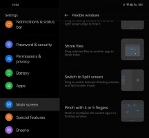
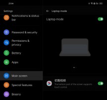
Main screen section in Settings
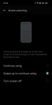
Perhaps the smallest adaptation, but definitely the most useful in day-to-day use, has to do with what happens when you switch screens. It's intuitive - when you're on the outer screen and then open up the phone, whichever app you were using is already there waiting for you. When you go the other direction, closing the phone, you get a "swipe up to continue using" message on the lower part of the outer display. If you do nothing, the phone will lock. If, however, you do swipe up, you're back into the app you were using on the inner screen. It's simple, it's brilliant, and it works amazingly well.
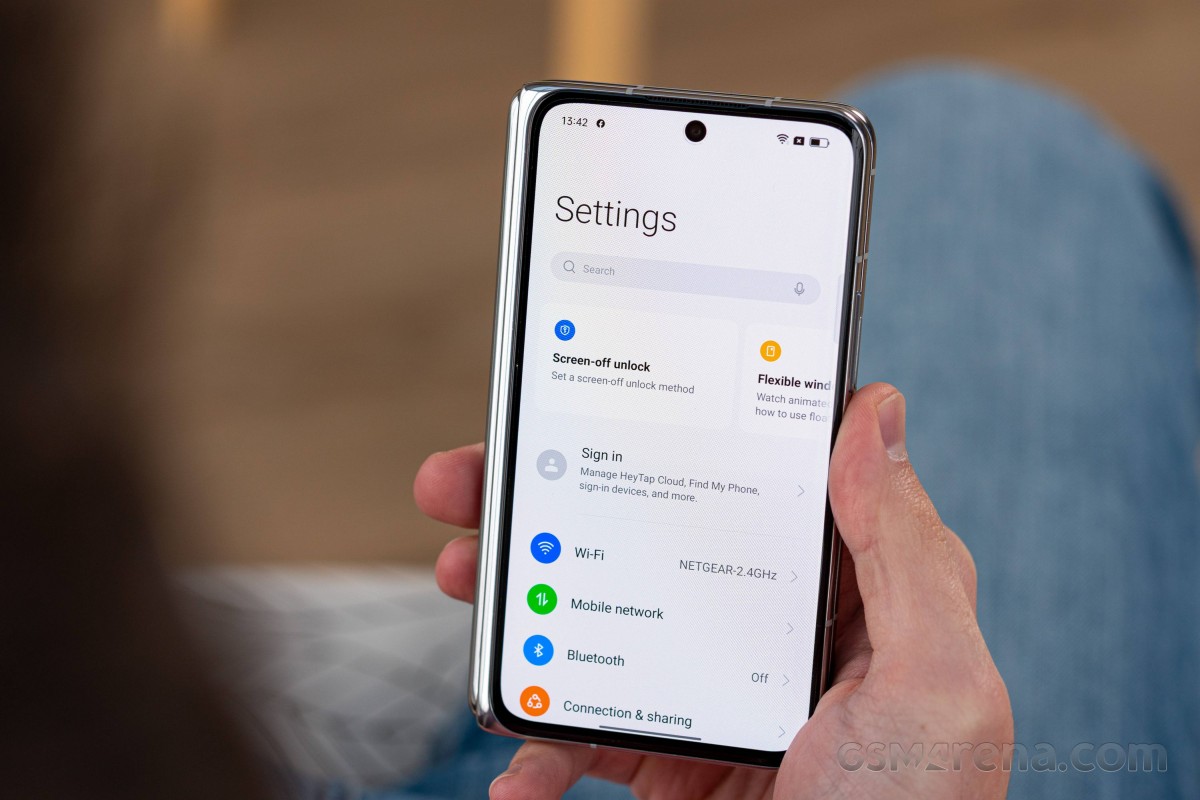
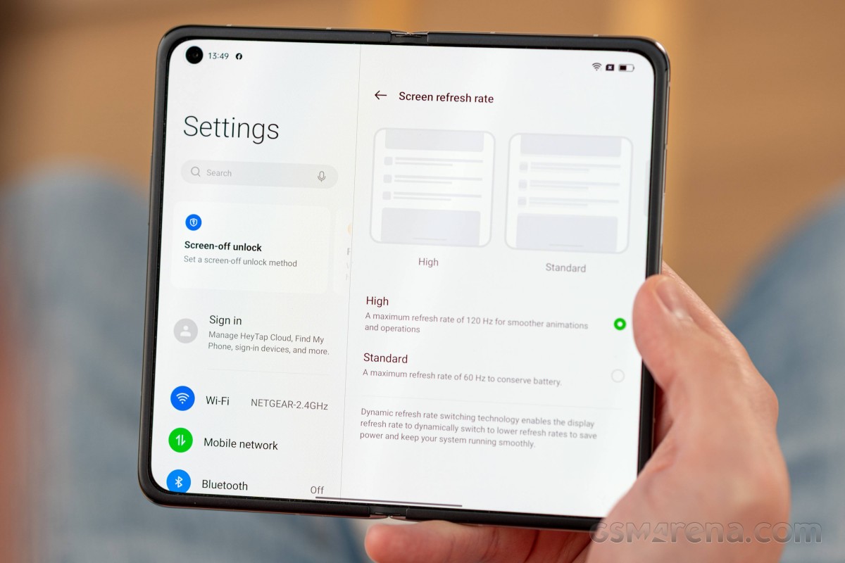
The inner screen gets its own slew of optimizations too. The Settings menu and all of Oppo's apps are all adapted to its aspect ratio, so you get the categories on the left and their contents on the right in Settings, for example. This works well to maximize how efficiently the added screen real estate is dealt with when you use system stuff or Oppo apps, but the problem is third-party app support. And this takes us to one of the main issues with using this Chinese model outside of China. Understandably, Oppo hasn't worked with developers of international apps to optimize them for the screen, so what happens when you use such an app is rather random.
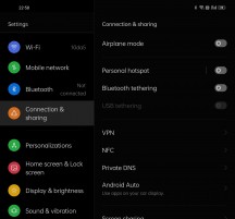
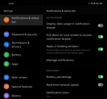
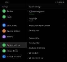
Two-column Settings on the inside screen
Some apps adapt to both orientations of the inner screen, showing a tablet-like UI when in 'landscape' mode and an embiggened phone-like UI when in 'portrait'. We say 'landscape' and 'portrait' because even though the screen is almost square, it's not exactly a square. So opening it up normally will put you right into 'landscape' mode, unlike on the Samsung Galaxy Z Fold3, which goes into 'portrait'. Then rotating it so that the crease is horizontal means you're in 'portrait'.
Now that we got the definitions out of the way, here's what happens. Some apps adapt to both of these very well, but a lot of apps don't want to be in landscape at all on the inner screen and only work in portrait mode. This is jarring if you're using such an app on the external screen and then open the phone up because the app is now displayed sideways and won't rotate no matter what you do - so you need to rotate the phone to use it.
Weirdly enough, Gmail used to work in both orientations, but after one update, it only wants to work in landscape - rotating to portrait will do nothing. So far, it's the only app we found that only wants to work in landscape; there are many more that only want to work in portrait - oh, and by the way, not in both portrait modes - just the one where the camera punch-hole is on the top right. Incidentally, that's the portrait mode in which the phone is easier to handle, in this reviewer's opinion, because the part that houses the camera array does seem to be ever so slightly heavier than the other one, and since the heavier bit is the lower one, there's no feeling of the device being top-heavy when held like this.
Moving on, Oppo has also created a nice little shortcut to run apps side-by-side when in landscape mode, and that's swiping with two fingers from the top near the crease. This neatly puts the app that was full screen on one side and then you can quickly select which app you want on the other side. It works very well, but the screen isn't really big enough for this to have been our main workflow while using the phone.
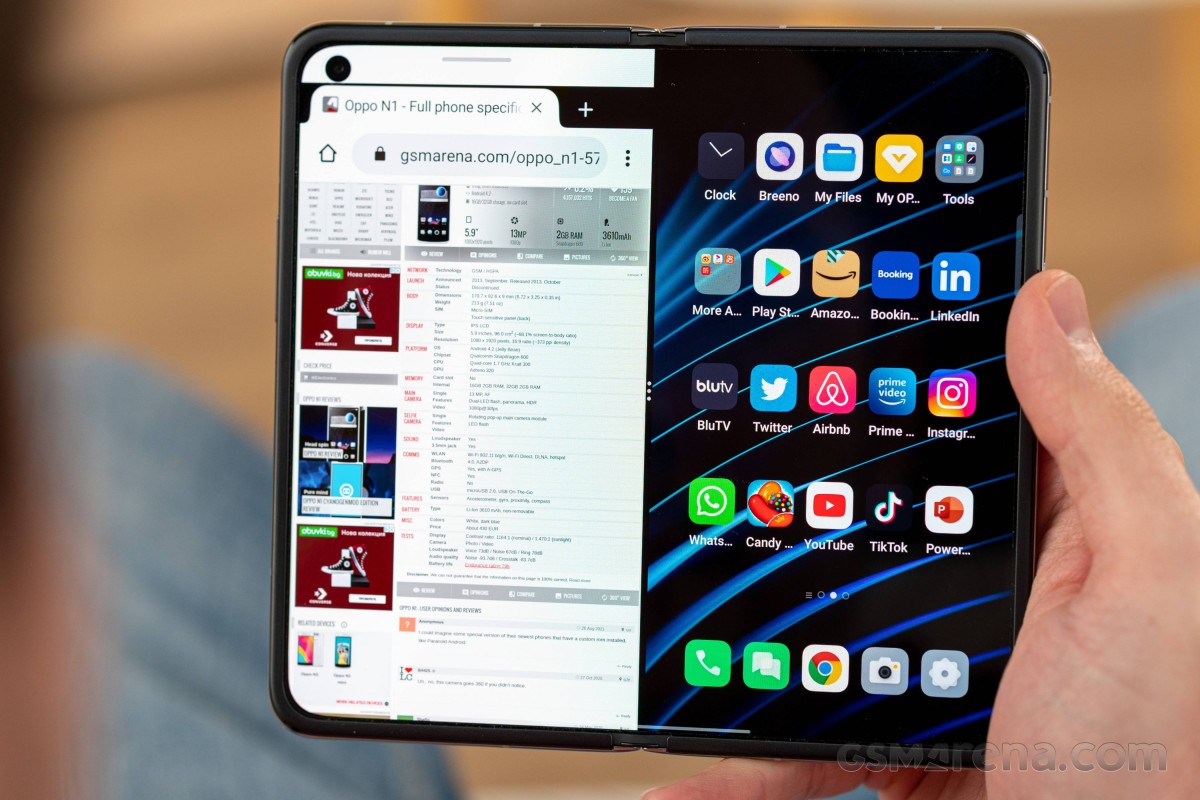
It's still nice to have, and you can move the dividing line around a bit, so it's not 50/50 - but also 40/60 and 60/40. And, of course, you can save such an app pair to your home screen to instantly start both apps in whatever configuration you want when you tap on that icon. However, the weird thing is that when you rotate the screen, the dividing line stays vertical - an option for it to turn horizontal so that one app would be 'on top' and the other 'at the bottom' would have been nice - to keep the divider aligned with the hinge.
The hinge isn't an all-or-nothing affair; it's not just closed or open, you can use intermediary positions, but here too, the lack of third-party app support is evident in the fact that, for example, YouTube's UI, when playing a video that isn't full screen, has no concept of where the hinge is, so the video window mostly occupies the top part, but does also spill into the bottom part by a few dozen pixels or so. It's understandable that Oppo wouldn't talk to Google for optimizing an app that isn't even available in China, but jarring nonetheless when you're using it.
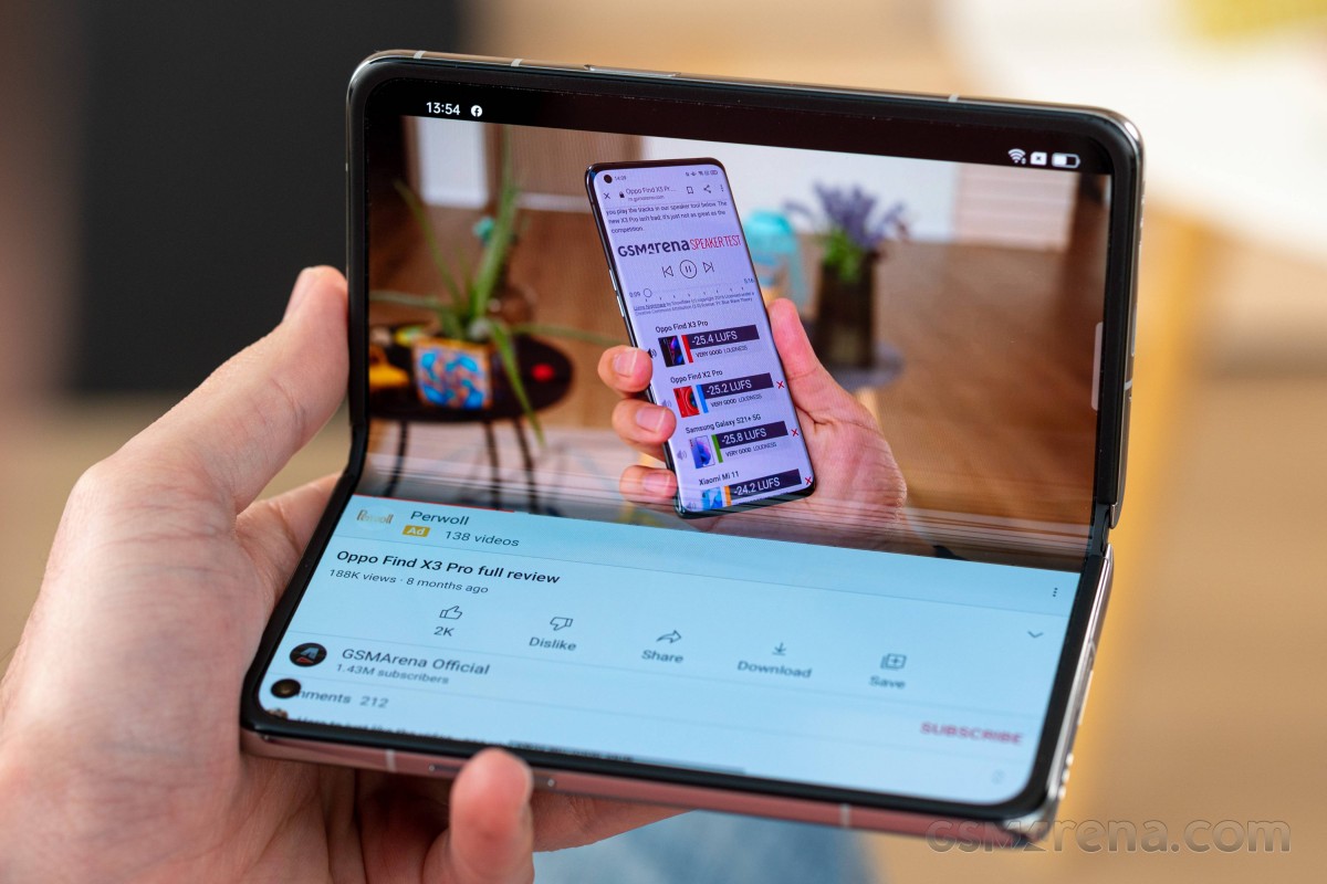
Additionally, you can't use the outer screen when the phone isn't closed (with the sole exception being for camera use, covered in the dedicated section). Opening the hinge a little bit, to 40-ish degrees, could have allowed for nice video watching on the outer screen, while the phone is still 'sitting' on its lower part, but this isn't possible. The second you open the hinge, even by 5 degrees, the UI completely switches to the inner screen, and this is an oversight that we don't think has anything to do with markets. So hopefully, you can get an option through a future update.
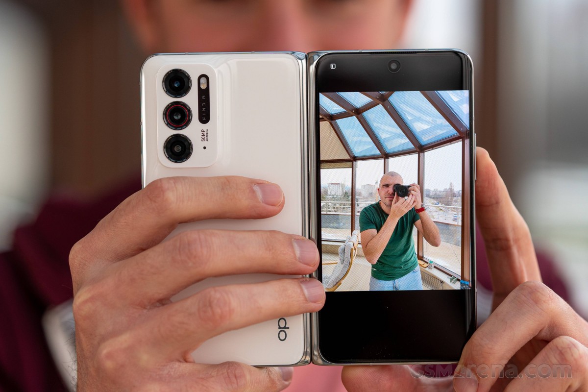
There's a "Laptop mode" too, although this doesn't seem to be doing anything, and we assume it needs to have per-app support. That's yet another thing that would need to be taken care of if the Find N was ever to launch internationally.
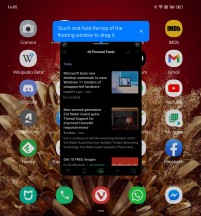
You can also use Flexible windows (aka floating windows) to multitask - you can open such a window from the Recents menu or the Smart Sidebar, and then you can resize, minimize, or easily switch to Split screen if need be. This works well (not for Settings, though), but honestly, we don't think the Find N's internal screen is big enough for it to be practical all the time. Still, there are definitely some good niche use cases for this, so we're glad it's there.
The aggressive app management policies that this version of ColorOS has should also be mentioned, even if they thankfully aren't to be found in the global one, at least not since ColorOS 7. Notifications are off by default for every single app. So if you install an app and want to see any notifications from it, it's a trip down to Settings to enable them. Same goes for doing anything in the background - not allowed by default but can be manually turned on. In order to reliably get notifications from apps, you also have to "lock" them in the Recents view, since the Settings change isn't enough.
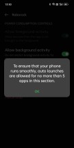
And, most annoyingly of all, there are heavy - and we mean heavy - restrictions on apps auto-starting. You can only get 5 apps in a category to auto-start, and this, of course, has to be done manually in Settings for every single one. It's entirely unclear how ColorOS categorizes apps for this purpose, but once you hit the limit, you won't be able to turn on auto-start, even manually, for any additional app. That's... not a good user experience and is clearly influenced by the state of things in the Chinese market, where there are many more nefarious apps than elsewhere.
Dark mode
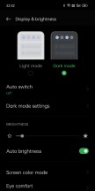
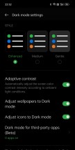
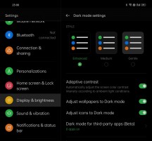
Now that we got all of this out of the way, let's turn to the normal Android skin features, of which ColorOS has plenty. There's a dark mode that's actually three dark modes in one - as you can customize just how dark you want it to be: Gentle, Medium, and Enhanced. We always prefer Enhanced as that's the darkest of them all, but you can pick whichever you want, and we like that there's such a level of customizability, that's not a given in your average Android skin.
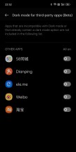
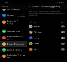
You can also adjust the wallpapers to Dark Mode automatically, as well as icons, and there's a way to force Dark Mode onto third-party apps that don't have one of their own, although this is still in beta and hilariously only works for a whopping five apps - all of them Chinese. Rather useless, then. Of course, Dark Mode can be scheduled, too.
Personalizations
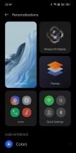
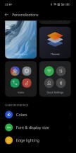
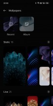
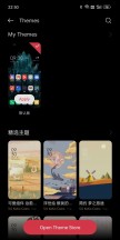
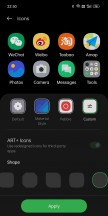
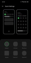
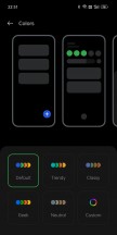
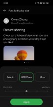
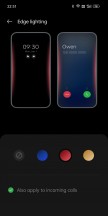
The dedicated Personalizations menu in Settings is nice to have, and if you think you've seen this before - well, we most recently mentioned it in our long-term review of the OnePlus Nord 2. Now that Oppo and OnePlus are integrated, expect more such commonalities in software. Anyway, inside Personalizations you can quickly attend to all the various UI customization options, like changing the wallpaper, setting up the Always-on Display, finding some themes, changing icon shapes for apps and Quick Settings tiles, messing with colors, fonts, the display size, and the Edge lighting that notifies you when something needs your attention.
Although you can find a lot of these things in other parts of Settings too, and we're not usually fans of redundant features, we think it makes sense for the Personalizations menu to exist. It's an obvious, quick, and easy way to personalize your device when you feel like you need a change.
Navigation gestures
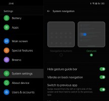
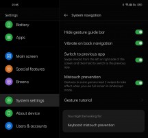
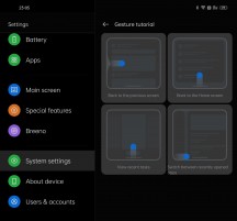
Like all modern Android skins, ColorOS in this incarnation also has support for navigation gestures, and this works very well. Thankfully there's an option to hide the useless "gesture guide bar", and don't worry - the quick switching functionality is still there when you swipe horizontally across the bottom of either screen.
Additionally, unlike MIUI, ColorOS has kept the option to quickly switch to the previously used app by swiping from the sides and then holding. We're very happy to see this survive, as we are big fans of this feature. There's also a toggle for vibrating when the Back gesture is triggered, which we like to have on because it gives a more physical feeling to using the phone.
Launcher, recents
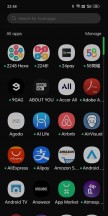
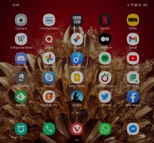
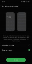
The built-in ColorOS launcher has support for an app drawer even though this is the Chinese ColorOS, which is surprising but great. It's not the most feature-rich of launchers out there, not even if we're only counting built-in ones, but it gets the job done with zero bugs or any other issues.
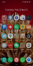
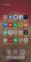
If you're wondering how it handles the two screens with their very different aspect ratios, the answer is simpler than you may think. Basically, you are shown the exact same amount of app icons on both screens (the most packed option is 5x5 for the home screen, unlike in other phones where it's 5x6). So on the outer screen, such a setup is bordering on cramped, but on the inner screen, there's a lot of padding around the app icons. It sounds weird, but it works, and it prevents you from having to set up two different home screens - one for each display. We think that would have just been an added hassle, but of course, you may beg to differ.
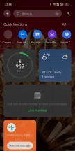
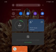
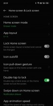
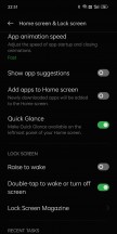
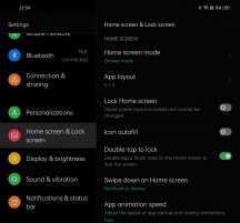
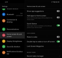
The App animation speed setting is in the Home screen settings, and switching this to Fast as we did has a notable effect on how fast app starts are perceived to be. There's also a Quick Glance panel to the left of your leftmost home screen, but this is no Google Discover feed. You can turn it off if you don't like it. We'll be honest here - we kept it on but never found any use for it. Otherwise, the launcher settings are pretty bare-bones, with only the most essential things being covered. We don't mind this at all, but if you want more control and customizations, then you're going to have to use a third-party launcher.
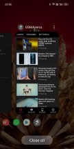
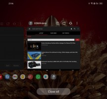
The Recents view is typical ColorOS with a horizontally scrolling list of app screenshots, under which you can see the app icons. If you swipe across the icons, not the screenshots, then it's a faster movement, and you can get to apps you used a long time ago much quicker. This may sound weird written down, but it works very well in practice. Under the icons, you'll find a big Close all button which we've never used, but you may if you can't sleep knowing there are still some 'open' apps over there.
Reader comments
- 0966765
- 17 Jun 2022
- X5u
Truly appreciate you taking
- Michael Snake
- 12 Jun 2022
- P@T
You can buy this on AliExpress and pay an extra $24 for fast DHL shipping. It's a great phone, helped my friend order one. I fooled round with it and it's gorgeous. The software is great, and the phone performs so well. A near invisible ...
- Jreid2k
- 11 May 2022
- IbG
I wouldn't buy it If I were you. This phone does not support sending or recieving group or picture text in the U.S. I called Oppo and they couldn't help.
