Oppo N1 CyanogenMod edition review: Pure mind
Pure mind
Boxes within box
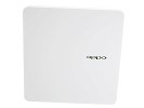
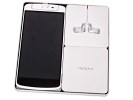
The CyanogenMod Oppo N1 comes in a flat retail box with separate little boxes inside for the various accessories, for a premium touch to the packaging. On the outside, there's just a simple CyanogenMod logo to distinguish the special version from the regular ColorOS-running Oppo N1. The Limited Edition model comes with a special cyan case, which is a nice touch.
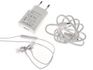
Inside, one little box holds the O-Connect Bluetooth accessory (remote shutter), while the cable of the bundled earphones with volume controls wraps around the slotted sides of another container. A pin is supplied too for ejecting the SIM card, as well as an A/C adapter with detachable USB cable.
The O-Click Bluetooth accessory is good-looking and quite efficient. Using Bluetooth 4.0 LE it will pair with the handset and serve several useful purposes. You can make the phone ring the remote or the remote ring the phone. The O-click easily fits on a keychain, so you'll no longer scramble for misplaced keys. It works the other way around too - finding a misplaced phone.
The remote can be set to start beeping if you walk out of connection range to make sure you don't leave without your phone. The O-click will also flash upon incoming calls or messages if you have the phone on silent and it can also double as a camera shutter remote.
Oppo N1 360-degree spin
The Oppo went big on its latest flagship. With the rotating camera module and ample space below the screen for the capacitive buttons, the Oppo N1 is taller than devices of similar screen size like the Nokia Lumia 1520 and the HTC One Max.
Sony's massive Xperia Z Ultra is perhaps the only one that comes to mind that's notably bigger - but it does have a larger 6.4" screen to show for it. The Samsung Note 3 is impressively compact in comparison, and the difference in screen diagonal is negligible.
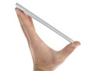
Weight is about average for the sample. At 213g, the Oppo N1 is right between the Lumia and One Max. So is thickness, at the reasonable 9mm - which is still nowhere near though the Z Ultra's 6.5mm.
Design and build quality
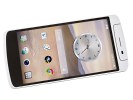
OK, for a gadget that's not exactly subtle - we're talking a phablet with a near 6" screen - the Oppo N1 is a seriously good-looking slab. The device has an aluminum alloy frame going around its sides and the back is treated to an impressively sleek soft finish, which is great to the touch and virtually impervious to fingerprints, while offering excellent grip.
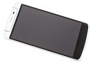
The front is dominated by the immense screen, with the three capacitive buttons enjoying plenty of space at the bottom. At this size though, they are almost unusable in a single-hand scenario - reaching all the way down to them you risk dropping the N1 almost every time. It's a top-heavy device too, which certainly doesn't help.
Above the screen, the earpiece and sensors are on one side of the rotating bit, the 13MP camera and dual-LED flash on the other.
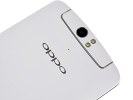
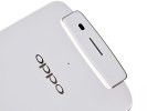
There are subtle chrome accents that work well against the pure white paint. The Oppo logo is engraved at the back, the rotating piece, as well as the sides of the phone have slim metal framing. The camera lens, and the couple of LEDs are encircled in metal, while the earpiece and the loudspeaker have the same grille pattern.


Oppo N1 rotating camera module
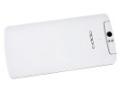
By placing the camera lens on a rotating piece, Oppo has ensured an almost clinically clean back panel. It has a microphone and company logo and seemingly nothing more. Located under the OPPO insignia, the O-Touch pad is as good as invisible.
The camera and screen are the highlights on the Oppo N1 and clever design makes sure they get all the attention. The phablet is big and heavy, no doubt about that, but the styling is as clean as it possibly can, yet with great attention to detail. We like the sparing use of accents and are delighted with the finish - that goes to premium feel and excellent grip in equal measures, the latter being essential in a device of this size.
Controls
Above the 5.9" screen there's the 206°-rotating module, which holds the earpiece and proximity sensor on one side and the 13MP camera and couple of LEDs on the other. If you enable it in the settings, rotating the swivel top will automatically launch the camera. Of course, it will launch in self-portrait mode - after all these are the highest-resolution selfies we can think of.
Under the screen you'll find a familiar three button layout. These are Home, Back and Menu and are all capacitive.
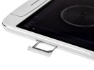
The sides of the Oppo have different duties. Near the top on the left side of the phone is the SIM tray, which takes a dedicated eject pin to pull open. On the opposite side you'll find the power and volume buttons placed a little lower than usual, so as to be comfortably within reach. The power/lock key may see less use than usual, as the Oppo N1's screen can be double-tapped to wake up.
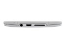
There's nothing at the top of the Oppo N1, while on the bottom there's a 3.5mm headphone jack, a microUSB port and a recessed speaker grille. The frame around the device is nicely etched out to provide room for these three.
The back of the Oppo N1 has the company logo, a noise-suppressing microphone and the O-Touch pad, which enables more ways to interact with the device. Scrolling (screens and lists) is the most typical scenario but you can set it to launch apps too. We had a double tap start and stop the camera but it can be any app really, from the dialer to the torch. The touchpad can serve as a shutter key too - as in tap to focus, release to capture. It also lets you control music playback.
It's placed right where you'd want it to be and the idea is to help single-handed use but the O-Touch isn't that comfortable after all. It's the sheer size of the device - it'll take a bit of time to find the proper way to hold the N1 securely enough and slide a finger on the touchpad to scroll with reasonable speed and precision. On the other hand, when the O-Touch is enabled accidental taps are likely to launch an app or scroll away from what you're looking at when you're only trying to adjust your grip on the device.
Overall, the most usable scenario for us was holding the device landscape in both hands and browsing pictures using the rear touchpad - which is still something. Nothing obscures the actual content and having a few smudges less on the touchscreen is always a good thing.
At this size, the Oppo N1 is not a device to comfortably use single-handedly - but that's true for almost any phablet out there. That said, the O-Touch provides a somewhat usable solution in some cases but there's no getting around the fact that for most purposes you'd need to use both hands to operate the Oppo N1.
It's a phablet after all, and that means you're here for the big screen to begin with. So, let's see what you're getting.
Reader comments
- Anonymous
- 27 Aug 2014
- NxF
Does oclick remote in the package? I don't have it,,,Damn!!!!!!
- Anonymous
- 11 Jul 2014
- tU3
Mayur
- AnonD-265729
- 20 May 2014
- mDP
In 6 months, cyanogen did not issue a single version update, nor real support for the unique hardware. CM does not even support the N1 with its installer. Be careful when you buy cyanogen. They are not as committed or as reliable as the historic c...
