Oppo N1 CyanogenMod edition review: Pure mind
Pure mind
Phonebook is unchanged, still great
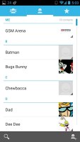
The phonebook is the stock Android People app, which hasn't been changed since its major redesign under Ice Cream Sandwich.
It's made up of three tabs that you can switch between with sideways swipes. The middle tab is the default one, listing all of your contacts. Contacts are listed with a name and a picture to the right. They can be sorted by first or last name, and viewed as first name or last name first.
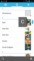
There's a permanent scroll bar available that you can grab and jump straight to contacts starting with a certain letter. There's regular search as you type too.
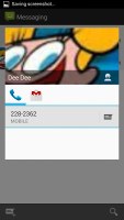
The quick contacts feature triggers on tapping a contact image to bring up a tabbed popup window. The tabs are phone and email with a list of the available numbers or addresses. These tabs can be navigated with sideways swipes as well.


Quick contacts sport the same design as before
The single contact view displays the contact's name along with a star to favorite a contact and a Settings button that lets you edit, share or delete a contact, as well assign custom ringtones to them or set the phone to redirect calls from that contact straight to voice mail.
Under that is a list of all contact info sorted by category - phone numbers, emails, events, notes and so on.
While editing a contact, you can add new fields of different types to fill in more info for the contact. You can link contacts too, if you've added the same person on multiple services.
The contacts that the phonebook displays can be filtered by service (e.g. hide all Facebook contacts) and even group (so you can hide all contacts that don't belong in a group, for example).
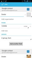

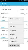
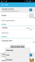
Editing a contact • Joining contacts • Adding an extra field
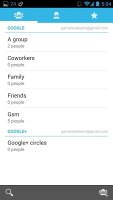
The other two major tabs in the phonebook are Groups and Favorites. Groups are listed by service (e.g. your Gmail account), while favorites are a listed as a grid of large contact photos, which is readily thumbable.
Basic telephony
In-call quality on the CyanogenMod Oppo N1 is delightful. Voices come out loud and clear and the device held on to signal without issue.
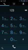
The dialer features the neon-blue on black theme, but hasn't grown any new functionality. There is smart dialing on board, which is pretty well implemented. Kudos to Cyanogen for cooking this feature in.
The dialer is just the first tab of the phone app, the other two being the Call log and the Favorites tab (you get the same in the Phonebook). In the Call log, you can't delete individual entries, which is mind-boggling.
We also ran our traditional loudspeaker test on the CyanogenMod Oppo N1 and it scored a Good overall mark just as its ColorOS running sibling did. .
| Speakerphone test | Voice, dB | Ringing | Overal score | |
| 60.1 | 58.3 | 61.6 | ||
| LG G2 | 65.7 | 62.2 | 66.2 | |
| LG Nexus 5 | 65.0 | 64.8 | 65.8 | |
| Meizu MX3 | 67.1 | 66.5 | 77.7 | |
| HTC One | 69.3 | 66.6 | 75.9 | |
| HTC One mini | 68.0 | 68.7 | 78.1 | |
| Samsung I9505 Galaxy S4 | 70.6 | 66.2 | 77.3 | |
| Samsung Galaxy Note 3 | 70.5 | 66.6 | 78.0 | |
| 71.0 | 66.6 | 78.8 | Good | |
| 72.7 | 66.6 | 78.1 | ||
| Oppo N1 | 73.7 | 67.7 | 78.7 |
Information on how we perform the test can be found here.
Stellar messaging
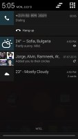
The messaging section is business as usual but with some improvements. All SMS/MMS communication is organized into threads. A cool new feature is that you can select multiple threads for mass deletion.
Each thread is organized like an IM chat session, the latest message at the bottom. You can manage individual messages (forward, copy, delete) and even lock them (to prevent deletion). You can use search to find a specific message in all conversations.
Quick contacts work here too and there's a call shortcut at the top of the screen when viewing a thread.
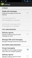
You can set the CyanogenMod Oppo N1 to delete older messages (by default, it keeps 500 texts and 50 MMS). You can activate delivery reports as well as read receipts.
Composing a text is a little frustrating as the text box starts off as a single line and grows only up to three lines, which makes working with longer texts hard. We mostly let it slide on previous versions, but with a 5.9" screen there's no excuse not to make the text box bigger.
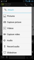
You can add multimedia (photos, videos, sounds, etc.), which will convert the message into an MMS. If you need multiple slides or multiple attachments, you can go to a full-blown MMS editor as well.
Moving on to email, the Gmail app features color coded sender images, based on the first letter of the sender's name. The default app supports multiple Gmail accounts, but there's no unified inbox.
You can swipe left or right to move between messages in your inbox.


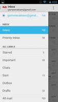
Viewing email • Email selection
There is also a generic email app for all your other email accounts and it can handle multiple POP or IMAP inboxes. You have access to the messages in the original folders that are created online, side by side with the standard local ones such as inbox, drafts and sent items.
Unlike its Gmail counterpart, this app supports a combined inbox view. It color codes the inboxes so you can easily tell where each message came from. Unfortunately, there's no moving between messages with sideways swipes here.
The keyboard has now even more room to stretch its legs on the 5.9" screen and typing is very easy. Keys get even bigger when you switch to landscape mode - the long screen becomes very comfortable for two-thumb typing.
In Jelly Bean 4.2.2 Google introduced a new typing method called Gesture typing. It works in a manner very similar to Swype -- you just drag your finger over the letters you want to type, lifting when each word is complete. Naturally, the Gesture Typing feature benefits from the already existing Android word prediction, so you can just click on the words the keyboard suggests.
A tap on the text area will reveal a "handle" attached to the text cursor - it's easier and more accurate when correcting mistakes. A double tap will bring up the select options - select word and select all - with two handles to adjust the start and end of the selection.
If a word has a typo, it will be underlined in red and when you tap it, the phone will offer a number of suggested corrections along with options to add the word to the phone's dictionary or just delete the word.
Reader comments
- Anonymous
- 27 Aug 2014
- NxF
Does oclick remote in the package? I don't have it,,,Damn!!!!!!
- Anonymous
- 11 Jul 2014
- tU3
Mayur
- AnonD-265729
- 20 May 2014
- mDP
In 6 months, cyanogen did not issue a single version update, nor real support for the unique hardware. CM does not even support the N1 with its installer. Be careful when you buy cyanogen. They are not as committed or as reliable as the historic c...
