Oppo N3 review: Motor head
Motor head
Color OS 2.0 on top of Android KitKat
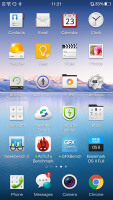
Oppo N3 runs on Oppo's proprietary Color OS v2.0, which is another name for a heavily skinned Android 4.4 KitKat. The Oppo's launcher customizations run very deep, they keep all Google apps and services, and even bring quite a few of its own - themes support, new lockscreen, homescreen, and settings menu among others.
If you are not into custom UIs, there is a preinstalled theme called Jelly Bean, which replicates the stock Android Jelly Bean UI for you as close as possible.
Here's a quick Color OS rundown on video to get you started:
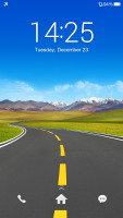
The Color OS default lockscreen uses swipe gesture for unlocking. It also has shortcuts for the Phone and Messaging apps. Double tap to wake works on the homescreen, but not on the capacitive keys.
Oppo N3 features a fingerprint scanner on its back, so your can protect you lockscreen by a fingerprint-recognition security. Naturally, you'll have to setup a password in case you can't unlock it with your finger for some reason. The fingerprint sensor over the back doubles as a wake up key, when this type of security is up.

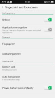
Setting up the fingerprint security
The fingerprint security can also be used for encrypting apps - you'll need your finger to open any encrypted apps.
The lockscreen also has a hidden flashlight shortcut - a press and hold of the Home button (the screen needs to be awake) turns on the LED flash on the back of the device. It turns off when you let go of the Home button.
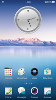
The Oppo N3 doesn't have an app drawer, so all of your app shortcuts are available on the homescreen. And the apps above the dock are organized in a grid of 4x5.
Widgets are available as well, though there are hardly as many as some other Android smartphones offer these days.
Naturally, folders are available, so you ca group your apps the way you like.
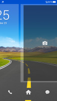
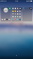
Exclusive space is Oppo's custom homescreen page. Currently, there are only two available - Photo and Music spaces. Photo space takes up a whole homescreen and features a live viewfinder so you can take shots straight from your homescreen plus a shortcut to the full camera app. Below you get a timeline with all your recent photos and you can share them very easily.
The second Exclusive space homescreen pane is the Music space. It features a cool, if slightly unintuitive design with a vinyl for changing the currently playing song and stopping/resuming playback. You can change songs, or go directly to the music player or the Phone app from here.
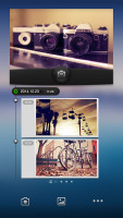
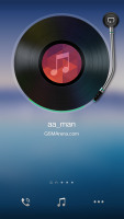

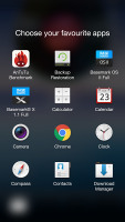
Exclusive spaces - Photos • Music • customizing docked shortcuts on an exclusive Space
Oppo's Color OS supports themes, one of which changes the appearance and functionality of Color OS to match that of stock Android. There are plenty of awesome themes available for free in the Oppo's Theme Store.
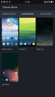
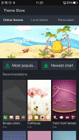
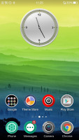
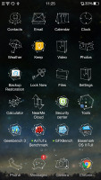
Themes Store • Different themes
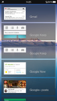
By default the notification area will show one row of quick toggles, a brightness slider and a shortcut for enabling auto brightness mode, the current notifications plus a shortcut to go into settings. If you do a drag gesture from the quick toggles row you get two more lines of toggles. There's also a Kill all apps button there.
A long press on a toggle will bring up its respective settings entry. By the way, you can access the notification area even if you slide down from any empty part of the homescreen (not just the top), which helps a lot with the single-handed use on a big screen smartphone like this one.
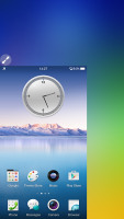
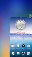
The task switcher is pretty close to the one found in Apple's iOS. All your apps are shown in a horizontally-scrollable grid of thumbnails, which you swipe either up to close or tap to open. Oppo has added a Kill All toggle at the bottom.
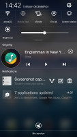
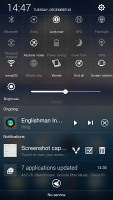
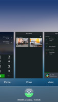
The N3 notification area • App switcher
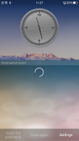
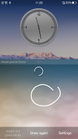
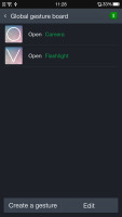
Then there's the Gesture panel. You access it just like you would open your notification area, but you need to start your swipe from the bottom of the screen. You can perform various gestures in the Gesture panel to open different apps. For instance drawing a circle would open the camera app but you can assign any apps to any gestures you want.
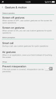
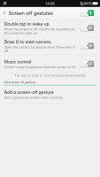
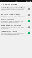
The Gesture & motion menu deserves our attention as well. It holds all the gestures and motion tricks that make your life with the N3 easier. For one, you can swipe with three fingers across the screen to capture a screenshot or pinch with several fingers to launch the camera and more.
The Motion options are very useful, too - flipping the device will mute the ringer, raising the ringing Oppo N3 to your ear will automatically answer the call and more. The Motion menu also offers Air Gestures on the homescreen - you can swipe through the panes by waving your hand over the display.
One hand mode is available too, activated by an upward swipe from the bottom left or right corner. When done, this will minimize the UI into a more compact window, making it possible to use and operate the handset with just one hand.
Overall, Color OS strives to be more feature rich than stock Android and has been customized quite deeply. It is still Android though, so users who are familiar with the OS won't have trouble knowing their way around Color OS. In fact most of Oppo's additions are quite welcome and improve the overall user experience.
Reader comments
- M. Niki
- 24 Feb 2023
- DkD
Very nice
- Catherine the Great
- 04 Dec 2018
- mKJ
No it isn't, this phone is nothing like the Sony Ericsson Xperia Arc S.
- aj
- 07 Aug 2016
- IVR
Can,somebody.tell me how to use the finger scan button as a trackpad button
