Oppo R5 review: One to remember
One to remember
An Oppo gallery
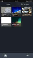
The Gallery on the Oppo R5 is a custom job, but surprisingly one with less features than the vanilla app. Obviously, Oppo has approached this interface with a less-is-more tactic.
The default view is a grid of folders, with a name and number of images for each folder labeled underneath. You can't filter images by location, time, people or tags like you would in the stock app. Images inside folders are arranged on a rectangular grid and you have two options - image selection mode and start a slideshow. You can select multiple images (folders too) and then Share and Delete options become available.
The available features when viewing a single image are pretty standard - set image as wallpaper/contact image, share it, delete it or get a menu with more functions.
The image editor offers light adjustments that let you bring out the shadows or the highlights, you can apply effects, color styles, red eye correction, straightening, sharpening and face glow (which detects faces automatically). Most of these options have a slider that lets you fine-tune the intensity of the effect.

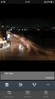
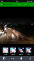
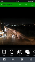
Viewing an individual image • Editing options
Video player
The Oppo R5 comes with a pretty simple-looking video player, which supports DivX, AVI, MKV, MP4, etc. We had no issues playing files all the way up to 1080p resolution and the only real setback were certain files with XviD video or AC3 sound.
The interface for video selection is pretty basic too - a list of all available files. The player supports subtitles too, but there's only an on/off toggle here, you can't manually pick the subtitle file (so it would have to have the same name as the video file to work, and be in the same directory). Also, some foreign language subtitles didn't display all characters correctly.
While watching a video you get a timeline scrubber, play/pause along with forward/back controls, a lock option (which locks the display against accidental touches) and a pop up toggle.
A feature that seems lifted right off the Samsung/LG flagships is the pop-up player. It's a small floating window that lets you have other apps working underneath. You can move it around to get it out of the way, but there's no transparency option.
Music player with Dirac HD
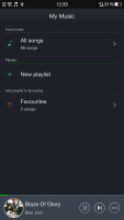
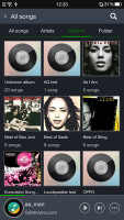
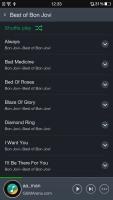
Oppo's latest music player has quite a simplistic interface and is very easy to use and navigate. The music player UI is pretty straightforward - your music library is organized into a local list of all music, favorites, artists, albums and folders. There's also an option to add a playlist.
The music app supports Dirac HD Audio though there are no other music enhancement options.
The Now playing interface is split into two - the current playlist and the album art/music controls screen. You can swipe between the two. By default the player will look for lyrics and display them under the album art, which imitates a vinyl record. You can add album art if it's not built inside the tracks (but the player won't look for it automatically).
There's a playback mode button (normal, shuffle, repeat track) and a toggle for audio enhancement. That cycles through Dirac HD on and off.
By the way, the music player successfully played a 16-bit FLAC file so there is hardly anything it won't play.
Audio output has its ups and downs
We weren't very optimistic about the Oppo R5 audio output - the lack of a dedicated 3.5mm audio jack means that the smartphone had to use its microUSB for sound-feeding purposes and similar attempts in the past have shown that it's not a great idea. Besides, the very slim waistline is a challenge on its own as some audio components require more physical room to prevent interference.
As it turned out, the Oppo R5 sound output isn't as bad as we feared it might be, even if it's not quite the best around. The smartphone was nicely loud when used with an active external amplifier and had no issues with its scores outside of the rather high intermodulation distortion.
Plugging in a pair of headphones lead to a reasonably contained hike in stereo crosstalk as well as some deviation in the frequency response. The volume levels also dropped to average levels so we had to drop the overall score from very good to decent. It's certainly better than some other super slim phones we've tested recently and that's a win in its own right.
And here go the detailed results so you can check them out for yourselves.
| Test | Frequency response | Noise level | Dynamic range | THD | IMD + Noise | Stereo crosstalk |
| Oppo R5 | +0.02, -0.08 | -93.4 | 92.5 | 0.0009 | 0.398 | -93.2 |
| Oppo R5 (headphones attached) | +0.66, -0.01 | -93.3 | 92.9 | 0.011 | 0.385 | -68.6 |
| Gionee Elife S5.1 | +0.03, -0.23 | -91.2 | 91.2 | 0.0099 | 0.014 | -82.7 |
| Gionee Elife S5.1 (headphones attached) | +0.57, -0.90 | -83.8 | 88.7 | 0.019 | 0.476 | -43.8 |
| Motorola Moto G (2014) | +0.01, -0.06 | -91.6 | 92.4 | 0.0089 | 0.014 | -91.7 |
| Motorola Moto G (2014)(headphones attached) | +0.02, -0.09 | -91.6 | 92.4 | 0.011 | 0.017 | -45.7 |
| Motorola Moto G | +0.08, -0.85 | -92.1 | 91.9 | 0.0059 | 0.082 | -91.4 |
| Motorola Moto G (headphones attached) | +0.10, -1.03 | -92.0 | 91.8 | 0.010 | 0.117 | -50.4 |
| Oppo R819 | +0.04, -0.09 | -92.4 | 92.3 | 0.017 | 0.045 | -87.9 |
| Oppo R819(headphones attached) | +0.58, -0.13 | -91.0 | 90.9 | 0.015 | 0.438 | -48.7 |
| Nokia Lumia 625 | +0.13, -0.10 | -90.3 | 90.3 | 0.013 | 0.355 | -82.5 |
| Nokia Lumia 625 (headphones attached) | +0.24, -0.00 | -90.2 | 90.2 | 0.014 | 0.460 | -83.8 |
| Samsung Galaxy S5 mini | +0.03, -0.04 | -92.6 | 90.7 | 0.016 | 0.018 | -94.0 |
| Samsung Galaxy S5 mini (headphones attached) | +0.23, -0.05 | -86.7 | 86.2 | 0.052 | 0.167 | -55.7 |
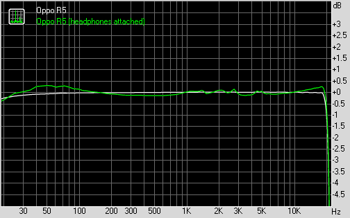
Oppo R5 frequency response
You can learn more about the whole testing process here.
Reader comments
- Anonymous
- 05 Jul 2016
- t7X
Why my oppoR5 cellphone did not flash charging???
- saket
- 15 May 2015
- t@x
A phone with worst battery life.. Except the battery, overall phone is awesome.. love this phone.. Please see to the battery..
- muid
- 09 May 2015
- 0ZE
why not water resistant

