Oppo R7 Plus review: Monster truck
Monster truck
ColorOS 2.1-enhanced Lollipop
Oppo took its time with the jump to Lollipop, but finally made it. The R7 Plus is one of select few devices that have been launched with Google's now one-year-old release, and it's running the latest available 5.1.1 version. Lollipop was also promised for the regular R7, and we'll be holding Oppo accountable for that.
With ColorOS 2.1 on top, the differences between the two R7s are mostly under the hood. That is, unless you count Oppo's constant rocking between menu background colors - black on the R5, white on the R1x, black on the R7, now white on the R7 Plus - makes you wonder.
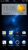
In typical fashion, ColorOS makes Android nearly unrecognizable, with custom lockscreen, homescreens, icon packs, task switcher and settings menu, as well as extensive theming support.
The Color OS default lockscreen uses swipe gesture for unlocking, though it only works with an upward swipe. The truly new feature here for Oppo comes courtesy of Lollipop and that's lockscreen notifications. You can set up pattern, PIN or password unlock protection, and now fingerprint unlock too.
The side swipes are reserved for lockscreen widgets, but you need to start swiping from the extreme edge for them to work, so swiping out from the middle of the screen could have easily been used for unlocking purposes. Swiping in from the right opens up the camera app, while on the other side you can have one or several widgets, though the choice is limited to a few basic Google apps - Gmail, Hangouts, the like.
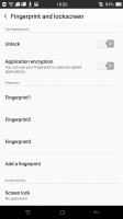
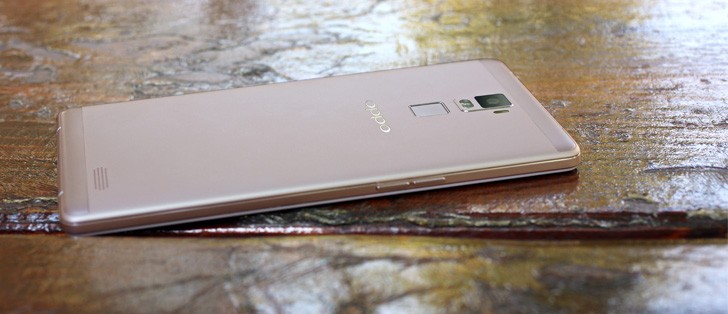
The Oppo R7 Plus comes with a fingerprint sensor on the back. It's our favorite position, the one best suited to such large devices, as it's the most natural spot to place your index finger, left or right. The HTC One Max premiered the design, although it used a swipe sensor rather than a touch one like Oppo.
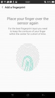
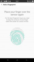
You can save up to 5 fingerprints, meaning your two index fingers and another two potentially for someone else, with one extra. It's hard to imagine a use case, where you'd be using any other finger - it's just not a natural position for those. The recognition works excellently and you seldom need to try a second time. Of course, a backup password or PIN can always save you, should your fingers be dirty, in gloves, or whatnot.
What Oppo didn't quite get right is more of a niggle than anything else. The thing is, when you place your finger on the sensor and it recognizes the print, the phone shows the lockscreen for a brief instant before taking you to the homescreen, thus wasting precious moments.
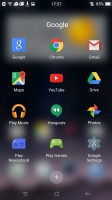
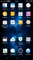
The Oppo R7 Plus doesn't have an app drawer, so all of your app shortcuts are available on the homescreen iOS-style, and the apps above the dock are organized in a grid of 4x5. You can still select multiple apps (up to 20) and move them around the homescreens together.
The 4x5 grid may have been fine on the 5-inch R7, but on the 6-inch R7 Plus it feels a little wasteful. It's also not the only example of unnecessarily large menu elements, which Oppo has failed to scale to better use the ample screen estate. The font size setting doesn't help with scaling buttons, and it's also limiting on the small end for those with good vision.
Naturally, you can group your apps in folders the way you like, and the dock can take folders too, though you need to create them above in the homescreen, and then drag them to the dock. Widgets are available as well, though there aren't many of them here either.
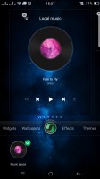
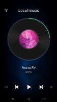
Exclusive space is Oppo's custom homescreen page. Photo has been retired and now there's just Music. Gone is the unintuitive design from the R1x, where you had do swipe away the currently playing vinyl for changing the song and it has made way for more straightforward Previous/Play/Next buttons.
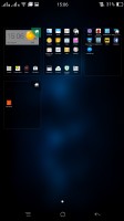
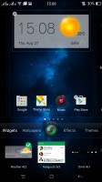
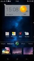
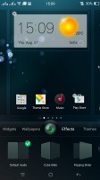
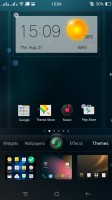
The homescreen's contextual menu lists widgets, wallpapers, effects and themes. You drag widgets upwards to place them on the homescreen.
Oppo's Color OS supports themes, one of which changes the appearance of Color OS to match that of stock Android 4.3 Jelly Bean. There are plenty of themes available for free in Oppo's Theme Store, and some are better than others at dealing with non-stock apps.

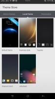
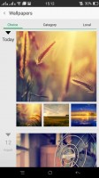
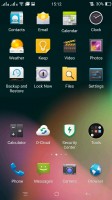
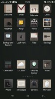
Themes Store • Different themes
By default the notification area will show one row of quick toggles, a brightness slider and a shortcut for enabling auto brightness mode, the current notifications plus a shortcut to go into settings. If you do a drag gesture from the quick toggles row you get two more lines of toggles. There's also a Dismiss all button there.
A long press on a toggle will bring up its respective settings entry. By the way, you can access the notification area even if you slide down from any empty part of the homescreen (not just the top), which was welcome on the R7, and here it's nothing short of a blessing, due to the sheer size of the device. You can also set up app-by-app permissions for displaying notifications.
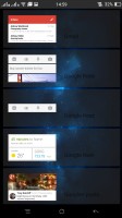
The task switcher is pretty close to the one in iOS. All your apps are shown in a horizontally-scrollable grid of thumbnails, which you either swipe up to close or tap to open. A downward swipe locks one or more apps, so they remain open even when you use the Kill all button to close all the others.
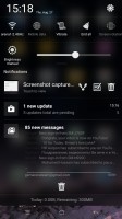
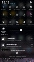
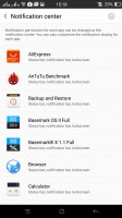
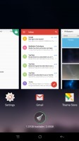
The R7 Plus notification area • App switcher
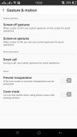
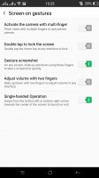
The R7 Plus has some of the most comprehensive gesture controls out there. It picks up gestures with the display off, then others with the display on and it also recognizes motions to answer or mute incoming calls.
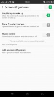
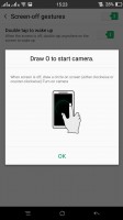
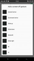
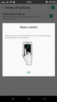
Among the screen-off gestures you get the obvious double-tap-to-wake, but also music control, which lets you play/pause/skip songs with distinct swipes. Drawing a circle launches the camera and you can set up a host of other gestures to launch an app or call a contact.
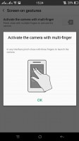
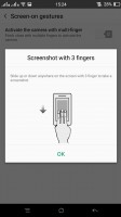
Moving on to screen-on gestures, you can swipe with three fingers across the screen to capture a screenshot or pinch with several (three or more) fingers to launch the camera.
The Smart call options are where motion goes into play and they are very useful, too - flipping the device will mute the ringer, raising the ringing phone to your ear will automatically answer the call and more.
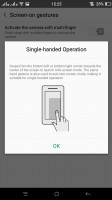
One hand mode is available too, activated by an upward swipe from the bottom left or right corner. When done, this will minimize the UI into a more compact window, for an easier reach with just one hand. It's a lot like Samsung's feature in the Note series, though without the option for resizing. It also doesn't completely turn off the unused pixels to conserve energy, though the effect would probably be negligible.
Reader comments
- Anonymous
- 04 Aug 2021
- y6V
How did you manage to update its os to android 10, coz mine is stock up with outdated os? Please reply.
- Kurnia
- 22 Jan 2021
- SgK
Just upgrade to android 10 and still working good with my 3gb rom and 32 internal memory. So far so good....still happy with my phone
- Mubarak
- 10 Dec 2019
- fuf
Can't update software and even play store can't work


