Oppo Watch review
Battery life and charging
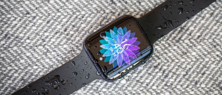
The 46mm Oppo Watch, we tested, has a 430 mAh battery, while its smaller 41mm sibling drops that down to 300 mAh. True smartwatches, which have a proper OS to run apps off, typically sacrifice endurance for features, and the Oppo Watch is no exception. Oppo is advertising a 36-hour endurance for the 46mm unit (30-hours on the LTE one) and 24 hours on the smaller 41mm one.
We can confirm these numbers, almost to the minute. In full-featured smart mode, with quite a few (200+) notifications a day, always-on display off, and automatic heart-rate monitoring, our 46mm unit consistently lasts a day and a half. In other words, it is perfectly suited to go a full day, then monitor your sleep and then be comfortably charged the next morning to repeat the process. Leaving AOD on or using things like navigation or other apps during the day typically left us with just around 24 hours from a single charge.
 Battery saver UI step count
On the other side of the endurance race we have devices like the popular Xiaomi Mi Band, or my current daily-driver - the Amazfit GTR. These are technically not smartwatches, since they don't support apps. They still have smart features, to a varying extent, and can relay the notifications from your phone. What they sacrifice in features, they gain in battery endurance, though, with my Amazfit GRT comfortably going a month on a single charge with the same notification use pattern.
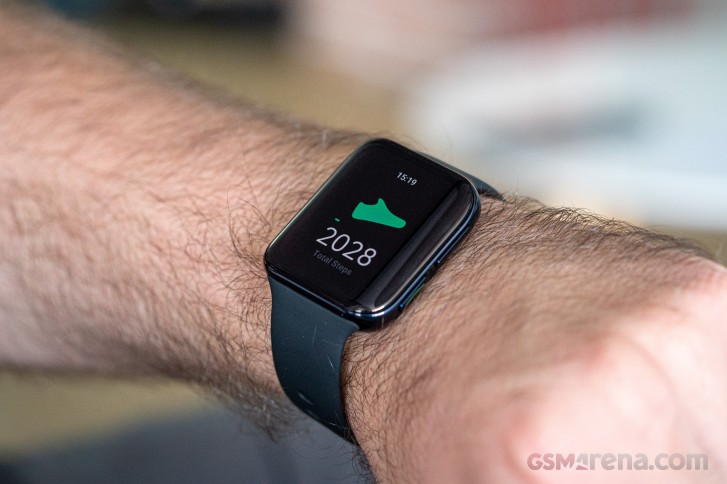
So, Oppo's idea with the Oppo Watch was to create a hybrid device, the best of both worlds, so to speak. By running a secondary battery-saving OS environment off a low-powered chipset, they can offer a much longer battery life than a real smartwatch. In this mode, the Oppo Watch offers a choice of several watch faces, a step counter, a heart rate monitor and notification alerts.
Running in battery-saving mode didn't quite get us the advertised 21 days from the 46mm review unit, but still managed a little over two weeks on a single charge all while delivering a solid experience on the basic feature set, we described earlier. Not a half-bad tradeoff. Going from it back to Wear OS only requires holding down the function button, which is a much better experience. But it does involve a few seconds of waiting for the main OS to boot back up. Unlike the Ambiq Micro Apollo3 SoC, the Snapdragon Wear chip has measurable boot-up times.
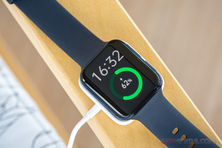
Charging the Oppo Watch is quick and convenient. A full charge takes around 75 minutes. If you just need a quick top-up, 15 minutes on the charger can get the battery up to about 45%.
The pogo-pin-based charging set up doesn't waste much of the 5V@1.5A going into the charger. You just need to be a bit mindful of dirt and moisture on the pins and keep them clean. That's about the only drawback to this solution, as opposed to wireless charging. Well, that and the fact that you need to use the proprietary charger and can't just pull a reverse wireless charging stunt with a supported smartphone.
The charging base itself is a bit bulky compared to some competing solutions, but it does provide good stability for the watch once it is in. The base is attached through magnets, which is a typical approach. Plus, it looks and feels adequately premium to house the Oppo Watch. Which makes sense in our mind.
In case you were wondering, we did try to charge the Oppo Watch while in battery-saver mode, out of curiosity. That immediately forces a restart into Wear OS. Presumably, since Oppo has designed its faster-charging scheme, dubbed Watch VOOC Flash Charging with the use of the Snapdragon Wear chipset and its IC and that's the only, or at least preferred way for charging to take place.
Oppo Watch features
The software experience on the Oppo Watch is a bit of a mixed bag. It has certain nuances that we will get into, but the important bit is that using the Oppo Watch can be either a very straight-forward affair or an extra complicated one, depending on how in-depth you want to explore and use its features.
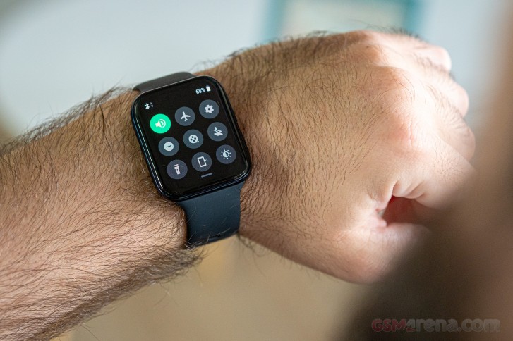
On the simplest possible level, once you power the Oppo Watch on and bring it near most current Android phones, an automatic pop-up to connect it, via the Google Wear app will pop-up. That's an incredibly simple, guided process, which will net you a perfectly functional Oppo Watch. That can mostly be attributed to the fact that it has Wear OS at its core.
Oppo has taken Google's Wear OS 2.19 and customized it in a few ways, to give it a ColorOS flavor similar in looks to the OS that the Chinese model gets. Changes mostly boil-down to some custom watch faces, a different style and layout for the app drawer, and various visual tweaks across the UI. For any existing Wear OS users, the migration should be fluent, since most core features are intact.
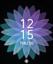
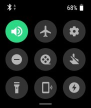

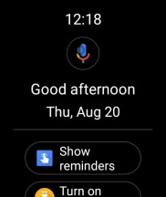
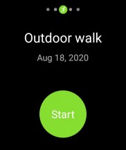
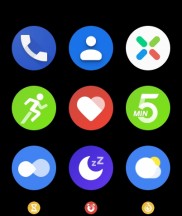
Home screen (watchface) • Quick toggles • Notifications • Google tab • Tiles • App drawer
Swiping down from the home screen lends you in a quick toggles interface. It also shows the currently active connection (Bluetooth or Wi-Fi) and the battery percentage. Swiping up gets you a list of notifications.
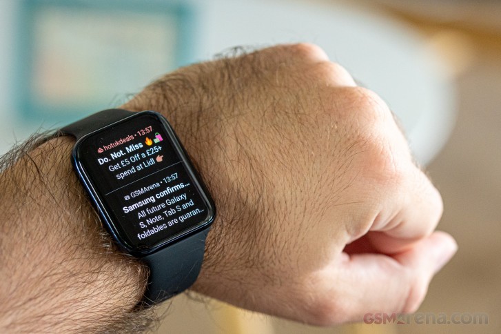
Notification handling on the Oppo Watch is excellent. Notifications arrive quickly and consistently, they are also well organized and sensibly stacked, not to mention color-coded, when the app supports it. Also, there is a constant 1:1 link between the notifications in your phone's notification shade and on the watch. That is to say that if you dismiss something on one device, it will be gone almost instantly from the other, as well. That's mostly achievable thanks to a proper, constant Bluetooth link, as opposed to Bluetooth LE. Which is the reason why many smart wearables can't match the level of intuitive notification handling. Those do save battery in the process, though.
Continuing the comparison with simpler, smart-wearable-style notification handling, Wear OS and the Oppo Watch also offer advanced functionality, like replying to IMs and, generally, all Android notifications that support quick reply. You can either dictate a message, draw an emoji and them pick from a list of suggestions or even touch or swipe-type on an extremely small, yet still passable keyboard.
Swiping right to left from the watch face cycles through a list of widgets, called Tiles. By default, a few are enabled, like Daily activity, Sleep statistics, live heart rate measurement and a shortcut to your last exercise type.
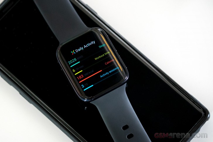
You can freely enable, disable, change and rearrange tiles. Certain third-party Wear OS apps even offer tiles of their own.
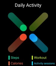
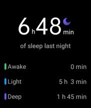
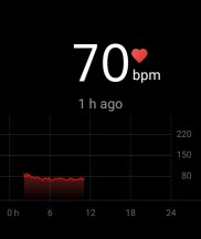
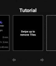

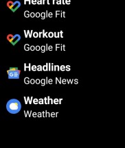
Daily activity • Sleep statistics • Heart rate • Tile management
That about covers the main part of the Wear OS UI - clean, simple and straight-forward. The Oppo Watch, in particular, has a pair of physical buttons to simplify navigation even further. The top one always takes you Home (to the watch face), while the bottom is a Multifunctional key that also consistently has one function, regardless of where you are inside the UI. That function can be customized to various actions, as well as app launching. Since certain Wear apps, like Google Fit have specific shortcuts for individual exercise types made available as selectable quick actions, the system is really flexible.
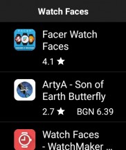
The Oppo Watch includes a few custom watch faces out of the box. Most of these have additional features and variants to choose from. The AI Outfit and Photo faces are especially interesting, since the former can be custom-crafted to match your current outfit, while the latter can cycle through photos or images. There need to be tweaked from the phone companion app, which we will get to in a bit.
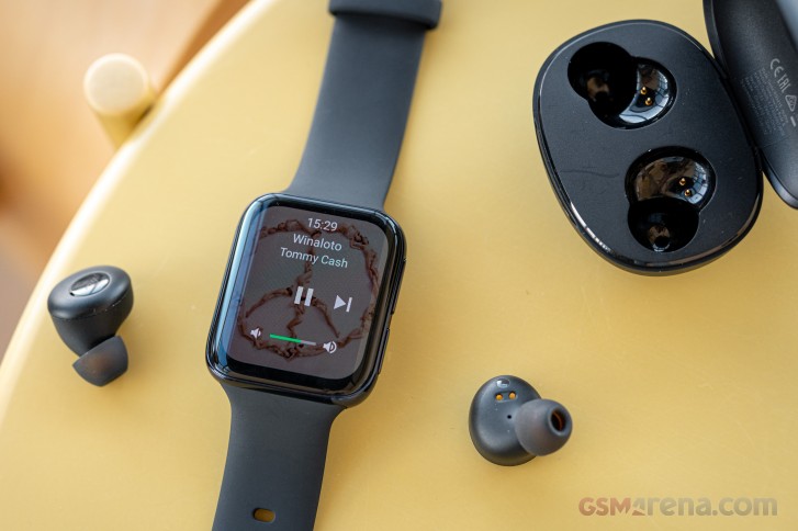
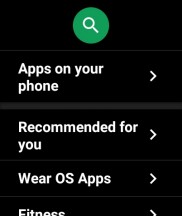
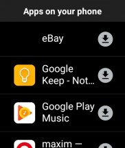
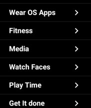
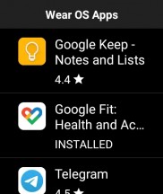
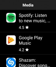
For extra watch faces, beyond the default ones, you can always turn to the Google Play store and its selection of faces and face apps for Wear OS. The easiest way to end-up with a curated list of Wear apps from different categories is to open the Play Store on the watch itself. It even has a nifty menu with suggestions for Wear app counterparts to the apps currently installed on your phone, where available. It turns out my home automation apps were almost entirely supported, natively on Wear OS. Neat!
The connectivity menu will likely see some extra use, since this is where you can set-up a Wi-Fi connection, as a nifty backup, in case your phone and watch are outside of Bluetooth range. It also houses the NFC toggle and the optional location assistance one, which tells the watch to not only rely on its internal GPS receiver, but also get data from the connected phone, when available, for better performance.
If you really don't like the Oppo-customized three-column layout for the app drawer, you can go back to the default Wear OS carousel.

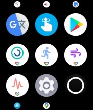
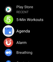
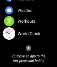
Oppo ColorOS-style app drawer vs standard Wear OS carousel
Unfortunately, there was no way for us to screenshot the battery-saving OS on the Oppo Watch. Its list of features is short and easy to retell, though. The main screen has a watchface, which is customizable, with a limited selection.
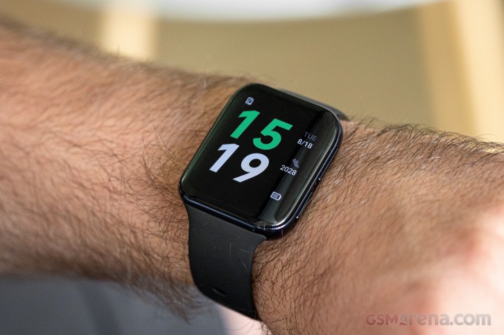 Battery saver UI
Swiping left and right from there, or pressing the top button cycles through the step counter and live heart rate monitor. Swiping up, again, brings-up a list of notifications. No support for replies or 1:1 linking with the phone's notification shade this time around, though.
Holding down the bottom button for a few seconds exits battery saver mode and reboots into Wear OS. That about covers it. Spartan, yet perfectly adequate.
Oppo Watch companion apps and connecting to your phone
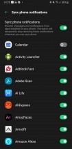
Like we said, using the Oppo Watch is simple. You just add it in the Wear app and start using it. Pretty much all of its core functionality will be perfectly functional, including watch face selection, tile management, notification interaction and activity and sleep tracking.
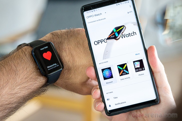
The Oppo Watch will even be happy to sync the latter data automatically with Google health, so you get nifty breakdowns and statistics.
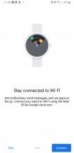
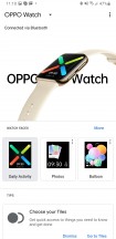
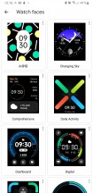
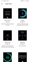
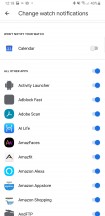
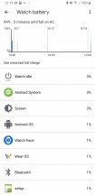
Oppo Watch inside Android Wear app
However, what you are getting at this point is not the entire feature set of the Oppo Watch. A detail we instantly noticed after booting into the Batter Saver OS and lacking any connection to the phone for notifications and activity data syncing.
Makes sense, since we are running an entirely different chipset, with its own Bluetooth radio. On that unlike the main Snapdragon Wear chip uses Bluetooth 5's low-energy profile. Hence, it should require some extra setup. Adding the newly available "LE" device from the Bluetooth menu did not help the situation though.
Turns out, there is a whole other companion app for the Oppo Watch, called HeyTap Health. The only mention we found of it anywhere on the Oppo Watch and its materials was a text, buried inside the empty notification list, within the Battery saver mode. So, not only are we now stuck with a complicated setup, involving two apps, but we had to snoop around to get there. Oppo desperately needs to make this process smoother, somehow.
Getting the HeyTap app also involved a lengthy registration process, with plenty of personal data volunteered to a service we barely know, which we didn't particularly appreciate. Once all set-up, an interesting prompt appeared in the HeyTap Health app, which redirected us back to the Wear app, which now managed to detect the Oppo Watch in its battery-saving "LE" connection mode, as well. Very, very odd behavior, but we did end up with two distinct devices in Wear. Even so, notification and data syncing for the Oppo Watch Battery Saver Mode still seem to pass entirely through the HeyTap Health app, so you can't just go and uninstall it. Why bother adding the watch twice in the Wear app then? Confusing, to say the least.
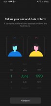
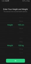
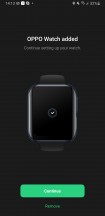
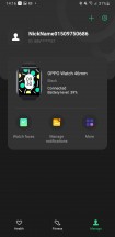
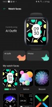

HeyTap Health app adding the Oppo Watch
Even if you can live without ever using the Battery Saver mode on the Oppo Watch, there are more reasons to keep the HeyTap Health app around. For one, it does a more thorough job of syncing sleep, heartrate and activity data from the Oppo Watch and visualizing it in detail.
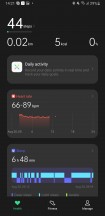
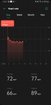
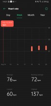

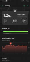
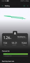
Getting complete tracking data from the Oppo Watch
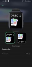
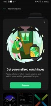
If that is not enough to tickle your fancy, the HeyTap Health app is the only place to control both the custom Photos and AI Outfit watchfaces on the Oppo Watch. The former is a lot simpler. You just need to select an album or a bunch of images for it to cycle.
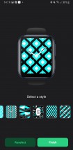
AI Outfit is a lot cooler and has plenty of potential. The way it works is that you snap a photo of your outfit or anything you like color and pattern-wise, really, select a matching region and then wait for the app to give you a few different variations of custom patterns and colors, meant to match what you captured.
It's a killer feature, overall, but it still has its ups and downs. After playing around with it a bit, we can say that it generally nails pattern selection and generation. There is a surprising amount of variety there. However, colors are less impressive for a couple of reasons. The algorithm seems to be making quite a bit of approximation, and more often than not, the watch face colors are a different shade than the object. Also, it errs on the side of caution in terms of color variety. Don't expect amazingly colorful patterns.


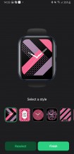


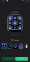
AI Outfit watchface generation test
Activity tracking and performance
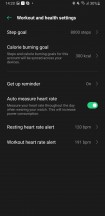
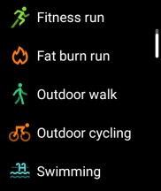
At first glance, the Oppo Watch is a bit light on activity tracking features. The main fitness app only has five modes: Fitness run, Fat burn run, Outdoor walk, Outdoor Cycling, and Swimming. Nothing too fancy, but all of the basics are well-covered. Plus, since this is Wear OS, there are plenty of third-party, specific activity-tracking apps you can download beyond that. Thinks like Strava, for biking.
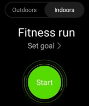
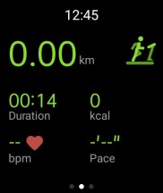
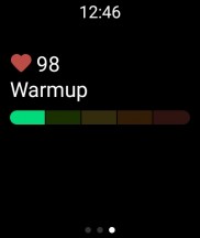
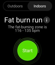
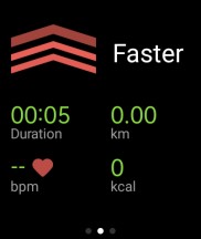
To Oppo's credit, each mode comes with specifically-tailored options, indicating that some effort has been put into them. Fitness run has a selection between indoor and outdoor mode, the latter leveraging the GPS for additional data. You can also set goals, in distance, duration, and calories. A nifty meter tells you which part of the exercise you are in and whether you are on track, based on your heartrate.
The Fat burn run expands on that last functionality, by offering both visual and audio guides, through the built-in speaker or a connected Bluetooth device, for you to seep-up or slow-down, to keep heart rate in an optimal fat-burning window.
Outdoor walk and Outdoor Cycling are both similar and straight-forward. These always use the GPS and support goals, set in distance, duration or calories. Swimming drops the GPS, but adds a lap-length setting.
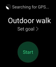
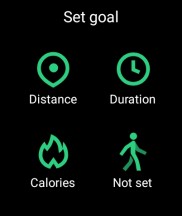
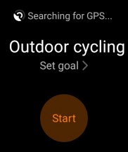
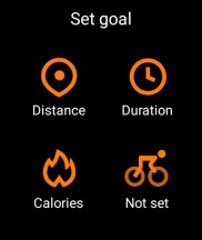
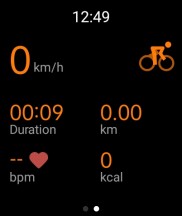
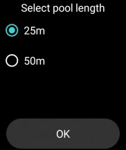
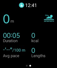
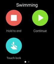
Outdoor cycling, walking and swimming
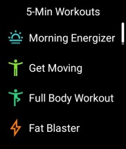
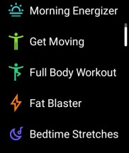
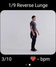
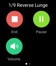
Our Oppo Watch also came pre-loaded with a 5-minute workout app, with a few extra fitness modes. These only come with minimal data tracking from the heart rate sensor, though, and a calorie estimate. The spotlight feature here, though, is the animated instructions, guiding you through each exercise and its repetitions.
In terms of activity tracking accuracy, we have very few complaints from the Oppo Watch. The step counter is accurate to within a few hundred steps, over a day, cross-referenced with a few other devices.
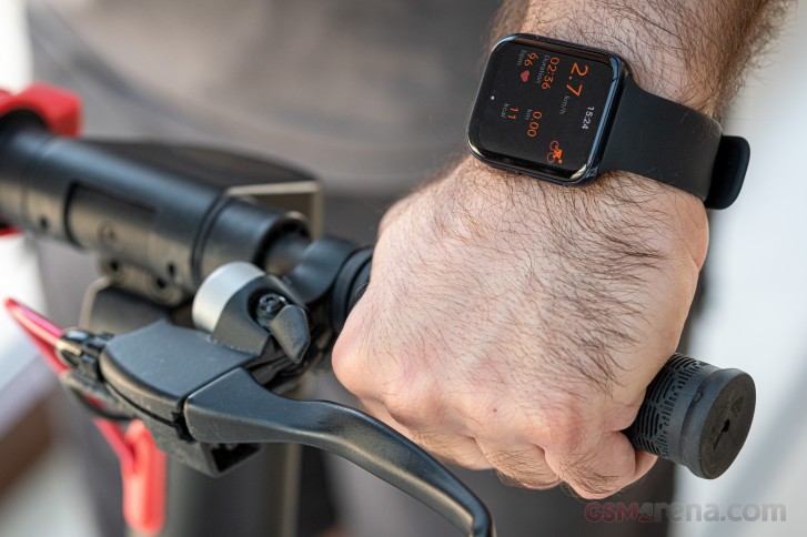
The heart rate sensor is hard to throw-off and rarely gives obviously false reading, even during intense activities. The automatic sleep tracking works well, too, but is weirdly limited to only tracking sleep between 20:00 and 10:00 AM. Aside from that, we have no real complaints in the tracking department.
Reader comments
- Anonymous
- 12 Feb 2022
- XZA
Can we connect with apple ?
- Chowtin
- 26 Nov 2021
- rKd
Can't connect to hey tap health
- Rombert
- 20 May 2021
- 693
Just bought OPPO 41 mm today and feel so much disappointed with battery. Seller was cheating me by saying that the battery life is up to 14 days. But it's less than 6 hours, the battery almost fully drained. How can I say about it?
