Palm Pre review: A pebble in your hand
A pebble in your hand
Modest retail package
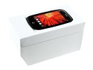
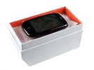
The retail box of the Palm Pre winks at iPhone, save for a slashed corner. The unusual shape is an eye-catcher, and it feels like it was made with shop windows and shelves in mind.
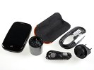
The contents are on the modest side though. The Palm Pre ships with a two-piece charger, a USB cable (it serves the charger too) and wired headphones with a remote/mic. The only bonus piece you get is a black velveteen case with orange inner padding.
Palm Pre 360-degree spin
The Palm Pre doesn't look and feel like the QWERTY slider it actually is. And it's a regular portrait slider too - a true rarity in a world where touchscreen handsets usually get side-sliding full keyboards. The weight of 133 grams is friendly enough and the good hand balance is perhaps the more important thing to note.
Design and construction
OK, to get it straight - it's a Palm phone and the QWERTY keyboard is simply non-negotiable. But the Pre is trying to reinvent touchscreen and a full keyboard is more of an add-on that needs to be out of the way. Last but not the least, the phone needs an identity so it doesn't get lost in touchscreen uniformity. That's too many tasks for the designers already and we guess the Palm Pre pays the price.
First things first: the simple, organic shape works well for the Pre. Nice friendly attitude, a pebble in your hand. If only it looked a bit more stylish.
The all-plastic finish is not to blame here. It's not the basic looks or fingerprint issues either. But the unpleasant rustle and creak of plastic rubbing against plastic every time you slide the keyboard in and out is just too much for the money you paid. And the Palm Pre does wobble - you'll feel it as you do the swipes across the gesture area beneath the screen.
The rounded shape of the Pre results in a bit of kick-slide profile: the slider bends in to give the screen a slight tilt. The phone is quite secure to hold this way and single-handed typing is comfortable.
The 4-row layout of the trademark keyboard has accommodated well-defined keys with adequate press feedback. There's nothing you can do about the limited space but we think the Pre's QWERTY keyboard can give you reasonable comfort and speed of typing. The keys have some kind of rubbery finish so your thumbs won't slip and the arrangement is pretty standard.
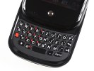
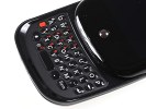
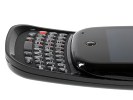
The QWERTY keyboard does reasonably well but makes the phone look ridiculous
The Palm Pre has a 3.1" 16M-color TFT display of 320 x 480 pixel resolution. The pixel count is the same as iPhone's but size is well in favor of the iPhone with its 3.5" touchscreen.
The Palm Pre display, similar to iPhone again, has near perfect sunlight legibility and great backlighting. The keyboard illumination is equally pleasing. Both indoor and outdoor performance is excellent. An ambient light sensor integrated in the earpiece makes sure the display and keypad backlighting turn on when needed. The only difference is notable in direct sunlight where the Palm Pre screen manages to keep colors warmer and more vibrant than the iPhone.
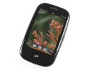
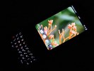
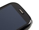
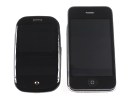
It's a small but vibrant display • Palm Pre next to iPhone 3GS
Just below the screen you'll see the single button, that is the only navigation control the handset has to offer. The whole area around it though is touch-enabled to make the Palm Pre so novel and exciting to handle. This touchpad lets you perform a series of gestures to launch the menu, get one step back in the interface, switch between active applications, etc.
The solitary button is a Home key of sorts but the new logic of the webOS makes it a Task Manager too. You see, the whole thing is a multitasking engine with all applications potentially available on the homescreen. But more on that is to follow as we look closer at the Cards UI.
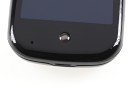
The Center key is THE key, the area around it is touch-enabled
There are small LEDs on either side of the Center key, which are absolutely invisible when the phone is idle. They glow in soft white as your finger sweeps on the Gesture area are recognized.
The left side of the handset features the volume rocker only, while the right hosts the standard microUSB port covered with a plastic lid. The Pre can charge off a USB connection, so you can plug it in to your computer anytime you want.
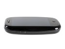
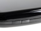
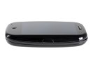
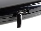
Volume rocker on the left, data port on the right
All there is at the bottom is the battery cover latch. The mouthpiece is in the bottom left corner up front. You can take calls without sliding and the kick-slider form factor has nothing to do with in-call ergonomics. It does provide a comfortable hand-hold for typing though.
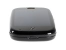
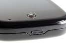
The bottom side with the battery cover latch
Compared to the other sides, the top looks crowded. The 3.5 mm jack, the mute switch and the Power / Lock key are all there. The mute switch is a trademark Palm control, which you get on the iPhone too.
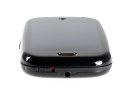
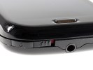
3.5mm jack, silent mode switch and Power / Lock key
The plain backside of the Palm Pre houses the 3 megapixel camera lens, along with a LED flash and an old-school loudspeaker grill. There is no camera lens protection except slight embedding and the whole rear is made of black glossy plastics that cover in smudges in no time.
The rear cover is neat and minimalist, with a nicely engraved Palm logo. It doesn't look or feel cheap but the finger-print issues should be noted.
When you slide the keyboard out, the back of the top part of the phone reveals a mirror surface. It may not be a great benefit but will sure have its uses.
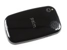
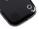
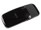
Glossy rear and a mirror at the back of the slider
Opening the battery cover reveals the 1150 mAh Li-Ion battery. It's said to provide up to 500 hours of stand-by and 5 hours of talk-time in a 2G network or 500 hours of stand-by and 4 hours of talk time on 3G. Based on our experience, a single charge will keep the phone going for as long as four days of moderate use.
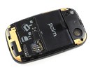
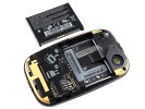
Palm Pre is powered by a 1150 mAh battery
So, we guess we can safely move on to the more exciting part of this review - the webOS, the cards interface and all the multi touch and multitasking we can handle. Design has always been a matter of subjective opinion and you have every right to disagree. We don't mean to say the Palm Pre is failed by its looks but design sure had its ups and downs here.
It's hard to talk about handling omitting the exciting ways to navigate and control the device. But the plastic finish, flimsy slider and the funny looks (bordering on stupid) do no justice to such an inspired and inventive piece of gear. We can't even make up our minds about the QWERTY keyboard. We guess it's reasonably good for the limited space it has to work with.
Anyway, the Palm Pre loves to sit in the hand and is fun and exciting to navigate. There's nothing we can do about the build and finish but that won't change our mind about the webOS. We get busy showing it to you after the jump.
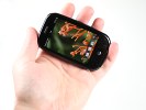
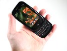
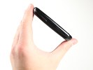
The Palm Pre is palm-friendly and fun but takes build quality too lightly for a smartphone
Reader comments
- AnonD-655782
- 25 Mar 2017
- t}V
I want to repair my phone. Touch pad is not working so want to change it. please suggest where can I get a new touch pad for this phone? or suggest another suitable touch pad.
- oky garis
- 15 Mar 2010
- txx
i like the concept of palm..... its a fresh phone with fresh UI
- HELP!
- 22 Jan 2010
- LyH
PLIZ! can someone help me with this decision? which one do you think is better? -Palm pre plus -Nokia N900 -HTC Hero ok, i don't need a lot of settings, i love the keyboards but hate blackberry, and don't like nokia E72 interface, so my ...
