Poco F4 GT long-term review

Updates
Poco is part of the Xiaomi family; as such, all our usual software-related niggles for Xiaomi and Redmi phones, unfortunately, apply here too. We're talking about update cadence primarily. Our Poco F4 GT European review unit currently runs MIUI 13.0.7 based on Android 12, and it's got the August 2022 security patch level.
We won't bash Poco for not having issued an update to Android 13 already - few companies that aren't Google have. Plus, as usual, we have to note that MIUI is such a heavy skin that most UI changes that Google introduces in every new Android iteration don't even make it through, at least not without some significant changes. That's all fine and dandy. But a security patch level that's more than three months out of date? That's simply unacceptable.
Xiaomi, Poco and Redmi simply have to get better at this. We understand that it takes a lot of work to issue monthly security updates to all devices. Fine. But at least the flagships should. And, let's not forget, the F4 GT is currently Poco's top-of-the-line. And yet it sits there awkwardly in the corner, hopelessly out of date. No bueno, Poco, no bueno.
As for that Android 13 update - it will probably happen. At some point. In 2023 most likely. Should it take less for the brand's current flagship device to receive the latest version of the underlying OS? Definitely. Will Xiaomi, Redmi and Poco ever care enough about this to invest the necessary resources into making big updates happen faster? Well, you know what they say - never say never. But based on how things have been so far, it's unlikely. That investment needs to come from somewhere, and constantly having the cheapest handsets compared to their competitors is not a recipe for big bulky profit margins, is it?

So here's the tradeoff - you pay less for a Poco than for a similarly-specced Samsung, sometimes significantly less, and you get less in the way of software updates. Fair? That's your personal call to make, but we wanted to point out the situation as clearly as possible.
MIUI 13
Now that that's out of the way, let's turn our attention towards MIUI 13, as it lives and breathes inside the Poco F4 GT. It's... MIUI 13. It looks like MIUI 12.5, which looked and felt identical to MIUI 12 before it. We've been saying this for a while now - MIUI already needs a new coat of paint. There have been many years of incremental improvements now, which we have appreciated, but it's starting to feel a little stale.
Of course, we say this as phone reviewers who've already seen MIUI 13 on a dozen or more devices. If you have zero experience with it, you will definitely not feel tired of it for sure. But even on a more objective level, the design language has been the same for a while now - maybe it's time for a refresh? Even Apple kind of, sort of did that when it debuted the Dynamic Island this year.
Functionally, all the bits and pieces you expect in a modern Android skin are there. There are parts of MIUI that are incredibly customizable - like the Reading mode blue light filter and the Always-on display, which we've already talked about, for example. There are a lot of features built-in, and as a consequence, some of them might be hard to find for a casual user who doesn't spend hours digging through Settings figuring out what's where.
Launcher, recents
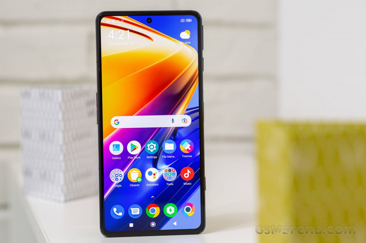
The launcher is the traditional Poco fare, with an assortment of options baked in, but not so many that navigating its Settings ever gets overwhelming. We always thought it strikes a good balance between not being overly simplistic (looking at you, Google) and not being overly confusing (something a lot of third-party options can be guilty of).
There's an app drawer, of course, as you'd expect in 2022, and it even comes with some rather neat options, some of which we enjoy very much (app suggestions at the top), others we've never seen the point of (app categories) - but you might, and if you do, they're there. We like that there's an option for an A-Z scroll bar, as this is, in our experience, generally the fastest way to get to any particular app in the drawer, way faster than searching or manually scrolling, though keep in mind that this applies for those who have 200+ apps installed like we do.
One word of caution if you're copying your data from another device - the Place new apps on the Home screen setting seems to have a random default behavior in the latest builds of MIUI. Sometimes it's off by default, as it should be; other times, it's on - and if you don't check, you might end up with hundreds of apps automatically added to your Home screens once the data copying process is over. If you like your device to be as close to an iPhone in user experience as possible, you'll love that. Otherwise, you should take a peek at the launcher's settings as soon as possible when setting up the phone for the first time.
This MIUI build thankfully comes with the option to show your recent apps in a horizontally scrolling list, although it's not enabled by default. MIUI still insists on a vertically scrolling two-column list by default, and if you love that - great. Otherwise, like us, you'll immediately switch to the other way of doing things since it's definitely the more familiar one, given how every other skin out there employs a similar mechanism.
New Control Center, Dark mode, RGB LED
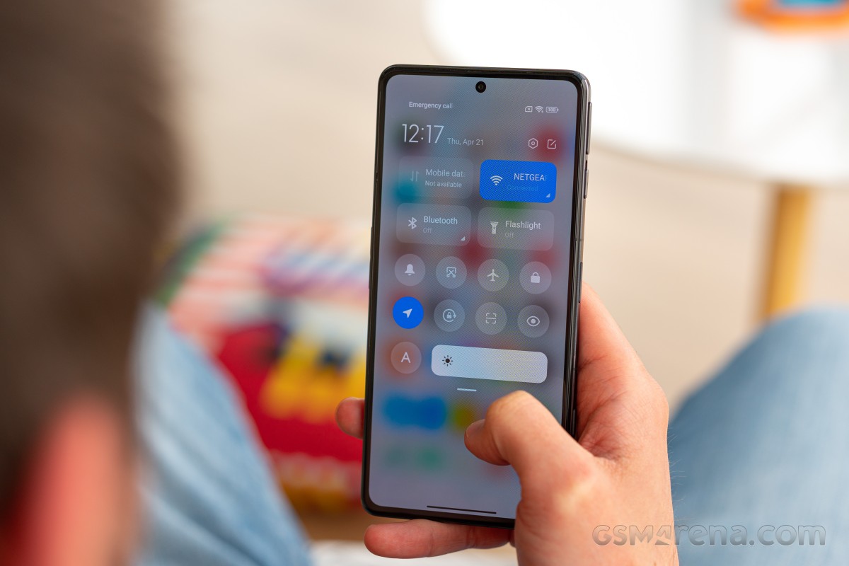
As with all recent MIUI releases, this one too, incorporates the "new" Control Center, a pretty blatant ripoff of iOS' identically named feature. Despite the lack of originality in its design, this works very well, but while we did initially try it on for good measure, we went back to the 'old' way of doing things eventually. It just makes more sense to us to have access to both notifications, and Quick Settings toggles in the same screen - not to mention that because the Quick Settings occupy the top part of that screen, notifications are actually easier to get to without complicated finger gymnastics.
Swiping down from the left for notifications also makes little sense to us since we're right-handed, but if we were left-handed, we'd probably hold the exact opposite view. As it is, between notifications and controls, we need to get to the former much more during the day, and swiping down from the left is just more uncomfortable if performed with the right thumb while holding the phone in the right hand. You, of course, may disagree, and that's why you can go with the new system if you prefer it.
Naturally, there's a Dark mode too, and it's a simple on/off affair here, with no fancy 'degrees of darkness' options like in ColorOS and its derivatives. Still, it works well, it can be scheduled (either with a custom interval or from sunset to sunrise), and theoretically, it can even be forced onto apps that don't have one of their own. In practice, however, there's only one app you can do this to - Amazon Shopping.
That's great because that app is, in fact, in dire need of a dark theme, but back in the day, features like this one used to work with every app - not anymore, for whatever reason, and the selection always seems to be incredibly limited. We don't know what's going on here, but we can assure you that Amazon's wasn't the only app we had installed that didn't have a dark theme of its own.

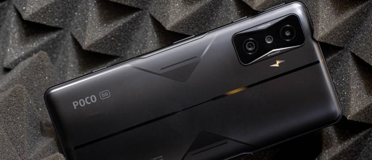
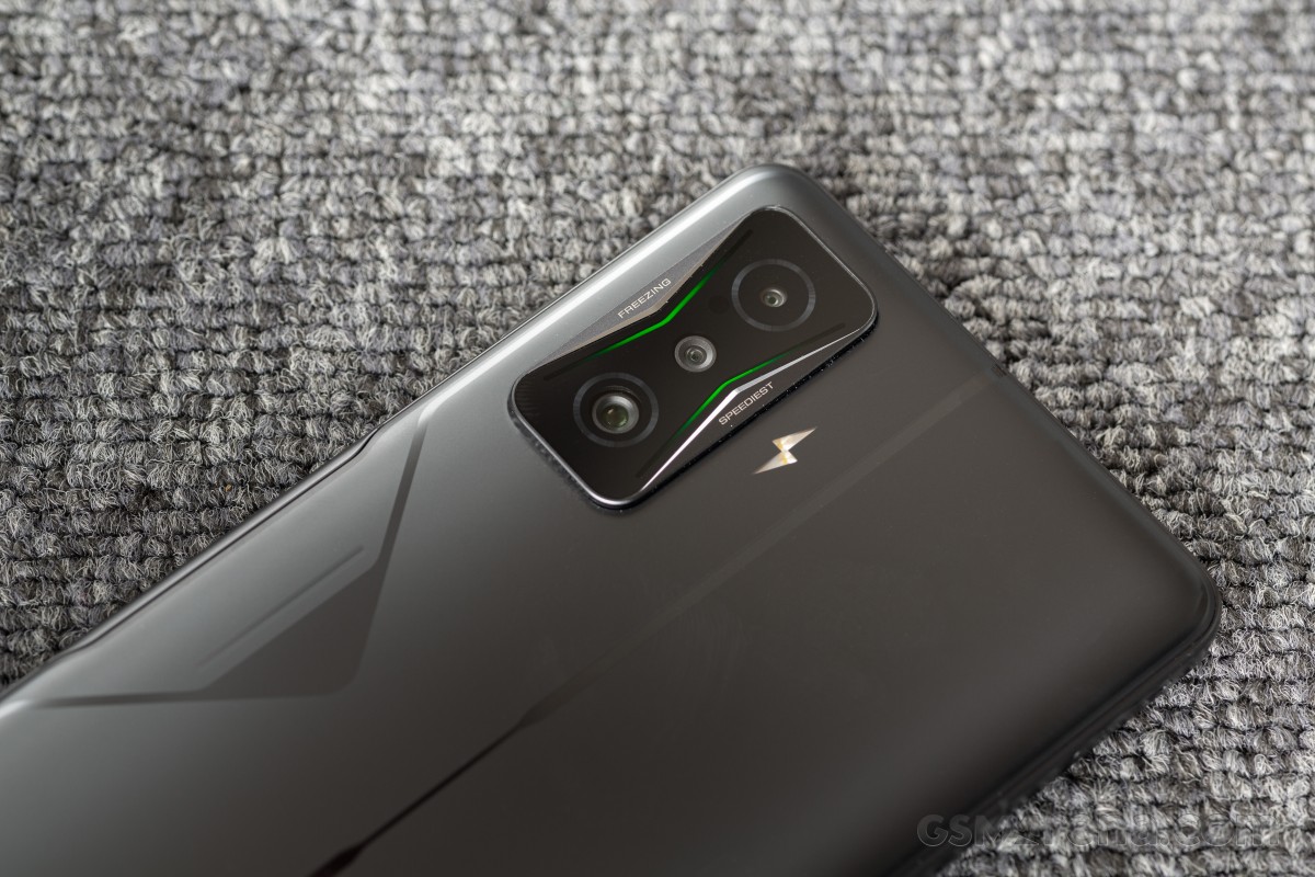
Since this is a gaming phone, it couldn't do without some RGB LED action, and in fact there are two LED strips inside the camera island, which can be set so that they light up when charging, as well as for incoming calls and notifications.
The LEDs can be used on a custom schedule, and they also work while gaming in conjunction with Game Turbo if you want them to - though if you're gaming, you're not actually going to see them, so this is more in order to let other people around you know you have a gaming phone, we reckon. Game Turbo, by the way, is also where you do your custom mapping for the pop-up triggers.
Gesture navigation, other gestures, pop-up trigger customization
Gesture navigation is present on the Poco F4 GT as you'd expect, and it works great, as it's always done in MIUI. You can optionally remove the pointless white 'pill' bar at the bottom if you don't enjoy seeing that particular eyesore very much.
There are other gestures present too, and we'll get to those in a bit, but first, let's just acknowledge how the Gesture shortcuts menu in Settings contains both gestures and button presses in a rather confusing fashion.
That nitpick aside, this is one of those menus that we assume most people never get to, but it has some neat things inside. You can set Google Assistant to come up with a long press of the power button, set the camera to launch upon a double press of the power button or the volume down button or both, and make the LED flash shine like a torch with a double press of the power button.
Then there's the option to double or triple tap on the phone's back for specific things - like taking a screenshot, accessing the Control center or notification shade, opening the Calculator app, going into Silent mode, and so on. The same list of things can also be set to occur upon a double tap of the fingerprint sensor.
These are all undeniably niche features - but once you know they're there, they may prove useful to you in day-to-day life, which is why we wanted to shed some light upon this menu and its contents. You can even assign the pop-up triggers some functions upon double pressing as well as pressing and holding. It's a more limited list that you can pick from here, though - you can start the camera, record video, record the screen, record audio, turn on the flashlight, go into Silent mode, and toggle vibration.
Why are the options here more limited compared to what you can pick for tapping the back or the fingerprint sensor? Who knows. Why these features specifically? Again, who knows. They're clearly a tiny subset of what the phone can do, and we can't say we fully understand how they were chosen, but it's still better to have these options than not to, we reckon. And since none of these are on by default, it's not like they're getting in the way of ease of use out of the box or anything like that.
Going back to the triggers, you can assign them one of four sound effects that will go off every time you unlatch them, and a color animation to go with that, just in case you need to broadcast the fact that you own a gaming phone across the room without uttering a single word.
Bugs
Unfortunately, our time with the Poco F4 GT was not bug-free, as we encountered a few issues. This is sadly becoming a recurring theme with devices from the Xiaomi / Redmi / Poco stable, and we're hoping the companies are planning on improving software quality control in the very near future - it's definitely needed.
Especially as updates are few and far between - it usually takes many months for a new one to appear, which means, at a minimum, that's how long you'll have to live with any new bugs any one of them might introduce. This is yet another reason why issuing more updates would be advisable, but so far, the three brands go their own way in this regard.

Before we start, let's just note the usual caveat - depending on how you use your phone, you may care a lot about one or more of these bugs, or not at all. We're listing all of the issues we found in order to give you an accurate idea of what it was like living with this phone. If you don't care about any of them, great! But if one or more is important to you, then you may want to wait until future updates hopefully fix them before you get this handset.
The most important bug for us was Do Not Disturb (DND) mode simply not working as it should. We had the same thing happen during our time with the Xiaomi 12 Pro, which we've also recently reviewed long-term, so this seems to be a rather prevalent problem in the latest builds of MIUI 13. We'll summarize the problem: DND mode should silence all notifications and allow only those 'interruptions' you set. We did our usual setup, scheduling DND for when we're asleep and allowing only calls to come through - and yet we still heard every single notification. There's not much more we can say about it - it simply doesn't work.
Next up, sound quality over Bluetooth. There are some serious issues with the Dolby Atmos implementation in this phone, and unfortunately, we can't tell you exactly what they are. But what we can say is that we've never, ever had to fiddle with Dolby Atmos settings in any phone with Atmos support before. It's generally on by default, and we left it like that, not ever touching the defaults, and everything was great.
We initially went the same route on the Poco F4 GT, but the music sounded terrible on an assortment of Bluetooth speakers, headphones, and earbuds. For lack of a better word, it was much more tinny than we're used to getting from any phone. And also much quieter. Note that we hadn't changed any settings on the speakers or earbuds since way before we started using this phone.
Our music listening experience was impaired by whatever bug causes this sound that's tinny and lacking any sort of depth. So then we started fiddling with the Atmos settings (for the first time ever, on any phone), and we eventually realized that Voice was the best preset for our ears, paired with a Custom EQ that has all the levels at the top. The latter helped with the volume, but even with these settings, the quality still wasn't the same as what we're used to. It's a weird feeling being accustomed to music sounding a certain way on certain speakers and headphones, regardless of which phone is being used, and then getting a device that just changes that significantly for the worse. Your mileage may obviously vary.
While roaming, we've had issues with the Wi-Fi Calling Quick Setting randomly showing up in the first (leftmost) position, even after we repeatedly manually moved it somewhere else. We assume this happens every time the phone connects to a different network (which tends to happen often while roaming), but it's completely unnecessary behavior and thus, in our eyes, qualifies as a bug.
The pop-up app selector that shows up when you try to open a specific file type seems broken, as tapping the More option doesn't actually give you an app list as it should. Instead, it randomly picks an app for you and instantly opens the said file in that app. This was maddening at first, since our desired app was never on the initial screen, but it seemed to fix itself over time without any software update. So with that in mind, you may or may not ever encounter this.

Finally, a small niggle: if you enter the Mute/Silence mode, an icon shows up in the status bar, letting you know it's engaged. That's all good, but the icon is on the wrong side of the status bar. It's right next to the clock on the left side, which is where notification icons normally live - and this may make you feel like there's constantly a notification waiting for you even when there isn't. We're unsure why all the other system-related icons can live on the right side of the status bar, but this one can't - and the same goes for the NFC icon when that's on. There's ample room for both on the right, no need for their placement to be confusing.
Reader comments
- Kaka
- 17 Apr 2023
- tZj
Try to install Gcam
- Anonymous
- 20 Nov 2022
- fXs
I can still buy a phone from 6 ago at a local Shoprite, South Africa


