Pocophone F1 long-term review
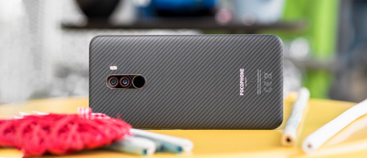
MIUI 10 for Poco
Although Xiaomi is no stranger to Android One phones, it chose to use MIUI on the Pocophone F1, which given its focus on enthusiasts is a weird decision - a lot of people who are into this combo of great specs paired with an amazing price definitely appreciate the perceived cleanliness of stock. On the other hand, a lot of them also like having myriad options for everything, and MIUI definitely delivers on that.
MIUI 10 for Poco is actually a bit different than MIUI 10 on any other Xiaomi device. Its default theme is a little bit more stock-like, but the similarities are skin deep and don't go further than that. The launcher having an app drawer is a very nice touch that means we didn't have to install a third party launcher. It even has the swipe up gesture to bring up the app drawer, although once you're in there the title line which tells you this is the POCO Launcher feels a bit like wasted space.


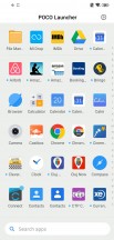
Lock screen • Home screen • App drawer
Anyway, the search bar is on the bottom which aids in usability for a device that has a tall screen, and you can swipe down on the home screen to get to your notifications. We'd have appreciated a setting to enable swiping down on the fingerprint sensor to achieve this as well, as that would have been possible to perform even while you're inside apps.
The Quick Settings tiles have a blue accent, to go with the whole more stock-like theme, and you can swipe notifications to dismiss them - but only from left to right because you always need to remember that even though it may look more stock-like than in the past, this is still MIUI.

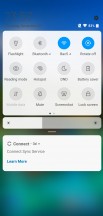
Notification pane • Quick settings
The notifications themselves have nicely rounded corners (which they also do in Google's Android Pie), but we can't talk about notifications without mentioning one of the Pocophone's biggest issues. That is the fact that you are only getting notification icons in the status bar for a few seconds, as each one comes in. Believe it or not, this is a new feature of the Android Pie update for the Pocophone, it used to be even worse before when you would never ever see any notification icon over there.
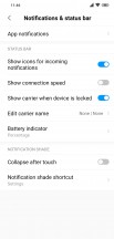
New setting for momentarily showing notification icons
A lot of people lashed out at Google when it moved the clock to the left of the status bar in Android Pie, and allowed only a total of four icons to fit in there next to the clock, but that's four more icons you're getting than in the Pocophone - plus, in Google's system you have a dot after the four to let you know that there are more notifications waiting.
You get none of that here, and this can be incredibly annoying if you're coming from another Android phone. If you're switching to the Pocophone from iOS you'll probably feel right at home, though, and notification dots are an option for app icons. Yet since there's an app drawer here, the chances of you seeing that dot on top of the icon of an app that you don't have on your home screen are probably quite slim.
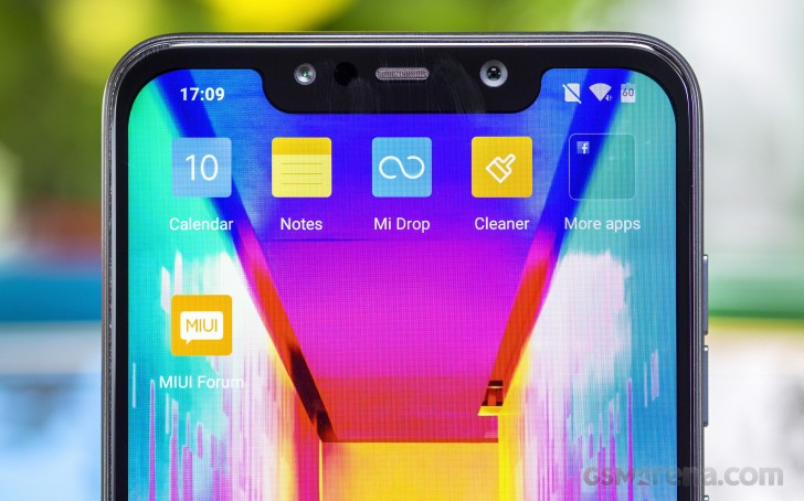
This is a pretty big usability issue that's unlikely to ever fully be fixed because there simply isn't enough room on the left of the notch to fit the clock and more than one or two icons anyway. And that brings us to the notch itself - we would have chosen a narrower cutout if that meant more icons being able to fit in that space, even if this would have resulted in the IR camera for face recognition being dropped. That tech still doesn't work in Europe, so it's not like we would've missed anything.
Switching gears, let's say that Xiaomi's full screen gestures system is probably the best out there, and this is for one specific reason - the way "Back" works. Since taller aspect ratio screens have become the norm, a lot of people do plenty of finger gymnastics to be able to reach various parts of the display, and this is most uncomfortable when you have to reach the top or bottom.
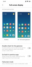
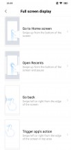
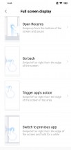
Xiaomi's Full screen gestures explained
Since "Back" is an action that's used a lot in day to day interactions, having to reach to the bottom, even to then swipe in some manner, isn't ideal. But with Xiaomi's system, you don't have to. You go "Back" by swiping from either the left or right edge of the screen. It even has a nice animation, and this means you can easily go Back no matter where your finger may be on the screen - no more gymnastics. It's a small thing, this, but a real boon for usability.
The other two gestures are similar to most of the other systems out there - to go Home you just swipe from the bottom, and to reach the multitasking menu you do the same but pause. Both of these work well, although the way the recent apps display is laid out feels like needless differentiation 101. The entire mobile world is settling on horizontally scrolling in this view, yet Xiaomi not only does vertical scrolling but also lays two apps side by side. This just results in every app switch taking marginally more time because locating the one you're trying to get to requires you to scan two columns and not one.
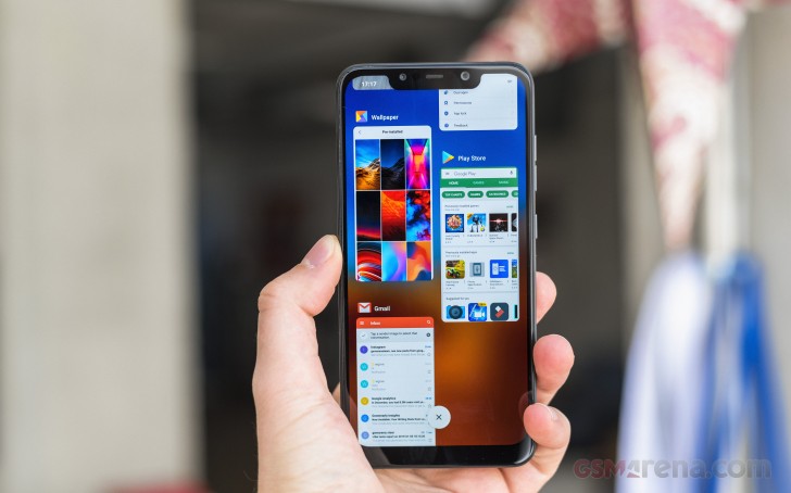
Quick switching to the previously used app is possible, by using the Back gesture and extending your swipe a bit more then pausing, after enabling the "Go back to previous app" option in Full screen display settings. We found this usually takes a little bit longer than feels comfortable, but you may disagree.
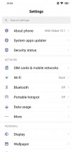
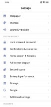
The Settings menu has a search bar which is handy, and its layout is different than what you'll find in other skins, but pretty easy to get used to. You used to be able to "hide" the notch but in MIUI 10 with Android 9 Pie this is gone. It's not a huge problem anyway since the Pocophone has an LCD screen which means the trick doesn't work as well as on AMOLED panels because the blacks up top aren't truly black. The 'ears' or 'horns' are also so small that you may not find them off-putting after a few days even if you otherwise don't love notches.
There's an Ambient display option which is great in theory but since this is an LCD that will consume way more power than on an OLED panel (since all the pixels need to be turned on at all times), so use this with extreme care.
Thankfully you can schedule it to automatically turn on and off at preset times. And if you're still not comfortable with it, there's a Wake Lock screen for notifications option that might serve you better.
Updates
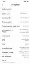
The Pocophone F1 has already received a few updates - both the minor, bug-fixing variety, as well as a couple of major ones: MIUI 10 first, then Android 9 Pie. At the moment our review unit is on the November 2018 security patch level, which is decent but not current. Expect this trend to continue - you will probably receive more security updates, but you shouldn't expect them to come every month, nor to ever be in line with Google's releases.
On the other hand, because Xiaomi is very good about supporting its devices with new MIUI releases for years, you won't be missing out on new features it might introduce in the future.
Reader comments
- Teutates
- 18 Oct 2023
- 0p}
Hi. I bought this model when they started producing it. Price $310. This is my second Xiaomi. The best thing is that if something breaks, they fix it right away. IPS is great, safe phone, battery in very good condition, I've been using it for 5 ...
- GeorgeFernandez
- 24 Sep 2023
- vxL
Omg me too. It just keeps chugging along.
- Jay K
- 29 Jul 2023
- 7tR
I bought it in 2018. It's frustrating that phone isn't breaking to allow me buy a newer version!
