Punch hole vs notches - is it really better?
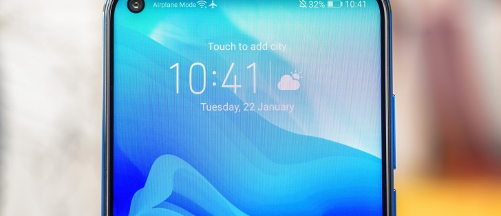
First it was taller screens, then notches and now we have a new trend punch holes as the next stepping stone before all screen front panels become a reality. But how much of an improvement over waterdrop notches are they and is it worth holding your breath for? We did the math to find out.
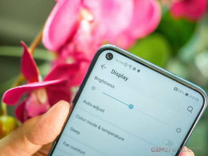
We compared the display real estate that punch hole cameras use as well as the total amount of screen space wasted. You see while the punch hole is circular it means that no UI elements can be displayed in the corner of the screen that it occupies.
In much the same way phones with notches don't typically display anything in the area where the sloping edges are and from a UI perspective the area used is a rectangle, rather than a waterdrop or regular notch.
 Unused area
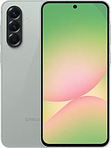
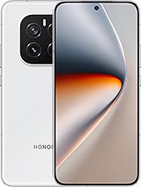
We did our calculations using two of the phones with punch hole cameras announced already as they represent the two ends of the size spectrum - the Honor View 20 has the smallest circle, while the Samsung Galaxy A8s has the largest. We've also used some of the more popular devices from the classical notch shapes to put those numbers in perspective.
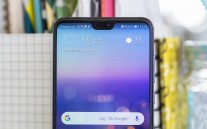
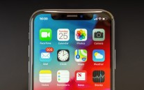
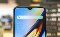
Huawei P20 Pro • iPhone XS • OnePlus 6T
| Phone | Honor View 20 | Samsung Galaxy A8s | Oppo R17 Pro | Huawei Mate 20 | Huawei P20 Pro | OnePlus 6 | iPhone XS | Huawei Mate 20 Pro |
| Type | Punch hole | Waterdrop notch | Small notch | Regular notch | ||||
| Hole/notch surface | 16mm² | 35mm² | 39mm² | 40mm² | 73mm² | 101mm² | 157mm² | 159mm² |
| Total wasted space | 40mm² | 72mm² | 71mm² | 74mm² | 102mm² | 122mm² | 163mm² | 175mm² |
As you can see, the gains in both sheer size and wasted area are there, but in the case of the Samsung Galaxy A8s they are quite minimal. The Honor View 20, on the other hand, with its hole of just 4.5mm compared to the 6.7mm on A8s, is a proper upgrade. It wastes nearly half as much space as the Oppo R17 Pro's waterdrop notch and less than a quarter of what the iPhone XS's huge cutout does.
We should also keep in mind that the punch hole cameras have only been used on three phones so far and they are all mid-ranger with IPS LCD panels. Chances are it can be done even better on a premium phone, where production costs are less of a concern.
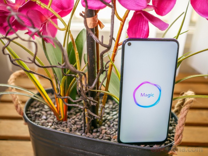
Yet, there are a couple of other things here that we need to mention. The first is symmetry - a camera hole in one of the corners of the display creates an imbalance and some will certainly find it ugly.
On the other hand, when watching videos or playing games, the area in the corner of the screen will rarely contain anything of value, whereas the middle (where notches stand) will contain important stuff way more often.
So the usability is certainly in favor of the punch hole design, even if aesthetics might not be its forte. It all boils down to what you value more then.
Related
Reader comments
- Mahfooz
- 15 May 2022
- XND
Brother does it gives comfort to our eyes?
- abc
- 08 May 2022
- XMr
I personally prefer notch cause in my opinion it looks better
- sin
- 20 Nov 2021
- N5a
Nether big bezels are by far the best camera can fit on them with stereo speakers just make better use of the bezels i hate Punch hole & notches and never buy a phone with them





 Motorola
 Samsung
 OnePlus
 Honor
Honor Samsung

