Razer Phone 2 review
Design and 360-degree spin
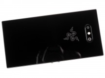
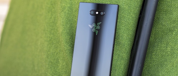
In many ways, the Razer Phone 2 constitutes a rather unique design offer. That's if you ignore the original Razer Phone. This is really shaping up as a recurring theme in the review, facts are facts. Dimension-wise, practically nothing has changed. The Razer Phone 2 still employs the same industrial "metal slab" design, complete with mostly straight lines and edges and an all-black, muted, stealth-jet-fighter-like appearance.
That is a double-edged sword right there. Just like the design of the gaming PCs isn't up to everyone's taste, the Razer Phone design definitely won't hold a universal appeal on the smartphone market. Now, the PC gaming scene might not be our usual forte, but we kind of know who we are dealing with here and will gladly admit that calling yourself "the world's leading lifestyle brand for gamers" unironically, is kind of off-putting for many, in itself.
Still, one thing is undeniable here - whether you personally like it or not, Razer has, by now, pretty much perfected its industrial gamer-y design. So as we said in the original Razer Phone review, it's kind of unsurprising that Razer nailed the look on the first try.
Speaking of unsurprising things, the decision to stick with the same design and especially dimensions for at least a couple of product generations is not a new one, nor was it kept a secret. On the contrary, once project Linda - the laptop-style shell accessory, for the Razer Phone saw the light of day, the company reassured fans that it would remain relevant for at least one more generation of handset hardware.
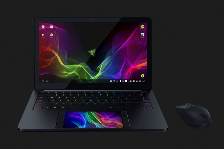
That being said, it is, perhaps, worth noting that the official dimensions for the original model (158.5 x 77.7 x 8 mm) and the Razer Phone 2 (158.5 x 78.99 x 8.5mm) do show some slight variations. Nothing too severe, but potentially enough to make any Razer Phone cases fit a bit oddly. Other than that, having seen Project Linda and the padding it uses to line the phone dock area, readjusting it shouldn't be much of an issue, even including the motorized Type-C connector, which won't be affected by the extra half a millimeter of girth on the Razer Phone 2.
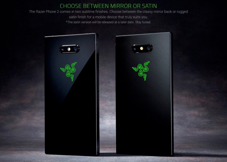
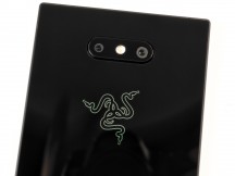
But, I think we might have gotten a bit sidetracked. Nothing that a quick and instantly sobering look at the RGB Chroma-compatible logo on the back of the Razer Phone 2 can't instantly fix. Remember, Razer knows its target audience extremely well and we have a hunch that putting RGB on the phone and matching the lighting on the new Qi charging were probably just as high on the Razer Phone 2 RnD list, as the new internals. Frankly, we dig it as well. Just a little bit.
The new Gorilla Glass back surface, complete with different camera placement is the biggest change in the second generation handset. One extra perk, made possible through the shift to glass for the back - Qi wireless charging. As per specs, it caps out at 11.25W, which is quite high as far as Qi charging goes.
The back surface itself feels great and quite sturdy, but it is a fingerprint magnet. You can probably expect to only see it pristine in the few short seconds after taking the phone out of the box. After that, all bets are off, especially if you are in the habit of munching during game sessions. That can be remedied with a case and you probably want one for the extra grip and control as well.
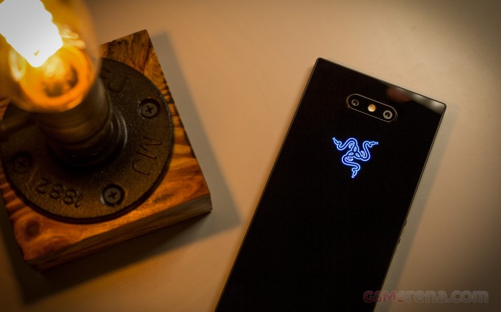
Razer mentioned that a "satin" finish version of the handset will be released at some point in the future as well, which could be another way to go about things. Then again, we have no doubt that you can find a good skin sticker for the regular one as well, if you are into that.
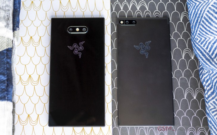
Speaking of extra grip and control, this is probably our biggest grudge with the Razer Phone 2. Upon first glance, the boxy design looks great for handling. After a few extensive gaming sessions on it, however, we can definitely attest to the opposite. The pointy edges tent to burrow down into your palms, leading to fatigue. This was somewhat of an issue with the original Razer Phone as well, but it's the new-found glass back that really ruins handling, since it makes the phone really slippery. A case really is a must. Perhaps even a Bluetooth controller, if you don't like hand cramps.
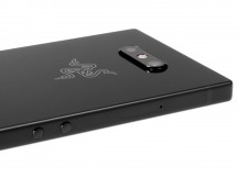
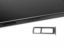
Left hand side • SIM and microSD card tray
Experiencing ergonomic fails on the Razer Phone 2 is particularly frustrating, considering so many aspects of its design are specifically tailored to accommodate horizontal use and mostly gaming. Like the volume buttons on the left side, with their seemingly odd location and with a rather unconventional shape and size. These are quite small, round and "clicky" - definitely not as convenient as a wide volume rocker, but also not in the way while gaming. Razer figures that having these buttons out of the way and preventing accidental presses during game is a lot more important to gamers than making them convenient for all other situations.
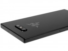
Right hand side and power button/fingerprint reader
On the right-hand side is the power button that doubles as a fingerprint reader. This is another familiar feature from the original Razer Phone. Unfortunately, it seems to sit almost flush with the rest of the frame this time around, making it hard to feel around and find. However, that also potentially makes in a bit harder to miss-click while gaming. The reader itself is very snappy and accurate.
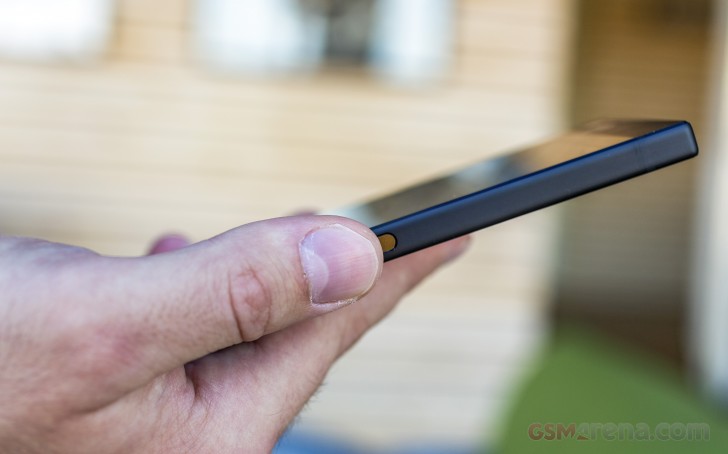
We only wished Razer would include some modern authentication alternative as well, like face recognition. Currently, you are only stuck with Android's standard patterns, pins and Smart Unlock. It simply feels lacking on the competitive 2018 flagship scene where everyone is rushing to provide all sorts of creative biometric solutions.
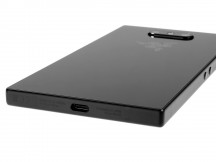
On the bottom of the phone - a single pinhole for the main microphone, which had to be distanced away from the bottom speaker and next to it - the USB Type-C port. Around the top - another microphone hole. Unfortunately, if you were hoping to see the 3.5mm jack make a sudden appearance on the Razer Phone, it is still, very much missing. Razer does still ship with a very premium Type-C to 3.5mm adapter.
The front of the Razer Phone 2 looks all too familiar. No curved displays or notches in sight. In fact, there is still a rather thick inner bezel, surrounding the 5.7-inch display, which makes for a rather deceptively "non-premium" look. Any such notion, however, quickly disperses once you actually see the gorgeous 120Hz, IGZO panel in action. But, more on that in a bit.
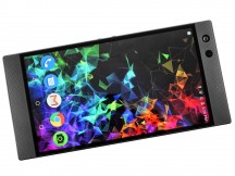
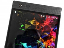
Front side • Huge bezels and speaker grills
One thing we really hoped Razer would re-style this time around, at least a little bit, was the huge front speaker grilles. Again, we are sure that the particular look holds a certain appeal. Plus, we definitely appreciate its functional nature in covering the pair of dual amplified, Dolby Atmos, front-firing speakers. Those are great for both gaming and multimedia and really loud in person. However, it just looks outdated on a 2018 flagship, even one as different as the Razer Phone 2. And it's also really easy to get grime and various small particles trapped in the grille.
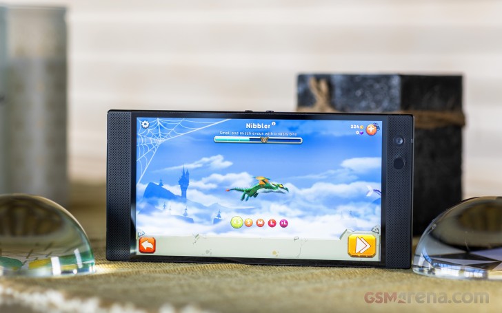
After only a few days of use of the original Razer Phone 2, the two chins start looking rather nasty and perpetually dirty, and there's not much you can do about that. You don't want to rub the grilles with anything chemical, since these are stickers placed above the speakers and will come off and wrinkle up quite easily.
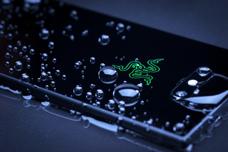
Interestingly enough, even with the significant number of tiny holes on the front, the Razer Phone 2 still managed to earn an official ingress protection rating. IP67, to be exact. That's a clear upgrade over the original.
Reader comments
- Anonymous
- 05 Feb 2025
- Nu6
I can't use mine again because I got no way of charging it can anyone help please.
- Anonymous
- 13 May 2021
- msg
i love this phone
- Anonymous
- 30 Apr 2021
- TdQ
i had this phone sins 2018 and i love it but the screen shattered but i did drop it of a balcony but i love Razer products
