Realme GT Neo 3T review
Design and handling
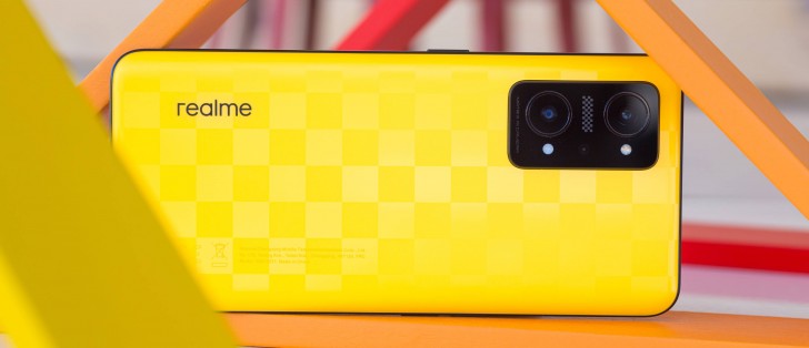
Aside from the new paint jobs, there's hardly any difference between the Realme GT Neo2 and the Neo 3T. Dimensions and weight are pretty much identical, and so is the back design. The panel on the back and the frame remain plastic and a Gorilla Glass 5 sheet protects the front.
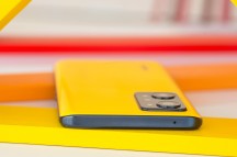
The slightly curved back design and the side frame's finish help with the grip to some extent, although the frosted finish, which imitates AG glass, is somewhat slippery. No way around it. It does feel pretty nice to the touch, though. This time around, two of the color options are of the "fancy" type. The Dash Yellow and Drifting White adopt a racing flag design in contrast to the racing stripe design on the Neo3. Realme allegedly used fluorescent particles to make those two color options to achieve that bright effect under strong sunlight. The Shade Black, on the other hand, is a more conservative color for anyone not into the car racing theme.
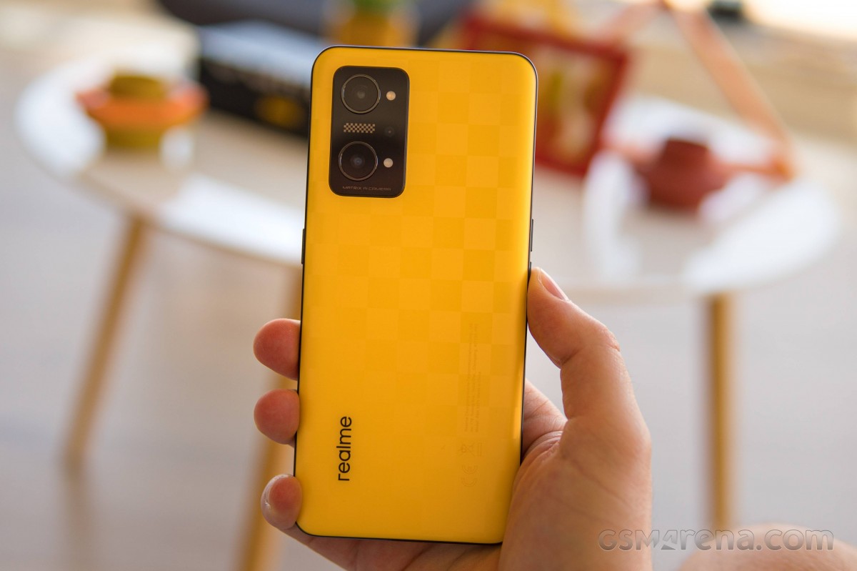
Sadly, there's still no ingress protection, and for a 6.62-inch device with a plastic build, 195 grams come off as a little hefty.
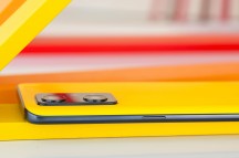
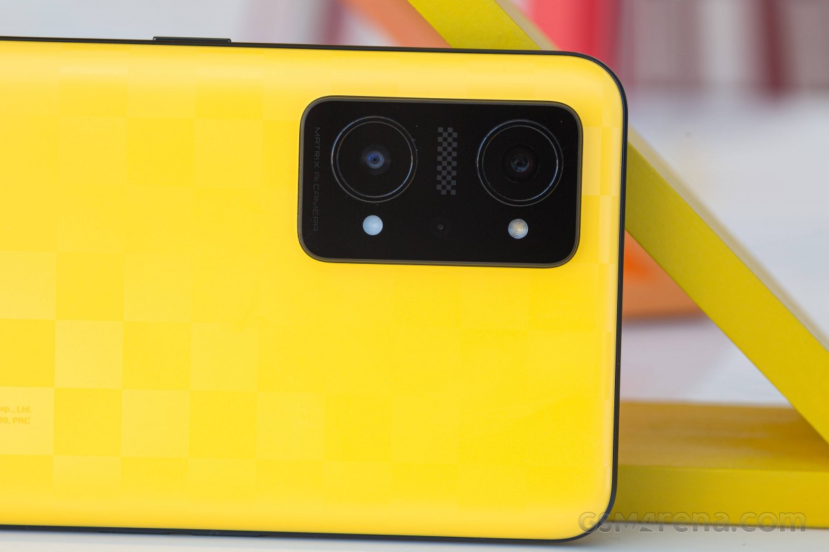
The camera island is identical to the GT Neo2 and follows the same design language as its 2022 siblings as well. The main 64MP sensor along with the 8MP ultrawide camera stick out within separate metal rings, while the macro shooter and the two LED flashes are positioned symmetrically next to them. The module itself protrudes quite a bit and causes the phone to wobble on a flat surface.
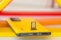
There's nothing out of the ordinary around the sides. The patterned power button is placed on the right and sits right within thumb's reach. The left is where the volume controls are, while the bottom houses the USB-C connector, the main speaker grille and the dual SIM card tray. No room for a microSD card in there.
Speaking of positioning, the fingerprint reader is once again placed too close to the bottom edge of the display. This requires some awkward thumb gymnastics or holding the phone too close to the bottom half.
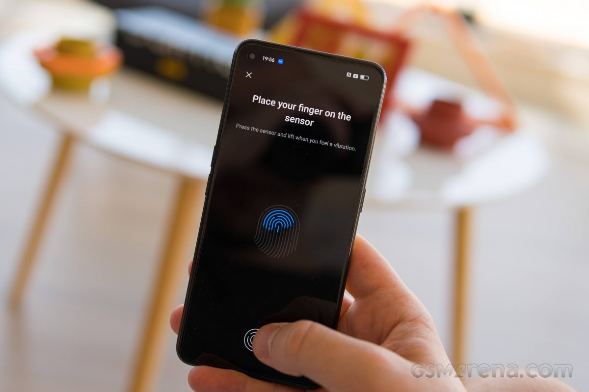
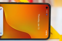
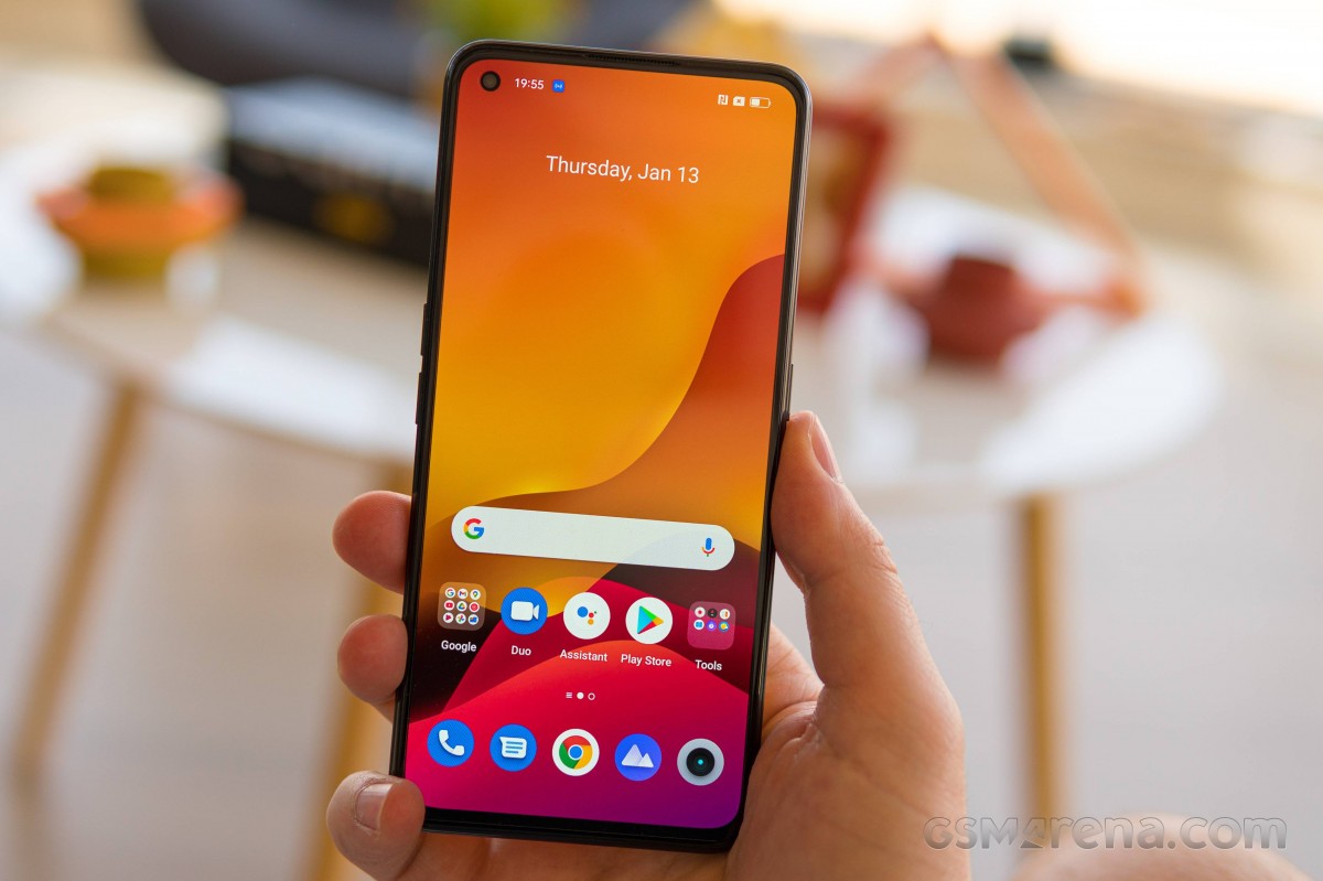
Since the handset shares the same display as the Realme GT2, it's no surprise that the frontal design is identical as well. There's an off-centered punch-hole for the selfie camera, thin side and top bezels that look quite symmetrical while the chin is still thicker than the rest.
Our conclusion of the overall design remains the same as last year's, of course. There's nothing inherently wrong with the chassis, it's built in line with the current trends, and the racing flag designs may appeal to some. If we were to get nitpicky, we would have expected a lighter build and higher fingerprint reader placement. There are some rivals that have some sort of ingress protection too and use more premium materials.
Reader comments
- Jadran
- 10 Mar 2023
- SXm
Thanks for this honest review! Speakers and screen ain't enough to justify the price, and appears that there are more disatvantages all over.
- Vipxpert
- 14 Dec 2022
- bId
A big notice that you have to disable show pointer settings or it'll be terribly lag. I've just notice this after a few months using
- Pj
- 10 Dec 2022
- 7j%
After 2 months of Usage Plus Speakers Camera Quick charge Minus Battery backup (12 hours) Performance not good ( phone just froze for 30 minutes when I was just watching insta reels) Even simple games like shadow ninja 3, ...
