Samsung Focus 2 review: Taking it easy
Taking it easy
Telephony is good
Much like with most Samsung phones the in-call quality and signal reception on the Focus 2 were great.
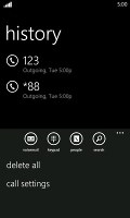
The phone application shows you the call history, with shortcuts to voice mail, dialer and phonebook. The phone live tile will show the number of missed calls as will the lock screen.
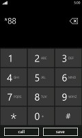
The dialer itself is as simple as it gets - a phone keypad with a Call and a Save button. The lack of smart dialing is an annoyance, but the People hub is good at finding contacts.
You could use voice dialing instead - the Focus S did well in recognizing our commands, though it did have issues separating the two Dexter's in our contact list - "Dexter" and "Dexter Morgan". Still, it did recognize the unusual name "Mandark".
An interesting option is the International assist - it comes in handy for dialing while abroad or calling someone outside the country. What's missing is the ability to set any song from your collection as a ringtone - a feature some of you might miss. You can download new ringtones from the Marketplace though (possibly at some cost though).
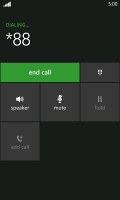
During a call you can always exit to the homescreen to open an app, your contacts or anything else you might need. To get back to the call just selected the call notification at the top.
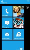
In-call screen on the homescreen
When there's an incoming call, the contact's photo will appear full screen and you can slide up to reveal the answer and reject call buttons. This will prevent any accidentally answered or rejected calls.
A quick note - status indicators are hidden by default (except the clock) but you can bring them up with a quick tap on the very top of the screen.
All-round messaging
Messaging is a strong side in Windows Phone. Threads are the building blocks of all non-email messaging. Although a sort of conversation view, threads mash together SMS, Facebook and Windows Live messages.
That's the thing about Windows Phone: the Messaging hub removes the old division between texts, IMs, social messages. The other hubs do the same for the other functionality, making the whole thing simple yet powerful.
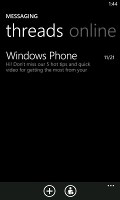
Anyway, Messaging is separated into two tabs - threads and online. Online shows you who's online with the people you've talked to most recently on top. This makes finding someone to talk to very easy.
Threads is where this hub's impressive features kick in. A new thread is created for each person you start a chat with. Messages are displayed as speech balloons and a label on the left shows the type of message - text, Facebook or Live Messenger. Labels are placed only when the conversation moves to a different platform so it's not cluttered.
You can choose which platform to use to send a reply and the text box will remind you what you're currently using with a message like "chat on Facebook". Individual messages can be copied (the whole message is copied to be pasted later, you can't copy only a part of the message), they can be deleted or forwarded. Whole threads can be deleted too.
You can't attach anything to Facebook messages, you'll need to use MMS for that.
The visual voicemail functionality is also part of the new OS (that is dependent on the carrier and your plan). It works as you would expect, by letting you read your voicemail messages instead of listening to them.
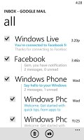
Email integration is a corner stone of any smartphone OS out there. Windows Phone doesn't lag behind here either. You can link multiple inboxes (and unlink them individually later), so that you have a single place to check for new messages - those include the most commonly used such as Gmail, Yahoo, Hotmail and others.
Linking several inboxes will also automatically combine their live tiles. You can browse individual folders for each account, which lets you view messages from only one email account even if it's linked.
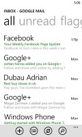
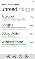
Email main screen • Linking inboxes
Conversation lists emails between you and a contact chronologically, grouping them by subject. It's the display style that Gmail popularized and is the best way to keep track of a conversation over email.
Each email conversation is listed with a subject and number of messages, plus how many of those are new. A tap on a conversation expands it to show the messages plus a line from each message.
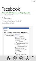
Viewing an email is pretty straight-forward - it displays the content of the email and atop it the subject and sender of the mail.
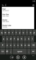
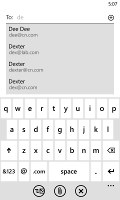
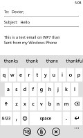
Creating a message is very simple too - just starting typing a contact's name and you'll get an automated suggestion box with names and emails. Type away and send your message, that's it.
Marking emails • Email options
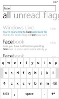
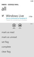
You can tap on an individual message to read it, as well as skip messages back and forward to navigate the conversation.You can also mark individual emails, make them read/unread, set flag, clear flag and more. Finally, you can search your entire mail for individual emails - it's a very useful feature, especially for those with large inboxes.
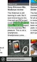
Selecting text is very simple, but does require some getting used to - there's no double tapping here. Hold your finger over some text for a second or two and then release. The text area gets highlighted and then you can move the beginning and end cursors to adjust how much text you want to select. A little icon pops up for copy and the selected text is available to paste anywhere in the OS.
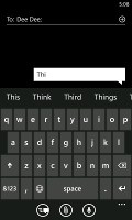
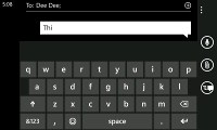
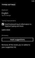
Text input on Windows Phone constitutes of the default QWERTY keyboard and offers portrait and landscape modes - that's it. The layout remains the same on all WP devices and the only options you have are changing the language of the keyboard and resetting the dictionary that displays word suggestions.
The WP QWERTY keyboard is very comfortable to use and offers sound feedback. There's no haptic vibration feedback and there's no way of enabling it.
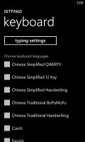
You can also choose from a variety of foreign (other than English that is) languages and choose to reset suggestions in case you've overwrited a word you shouldn't have.
Reader comments
- AnonD-65720
- 05 Aug 2012
- U@J
hey guys... I wanted to go for a windows phone, and i really like this one. Where can i get one in India? Or is lumia 710 or htc radar BetTer? Plz help.
- SiddharthAnand
- 02 Aug 2012
- Q6x
Hasn't Skydrive been reduced to 7GB? In the review it is mentioned Skydrive Cloud with 25GB.
- amede
- 10 Jun 2012
- n3a
very very nice
