Samsung Galaxy A54 review

Design, build quality, handling
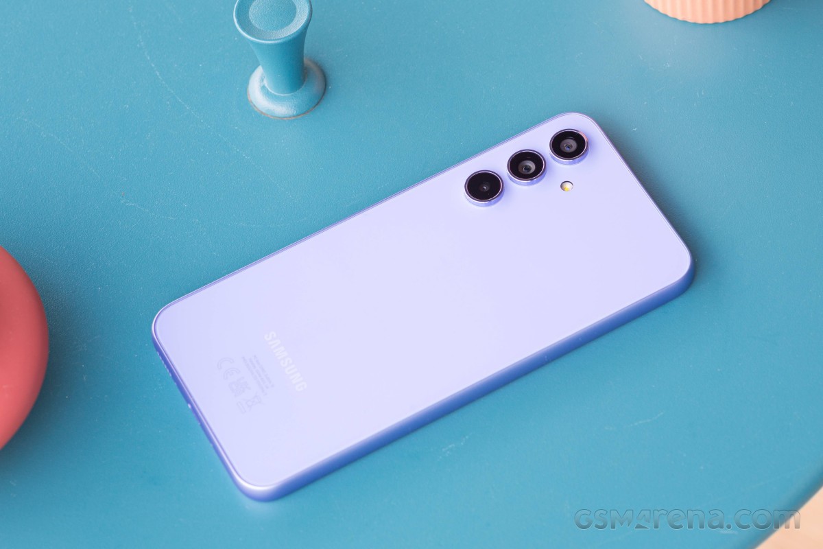
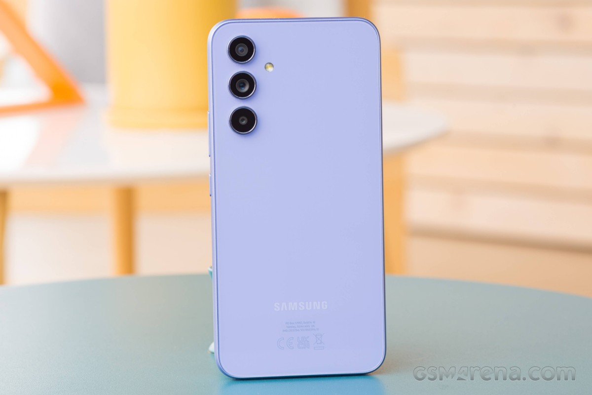
The unification of the Galaxy design language across the lineup is intensifying. Not only did the S23 and S23+ get restyled like the Ultra, but members of the A series now also adopt the same camera arrangement.
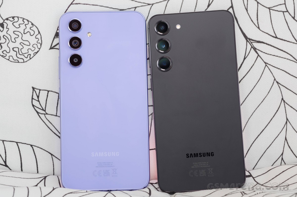 Guess the Galaxy
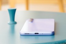
The three separate camera lenses, each wrapped in a shiny ring, stick out by close to 2mm, and since the phone is actually resting on the bottom one when lying on a table, it's particularly wobbly - typing on the keyboard in such instances will be sure to annoy you.
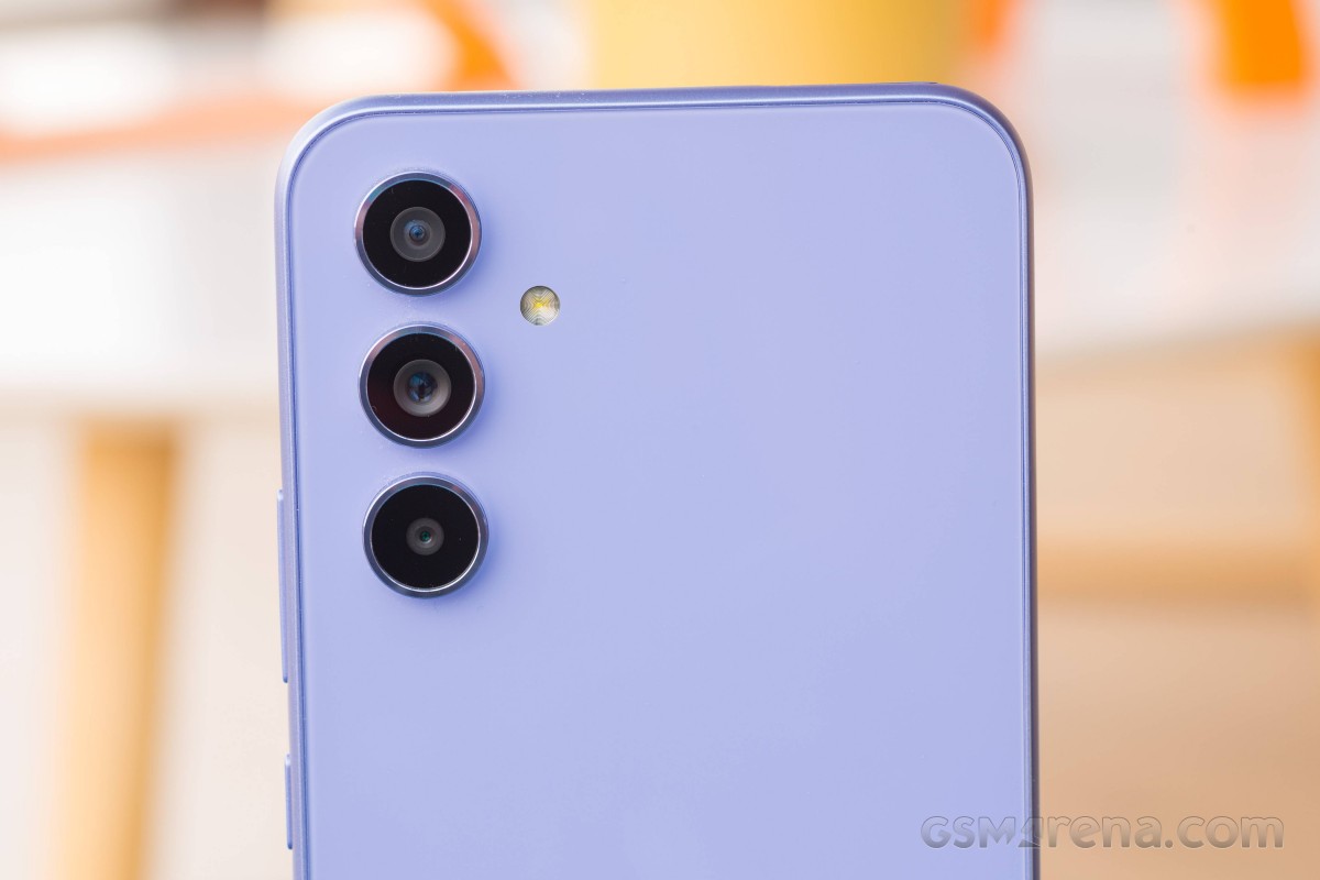
While the lens design has been made to resemble the flagships, the back panel isn't quite like theirs. For one, it's (probably) plastic - Samsung would have certainly advertised it if it were Gorilla Glass (Update, 11 April: turns out it's Gorilla Glass 5, after all) - but it's also glossy. That's in contrast to the S23 family's frosted finish but also a departure from the A-series' matte aesthetic from the previous two generations.
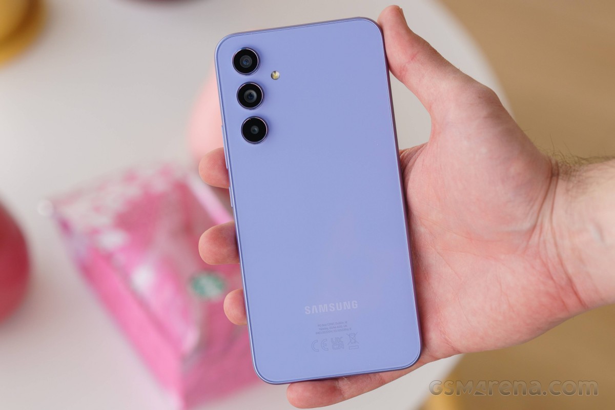
This whole back and forth is probably necessary to add at least a little distinction between the models in the current lineup, but also to reinforce the feeling of novelty in the A models in isolation. That said, we were particularly fond of the look and feel of the backs on the A53 and A52(s) and this return to glossiness, with the entailing battle against fingerprints, feels like a step back.
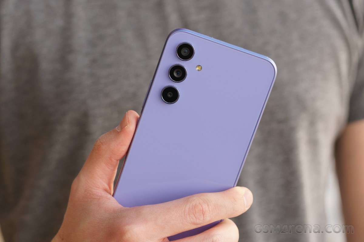
Now, we'll have to quickly re-counter the above by saying that the Violet colorway of our review unit does a fair job of concealing fingerprints - or, rather, it's light enough that it doesn't readily advertise them. We can't imagine the Black one as anything but a constant smudge fest, though.
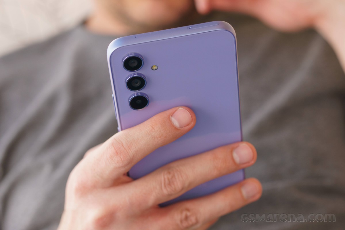
Best as we can tell, the frame is plastic - the lack of antenna lines (and the way it behaves against a knife blade) points to that. So while it's shaped like on the high-end models, it's not quite as high-end inside.
Technically, it's different on the surface, too - the flagships have it treated to a glossy finish, while it's got more of a satin look on the A54 here. It's not unlike Apple's approach, where the Pros get a frosted back and shiny frame, while the lesser models' backs are glossy and their frames aren't. Hmm.
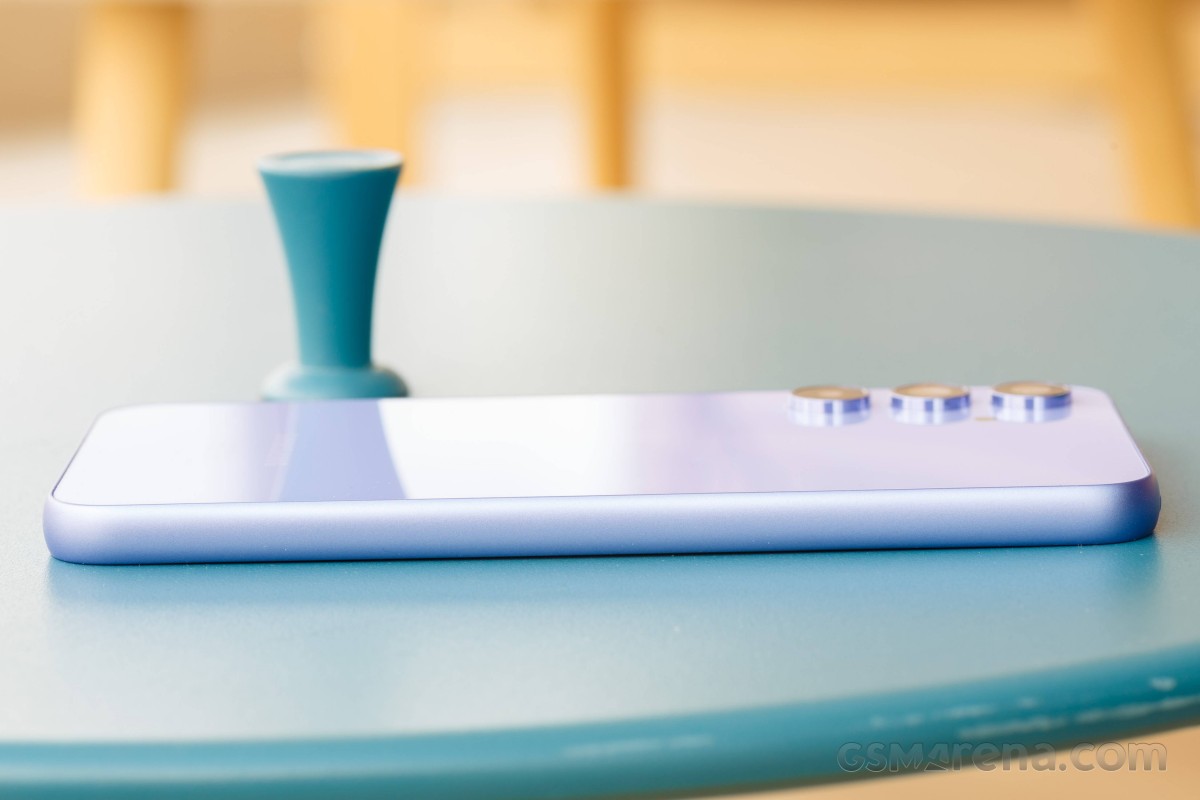
It's perhaps around here that we should once again mention the Galaxy A54's IP67 rating. Getting dust and water resistance in the midrange is still fairly rare, so it's worth emphasizing it on the phones that do have it.
The arrangement of the features around the perimeter isn't entirely the same as before, but little has changed in terms of the practical implications. The nicely clicky physical buttons are on the right, the USB-C port is on the bottom. There are now two pinholes on the bottom, possibly a mic behind each (as opposed to a pinhole on the A53), and that's in addition to the 'main' loudspeaker. Another mic is up top where the card slot has found a new home, relocated from the bottom.
The business end of the Galaxy A54 has the 6.4-inch OLED display surrounded by a meatier-than-expected black border. Except for the slightly thicker bottom, it's got a uniform thickness along the other three edges, so at least a case could be made that the uniformity vs. thickness is a reasonable trade-off from the standpoint of looks.
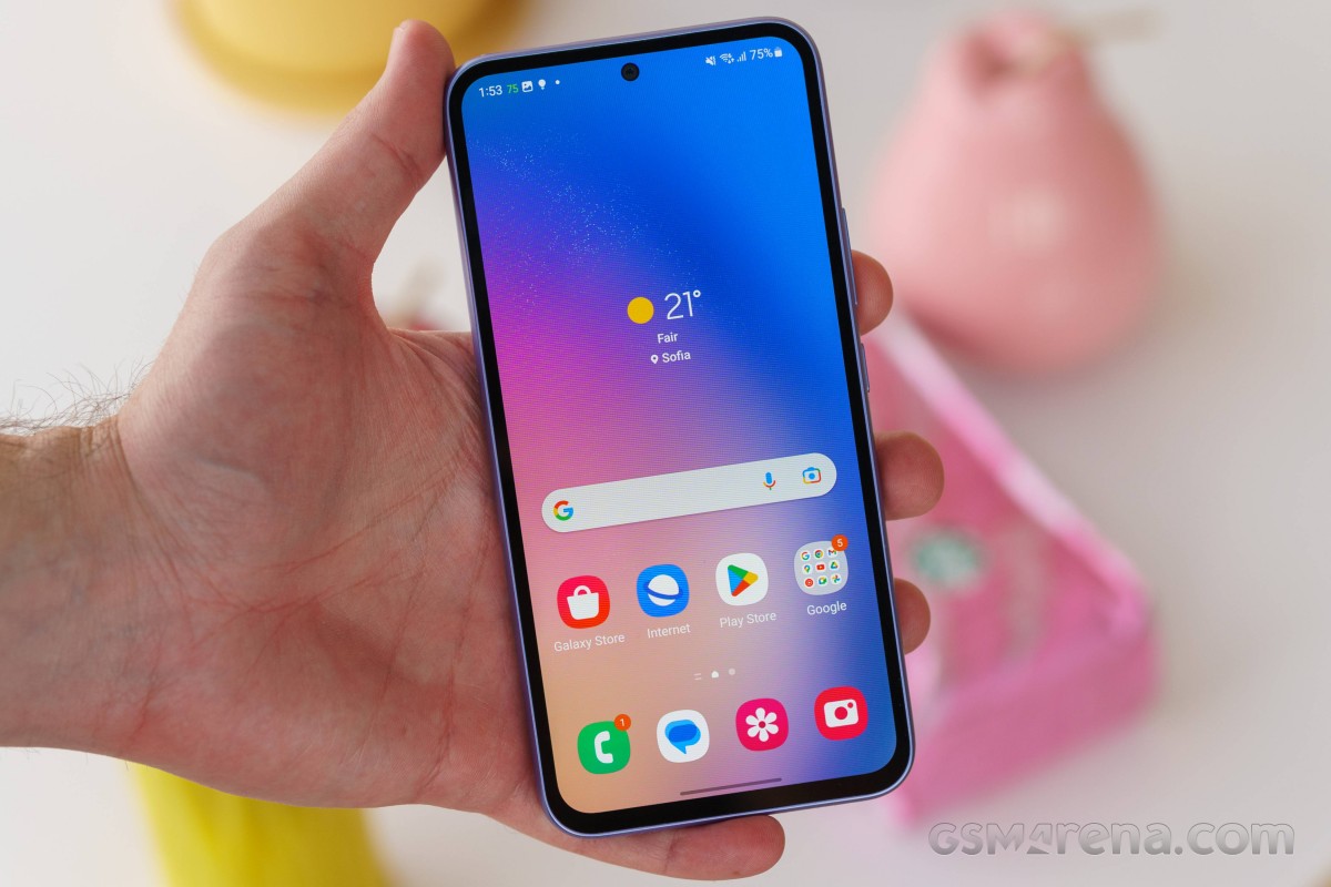
The bezel situation is another instance where iPhone comparisons come to mind, too, with Apple's models typically trailing in screen-to-body ratio charts.
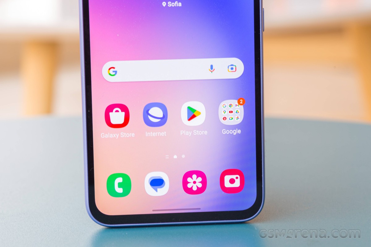
The entirely flat Gorilla Glass 5 sheet is also giving off a similar vibe. That is to say, the A54 looks and feels a lot like the S23 or S23+, but those have gotten quite iPhone-y on the front these past two generations.
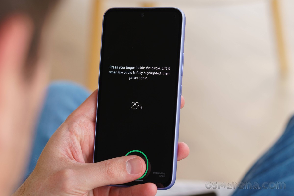
What you won't find on an iPhone, but the Galaxy A54 does have is an under-display fingerprint sensor. It's the optical variety and works quickly and reliably, though if you'll allows us one complaint, it would be the rather low placement - the S-series get a higher (and, in our minds, better) placement.
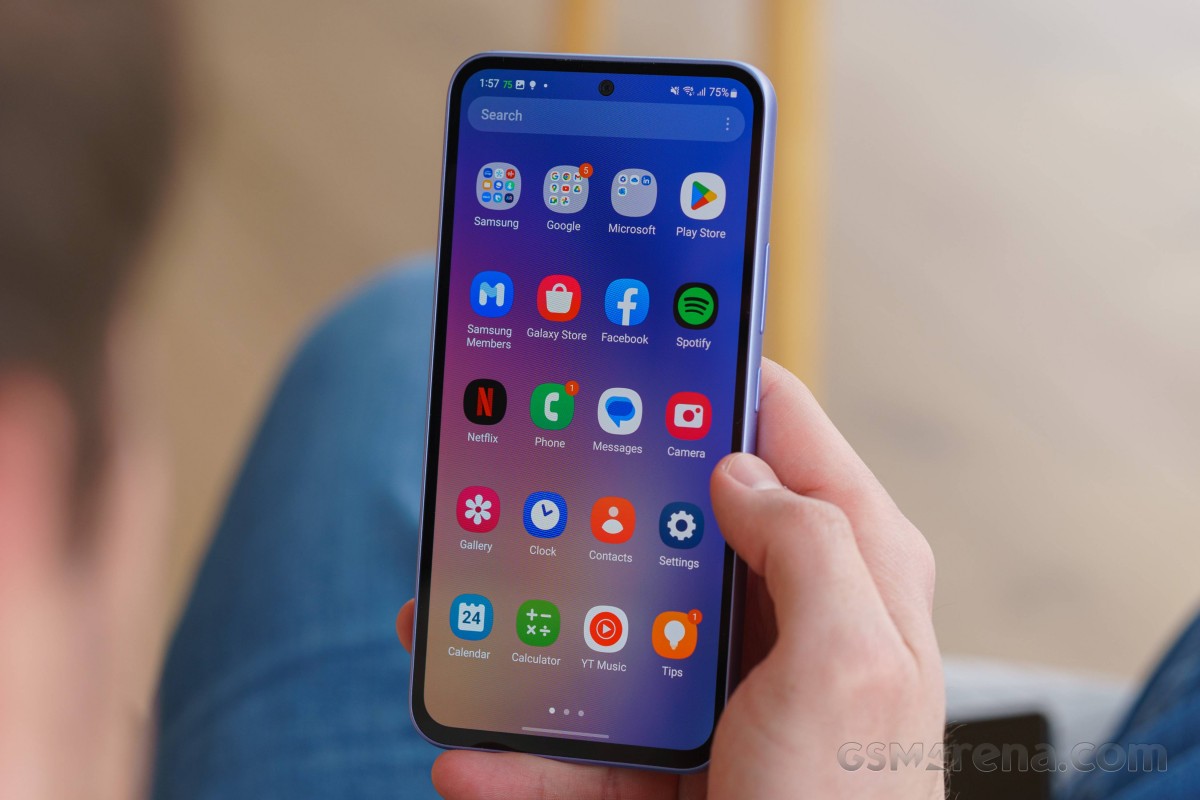
A new development is the move from a 20:9 to a 19.5:9 aspect for the display this year - in that sense, the seemingly logical convergence between the S- and A-series continues. Staying within the A realm, however, it means the A54 is not only heavier than the A53, but it's also wider - by close to 3mm, which is a massive difference in that direction, and easily felt.
Circling back to S-series comparisons, the 6.4-inch A54 is in fact larger than the 6.6-inch S23+, physically. The flagship's bigger display fits in a smaller footprint thanks to its flagship bezels, so while the A54 may look and feel like the S23+ in passing, it's nowhere as efficient in its use of space. Which is to be expected, after all.
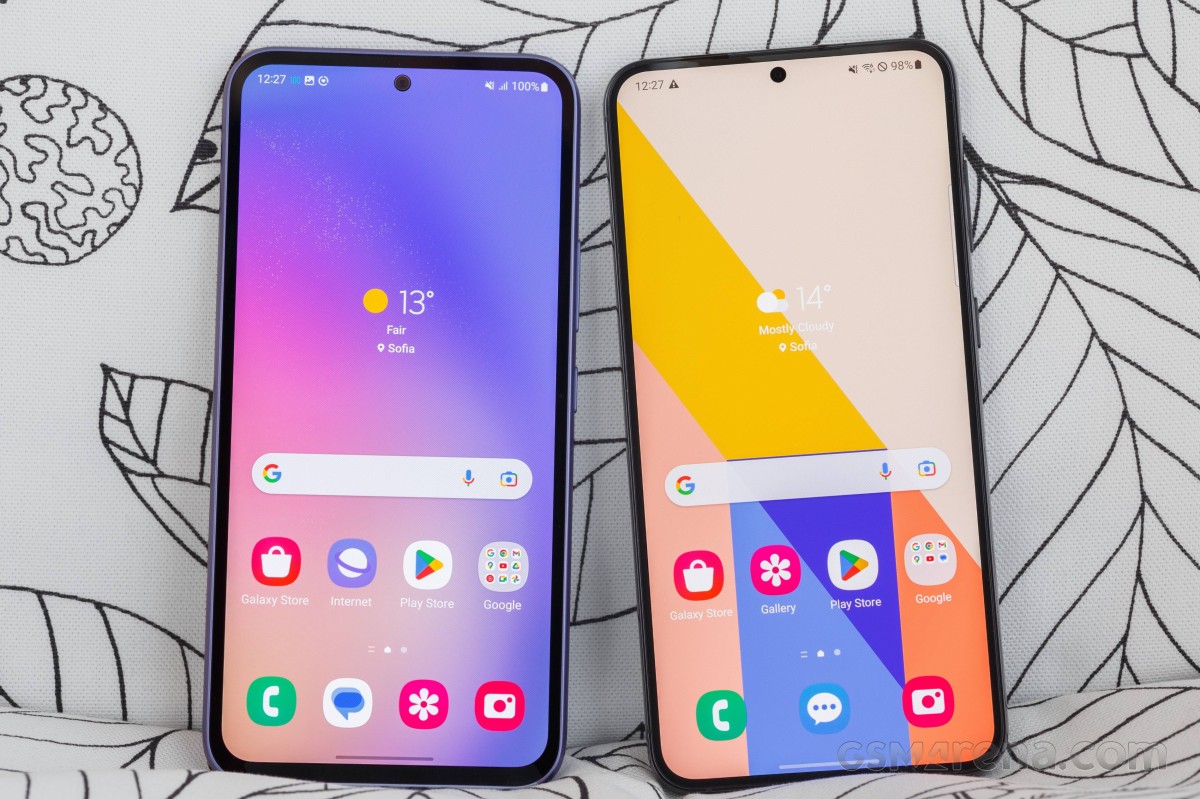 Galaxy A54 (left) next to S23+
In summary, the every-Galaxy-should-look-the-same tendency we see with Samsung's design language is perhaps well founded in marketing logic. Still, it leads to inevitable negative results, as we see it. For one, while from the perspective of the A54 it's nice to look like the S23+, what does it say about the S23+ that you can barely tell it apart from a random midranger in the lineup?
And, in the A54's own context, is the lack of personality really a plus against competitors with all sorts of crazy colors and finishes, and can it count on simply being a Galaxy to make people want to buy it? Don't get us wrong, the Galaxy A54's design is certainly easy on the eyes, it's just not all that inspired.
Reader comments
- Anonymous
- 11 Mar 2025
- CbI
a55
