Samsung Galaxy A54 long-term review
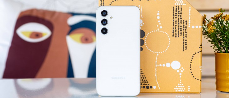
One UI 5.1, updates
At the time of writing the Galaxy A54 is on the verge of receiving the update to One UI 6 based on Android 14, but not quite there yet. Depending on where you are in the world, this may have changed in the meantime and if you buy an A54 now you might find the update waiting for you when you take the phone out of the box. And even if that doesn't happen right away, it undoubtedly will very soon - Samsung has recently been very good at issuing big Android updates to a lot of its devices in a very short span of time once it gets the ball rolling, so to speak - and the ball has definitely been set in motion already.
One UI 6 doesn't look very different from One UI 5.x, which in itself didn't look all that different from its predecessor. At this point, One UI is pretty much a known quantity in the mobile world, and that is probably a good thing for most normal users, who might not enjoy huge UI changes from year to year. On the other hand, if you're more of an enthusiast type and have had Samsung devices in the near past, then you could find it a bit boring.
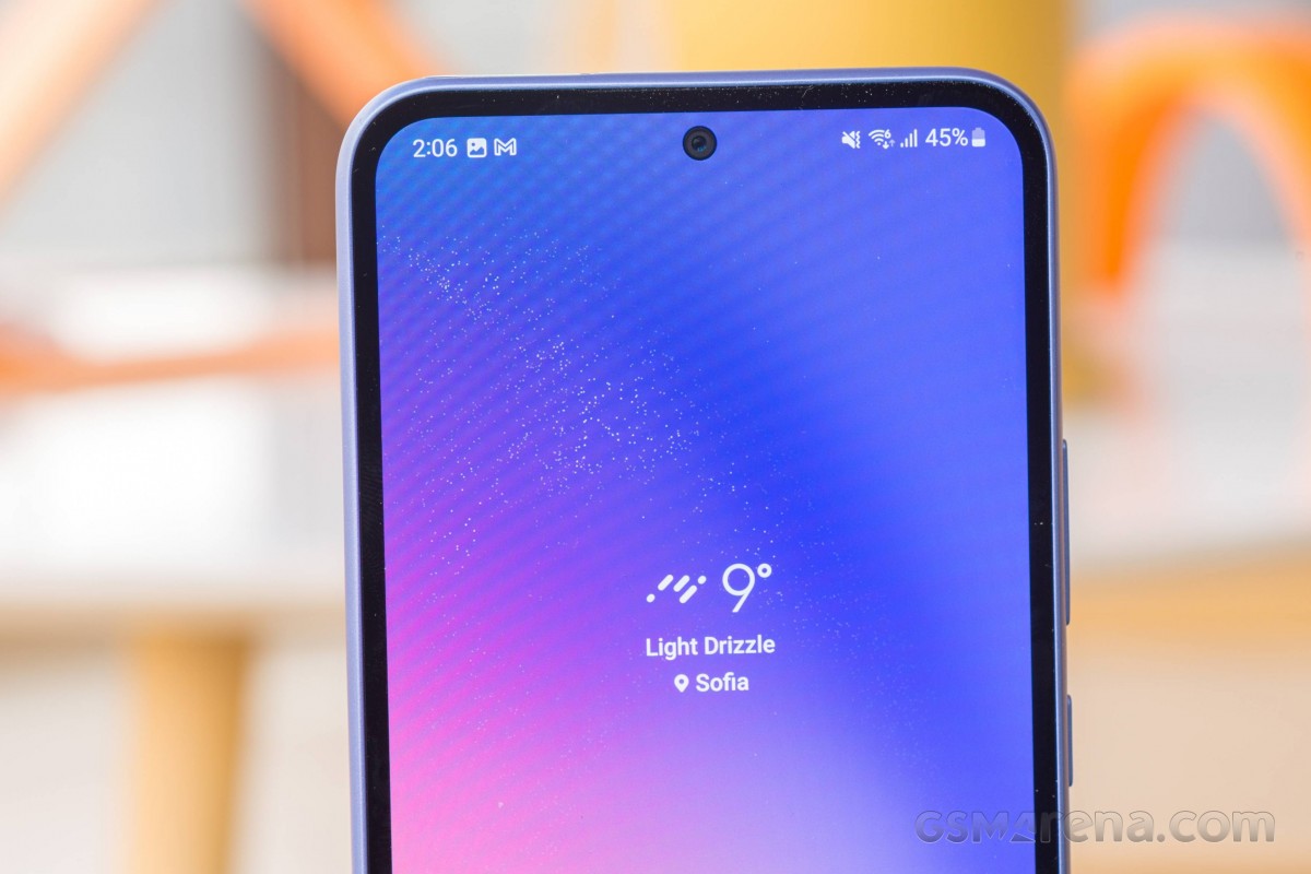
One thing that definitely has changed in the past year or two is quality control for updates. During our extended time with the A54, we have encountered no bugs at all. Zero. None. And that's something a lot of Samsung's competitors can definitely learn from (we're primarily thinking about Xiaomi and Poco and Redmi, but in truth even Google sometimes breaks things with an update or two - the difference is that with Google things are usually fixed with the next monthly update, whereas in Xiaomiland sometimes many months pass and very obvious, egregious bugs are still there unfortunately).
We honestly can't remember the last time a Samsung update introduced any bug whatsoever, and that deserves praise, especially since the A54 isn't a top of the line device, and for a lot of companies the logic seems to be - the higher the price, the more care is taken with such things, whereas mid-rangers and especially low-end phones are left to fend for themselves, as it were.
That's not a good strategy in our book since a lot of people will buy a cheaper model initially and then if they're satisfied will eventually move on to something more expensive from the same brand - a lot of our friends with Samsung phones have gone through exactly such a process.
But if the cheap one is buggy, they'll just turn to a different maker - or, in some cases, decide that "all Android phones suck" based on one experience and buy an iPhone. Samsung seems to understand this pretty well, at least when it comes to updates and bugs - it feels less concerned with the overall performance and smoothness of its mid-rangers, but we've already talked about that in the previous section of this review.
Speaking of updates, Samsung actually issues the monthly security patches monthly, which is still not a thing that happens across the mobile industry as a whole. Not just that, but they're usually quite timely and at various points may even arrive before Google sends the same update to its Pixels. This deserves praise, as does the generally decently quick rollout of a big Android update, especially considering how many more devices Samsung is updating compared to Google.
At the time of writing, our A54 was on the October security patch level, which is perfectly acceptable considering we received a security update every month while using it - and in the appropriate month, no less (so no "here's the September update at the end of October" shenanigans). If One UI 6 wasn't coming, we're sure we would have received the November security patch in the first half of November too.


Current software at time of writing
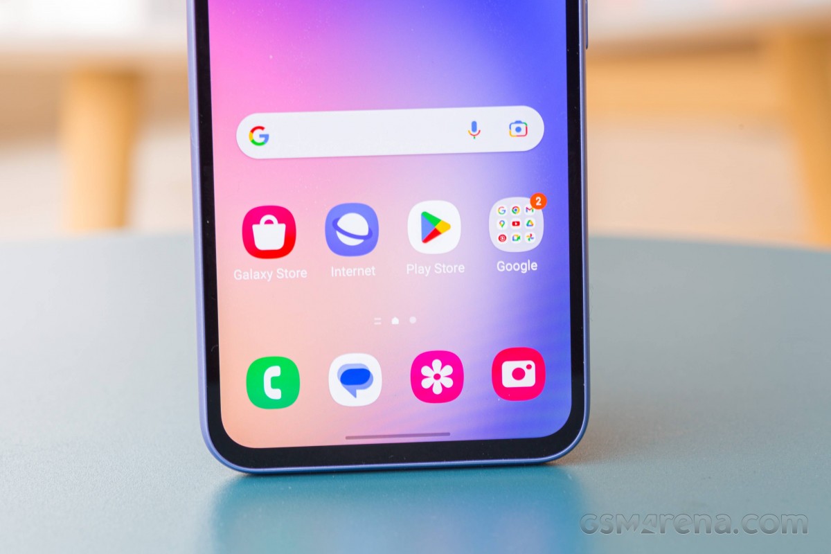
One UI still has its now-trademark idiosyncrasies, but after so much time on the market we assume most people have gotten used to the presence of two separate app stores, for example - not that it makes any logical sense from a user experience point of view, of course. But Samsung wants to play the ecosystem game, and this is one of the ways in which it does that, annoying as it might be for end-users. It can't get rid of the Play Store since then it wouldn't be able to use Google apps, but it also wants to have its duplicate built-in apps which are the defaults, so that you get tied into its ecosystem, not Google's.
We really do wonder how well this has worked out - how many people actually use the default Samsung apps and not the also available Google ones. The former option means you have a pretty substantial incentive to switch to another Samsung phone, while the latter variant gives you the freedom to move to any other Android device without issue.
Of course, Samsung really wants you to stick to its devices, and that's understandable, but do people actually do that? We can't tell you for sure, our hunch is that those who are more into tech go with Google's offerings precisely for the freedom of switching that entails (and let's not forget that most times these apps are actually better too), while normal people may as well just go with the defaults and never think twice about that.
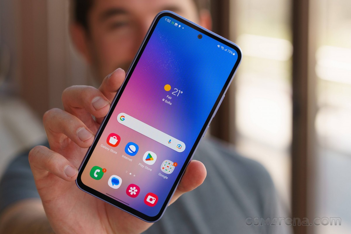
Then again, in recent times Samsung has been working more with Google - the Messages app is a weird hybrid of Google's Messages and Samsung's app of the same name, and thankfully there aren't two of them preinstalled anymore. You also get RCS support, which up to twelve people across the world surely appreciate - and the rest are probably fine using WhatsApp or Telegram or Signal or Facebook Messenger or whatever.
In the US, however, you're kind of stuck with the Messages app, because people with iPhones can't get over their iMessage bubble addiction, so it's good that RCS gives them a decent set of features on top of SMS for the chats they are having with people who own other Android phones (and next year Apple will support RCS too, so while the green bubbles won't be gone, there will be better interoperability of features for sure).
As always, the built-in Samsung apps all update through its own app store, and sometimes other, third-party apps get updates a little bit faster this way, but most will be updated via the Play Store. It's not an ideal state of things, obviously, but by now most of you are probably used to it, so we won't rant about it any further.
The Settings menu is as extensive as always, with hundreds of things you can tinker with, so if you enjoy doing that, you can spend hours upon hours diving into every single option and customizing it to your heart's content. Customization has always been a pretty huge theme with One UI, and that hasn't changed at all. Of course, you don't have to do any such thing if you don't want to, and just stick with all of the defaults.
You will, in this case, however, find out that the phone doesn't show any notification contents on the lock screen by default, which has been a pet peeve of ours with One UI for years, and yet you still need to go into Settings and let it show you more than just an app's icon. To visualize this, imagine that One UI treats the lock screen like most other skins do the Always On Display - you get an icon and that's it. It's not necessarily a better or worse way of doing things (after all, this does enhance privacy), it's just different for the sake of being different.


Lock screen notifications settings
Speaking of which, by default long-pressing the power button still launches Bixby instead of giving you the power menu. This too is easily fixable with a dive into Settings.
For us these were the only two defaults that definitely needed changing, of course for you things may be different, so allow at least half an hour for tinkering with such things after you get your phone set up for the first time (or definitely more if tinkering is your hobby).
Launcher, Recents, Dark mode
The One UI launcher has pretty much been unchanged for years, which is great if you're coming to this phone from an older Samsung. That, however, also means it has the same weirdness about it - like the horizontally scrolling app drawer, and perhaps most egregiously, the fact that said app drawer is, by default, not sorted alphabetically. Bonus one: folders in the app drawer. Why? We couldn't tell you, we think all of these 'features' make apps harder to find in the drawer, but maybe it makes sense for you.
Anyway, if it doesn't, then you can at least switch to alphabetical sorting, though there's nothing you can do about the scrolling and the folders (you can try to take all apps out from each of them, but that may just prove too time consuming and annoying - we won't judge you if so).
Interestingly, Samsung's version of Google's Discover feed is gone. Last we saw it, it was called Samsung Free, and in our view provided a sub-par alternative to the Google Discover feed, but was the default. Now, it's simply gone, and to that we can only say: good riddance! This leaves the aforementioned Google Discover feed as the only option for your "-1" screen - the one to the left of the leftmost home screen. You can also turn it off if you don't like it, in the spirit of customization.


Google Discover feed and Launcher settings
The Recent apps display is horizontally scrolling, as most are these days, and this one has a neat feature we love to use - you get four 'suggested apps' at the bottom. The software is trying to anticipate where exactly you want to go, and does so with incredible accuracy, at least for us. The app we wanted to switch to was one of those four about 85% of the time, which we think is commendable.
Dark mode is present and pretty bare. There are no fancy customization options here, weirdly enough since there are so many of those for so many other features. You get to turn it on and off, schedule it from sunset to sunrise or with custom hours, and, if you go to the Wallpaper and style section of Settings, you can also turn on "Dim wallpaper when Dark mode is on". That's it.
Of course it works just as intended, but as we already said - some extra customization options would definitely be welcome.
Gestures
Gesture navigation is of course present on the A54, and it generally works well, with one exception we'll detail below. We like the fact that you can hide the white pill bar at the bottom, the 'gesture hint' as it's also known, and still swipe across the bottom of the screen to quickly switch apps. In some other skins as of late, you can't do that anymore, which is a shame.
You can also customize the gesture sensitivity, which we find to be a welcome feature. You can choose a higher setting if you're using a case and find the back gesture hard to perform, or a lower one if the gesture is being triggered by accident.
While we haven't encountered any bugs per se during our time with the A54, there is one bit of 'functionality' that baffles us. We'll preface by saying this behavior used to be widespread across all Samsung devices a couple or so years ago, but right now none of the flagships (be they S series or foldables) have it anymore, which makes us to think that it's somehow related to how well the chipset is able to perform. And since the A54's SoC is anything but a great performer, this problem has unfortunately reared its ugly head here.
We're talking about how, when you do the 'going home' gesture, aka swiping up from the bottom, a lot of times, the phone initially interprets the gesture as scrolling, only to then, about a second in, realize you actually wanted to go home. So what happens in the space of a second is it scrolls inside the app you're currently in, then goes home. Needless to say, when you go back to said app, you won't be 'at the top', as it were, but a bit lower down, thanks to the scrolling we just described.
This may not be annoying to you at all, but it just shouldn't happen. Our unconfirmed theory, based on how flagship devices don't have this anymore, is that on Samsung handsets that aren't very gifted in the performance category, it simply takes a lot of processing power to interpret the gesture, and so this happens. It's unfortunate, and if true it means One UI processes gestures differently from any other skin, since we have never, ever had this issue on any smartphone that isn't a Samsung. Hopefully the company will get round to fixing this soon, since it's not a great user experience, to say the least.
Reader comments
- Anonymous
- 23 Mar 2025
- f0y
Worst piece I've read in some time. Seems viewed from an obviously skewed lense in an unprofessional way. You dealing with a midrange phone so treat it as such.
- Heis jxy
- 11 Feb 2025
- XBF
Im currently using the Samsung a54 In gaming it has slight touch sampling rate issues Basically the screen may not respond to certain touches and swipes done Secondly the phone heats up easily Especially when gaming the heat intensifies. ...
- dablaze01
- 02 Jan 2025
- XBB
Please is there a way you know I could fix my redmi Note 12? Cause the unit I possess behaves off many a times and I got to know it's buggy


