Samsung Galaxy A9 (2018) hands-on review

Design
The Galaxy A9 (2018) has all the characteristic markings of a modern, near-flagship Galaxy device. Well, almost all, to be precise, since there is no ingress protection rating to be seen. Kind of odd, considering the Galaxy A8 (2018) is rated for IP68. Even so, the A9 (2018) currently sits at the top of the Galaxy A family. At least the other staples of the line are accounted for.
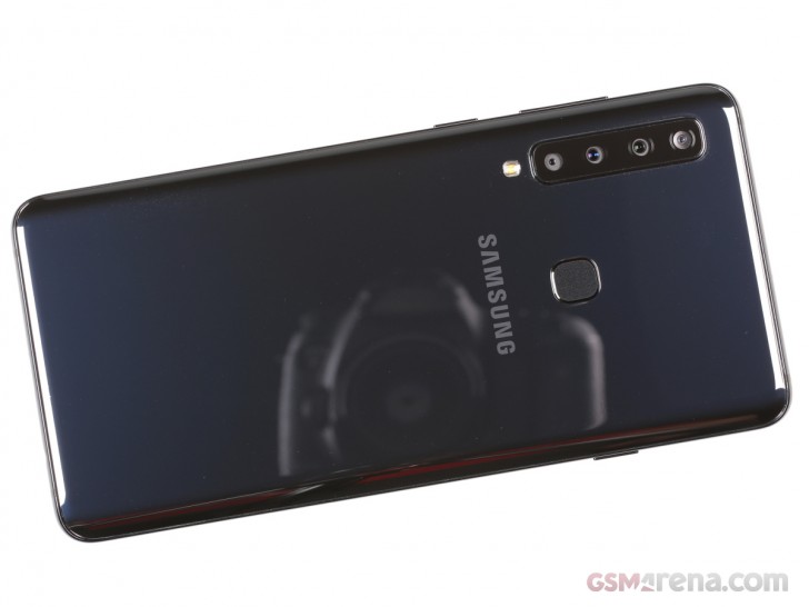
Most notably - a huge, 6.3-inch, in this particular case, Super AMOLED display, in the still trendy "Infinity Display" design. That means nicely rounded corners and almost no bezels. In fact, if you are not into the curvy nature of the flagship Galaxy S and Note lines, these devices are currently your best bet over at camp Samsung.
The similarities with said flagships extend on to the general build and design as well. The Galaxy A9 (2018) employs the standard sturdy metal frame, inside a glass sandwich arrangement. While the front might be flat, the back of the phone is very much curvy on all sides. The slope makes for a familiar and natural-feeling design, which Samsung has been refining for a few generations now.
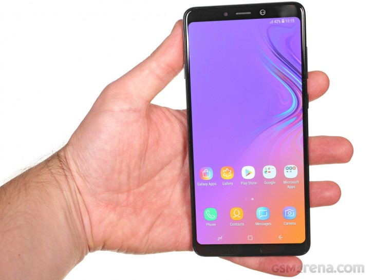
The A9 (2018) is a looker, especially in its Lemonade Blue and Bubblegum Pink variants, which feature a vertical gradient and a very subtle pattern underneath the glass back. The Caviar Black is a lot less flamboyant and exciting when it comes to pure visual appeal, opting instead for a traditional mirror-like glossy finish. We guess that's the "grown-up" serious option and it's, unfortunately, the one we got for this hands-on.
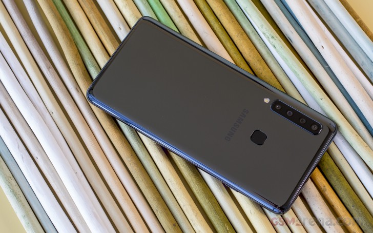
By the way, in case you had any doubt, that glass finish is a real fingerprint magnet. This, alone, is a good enough reason to explore case options, in our book. There are valid ergonomic reasons to go down that road, as well. While the A9 (2018) sits very snugly in the hand, it is still rather unwieldy due to its size. Plus, the gentle slopes make it really slippery and especially difficult to pick up from a table. Subjectively, in this regard, it feels a lot more like the Galaxy S8 generation than the S9, which introduced a bit more grip. And definitely not nearly as easy to grab hold to as the Note8 or Note9. Bottom line here - get a case, so you won't have to constantly struggle with the glass finish and gravity duo.
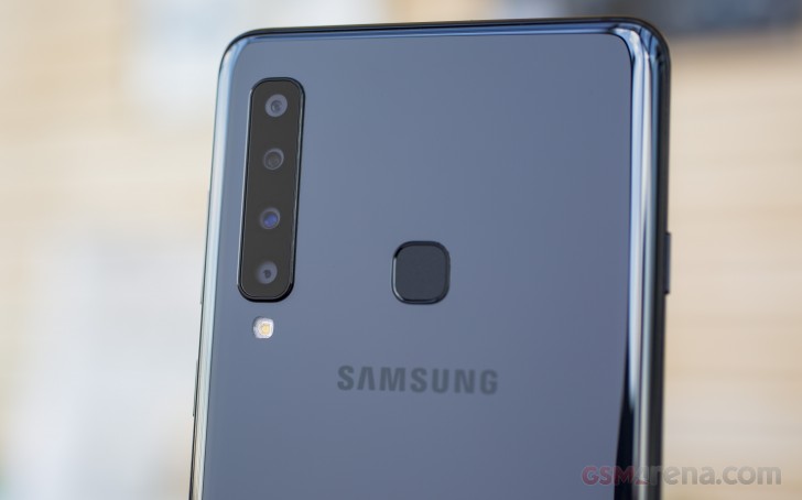
Since we are already discussing the back of the Galaxy A9 (2018), it is clearly dominated by one feature - the four vertical cameras. These appear to be grouped in pairs of two, which is probably done since the two biggest modules are next to each other. An odd visual consequence, however, is that the extra space somehow makes the camera area seem less crowded if that makes any sense.
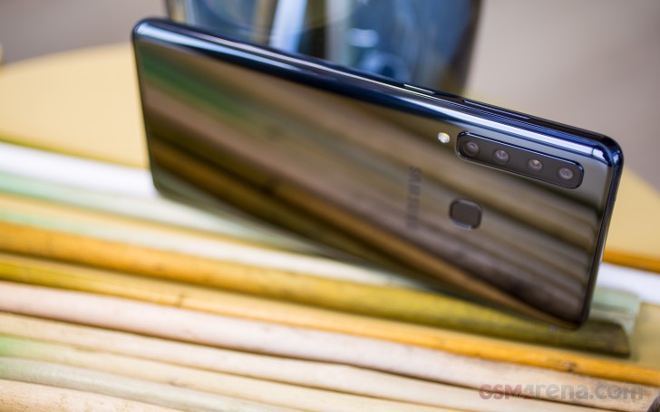
In fact, Samsung has managed to make the whole "hump" quite thin, in every direction. That also makes it look very unobtrusive. Plus, it doesn't really scrape real hard on flat surfaces. In fact, judging by the decision to place the single LED flash underneath the vertical camera array, rather than next to it, further proves the theory that Samsung's design department really decided to adopt the extra-tall aesthetic and work with it. We have to say - job well done! We imagine a whopping four cameras on the back of a phone can look quite a bit more off-putting.
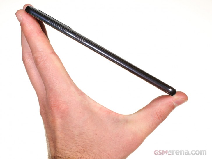
Of course, since this is a fairly high-end device, Samsung couldn't skip on some biometric security. The rear-mounted fingerprint reader is very snappy and reliable. It is also conveniently carved out, so you won't have to feel around too much. If you have long enough fingers, that is. The placement feels just right for my huge hands, but the average user will likely prefer it a bit lower down the tall back of the Galaxy A9 (2018).
This feels like the perfect segue to the showing your around the controls and their placement. Namely, the controversial Bixby button. Yes, the Galaxy A9 (2018) definitely has one and if you love it, we have bad news for you, since, like the fingerprint reader, it sits just a bit too high on the left frame of the phone. Then again, if you're not exactly fond of Samsung's Ai, this might just be a blessing in disguise. By the way, the Bixby button can be partially turned off on the Galaxy A9 (2018). You can opt to have Bixby trigger only after holding the button for a while so that a single accidental press will do nothing. You do have to go through the lengthy Bixby setup process to get to the settings menu, though.
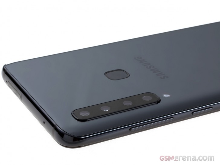
On the opposite side of the phone - the power button is at a much more reasonable hight. Above is - a volume rocker. All the buttons on the Galaxy A9 (2018) area a bit on the thinner side, which makes sense, seeing how the frame is not very wide either. Also, the buttons are surprisingly "mushy". Pretty out of the ordinary for a Galaxy phone, especially a high-end one. Yet another reason to get a case, we suppose.
The bottom of the handset hosts the single speaker grill, main microphone and the USB-C port. Right next to it - a good old, trusty 3.5mm audio jack. No dongles needed.
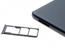
Samsung Galaxy A9 (2018): Bottom side • Top side and SIM tray
The top of the phone is pretty empty - only a secondary microphone hole and a SIM tray. We have some mixed feeling regarding the latter. On one hand, we love that Samsung leveraged the huge body of the Galaxy A9 (2018) and opted for a dedicated microSD card slot, alongside the duo of nanoSIM ones. No hybrid setups here. On the other hand, perhaps our nitpicking side got the better of us, but we can't fail to mention that only one of our SIM ejector pins was both thin enough and long enough to get the tray out.
Display
The huge 6.5-inch, Super AMOLED panel is pretty much the defining feature on the front of the Galaxy A9 (2018). It'scalled Infinity Display by Samsung PR, hence the rounded corners and the slimmed-down bezel, especially on the sides.
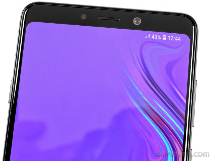
The top and bottom chins still occupy a fair bit of space. However, that has its practical benefits as well - extra grabbing room for horizontal usage and not nearly as much thumb-gymnastics for reaching the navigation bar one-handed. By the way, in case you were wondering, the A9 (2018) lacks the fancy persistent, hidden home button, under the display. Samsung's UI also lacks gesture navigation out of the box. Though, there are plenty of third-party solutions out there if you desperately need it.
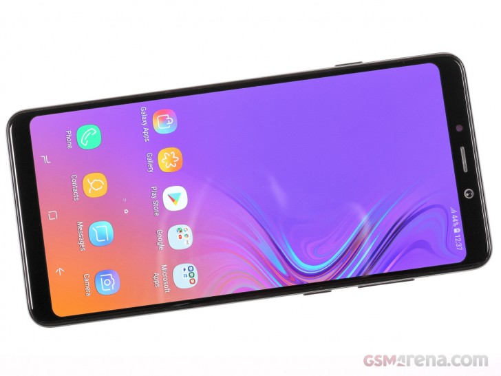
We can't provide any specifics along the lines of brightness and sunlight legibility for the panel, before our full review. But, as you can probably guess, it's a typical Samsung Super AMOLED. It shines brightly when it needs to, it has infinitely deep blacks and looks perfectly sharp, despite its FullHD+ resolution. Unlike its flagship siblings, it is not certified for any kind of HDR standard, though.
Reader comments
- Anonymous
- 01 Jan 2019
- mp5
Why woukd someone buy this phone when the OnePlus 6T has top notch specifications such as a Snapdragon 845 chip for a cheaper price?
- Samath N8 808 owner
- 31 Dec 2018
- Dk{
Bro, mirror will never give the accurate picture.... Also, it makes video calls impossible.... You can't be looking at a mirror. My idea on the other hand, replaces 2 front cameras with 2 simple motors, which rotate inside the device, not outs...
- the.one
- 30 Dec 2018
- gyF
600$ are you kidding? wait, waht? euro? ohh sh..t 4 camera is a good way to rip peoples pocket 300$ price is fine, but not for me for samy lovers