Samsung Galaxy Ace 3 review: Minor league
Minor league
User interface with TouchWiz
The Samsung Galaxy Ace 3 runs on Android 4.2.2 Jelly Bean skinned with Samsung's TouchWiz Nature UX. It doesn't have all the bells and whistles of the latest Galaxy flagships, but it's come a long way since the Gingerbread days of the Galaxy Ace 2 (which has since been updated to Android 4.1.2 Jelly Bean).
We've shot a quick video showing off the user interface:
The Galaxy Ace 3 features the new lockscreen widgets introduced with Android 4.2. It can be customized to show the time along with a personal message, and beautiful images pulled from TripAdvisor providing the background.

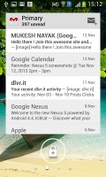
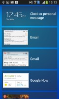

The lockscreen shows beautiful photos and cool widgets
The lockscreen has multiple panes, each containing one widget. The page to the right of the default one is special and can either be a list of favorite apps (the default TouchWiz setting) or a shortcut for the camera (as in unskinned Android).
The pages to the left contain different widgets - email, Google Now, Messaging, music player, Yahoo! Finance and News and you can download apps from the Play Store that add new widgets.
There are no app shortcuts at the bottom of the screen by default - the Favorite Apps widget to the right has taken over that role, but you can enable them and have up to five easily accessible shortcuts right there on the lockscreen.
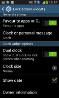
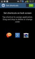
The lockscreen shortcuts are not enabled by default but are still here
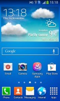
The homescreen and the notification area are identical to what you get in the Galaxy S4.
There are five toggles at the top of the notification area to quickly enable and disable features. There are more than you can see, of course - simply swipe to reveal the rest. Or you can tap the button in the top right that displays a grid of all the shortcuts, 10 in total. You can rearrange this grid (the top row toggles are always visible). A two finger swipe down on the notification banner directly opens the grid of toggles, and holding down on a toggle will directly take you to the relevant setting.
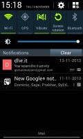

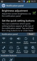

The notification area is better than the one in stock Android 4.2
The notifications have not changed - they can be expanded to reveal more info and collapsed to save space or dismissed with a sideways swipe. Sometimes they also have helpful buttons on them, such as "Call back" or "Send SMS" on a missed call notification.
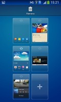
You can pinch zoom to get into the overview mode of all homescreen panes. There can be up to 7 and you can easily add, remove and rearrange panes from here. One pane is marked as "home" - that's the one you go back to when you press the Home button.
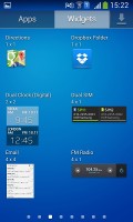
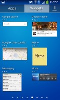
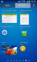
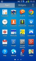
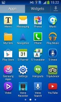
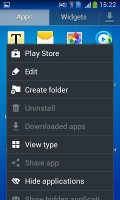
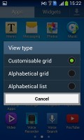
The app drawer hasn't really changed since the early days of Nature UX. The app shortcuts are presented as a customizable grid, alphabetized grid or list and some shortcuts can be hidden (good for bloatware you can't uninstall), view only downloaded apps, uninstall apps and add folders. Widgets are in a separate tab in the drawer.
There's a discreet but useful change to the way you drag out shortcuts and widgets to the homescreen - there's a list of small thumbnails of all the homescreen panes with the silhouettes of the widgets there so you can judge how much space is available on each pane.
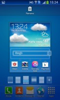
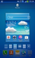
The small thumbnails of homescreen panes make finding room for a new widget a breeze
The App switcher interface is unchanged - there's a list of thumbnails of all the recent apps, apps can be swiped to dismiss and there are three buttons at the bottom, Task manager, Google Now and Kill all apps.
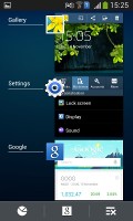
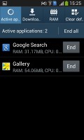
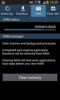
The app switcher lets you free up RAM as well
Samsung tweaked the Settings screen to use a tabbed interface. There are four tabs - Connection, My device, Accounts and More. You can find the relevant features in their corresponding place - display, for instance, is in the My device tab.
The latest iteration of TouchWiz is highly customizable as usual, and offers rich functionality. As expected, most of the flagship features are missing in the Galaxy Ace 3 - but Air gestures are not a huge deal-breaker in our view, and Multi-window mode is not really feasible on such a small screen.
Out of the so-called Smart Screen package, you do get Smart Stay, which won't let the screen go blank as long as the front cam can detect you looking at it. Smart rotation is absent though.
S Voice and Google Now
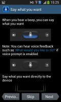
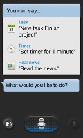
S Voice is Samsung's answer to Apple's Siri and is preloaded on the Galaxy Ace 3. S Voice can be used to initiate a call, dictate text, launch apps, play music, change a setting, make a memo (including voice memo), add a reminder, schedule an event, set an alarm or timer, check the weather, do a search on the internet, look for local listings (e.g. nearby restaurants) and even get an answer to a question.
S Voice does duplicate parts of Google Now, but being less search focused it focuses on doing more on the actual phone in terms of available commands and it also has some added features. Some of these are available outside of S Voice too, so you can set the Galaxy Ace 3 to answer a call, snooze an alarm, take a photo and what not by voice commands even when S Voice isn't running. The problem with S Voice is that it is not nearly as fast or as accurate at recognizing your speech input as Google Now.
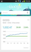
Google Now integrates with your Google account and it can access your daily routine, internet searches, email, etc. and give you information relevant to you.
It provides traffic information to your work or home, knows the scores of sports teams you follow and gives you the weather forecast for your location.
The latest version of Google Now (November 2013) will allow you to have short dialogues with the app AI when you are conducting searches. In these dialogues, Google Now should be able to understand when you referring to your search term by an indirect pronoun instead of using its full name. It will also answer back when there are several options for action.
Another perk of the new version is that you can now activate the Google Now voice commands handsfree by simply starting with a "Ok, Google" instead of pressing the Mic button. This however, should only work in US locales.
Google Now now also taps into the crowd-sourced real-time traffic information by Waze - a popular smart navigation app project that Google purchased earlier this year.
Google Now also has its own separate widget for the homescreen or lockscreen.
Reader comments
- Mary
- 02 Feb 2021
- LEi
Wow, I had this phone from 2016 to 2017, it was good for me at the time, it was affordable, I remember my father bought it for me to use it when I got into college, I was happy with it, resisted so many drops and never stopped working, camera was fu...
- Anonymous
- 17 Oct 2016
- LaT
My friend bought one new today from a small independent high street London shop.it is a very poor phone.the storage on it is diabolical.after just downloading 3.apps on to it.nothing else.it stated that we could not use those apps because there was n...
