Samsung Galaxy Camera review: Half-press to play
Half-press to play
User interface
The Samsung Galaxy Camera is a proper point-and-shoot on the outside, but the on the inside is a full-blown Galaxy S III. The camera comes with Android 4.1 Jelly Bean out of the box (the S III launched with 4.0 ICS) and almost the same Nature UX interface, save for a few camera-specific differences.
Since the Galaxy Camera has nearly all of the features of a Galaxy S III, we'll cover all the usual topics, but we'll re-order things a bit. First, we'll look at the interface and camera and then move on to the rest of the features.
The Samsung Galaxy Camera comes with the lockscreen off by default - you can enable several lockscreens, but that will slow things down when you want to take a photo. This device is primarily a digicam after all and needs to be ready to shoot as soon as you hit the power button.
That's not always the case, which is one of our problems with the Camera. The device can start up fairly quickly, but if you haven't used it in a while it goes into a deeper sleep and it can take several seconds to launch. You can adjust how long the Camera waits before going into hibernation (if at all, but you're trading off battery life here).
The other thing is that you don't always go into the camera once the device is ready - if you used the camera last, that's what you get, but if, for example, you used the music player or the browser or the homescreen then you'll need to start the camera manually.
The Galaxy S III motion gesture to unlock the device and jump straight to the camera isn't available. Starting the camera with the hardware shutter key also didn't work, but those are things that Samsung can enable with a software update later.
Now, let's have a look at the general interface. The whole thing is a spitting image of the Samsung Galaxy S III UI, though changes have been made to accommodate the lack of hardware keys and the fact that the device will be used mostly in landscape orientation rather than portrait.
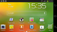
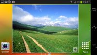
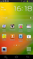
The homescreen is a slightly tweaked version of the TouchWiz screen
You still get up to seven homescreens to put shortcuts, folders and widgets on. You can add, remove and rearrange homescreens as usual.
The space for the shortcut dock is taken up by the software keys, so instead of a dock you get only two fixed shortcuts - the camera on the left and the app and widget drawer on the right.
Samsung went for its usual arrangement of Android buttons, Menu, Home and Back, instead of the Back, Home, App switcher that most droids with on-screen controls use. But that's not our biggest problem, it's that the on-screen buttons don't stay in the same place. In landscape, they're in a column on the right of the screen in the General UI or in a line in the top left in the camera viewfinder.
The camera and gallery apps are the ones that move the controls, most other keep them on the right. Still, it can be annoying having to look for buttons that are used as often as Back and Home.
Moving on, the notification area looks pretty much the same - you get Wi-Fi, GPS, Sound mode, Screen rotation, Bluetooth, Mobile data, Blocking mode and Power saving, plus AllShare Cast and Sync, which are just off screen (you need to swipe to get to them).
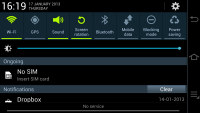
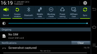
The notification area has a lot of functions, but little space for actual notifictations
The notification area also features a brightness slider that lets you quickly adjust the screen backlighting. There's no auto mode as the camera lacks an ambient light sensor.
While we like the Samsung notification area, we have to say it works better in portrait - in landscape there's just not enough space left for actual notifications (especially if you don't have a SIM card in - in that case all you see is the No SIM warning), which is a shame on such a big screen.
The app drawer is the standard ICS and TouchWiz combo - apps and widgets are separated into their own tabs and you can do a pinch gesture to rearrange the panes in the drawer.
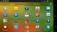
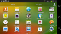
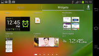
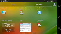
The app drawer houses both app shortcuts and widgets
Once you get several apps running, you can use the task switcher to go back and forth between them. It's an ICS-style list with a screenshot and a name for each app. Apps can be terminated by swiping them away.
There are three buttons at the bottom of the screen - Task Manager, Google Now and Remove all.
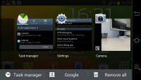
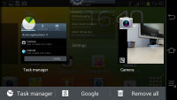
The task switcher has two custom buttons courtesy of Samsung
Reader comments
- Ariya
- 16 Nov 2024
- whB
What is the charger or battery of this camera?
- udan
- 10 Mar 2015
- v0q
The flash of my samsung galaxy dont work pls help me... :,(
- madhan
- 10 Apr 2013
- U@K
very like