Samsung Galaxy Fold long-term review
Software
We still stand by our opinion that end-user devices with foldable display were probably rushed to the market. If Samsung's Galaxy Fold display fiasco and the subsequent review unit recall was not enough of a hint. We can't help but notice that now that the dust has settled a few months later all the foldable display hype seems to be swept under the rug.
And before you get all riled up defending the feasibility of the technology even in its current state, there are plenty of considerations for foldable phones beyond purely physical and mechanical. A wave of new smartphone form factors requires work and can't conceivably happen overnight. Support is needed on multiple fronts, from Google and its still very fragmented Android ecosystem, through manufacturers and their custom UI efforts to developers.
Work has already begun and is going full steam. Android has been implementing backend support for more fluent transitional UIs and putting out developer recommendations for things like UI state saving and configuration change support. And on the manufacturer side of things, Samsung, like many others, has started putting out promises for major improvements in upcoming UI, like One UI 2.
Unfortunately, as things currently stand, the software backing just isn't there and what is present is crude and far from fluent enough to really promote a whole new paradigm for interacting with a foldable work area. Don't believe us? Well, for starters, the Galaxy Fold currently lacks the one-handed UI mode entirely.
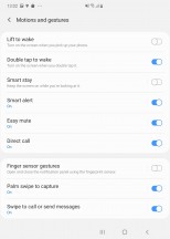
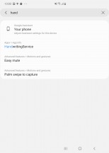
One-handed mode is simply not present
Shocking, we know. Our best guess is that Samsung deemed it unnecessary since you are most likely to hold the Fold with two hands anyway. Plausible enough of an explanation, but one that doesn't bring certain UI elements any more into reach on the extra-tall and skinny outside display either.
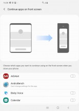
In terms of what there is to accommodate the use of the second external display and the large work area of the internal one, the Fold only gets a few extra bits of crude software. Some not even exclusive to the Fold. By default, any app open on the external display will scale up to the internal one once the phone is open. Pretty nifty. There is also an option to enable the same behaviour in the other direction.
The only problem is that many apps misbehave in any number of waves while doing this. Those, for instance, that don't have any handling for on the fly state changes need to re-create the current activity. And for some that don't employ activity states at all, this means losing your current place inside the app and restarting it. To be clear, that's on the developers to address. But, looking at the situation from another perspective, it's probably the best we can currently hope for with an operating system as broad and fragmented as Android. This is one tough nut to crack.
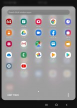
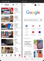
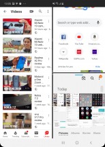
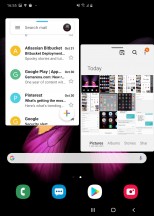
Multi window apps are the preferred and most advertised by Samsung way of multitasking on the Fold. While it works fairly well, the only really Fold-exclusive bit in the whole setup is the fact that you can have the right side split as well. That makes for three apps on screen at the same time. Not necessarily actively working, but still enough for most multitasking scenarios. Naturally, resizing is possible. One thing we notably found missing is app twins, or in this case app triplets, maybe? Anyway, Samsung did have those at some point.
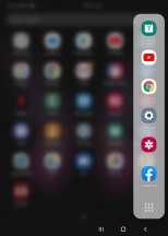
You can also pull out any app in pop-up view inside a floating window for even more flexibility. Again, however, that's not an exclusive Galaxy Fold feature.
Beyond this, there are only a few bits and pieces scattered here and there that aim to make the large display real estate more usable. The keyboard, for instance, has a split mode. Surprisingly usable and easy to get used to. Two-thumb typing has never been easier. Of course, all the standard options of the extremely feature-rich Samsung keyboard are accounted for as well.
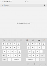
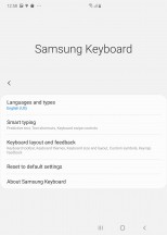
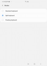
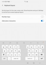
Samsung keyboard has split mode
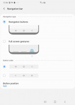
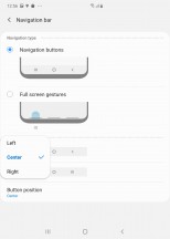
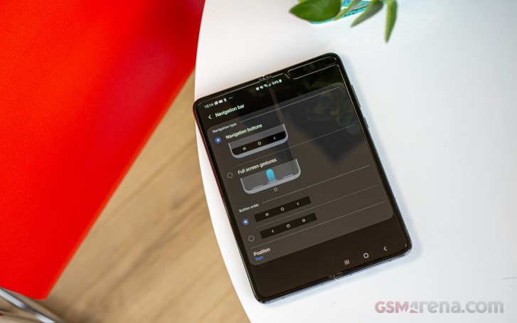
Within the navigation options we find an interesting additional toggle. If you opt for a traditional navigation bar, you can have it shifted to the left or right of the massive display for better reachability. These kinds of small touches do give us at least some hope about future software potential. Samsung is on the right track in some areas, but needs to step up its custom OS game for the Fold in many other.
One thing to note in all this is that Samsung has maintained an impressively consistent and familiar UI experience. Everything looks and feels very familiar in the current version of One UI. So much so, that we had to specifically go out of our way to find these few small tweaks put in place to accommodate the Fold. Frankly, for many other aspects, we are left wondering whether it was intentional on Samsung's part or not.
For instance, the navigation bar button shift we just mentioned. Naturally, it does not affect the navigation bar of the front display. That one always stays centred. Accidental or not, we would qualify this as a seamless experience.


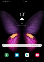
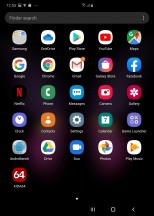
Main UI as seen on: external display • internal display
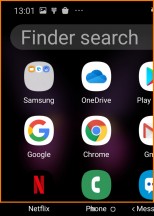
In fact once you stop and really think about what you are experiencing on the two separate displays, some significant differences in UI become apparent. For instance, due to size constraints, the external one only has three icons on its home screen rows and three columns inside the app drawer.
In contrast, the huge internal screen has four on the home screen by default, with the possibility of fitting a fifth and five columns inside the app drawer. In familiar Samsung fashion you can also edit that grid for the large internal display. All the while, entering the same customization menu on the external screen seen the grid options missing.
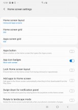

The two displays have different home screen settings
This definitely makes sense. So does the fact that widgets display differently or at least get different size constraints on the two displays. You still get the full selection of widgets on both, but you have to deal with their arrangement separately. In fact, that goes for the entire layout. To put it simply, your inside and outside home screens are separate and do not share their layouts and settings. Again, pretty fluent and seamless as far as experience goes, since the things you will find convenient one display are probably not the same you would find on the other.
Just to round the software section up, we can't fail to praise the Fold on its amazing readability. When apps do manage to scale properly, it is a pleasure to use the fold due to the sheer amount of data that can be on screen and still be legible. The DJI flight app is a perfect example of a data-heavy UI that benefits immensely from the extra real estate.
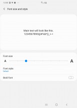
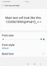
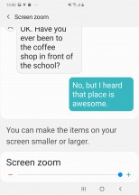
Also, for impaired vision users, you really can't do better than the Fold for a phone. Crank all the font and sizing options up to max and turn on the UI zoom feature and you can easily get icons a few centimetres in diagonal.
Reader comments
- Ram Lord III
- 29 Dec 2020
- n$5
A quick answer to most questions and silly answers. People who talk about thick or foldable phones, plastic screens, size of front screen 4in, etc. have to be realistic: 1. Ever tried to use a Nokia Communicatior from 13 years back. E90 - com...
- Fold user
- 16 Apr 2020
- uKH
Great concept feels sturdy however screen is ridiculously sensitive Even putting it in your pocket is a hazard for dust for it to get damaged. When I first got it in November last year had it a week screen managed to get a small indent Ended ...
