Samsung Galaxy J3 (2016) review: Value driven
Value driven
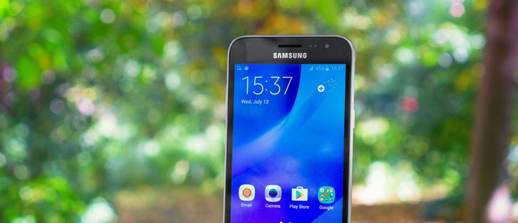
User Interface
Unlike its J5 (2016) and J7 (2016) siblings, the Samsung Galaxy J3 (2016) still boots Android 5.1.1 Lollipop, just like the previous generation of "J" devices. This is a little dated and hopefully owners can at least look forward to an update to Marshmallow. But, even in this state, the company's traditional TouchWiz UI wrapper manages to keep things consistent and provides an up-to-date experience.
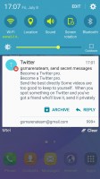
For one, the icon set is the most recent Samsung one, many color accents and menus, however, like the blue notification shade somewhat give Lollipop away. Although, even that point is arguable, as some Samsung Marshmallow ROMs do still use the aforementioned color pallete. The only things you are really missing out on are Google features like Doze and Now On Tap.
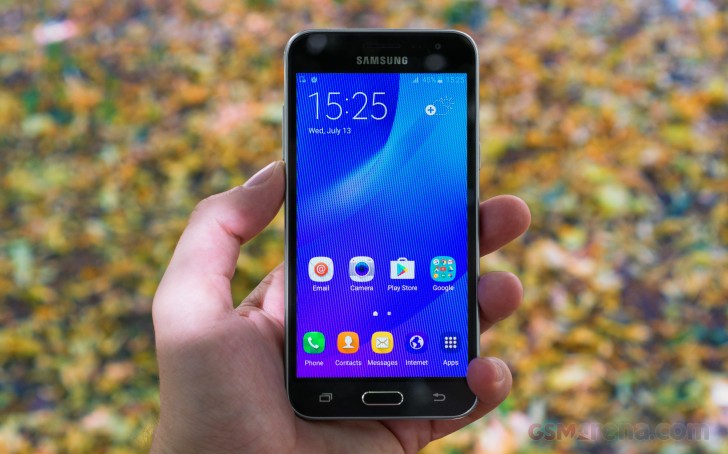
The lockscreen follows Android trends with a list of notifications and a couple of shortcuts - dialer and camera. You can double tap the Home key to quickly launch the camera and the gesture does work surprisingly quick even on the J3's low-end hardware.
The added weather info on the lockscreen is perhaps not standard Android, but it's useful enough and is also a typical Samsung touch.
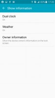
The lockscreen shows notifications, but can hide them from prying eyes too
Fingerprint readers is a luxury the "J" lineup is deprived of, which does mean you only get the traditional locking methods on - swipe, pattern, PIN and password. There's no Private mode either, even though Private mode can be set to use only a password on other devices.
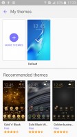
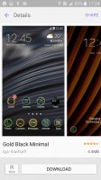
As some form of consolation, however, the Galaxy J3 (2016) has access to the Samsung theme store. The preloaded themes aren't that great, but the store has been progressively getting more variety lately. Themes can change the wallpaper and icons, but also some Samsung apps (dialer, contacts, messages) and the notification area. We wish there was a search field, though.
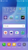
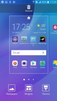
The homescreen is quite normal. There's an option to change the screen grid between 4x4, 4x5 and 5x5, the smallest one is the default.
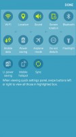
The notification area has one scrollable row of quick toggles and some have text underneath like the name of the Wi-Fi network you are connected to. The only way to view all toggles is to hit the edit button.
The brightness slider is below the toggles. Instead of an Auto toggle it has an Outdoors mode that temporarily boosts the brightness (it switches off automatically in a while to preserve battery).
Samsung has remained loyal to the vanilla Android way over the years and is still sticking with an app drawer. The Galaxy J3 (2017) comes with a nice assortment of pre-installed apps, luckily, without much bloat. It tucked away Google's mandatory apps in a folder and placed its home-brewed alternatives up front. You can disable apps you don't want (but can't uninstall the TouchWiz ones).
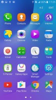
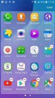
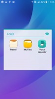
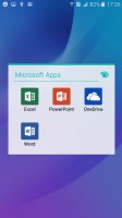
App drawer and pre-installed apps
Samsung has partnered with Microsoft so you get OneDrive (you get 100GB free as a gift), along with OneNote, Word, Excel, PowerPoint and Skype pre-installed. The 8GB of on-board storage can be a little cramped since around 5GB are taken up by the system and only 3GB are available to the user.
Unlike the higher-end Galaxys, the Galaxy J3 (2016) does not have split-screen multitasking. We are pretty sure that this is just as much a business decision as it is a technical limitation, since 1.5GB of RAM can only stretch so far.
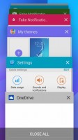
Ordinary app switcher with no split-screen option
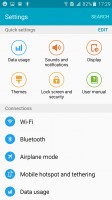
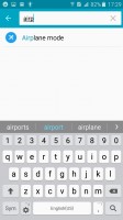
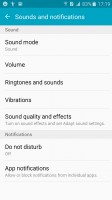
The Setting menu features Quick settings - a selection of the most used options you can use. Below that is the full list, though we prefer using the search function as the extensive features that Samsung has provided can be hard to track down among menus and submenus.
Reader comments
- Anonymous
- 10 Oct 2024
- 8pJ
It's just a micro USB cable
- Daniiabbasi
- 08 Jul 2024
- u1v
Service problems
- Oyindal
- 12 Feb 2024
- r3H
The phone is ok but does not have enough storage but I love it sadly it fell and broke😿
