Samsung Galaxy J7 Pro review
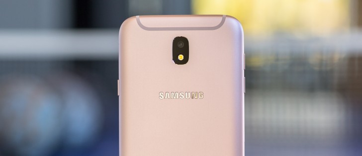
Android 7.0 with Samsung UX
We have to hand it to Samsung for extending its fresh new UI design all the way down to the budget/mid-range J-series. Just like the Galaxy S8 and S8+ pair, the J7 Pro runs on Android Nougat and offers the same heavily-customized Samsung Experience - it's the same version 8.1 too.
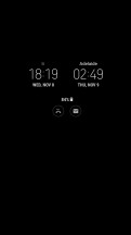
To be fair, however, Samsung has significantly dialed back on its customizations. The new version looks more simplified even from first glance, having been thoroughly revised with new iconography and other goodies. Before you get to those, however, there's an Always On Display to greet you, and a few unlock options.
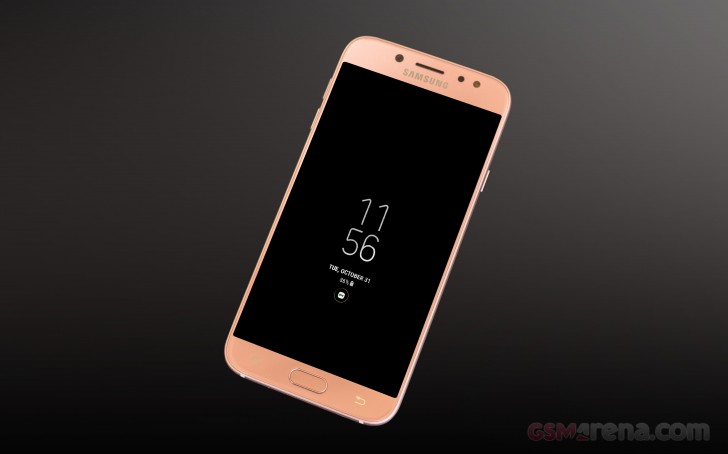
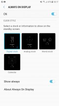
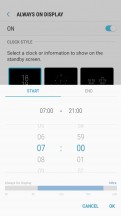
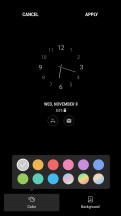
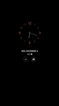
It is refreshing to see an AOD on a lower end device. AMOLED is AMOLED no matter which way you cut it, so the feature makes equal sense on the J7 Pro and provides just as much added value. There's a selection of analog and digital clocks to choose from, plus a calendar or image option.
What used to be a Night clock mode on the S7 edge is now a separate mode of the AOD, which means that you can no longer have the full-blown AOD in the day, and the Night clock at... um.. night.
Then there's the lockscreen itself which displays the standard Nougat notification feed with grouping and direct reply. There are two shortcuts in the bottom corners, Dialer, and Camera by default, but you can change them to any app you want.
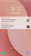
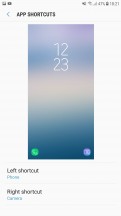
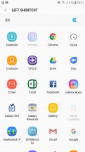
Lock screen • Shortcuts settings • Pick an app, any app
You may not get to see the lockscreen at all though, depending on how you choose to handle the unlocking process, and you're not short on options. Now, the selection isn't nearly as rich as on the S8 pair, with its iris scanner and facial recognition. Still, there is a fingerprint reader on this year's model, which you could only get with the J7 Prime last year. It's not the fastest fingerprint reader, but it's always-on, no pressing or waking up required. It also completely bypasses the lockscreen.
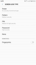
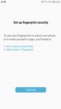
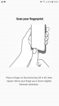
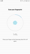
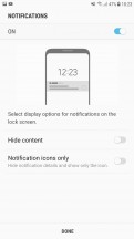
Unlock options • Fingerprint settings
There's always the option for a simple swipe unlock, no biometrics whatsoever, as well as PIN, pattern, or password. You'll need to set up one of those three as a backup to the fingerprint reader anyway. Don't go with 0000 for your PIN, please.
The Galaxy J7 Pro also has support for the standard Android Smart Lock feature. You can use it to set trusted voices, places or devices, as well as leverage on-body detection.
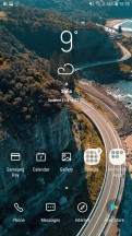
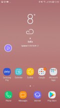
On to the homescreen then, where we find Samsung's still new 'Light and Line' concept for icons and navigation keys. Since the J7 Pro still has a physical home button and the standard Samsung pair of capacitive navigation keys (in the old-school arrangement) you get none of the fancy new remapping options of the S8 on-screen navigation controls. Depending on your taste, this might actually be a good thing.
The stock icons look cool, there's no denying it, and the simple and clear designs for the pre-installed apps make them easy to tell apart. You can have third-party app icons on a padding with the same shape as the stock ones, or you can leave them as they are. Multiple grid sizes are available, and you can set them differently for the homescreen and app drawer.
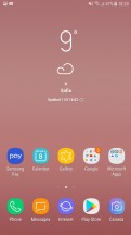
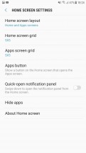
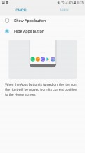
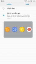
Home screen • Home screen settings • Apps button settings • Icon frames
By default, you have no Apps icon to take you to the app drawer. Instead, you evoke it with a swipe up or down from pretty much anywhere on the screen. It's not the most natural implementation, though - on a Pixel, you practically drag the app drawer up from under the dock, while here you swipe up or down, and the app drawer just appears.
You can still have the Apps icon if so you wish, but that won't change the swiping behavior. Alternatively, you can opt for a one-level UI, iOS-style, where all your apps are on your homescreens, and there's no app drawer.
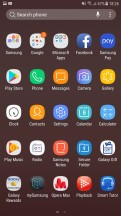
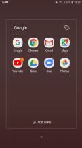
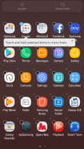
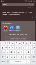
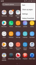
App drawer • Folder • Add to folder • App search • App drawer options
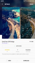
Samsung UX includes a powerful Theme engine. You can tweak almost every part of the interface individually to your liking. There is also a rich online database of pre-made skins. Some of them include an icon pack as well.
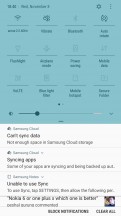
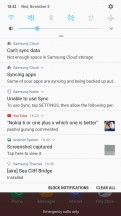
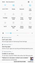
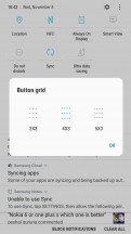
The notification shade is slightly tweaked in this new design as well. On the first pull, only the first six toggles are displayed - just the icons, no text. Pull down a second time or do a two-finger pull (yes, that still works), and you get the full list of toggles, complete with text. Where there's contextual info to be shown, it replaces the button's respective title - under Wi-Fi you'd see the network you're currently connected to, under Bluetooth, it's the headphones you have paired.
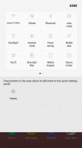
You can choose between three button layouts, or rather you can select between 3 and 5 icons for each of the three rows - that number you cannot customize. You can pick from 20 toggles in total, so if you want to have all of them there and you go for the 3x3 layout, you're looking to have 3 panes of toggles.
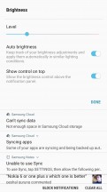
Samsung hid the Auto brightness in a drop-down menu next to the slider, which also contains a toggle than controls whether you have the slider displayed at the first pull or the second. There's also a red area on the slider where the phone warns you that brightness might strain your eyes - much like headphone volume warnings.
Notification handling is one of the big changes in Nougat, and we're already familiar with how Samsung adopted it on the Galaxy S7/S7 edge - it's the same here. Gone are the separate cards for each notification - instead, it's more of a feed of notifications. If an app has more than one event to inform you of, the notifications from that app are bundled together, so things don't turn into an endless feed of Gmail messages, for example.
You can, however, unbundle those, and act on them one by one. You can go one step further and expand the card to see part of the message body, and then you can go ahead and reply straight from the notification panel. Google calls this Notification Direct Reply and the rationale behind it is to allow you to streamline your workflow and save you the hassle of having to go into each separate app.
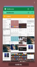
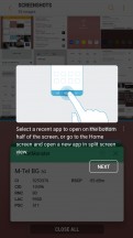
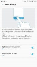
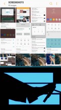
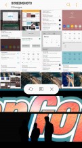
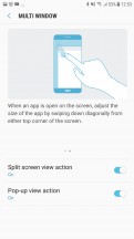
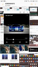
The task switcher is pretty traditional - it's the rolodex that's been around for a while, with Nougat niceties like screen pinning and multi-window support. The task switcher itself now features two distinct and convenient drop zones for toggling split screen or spawning a pop-up windows view for supported apps. To be fair to Samsung though, its flagships had multi-window way before it was cool (debuted on the Galaxy Note 3), and it's only now making its way to stock Android.
And yet, Samsung's implementation is still better and more powerful that what you'd find on a Pixel, or on the LG G6, for example. Here, you can resize the windows to just about any ratio, you can swap them, and you can have pop-up apps on top of the two ones that are in multi-window. Even shrink those up to a single draggable icon (Facebook chathead style).
Interestingly enough, we couldn't find the S8 UI cropping feature on the J7 Pro, and it seems to be the only omission in an otherwise full-featured multi-window implementation.
Speaking of missing features, the Edge Panel and Edge Lighting menus are a perfectly logical cut-back from the S8, since the J7 Pro lacks its curvy profile. Still, there are a few other interesting extra-value features that Samsung graciously decided to leave in. These are housed under the rather aptly named "Advanced Features" settings menu.
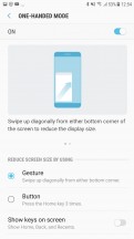
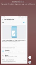
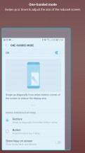
Although the J7 Pro isn't particularly wide or tall, Samsung acknowledges that some folks would still like to be able to use it single-handedly on occasion, so it's included a One-handed mode. It's not on by default, but when you enable it, you can swipe diagonally from either bottom corner, and the interface will shrink to more-manageable proportions. Alternatively, you can call it with a triple-tap on the Home button.
Direct share is another neat little feature that allows the OS to dig through supported apps and collect your frequent conversations and popular contacts, then place them at the beginning of the share interface for convenience.
Dual Messenger simply allows you to install two instances of certain messenger apps and use them with a pair of different accounts at the same time.
If you like the idea of a second space within your phone, Secure folder takes it one step further. It has been around for a while too. It's where you can keep files, memos and apps away from prying eyes. It's locked independently from the lockscreen. You can also install two copies of an app - one in plain sight and one in the Secure folder. And you can hide the folder too, so people can snoop all they want and will not find anything suspicious.
Samsung says Secure folder is like having a second phone. It does feel a lot like it too - you can have a different Google account in the Secure folder, you can launch the camera from here and photos you take go straight to the secure gallery. There are secure Contacts too; calls to them do not show up in the regular call log, but you can import contacts from your phone's non-secure-folder alter ego.
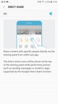
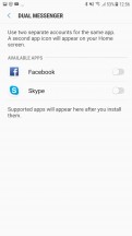
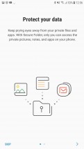
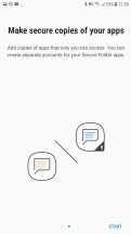
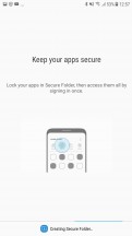
Direct Share • Dual messenger • Secure Folder
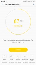
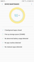
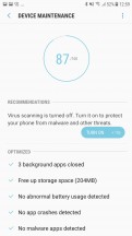
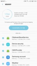
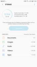
The whole Secure Folder platform is tied in with Samsung's patented KNOX active protection system. It is the company's primary offer regarding user data protection. You can find some settings for it in the Device Maintenance menu. The same central hub also has you covered with easy tools for memory and storage optimization.
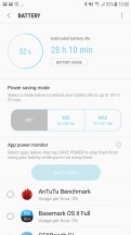
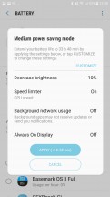
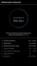
All the battery saving features reside here as well. Besides a convenient per-app battery consumption breakdown and process control, The J7 Pro has two battery saving levels. Medium is relatively mellow. It throttles your CPU, lowers the brightness and turns off background data usage, so you all your messengers will probably be off the grid.
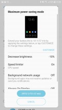
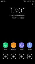
Then there is the Maximum power saving mode that leaves you with a minimal, mostly black and white shell, with very limited phone functionality by default. It is great for emergencies.
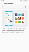
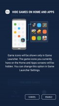
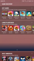
The Game Launcher has been Samsung's way of improving mobile gaming since the S7. It groups all your games in one place, so they don't get lost in the busy app drawer.
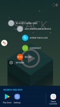
The in-play Game tools portion of it has been redesigned and offers pretty much the same functionality as before, admittedly in a much more straightforward manner. You can disable notifications during a game and disable the home and navigation buttons. You can grab screenshots, and record gameplay too.
Again, the interface seems almost as full-featured on the J7 Pro as it is on the S8 and S8+. It does, however, lack resolution control. The J7 Pro only has a FullHD panel, to begin with, but given the hard time the Mali-T830MP2 is having with the native pixel count, we do wish there was the option to take some of the load off and run games at 720p instead.
Reader comments
- Alishah
- 27 Jan 2024
- UUK
No. It's a "midrange" device released in 2017. 5G started rolling out in 2020. 5G came to "midrange" devices in 2022 only.
- Anonymous
- 17 Jan 2024
- iCr
Can it suppuort 5G?
