Samsung Galaxy Nexus review: Opening new doors
Opening new doors
Phonebook got redesigned
The phonebook has been completely redesigned and looks closer to the new Android Market than to the previous version of the app. It's made up of three tabs that you can switch between with sideways swipes.
The middle tab is the default - a list of all contacts. Contacts are listed with a name and a picture to the right. They can be sorted by first or last name and displayed with the first or last name first.
There's a permanent scroll bar available that you can grab and drag to jump straight to contacts starting with a certain letter. There's a regular search too.
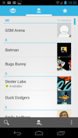
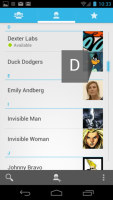

The new phonebook • Alphabet scroll • Searching for a contact
The quick contacts has been redesigned - tapping on the contact image now brings up a tabbed popup. The tabs are phone and email with a list of the available numbers/addresses. These tabs can be navigated with sideways swipes too.
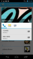
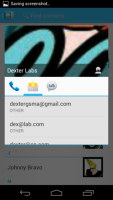
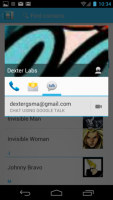
Quick contacts have a new, tabbed design
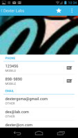
Anyway, the single contact view displays the contacts name along with a star to favorite a contact and a Settings button that lets you edit, share or delete a contact as well assign custom ringtones to them or set the phone to redirect calls from that contact straight to voice mail.
Under that is a list of all contact info sorted by category - phone numbers, emails, events, notes and so on.
While editing a contact, you can add new fields of different types to fill in more info for the contact. You can link contacts too, if you've added the same person on multiple services.
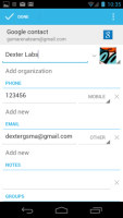
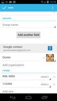
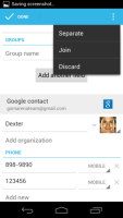
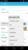
Editing a contact • Joining contacts • Adding an extra field
We should note that while Facebook came preinstalled on the phone, it wouldn’t add its contact list to the phonebook. That's a move Google made for its Nexus phones as far back as Android 2.3.3 citing the way Facebook stores contacts on the phone.
The contacts that the phonebook displays can be filtered by service (e.g. hide all Facebook contacts) and even filtered by the group they are in or not it (so you can hide all contacts not in a group, for example).

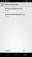
Choosing which contacts appear in the phonebook
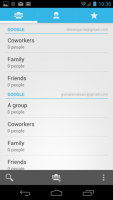
Anyway, the other two tabs in the phonebook are Groups and Favorites. Groups are listed by service (e.g. your Gmail account), while favorites are a listed as a grid of large contact photos, which is really thumbable.
Telephony
The in-call sound was good and loud and the curved shape of the screen conforms to the face nicely. However, the audio quality dropped when the signal strength was reduced and the call even started breaking up in the area of worst reception.
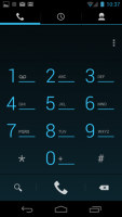
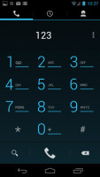
The dialer features the new neon-blue on black theme, but hasn’t grown any new functionality. There's still no smart dialing, for example.
The Samsung Galaxy Nexus does feature a secondary microphone for active noise cancellation.
The dialer is just the first tab of the phone app, the other two being the Call log and the Favorites tab (the same you get in the Phonebook). In the Call log, you can't delete individual entries, which was mildly annoying.
We put the Samsung Galaxy Nexus through our traditional loudspeaker test and it scored Below Average. You can find out more about the test here.
| Speakerphone test | Voice, dB | Ringing | Overall score | |
| Apple iPhone 4 | 65.1 | 60.3 | 66.2 | |
| Samsung Galaxy Nexus | 66.2 | 60.5 | 69.0 | Below Average |
| Apple iPhone 4S | 65.8 | 64.5 | 74.6 | Average |
| HTC Sensation XE | 65.8 | 65.4 | 76.9 | Good |
| Samsung I9100 Galaxy S II | 70.0 | 66.6 | 75.7 | Good |
| Motorola RAZR XT910 | 74.7 | 66.6 | 82.1 | Very Good |
| HTC Titan | 75.8 | 66.2 | 82.7 | Very Good |
| HTC Desire | 76.6 | 75.7 | 84.6 | Excellent |
Messaging is mostly the same, still good
The messaging section is business as usual but with some improvements. All SMS/MMS communication is organized into threads – each thread consists of all messages between you and one of your contacts. A cool new feature is that you can select multiple threads to mass delete them.
Each thread is organized like an IM chat session, the latest message at the bottom. You can manage individual messages (forward, copy, delete) and even lock them (to prevent deletion). You can use search to find a specific message in all conversations.
Quick contacts work here too and there's a call shortcut at the top of the screen when viewing a thread.


Viewing all threads • Quick contacts are available here too • Batch delete • Viewing a single thread
You can set the Galaxy Nexus to delete older messages (by default, it keeps 500 texts and 50 MMS). You can activate delivery reports and read reports too (they are notifications that the receiver has read the message).
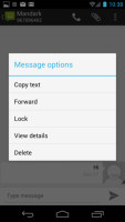
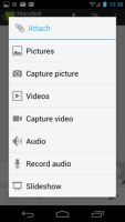
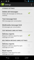
Options for a specific message • Attaching multimedia • Settings
Composing a text is still frustrating as the text box starts off as a single line and grows only up to three lines, which makes working with longer texts hard. We mostly let it slide on previous versions, but with a 4.65" screen there's no excuse not to make the text box bigger.
You can add multimedia (photos, videos, sounds, etc.), which will convert the message to an MMS. If you need multiple slides or multiple attachments, you can go to a full-blown MMS editor as well.
Moving onto email, the Gmail app has grown handy shortcuts at the bottom of the screen but is mostly unchanged. It supports batch operations, which allow multiple emails to be archived, labeled or deleted. The default app supports multiple Gmail accounts, but there’s no unified inbox.
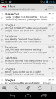
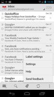
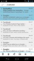
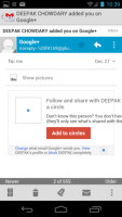
Gmail app supports batch operations and multiple (Gmail) accounts
A cool new feature in Gmail is that you can swipe left or right to move between messages in your inbox.
The shortcuts on the bottom of the screen are new email, search, labels, refresh and settings.
There is also a generic email app for all your other email accounts and it can handle multiple POP or IMAP inboxes. You have access to the messages in the original folders that are created online, side by side with the standard local ones such as inbox, drafts and sent items.
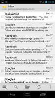
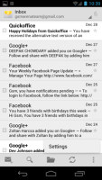


The generic email client doubles a lot of the functionality of the Gmail app but has combined inbox
Unlike its Gmail counterpart, this app supports a combined inbox view. It color codes the inboxes so you can easily tell where each message came from. Unfortunately, there's no moving between messages with sideways swipes here.
Google Talk handles the Instant Messaging department. The GTalk network is compatible with a variety of popular clients like Pidgin, Kopete, iChat and Ovi Contacts.
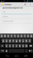
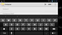
The keyboard has a lot of room to stretch its legs on the 4.65" screen and typing is very easy. Keys get even bigger when you switch to landscape mode - the long screen becomes very comfortable for two-thumb typing.
A tap on the text area will reveal a “handle” attached to the text cursor – it’s easy and more accurate, which makes correcting mistakes easier. A double tap will bring up the select options – select word and select all – with two handles to adjust the start and end of the selection.
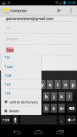
If a word has a typo, it will be underlined in red and when you tap it, the phone will offer a number of suggested corrections along with options to add the word to the phone's dictionary or just delete the word.
Reader comments
- Paul mbugua kamau
- 03 Jul 2018
- NYp
How could I find Samsung google phone shop on sh
- AnonD-346267
- 29 Dec 2014
- LaA
Hello! I have a question for anyone who can help me out. I have a samsung galaxy nexus 9250l and my problem is that from a while it begins to shut him self out and then restart again by it self. I was wondering if some one can give me a advice or...
- Anonymous
- 20 Aug 2013
- pqZ
Not true,you can select an option that makes all calls from a certain contact divert directly to your voicemail / answering machine and it doesn't even ring. If that person sends you an SMS/MMS you don't get the notification ,however it does show in ...
