Samsung Galaxy Note10 and Note10+ hands-on review
Design, hardware and controls
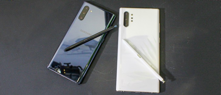
A lot has changed about the Note10 designed compared to its predecessor. Yet, the most apparent similarities are still there. That's pretty hard to pull off and Samsung's design team definitely deserves credit for keeping the Note10 instantly recognisable as a Note device. Frankly, we can't even put our finger on what exactly makes this effect possible, making the achievement all that more impressive.
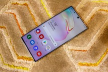
Starting with the more prominent changes, the Note10 is obviously all about slimming down bezels. A lot of work has been done to convey the sense of an all-display device as close as possible.
The vertical growth of the display is also instantly apparent. The 18.5:9 aspect ratio of the Note9 has now given way to a taller 19:9 one - the same proportions the Galaxy S10, S10+ and S10e use. And thins is just one example of the many ways the Note10 is kind of catching up to the S10 this year. We will definitely mention more as we delve deeper.
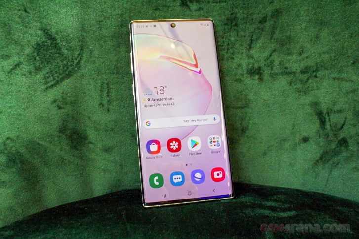
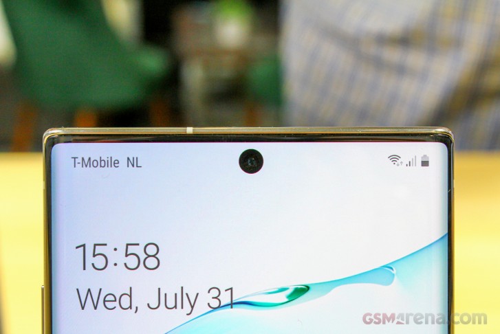
The new display basically leaves just a tiny sliver of space above the display. Barely big enough to fit the earpiece and a few sensors. Following the example of the S10 family, the selfie camera is placed inside a controversial punch hole. Since this is likely to be one of the most polarizing aspects of the Note10 as a whole, we will leave the usability, convenience and obtrusiveness aspects of the new design up to the community to debate.
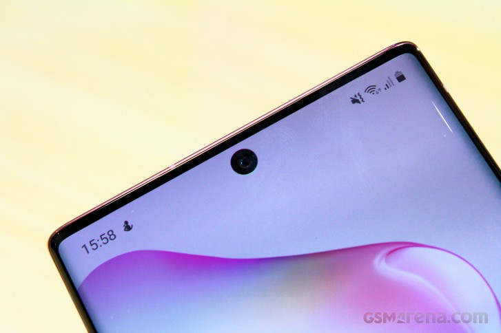
We will still note some facts, though, namely that for better of for worse the selfie cut-out on the Note10 is smaller than that on the S10 series. Samsung apparently achieved this by slightly downgrading the aperture of the 10MP selfie on the new Note10 to f/2.2, compared to f/1.9 on the S10. It's a bit early for us to definitely say whether or not the compromise was worth it, but the thing to take away here is that the punch-hole is in a different spot and definitely smaller.
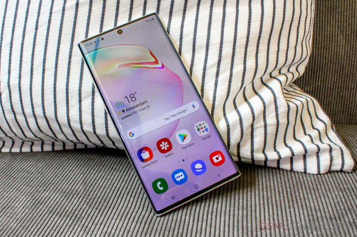
While on the subject of bezels, there are hardly any left underneath the panel of the Note10 and Note10+ as well. While this definitely looks cool and contributes toward the overall "all-display" look Samsung is striving for, it does bring about some ergonomic concerns. We brought this up with the Note9 and its chin-reduction back in its day as well. The thing is that the traditional Android navigation buttons end up very low on the phone when you start drastically slimming down the chin. This leads to a lot of thumb gymnastics.
The need for extra stretching is particularly noticeable on the taller Note10+, but is also kind of an annoyance on its smaller sibling, since both phones are pretty tall and require a good vertical grip position so they don't start tipping over at the top.
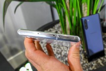

Samsung Galaxy Note10+ control layout
It's also particularly tough to see the trusty 3.5mm audio jack finally go from the Note10. There is no longer a heartrate sensor, a SpO2 sensor or an iris scanner.
Both the Note10 and Note10+ have their power button on the left-hand side of the device, right underneath the volume rocker. For anybody really used to a power button on the right frame or anyone used to avoiding pressing the Bixby key on the left side, this is a major change. Frankly, when we complained about the high placement of the power button on the S10 family, we didn't really have this solution in mind. To Samsung's credit, the new placement has said button at a reasonable and easy to reach height (unlike what we see on the S10 family).
And did we mention that the Bixby key is now officially gone with the Note10. It's been replaced by the power button and even thugh you can call on Bixby with a longer press of the button, you can alternatively not have it assigned to a physical button at all - Yay!
Samsung now allows you to set a custom action on double-press of the power key. This gesture was previously reserved only for quick camera launch. Now you can remap it if you like.


Samsung Galaxy Note10+ control layout
While on the subject of control placement, it is definitely worth mentioning a few things about the bezels themselves. Like its predecessor and most modern phones, for that matter, the Note10 employs a "glass sandwich" design. In this case this entails two curved pieces of Gorilla Glass mounted on a central metal frame. The frame is definitely thinner on the Note10. Or at least the visible bits on the sides are. So much so, in fact, that the area that houses the power button and volume rocker is widened, just to provide enough room.
On the flip side, the edge does tend to dig into your palm for a nice and confident grip. An appreciated and probably intentional effect since all that extra width taken away from the frame seems to have ended up on the glass back. Its curved sides are now a lot wider and extend deeper into the sides of the phone. And while definitely pretty, that Gorilla Glass finish is still very slippery.
The Note9 was a bit more conservative with its display curvature compared to the S10 and this is fortunately still the case with the Note10.
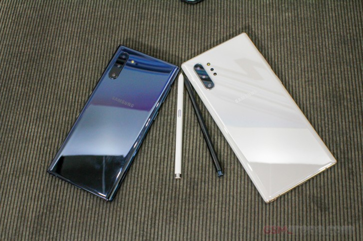
Samsung Galaxy Note10+ and Note10 head to head
Samsung did a really excellent job scaling the Note10+ down to Note10 size, which is why all of the design observations we made so far apply to both. We can only imagine it was no easy task, since the vanilla Note10 ended up with a body, measuring 151 x 71.8 x 7.9 mm, 168 grams, which is overall smaller and lighter than the Galaxy S10+ at 157.6 x 74.1 x 7.8 mm and 175/198 grams. Mind you, this includes the S-Pen, fitting inside the body of the phone and all the extra hardware that goes with it.


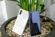

Samsung Galaxy Note10+ and Note10 head to head
And, like we already mentioned, the regular Note10 really isn't a major step down from its bigger sibling in terms of features. As far as build and quality go, the pair feels exactly as premium and well made. The regular Note10 is probably the easiest to hangle Note phone in a while.
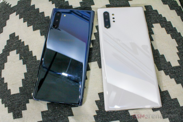
The vanilla Note10 is also the only way to get a slightly "more fun" color in the Aura Pink variant. Unfortunately, its availability could be limited.
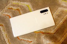
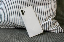
As far as the other finishes go, both phones can be had in Aura Glow and Aura Black. And the Note10+ (and possibly the Note10 as well, on some markets) also has an Aura White option, which is probably the easiest one of the bunch to keep clean. Good luck maintaining a black unit smudge-free for more than a second.
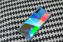
The Aura Glow is better in this regard. It's also really nice to look at. It combines the color sifting abilities of the Prism finish, as seen on Galaxy S10 units with a strong mirror effect. Even a slight tilt or change in angle changes the color of the surface dramatically. This being the case, there is no proper way to really capture the color on camera. No still shot will ever do it justice so we definitely urge you to see it in public before a purchase decision. An Aura Blue (for the Note10+) and Aura Red version are also on the table.
Reader comments
- Zue
- 16 Apr 2021
- YUU
I dont believe my Samsung Note 10+ dont have the function to record conversation when my Xiaomi 6 already have it
- NASSER
- 10 Oct 2019
- E3K
As i said earlier sorry Samsung iam out, after long years with you one hour laiter i will be useing Huawei ,this is my last message from samsong phone, just i wished samsung listen to users more than followng apple phones. any one happy wi...
- Nimal
- 13 Sep 2019
- teq
Agreed! Well a high end professional needs to answer calls and attend to conference calls and how to do that without a 3.5 mm jack required for a wired headset? Also, a high end professionals needs a Note series phone with a stylus to sign off ...
