Samsung Galaxy Note10+ review
Design and build
As one would expect, the Galaxy Note10+ offers nothing short of premium materials and impeccable build. As always, the phone exudes quality and as usual, it adopts two curved glass plates on the front and back and a metal side frame that keeps them together. There's no official info on the Gorilla Glass version but it's probably safe to say it's the latest one available - Gorilla Glass 6.
Then again, comparing the Note9, the Galaxy S10+ and the Note10+ side by side, you can feel a noticeable difference in the back panel. The Galaxy S10+ and the older Note feel a bit more solid and "dense", while the Note10+'s back is somewhat less premium to touch. It's really hard to explain and it doesn't make sense since the Note10+ has a bigger battery than both and it's thinner at the same time so you'd expect it to feel denser.
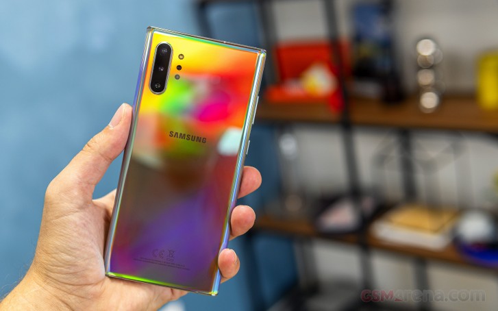
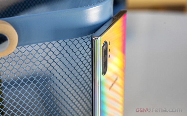
Four are the initial color offerings and we've got the Aura Glow - the best way to describe it is that it looks like the back of a CD and we don't say that in a bad way. It's pretty and the gradient stands out. There are also the Aura White, Aura Black, and Aura Blue paint jobs. Once again, the one we are using looks stunning but fingerprints and smudges build up fast and are quite prominent no matter the angle. Also, due to the nature of glass sandwich design, the Note10+ is slippery as hell.
Samsung has tried to tackle the issue with better ergonomics and kudos for that. The curvature of both glass panels is just the right amount while the side frame is razor-sharp. In fact, it's so thin that the designers had to make it a bit thicker right where the power button and the volume rocker reside just to make room for them. Surely, this design choice won't appeal to all because it's a fairly large phone and when you hold it tight, the edges and the sharp corners delve deep into your palm. Phones like the OnePlus 7 Pro or even the older Galaxy Note9 feel easier to handle due to their thicker frame. They somehow lie better in the hand and ensure a more secure grip too.
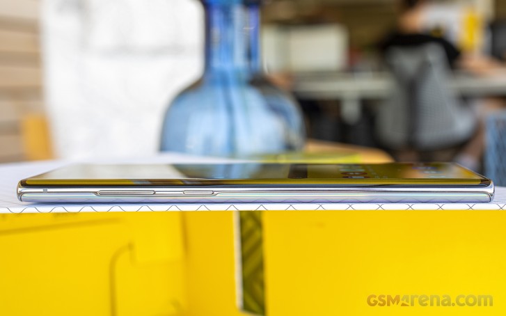
What's even more impressive is the weight of the handset. For a 6.8-inch device, the Galaxy Note10+ feels a lot lighter and pretty well-balanced compared to some of its rivals. There's a barely noticeable uneven distribution of the weight - the top side of the body is just a tad heavier, but this is just us nitpicking. Anyway, the Note10+ weighs approximately 196g and somehow doesn't feel as heavy as the OnePlus 7 Pro, for example, which tips the scale at 206g. For some unknown reason, there's a noticeable difference in weight between the two. Not to mention that the Note10+ holds a generous 4,300 mAh battery that should be contributing to the overall weight quite a bit.
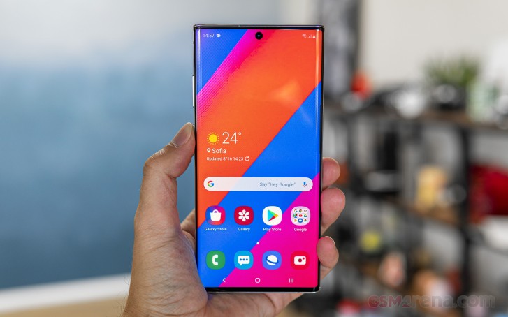
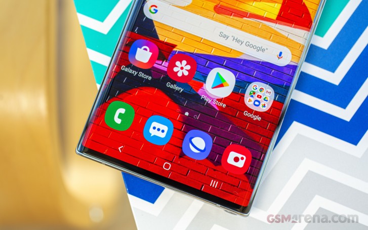
With all said, the Note10+ is definitely hard to handle with one hand and the extra tall 19:9 aspect ratio doesn't help either. Reaching the top end of the screen is a challenge while the thin bottom lip - although looking impressive - makes it even harder to execute a gesture. Thumb gymnastics are ensured. Hard to deny that impressive almost all-screen design though.
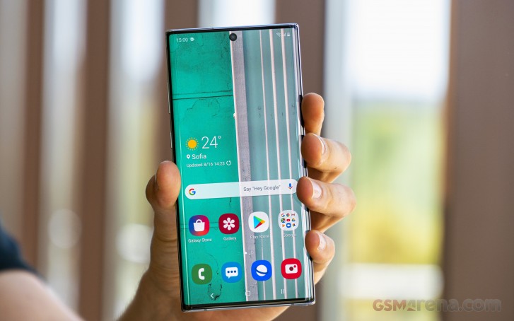
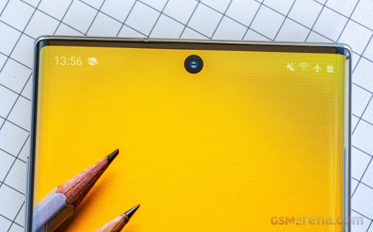
Which leads us to the polarizing punch-hole camera design. It's definitely smaller than the holes in the Galaxy S10-series and leaves a tiny space between the camera itself and the top bezel but it's not nearly enough to be usable space - you can't fit icons or interactive UI elements there. So the way Samsung placed the punch-hole camera makes it look a lot like a really small notch.
On the other hand, it doesn't get in the way of the icons on the left or the right like the S10 lineup. To be honest, it all boils down to aesthetics and personal preference - some may prefer it in the middle, some like it to the side or no holes at all. We talk more about obtrusiveness and general usability in the software section of the review.
Aside from the hole, the screen looks great. The bezels are virtually non-existent, including the bottom one, which is among the smallest we've seen on a phone. It can go head to head with iPhone XS Max's chin and it would probably win by a fraction of a millimeter. And as for the top one, it barely fits the earpiece and the usual proximity sensor. The ambient sensor is hidden behind the screen.
The back glass panel feels identical to the front one shape-wise. It adopts the same curvature and when looked from the side, the symmetry is striking. It goes flush with the side frame and the gap is barely noticeable. As we already pointed out, fingerprints stick easily and it's slippery. The camera bump got our attention as it's quite shallow - when you place the phone on a flat surface, there's no wobble. Kudos to Samsung for fitting all those sensors in such a thin 7.9mm body without letting them protrude so much.
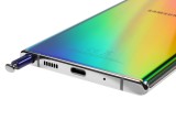
As we go around the sides, we can see one of the speaker grilles at the bottom right between the USB-C connector and S-Pen's lair. There's also the main microphone while the secondary noise-canceling mic is on the top keeping company of the shared microSD and SIM card slot.
And on contrary to most phones out there, the Note10+'s right side of the frame is clean - no buttons, no nothing. The left side is where the power button and the volume rocker are at. An interesting solution, to put it mildly, and not an ideal one too. When we complained about the Galaxy S10 lineup's power button placement, we didn't have this in mind as a solution.
The Power button now replaces the former Bixby button so anyone coming from the Note8 or Note9, for example, will be confused at first. But that's not the real issue here. It's the fact that it's on the left side of the frame. Lefties would be pleased and to be fair, it's easy to reach. However, if you are holding the phone with your right hand, you will find yourself reaching for the button with your middle finger or your index finger. Moreover, taking screenshots using the volume down key and the power button is a huge hassle. Oh, and there's a prominent wobble of the power key, which doesn't get in the way but we felt compelled to share.
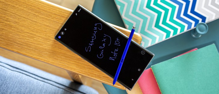
And finally, a few words on the new S-Pen. A simple and satisfying click is all you need to get the S-Pen out. It's as thin as ever and the awesome blue color (for Aura Glow) makes it stand out. It also feels different than the old S-Pen for reasons we can't quite put our finger on. It feels somewhat lighter with a bit more weight distributed towards the tip. It's not better or worse, it's just different.
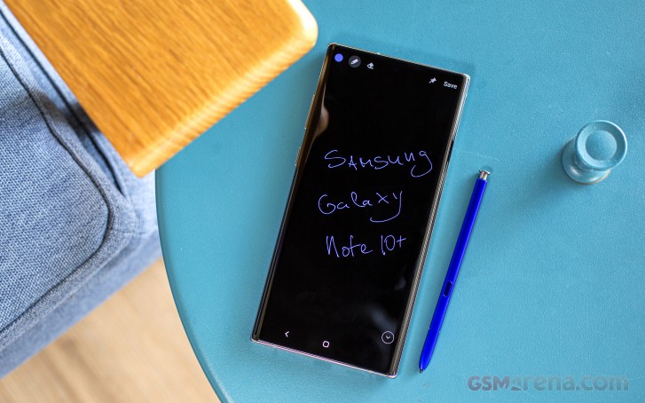
All in all, the Galaxy Note10+ is what you'd expect with some minor flaws we find hard to shake off. And by that we mean the power button placement and the extra smudgy and slippery back panel. We could also add the punch-hole camera but as we already said, it's more of a personal preference.
These pitfalls aside, the Note10+ is an excellently built device without any gaps or inconsistencies. It still supports IP68 rating and it's a huge step up in the right direction design-wise compared to its predecessor and perhaps some of its rivals.
Take a look at the 360-degree image below to take a better grasp of the design as a whole.
Reader comments
- Anonymous
- 06 Feb 2025
- Nu6
😂😂😂
- Anonymous
- 02 Jan 2025
- GTn
Battery is busted?


