Samsung Galaxy Note20 Ultra hands-on review
Galaxy Note20 Ultra hands-on
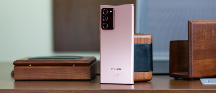
The Note20 Ultra and Note20 sit atop the Galaxy lineup and as such offer premium build quality and design. Having said that, even here the Ultra has an edge on the vanilla model.
Both phones get a stainless steel frame, a new development for Samsung high-end phones after sticking with aluminum for their skeleton needs until now. Apple has had steel on iPhones since the X, now Samsung joins in too.
Where the two differ is in the material of both front and back. The Note20 Ultra is where Gorilla Glass Victus debuts and Corning's latest should be safer than GG6 in the event of impact while also offering improved scratch resistance. It's two sheets of Victus on the Ultra - both front and back, while the camera is protected by Gorilla Glass 5.
Gorilla Glass 5 is what your Note20's display is covered by, but that's not what's raising eyebrows quite as much as the choice of material for the back - the Note20's rear panel is plastic. Reinforced polycarbonate, as Samsung calls it, and while we're not entirely opposed to plastic-backed phones, it does sound out of place on a $1000 phone.
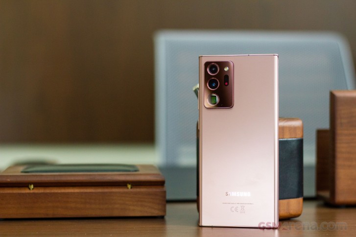
Victus or polycarbonate, both phones have this satin matte finish so they ward off fingerprints nicely. We welcome that decision, glossy Galaxies are practically impossible to keep clean. Thankfully, the IP68 rating for dust and water protection is a common feature too as plastic is able to keep the elements out just as well as glass.
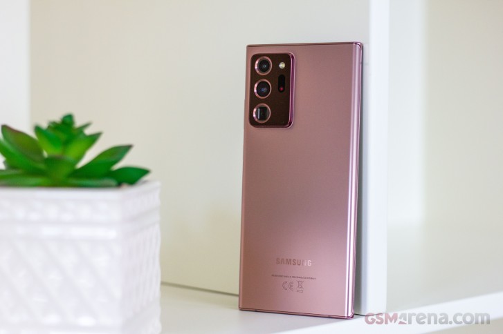
At launch, the handsets will be available in three colors each, the Mystic Bronze hero colorway shared between them. The Note20 also gets Gray and Green, while the Ultra will be available in Black and White - all of them Mystic, as the official naming will have it. Mind you, color options will vary by region with most markets getting two of the three available at launch.
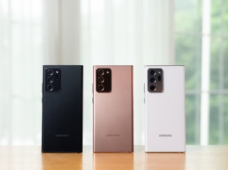
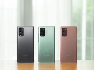
Color options: Galaxy Note20 Ultra • Galaxy Note20
The camera assembly of the Note20 Ultra is quite the chunky one, though having seen the S20 Ultra, we knew it was coming. It feels like this one sticks out even more and that would make sense - after all, the Note20 Ultra is a good 0.7mm thinner than the S20 Ultra at 8.1mm vs. 8.8mm so the camera island gets more prominence. If anything, it'll be even easier to support the handset by propping your index finger against the camera bump's edge than it was on the S20U, thus saving your pinky some heavy lifting.
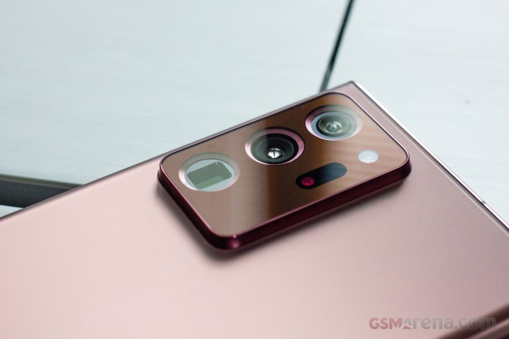
The Note20 proper has a sizeable camera cluster too, but it's simply not of the same scale. Both phones wobble on a flat surface, for what that's worth.
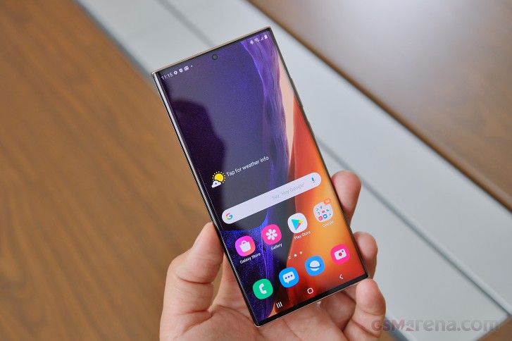
Looking at the front, Galaxy Note20 Ultra follows in the footsteps of the Note10 Plus from last year - a large rectangular slab of a phone with sharp corners and a very technical, no-nonsense look. It's, in fact, precisely as wide as the Note10 Plus, though a couple of millimeters taller. The S20 Ultra, in contrast, is two further millimeters taller, but a millimeter narrower - so the Note20 Ultra is more squarish.
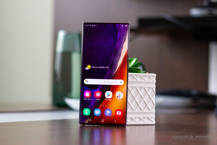
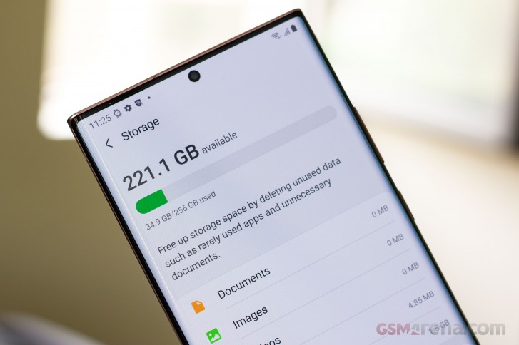
The Ultra's display is curved to the sides - ever so slightly, and only at the absolute edges, but it's curved nonetheless. It's got almost nonexistent bezels too and the tiniest of punch holes and that's certainly the closest Samsung has come to a 'full-screen display'. It will probably pose issues for handling, if you're one to need extra space to rest your fingers and/or hate curved screens. That'll be a task for the review to examine, but even in a quick hands-on session it's clear that for sheer 'wow' factor the Note20 Ultra's display is only bested by foldables.
The Note20 non-Ultra, meanwhile, has more ordinary appeal, to put it this way. Its display is flat, so there's that, and it's got a somewhat thicker black border all around. The punch hole in the display is also that extra bit bigger. It's not bad-looking by any stretch, but it's no Ultra.
We were particularly vocal last year when the Note10 and Note10 Plus arrived with the power button on the left side, as opposed to the right where it had always been. It was a one-off type of thing, never to be seen on other Galaxies since.
Starting with late 2019 models and continuing into 2020, the volume rocker got relocated to the right, joining the power button on those non-Note10 models - a decision much easier to live with. All of this is to serve as context for us to say that the Note20s have the power button on the right, where it should be, and we're happy. Of course, our outrage last year was a bit overdramatic as you get used to where a button is in no time, but it's nice that you won't need to this time around.
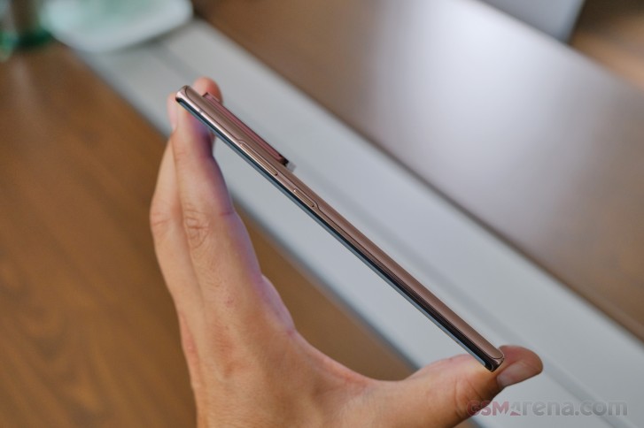
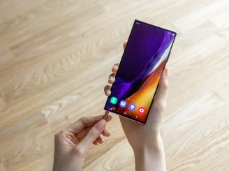
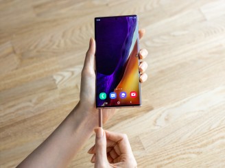
But hear this - the S Pen slot on the Note20 generation is on the left side of the phone when looking at the display - it's either that or the Power button it seems.
The S Pen has always been on the right, and it's a natural position for pulling the stylus out with the right hand, which you'll then use for writing or drawing, or camera remote, or Air actions (unlikely as that last bit may be). On the other hand, if you're left-handed, it may very well be the best Galaxy Note to date.
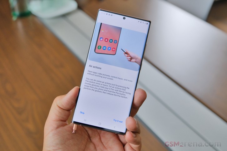
In all fairness, however, we didn't experience any notable difficulties getting at the S Pen on the Note20 Ultra with either hand. We had a minor argument at the office whether the left-side button placement on the Note10 was related to the S Pen's position inside the phone and if the internal design was unable to accommodate both on the same side. By the looks of it, that must have been the case.
The S Pen itself is virtually identical to the one we got last year. It's got the clicky top, the button on the side, and the capacitor, gyro, and accelerometer within to enable the remote actions. The stylus also matches the paintjob of the phone it comes out of, though we did enjoy the contrast of the blue S Pen on the Aura Glow Note10s - or as we call that one 'motor oil in a puddle' for its rainbow light effects.
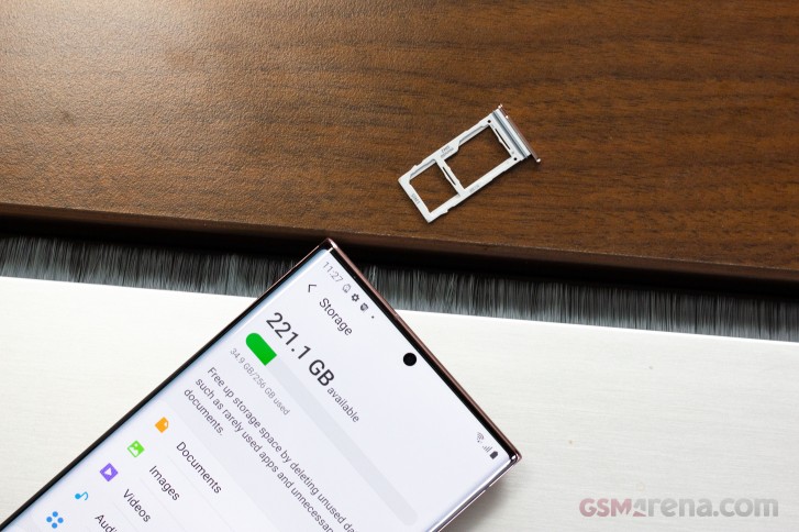
Circling back to the Ultra vs. non-Ultra differences, only the ultimate S Pen-wielding Galaxy supports storage expansion via microSD, while the vanilla Note20 has to make do with what it has from the box. It's one of the easier downgrades to swallow given that it was the case with the smaller Note10 last year too - so in way, it was expected. Then there's the matter that the Note20 comes with decent 128GB storage in its base 5G version and you can bump that to 256GB, while the LTE variant is 256GB only. Still, if all three S20s could have expandable storage, maybe both Note20s could?
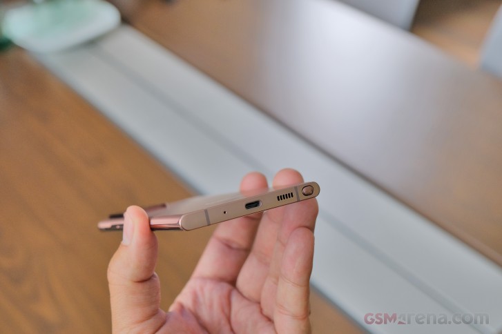
One difference on last year's models that was also seen on the S20 family but is now gone is fast charging support. The Note10+ and the S20 Ultra could be charged faster with optional 45W bricks, while the plainer models only went as high as 25W. Well, the Note20 Ultra and the Note20 both only go as high as 25 watts. It's hardly a big deal since the 45W adapter had to be purchased separately and it didn't bring the kind of speed advantage the numbers would suggest.
The charging situation may be a welcome bit of parity between the Note20s, but the differences continue into the camera section.
Reader comments
- Steve
- 06 Mar 2022
- SaV
Holy poop, I've dropped this phone at horrendous angles quite a few times without a case and it still doesn't have a scratch on it. Top teir phone quality and strength. My last phone (Huawei p90 smart) cracked in my pocket when a small...
- Abdul razack
- 09 Oct 2021
- nC7
Yes it's water and dust proof for around 30 minutes with 1m depth pool
- Anonymous
- 12 Apr 2021
- tA$
Because Samsung is very tired with all your complaint regarding the broken back panel because drop to the floor, and if you are using phone case, some phone case will close the shiny back panel, plus you are free from doubt that glass will broke whil...
