Samsung Galaxy Note20 Ultra long-term review
Updates
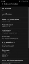
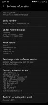
The Note20 Ultra now runs Android 11 with Samsung's brand new One UI 3.0 on top. The update arrived on our unit in December, and we think it's a pretty big step up compared to the previous One UI iteration. There's a very noticeable increase in smoothness overall, and we haven't experienced any bugs.
In the meantime, we've also received the January security patch, and speaking of security updates, Samsung is amazingly good at pushing these out in a timely fashion - and not just to its flagships or most recent devices. Aside from Google, it's the only company from which you can expect these updates to arrive consistently month after month, and we commend it for having achieved this. Sometimes, it even sends out a month's security patch before Google has had the chance to do the same for its Pixels, and that just solidifies how much of priority security has become for Samsung in recent years. In a word, all we can say is - kudos.
Current software
Big feature updates, on the other hand, still take a few months to be released from when Google first outs them. There are slight timeline improvements here too, compared to what the situation was like a few years ago, but they aren't as big. Still, Samsung has settled into a consistent release schedule with the new Android version arriving on its most recent flagships around the end of each year or beginning of next year, so you do have a high degree of predictability. And through its open beta builds, Samsung aims to catch any possible bugs before the stable rollout commences, which in theory should mean a less stressful post-update experience for most people.
So, to sum up the update situation - the support you're getting for the Note20 Ultra on the security patch side of things is second to none, while for new Android versions you'll wait more than owners of some other phones, but, in our subjective opinion, not long enough that it really becomes bothersome. After all, most people are probably not intimately acquainted with Google's release schedule for new Android iterations, so what they will most appreciate is Samsung's consistency in delivering new updates somewhat yearly.
All this said, new Android versions lately have had fewer and fewer huge new improvements in them that would require a quick update to take advantage of, and since One UI is one of the heaviest skins around, a lot of what Google announces for a new version may simply get lost underneath all changes that Samsung makes. The point here is that being on the absolute latest Android version is much less important, from the perspective of your day-to-day user experience, than it used to be. And that's a good thing because it means Android is a mature platform, and there aren't any huge glaring things that need to be fixed anymore. It's all an incremental march of improvements these days.
One UI 3.0
We feel like we say this with every new iteration of Samsung's Android skin, but here we go again - One UI 3.0 is the best version of One UI ever. Although the changes compared to its 2.x predecessors aren't big enough to require any sort of learning curve, it's improved in many small ways, and this all adds up to the best user experience we've ever had on a Samsung smartphone.
We've already reviewed One UI 3.0 itself, if you're interested in a full rundown of what's new and what's different, make sure you don't miss that feature. Here we'll list some things that have affected our day to day use of the Note20 Ultra for this long-term review, but keep in mind that this is in no way meant to be an exhaustive list of all software features - that would eat up just about the entire space of this long-term review.
And that's because yes, One UI is still incredibly complex, and, dare we say it - cluttered. There are so many features that simply going through all of the Settings menu items would take any reasonable human being a solid weekend, but the good thing is that most of them can just be left as they are in their default states with no need for tinkering - unless you want to change a specific thing.
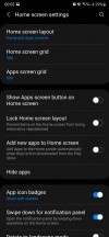
One of the exceptions to this rule, at least in our book, is the fact that by default you only see notification icons on the lock screen, and not the full content as it is shown in the notification pane. This has always felt like a baffling decision on Samsung's part, because the default setting requires more steps to do something that's just a one-step process in every other Android skin out there, but hey, you can change it if you want.
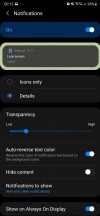
Icons only is the default for lock screen notifications
Actually, come to think of it, "you can change it if you want" seems to be the general mantra of One UI, version 3.0 included. There isn't any other skin out there that gives you this amount of customization options, but we always felt this is a bit of a cop-out on Samsung's part. See, it's easy to tell someone to make a choice for themselves every single time, for every single thing. It's much harder to have thought about things yourself and 'chosen' for them. If you make good enough choices, this has the benefit of not making things feel daunting for the user, sometimes at all.
Apple, for example, seems to be in the exact opposite philosophical extreme as Samsung, where a lot of things are restricted seemingly just for the sake of "let's not confuse people with choice". Samsung, on the other hand, has layers upon layers upon layers of choices for you to make. Neither concept seems like the best to us, because they are extremes - we feel like the best possible user experience is created somewhere in the middle, but obviously, you may disagree.
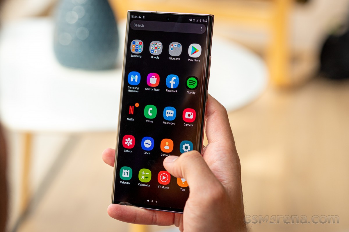
Philosophy aside, One UI 3.0 looks a lot like One UI 2.x, except in some places. The notification area's background is now semi-transparent, for one, all of the design elements have been tightened, and the fingerprint sensor gets a new icon - and the icon is always visible on the AOD (okay, that's a setting, too).
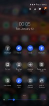
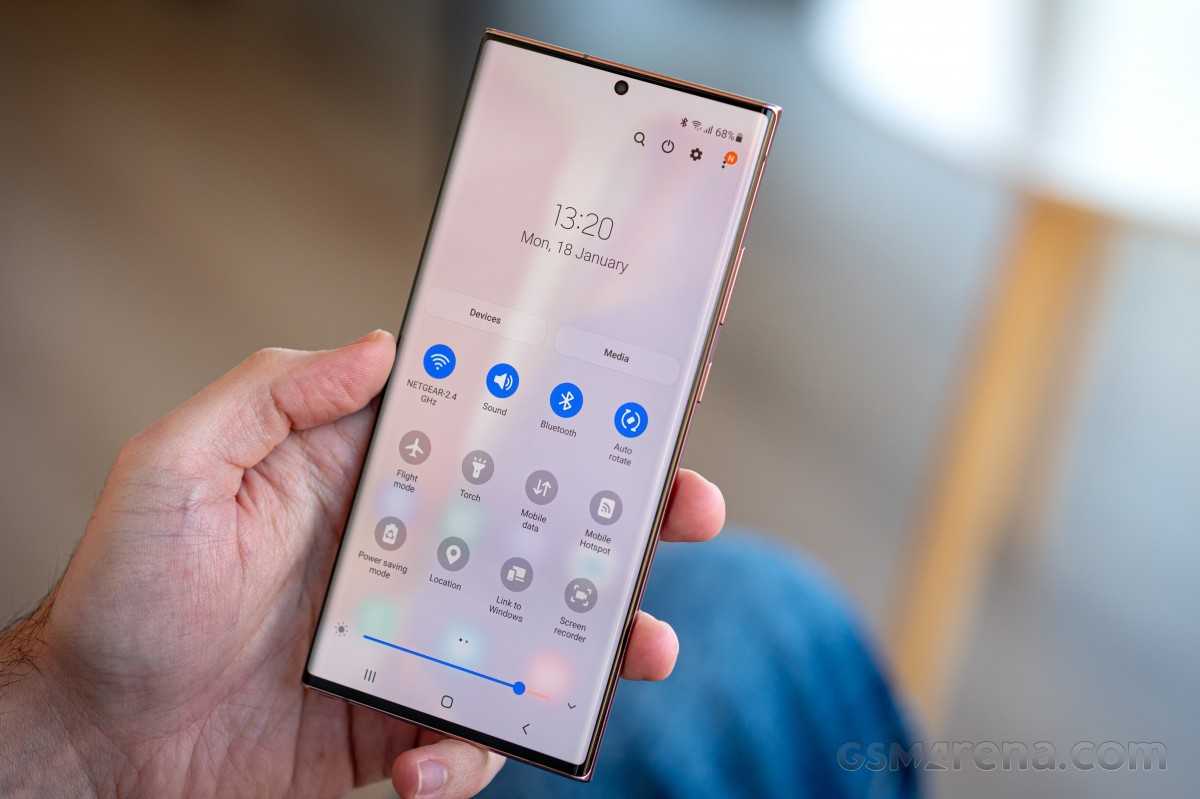
Notification area and Quick Settings
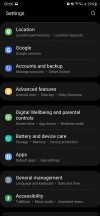
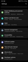
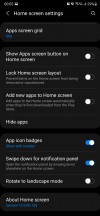
In terms of general features, not a lot has changed. One UI 3.0 still gives you a near endless Settings menu with many layers, the top level sections are still separated in groups, and now you get some more text under each heading telling you some of the things you should expect to be in there. Overall, this is a nice (if very small) usability improvement. If you still find it hard to locate specific settings, the search function continues to work very well.
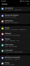
One UI 3.0 Settings
Launcher
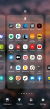
The built-in launcher still has two annoying things about it for us: the Samsung Daily screen at the left of your leftmost home screen, and the horizontally scrolling app drawer that isn't even sorted alphabetically by default. The sorting can be fixed, but because Samsung allows folders in the app drawer, you're still going to have issues finding some apps (such as those from Google and Samsung itself) if you're quickly trying to locate them using the alphabet. And that is because they live in folders.
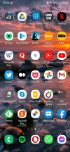
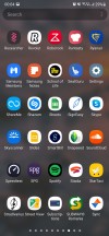
Launcher: Samsung Daily, home screen, app drawer with folders
We're going to say this again: you swipe up for the drawer, it having vertical navigation just makes sense because it's the same motion that you just continue. To navigate horizontally, you have to break that motion, and that always wastes a few milliseconds here and there.
Launcher settings
Of course, you don't need to stick with the app drawer at all - Samsung offers the iOS style all-apps-on-home screen organisation, too.
Moving on to the Samsung Daily screen, this is still by far the laggiest, stutteriest part of the entire software. It always lags when you go to it, it always stutters while scrolling. Every. Single. Time. Samsung has had ample time to fix this, and didn't. Not to mention it was never so useful so good thing you can turn it off (it's a setting).
We're glad that Google's Discover Feed has replaced the Samsung Daily in the latest One UI 3.1. For now, it is reserved to the S21 family but will probably come as an update here, too.
Dark mode, gestures, recents
Dark themes and gesture navigation have basically matured in the Android world at this point, and that's a very nice development. Took a long time, but we're finally at the point where we don't really have a lot to say about either, since they consistently work as intended on all phones.
We are fans of dark themes, so we switch to those on every device we long-term review, and the Note20 Ultra was no exception. The only thing we missed is the ability to force the dark theme onto apps that don't provide their own (Facebook is still, amazingly, in this situation).
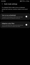
Otherwise the dark mode on offer here is pleasantly dark (and "AMOLED black" mostly, which is a nice battery life enhancing touch), it is schedulable of course, either with arbitrary points of your choosing or based on sunrise and sunset at your location.
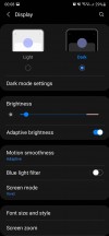
Dark mode
Google has standardized the way gestures work on Android, and so every phone basically gets a very similar system, where you swipe up to go home, swipe up and pause to reach the multitasking menu, and swipe in from the sides to go back.
By default you get a useless 'pill' shaped white line at the bottom to remind you that gesture navigation is turned on, and you can swipe across it to quickly jump between apps. Or, like us, you can simply turn it off, and reclaim that wasted screen real estate (it's a setting).
Unlike some other Android device makers, Samsung has fully implemented Google's gesture solution, though, which means that there isn't any vertical cutoff for the Back gesture, you can use the entirety of the sides for that. This creates a conflict with slide-in navigation drawers that some apps still employ, but thankfully most of the apps we use on a daily basis have moved away from that. If you do encounter an app which requires you to swipe to show its navigation drawer, there will be some fiddling involved, because the Back gesture and the drawer showing are triggered by swiping from different points.
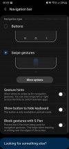
Gesture navigation settings
The Recent apps menu is horizontally scrolling, as most are these days (only Xiaomi seems to not be convinced), and at the bottom you get four icons of suggested apps to jump to. The algorithm powering this feature works amazingly well in our experience, constantly predicting which app we wanted to switch to. Obviously, it's much easier to just tap one of those four icons than scroll through the app carousel in the middle.
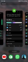
Recents
When you bring up the Recents menu by employing the swipe up and pause gesture, the app that's in the foreground is the previously used one, so you can quickly switch back and forth between apps this way. You can achieve the same effect if your swipe up gesture is small and then turns into a sideways swipe - this does what swiping across the 'pill' at the bottom of the screen would, if you had it there. Like we mentioned, we think it's an eyesore, so we used this alternative to it instead.
Reader comments
- ee
- 24 Dec 2024
- KAp
its the stabilization camera noise
- Eburner
- 17 Jun 2024
- IbI
How can the Pic 📸 quality not surpass the Note 9? That sounds pathetic to me, and Samsung aught to give a discount to every Note 20 Ultra. ☹️😠
- LM93
- 27 Oct 2023
- Xyb
I have had a P30 Lite since 2016 and haven't had a problem with it, however, I am now considering upgrading to a Note 20 Ultra as it has recently become available at one of the service providers in SA. Considering that it has Recieved its final ...