Samsung Galaxy Note8 review
General UI
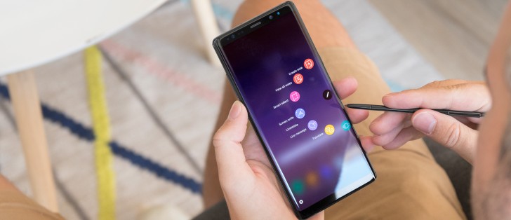
The Note8's Samsung User Experience 8.5 is for all practical purposes the same as the one on the Galaxy S8 and S8+. The iconography is the same; the menu arrangements are the same, the color scheme is the same - it's the S-Pen that makes the difference.
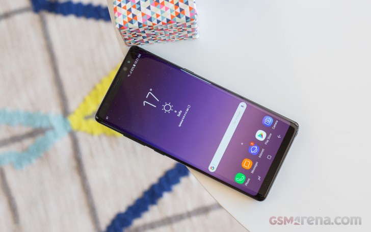
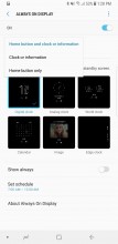
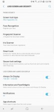
Hence, the pin-up memos are what sets the always on display on the Note8 apart from the S8 and S8+. That aside, the AOD experience is unchanged. The settings are on the Lock screen and security section of the settings menu, instead of Display, which we still can't get used to (been so for a while) but there's a handy shortcut suggestion in the bottom of the Display section.
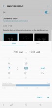
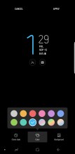
Anyway, there's a selection of analog and digital clocks to choose from, plus a calendar or image option. The Night clock mode was scrapped for the S8 and isn't making a return on the Note8. Here it's a separate mode of the AOD, which means that you can't have the full-blown AOD in the day, and the Night clock at... um.. night. In this Edge clock mode, you don't get notifications, by the way. You can still set a daily schedule when AOD will be active.
Just like on the S8, which was the first Samsung phone to lose its home button, the Note8 gets a Home button icon on the AOD. It's a setting, and you can disable the icon, but the 'Home' area will still function, you just need to remember where to press.
Then there's the lockscreen itself which displays the standard Nougat notification feed with grouping and direct reply. There are two shortcuts in the bottom corners, Dialer, and Camera by default, but you can change them to any app you want.
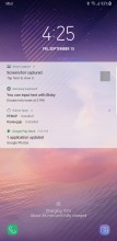
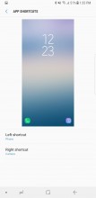
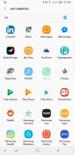
Lockscreen • Shortcuts settings • Pick an app, any app
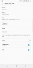
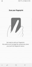
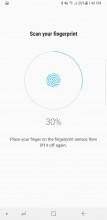
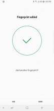
You may not get to see the lockscreen at all though, depending on how you choose to handle the unlocking process, and you're not at all short on options. There's the fingerprint unlock, but everyone's got that now, and given the uncomfortable location of the sensor you'd better cross it off the list.
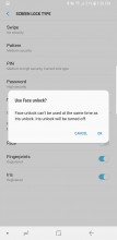
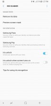
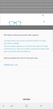
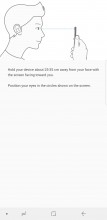
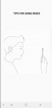
Coming straight from the Note7 we have iris recognition, and if that's not enough for you, face recognition will scan and look for your mug. It's not 30,000 point 3D mapping like the iPhone X's, so it's not half as secure, beware. Also, you can't have both iris and facial scan active at the same time, though the fingerprint sensor unlock can work with either of those.
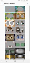
Iris recognition should theoretically be the safest. It works with a dedicated camera aided by an infrared illumination. In our experience, it unlocked the phone nearly instantly when you hold it the right way. Now that right way is the somewhat tricky bit, but you do have the preview to guide you. When there's bright sunlight pointing straight into the camera, it may refuse to work, but other than that we had no problems, even in dark conditions and even with sunglasses on.
Fingerprint unlock is present, of course, just not terribly convenient. That said, if you have the extra long fingers needed for it, it's perhaps the fastest option of all. It's not the fastest fingerprint reader, but it's always-on, no pressing or waking up required. It also completely bypasses the lockscreen.
There's always the option for a simple swipe unlock, no biometrics whatsoever, as well as PIN, pattern, or password. You'll need to set up one of those three as a backup to the biometric methods anyway. Innovate with that PIN, please.
We mentioned the iconography, and that's because Samsung has a whole concept for it called 'Light and Line.' The stock icons look cool, there's no denying, and the simple and clear designs for the preinstalled apps make them easy to tell apart. You can have third-app icons on a padding with the same shape as the stock ones, or you can leave them as they are. Multiple grid sizes are available, and you can set them differently for the homescreen and app drawer.
The nav bar buttons are in the same style, but more importantly, you can rearrange them to match Google's idea of Back-Home-Recents, instead of the other way around. Alternatively, long-time Samsung users can stick to the opposite arrangement. Oh, a dot has popped up in the Note8's nav bar, and double-tapping on it toggles the nav bar's auto hide mode on or off. Is that a v8.5 feature that's eventually going to make it to the S's, or is it Note-only?
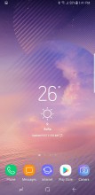
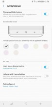
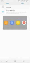
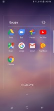
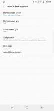
Homescreen • Navigation bar settings • Icon settings • Icons with no padding • Homescreen settings
By default, you have no Apps icon to take you to the app drawer. Instead, you evoke it with a swipe up or down from pretty much anywhere on the screen. It's not the most natural implementation, though - on a Pixel, you practically drag the app drawer up from under the dock, while here you swipe up or down, and the app drawer just appears.
Also, why not keep the downward swipe for calling up the notification shade, making it easier to access? Anyway, you can have the Apps icon, if so you wish, but that won't change the swiping behavior.
Alternatively, you can opt for a one-level UI, iOS-style, where all your apps are on your homescreens and there's no app drawer.
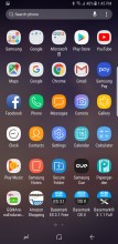
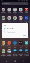
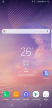
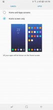
App drawer • Sorting options • Apps icon in the bottom right • Single - tiered mode
The notification shade is identical to the S8's. On the first pull, only the first six toggles are displayed - just the icons, no text. Pull down a second time or do a two-finger pull (yes, that still works), and you get the full list of toggles, complete with text. Where there's contextual info to be shown, it replaces the button's respective title - under Wi-Fi, you'd see the network you're currently connected to, under Bluetooth it's the headphones you have paired.
You can choose between three button layouts, or rather you can select between 3 and 5 icons for each of the three rows - that number you cannot customize. You can pick from 22 toggles in total, so if you want to have all of them there and you go for the 3x3 layout you're looking to have 3 panes of toggles.
Samsung hid the Auto brightness in a drop down menu next to the slider, which also contains a toggle to control whether you see the slider displayed at the first pull or the second. There's also a red area on the slider where the phone warns you that brightness might strain your eyes - much like headphone volume warnings.
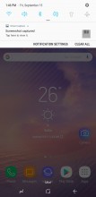
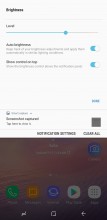
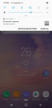
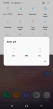
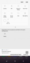
Notification shade: Default view • Brightness settings • Slider on first pull • Toggle rearrangement • Toggle Layout
The task switcher isn't unlike the one on the S8. It is the rolodex that's been around for a while, with Nougat niceties like screen pinning and multi-window support. To be fair to Samsung though, its flagships had multi-window since way before it was cool (debuted on the Galaxy Note 3), and it's only now making its way to stock Android.
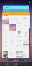
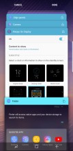
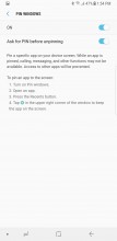
Task switcher • Lock apps • Screen pinning •
And yet, Samsung's implementation is still better and more powerful than what you'd find on a Pixel, or on the LG V30, for example. Here, you can resize the windows to just about any ratio, you can swap them, and you can even have pop-up apps on top of the two ones that are in multi-window.
Another thing you can do is literally crop a small strip of an app, cutting away unneeded interface elements, and have it docked to the top or bottom of the display so you can have it always visible.
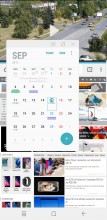
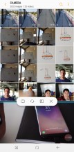
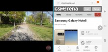
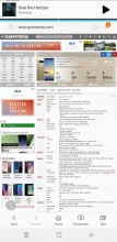
Multi-window: Pop-up view • Resizing/swapping options • In landscape • Docked cropped view
Secure folder has been around for a while, but that doesn't make it any less useful. It's where you can keep files, memos, and apps away from prying eyes. It's locked independently from the lockscreen - one can use a fingerprint, the other an iris. You can also install two copies of an app - one in plain sight and one in the Secure folder. And you can hide the folder too, so people can snoop all they want and will not find anything suspicious.
Samsung says Secure folder is like having a second phone. It does feel a lot like it too - you can have a different Google account in the Secure folder, you can launch the camera from here and photos you take go straight into the secure gallery. There are secure Contacts too, calls to them do not show up in the regular call log, but you can import contacts from your phone's non-secure-folder alter ego.
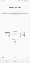
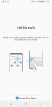
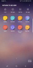
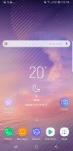
Secure folder: Intro • Creating in process • Inside it • Can you spot the shortcut?
Reader comments
- Anonymous
- 02 Dec 2024
- Nu7
I have one but unfortunately it has a screen problem.. so how much is the screen and where can I get it in Nigeria?
- himed
- 04 Oct 2024
- gXU
Does changing the touch of Note 8 mobile affect mobile touch or not?
