Samsung Galaxy Note 10.1 2014 review: Flying first class
Flying first class
Android 4.3 Jelly Bean and TouchWiz UI is all you need
The Samsung Galaxy Note 10.1 2014 Edition runs on the latest available Android 4.3 Jelly Bean OS upgraded with lots of premium features courtesy of Samsung's own TouchWiz UI. Samsung has done plenty of work optimizing the interface for the larger screen, bringing split-screen interfaces to the settings menu and virtually all system apps. The widgets have been polished too and have been made to support both portrait and landscape mode, while the shortcuts at the bottom of the screen are gone.
Before we get started, here's a short video of the UI in action.
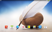
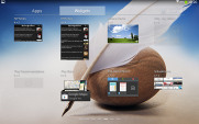
We start with the lockscreen, which features multiple widgets (one widget per a pane) introduced with Android 4.2.2 that we saw on the Galaxy S4 and Galaxy Note 3. The default lockscreen shows the time on a beautiful background. You can choose what effect to add to the unlocking. The options include ripple and watercolor, which blur the color on screen as if you were dragging a wet paint brush through the screen.
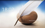
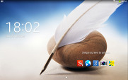
The lockscreen
There are no app shortcuts at the bottom of the lockscreen by default - the Favorite Apps widget to the right has taken over that role, but you can enable them and have up to five easily accessible shortcuts. You can opt for a greeting personalized message as well.
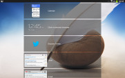
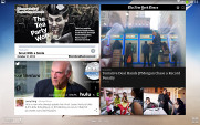
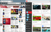
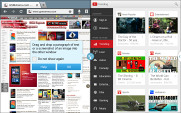
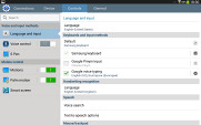
The notification area is one of the few UI elements that fails to capitalize on the large screen. Instead of only covering a part of the screen and letting you see what's underneath, it stretches over the complete 10 inches. At the top there are eleven (or seven in portrait mode) toggles that can quickly enable and disable features. There are more than eleven toggles, of course, you can swipe horizontally to get to the other five. Or you can tap the expand button, which reveals a grid of all the shortcuts, 16 in total. You can rearrange this grid (the top row toggles are always visible). A two finger swipe directly opens the grid of toggles.
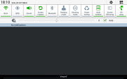
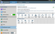
Notification area
Below the toggles is the display brightness slider complete with an Auto toggle. You can remove this slider to get more room for notifications.
The notifications themselves have not changed - they can be expanded to reveal more info and collapsed to save space or dismissed with a sideways swipe. Sometimes they also have helpful buttons on them like "Reply" on a missed email notification.
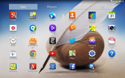
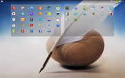
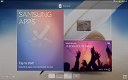
The homescreen looks mostly the same if you're coming from a Galaxy S4, Note 3 or Note 8.0. Samsung has provided many of its own custom widgets like Samsung Hub and Action Memo, and the vast majority of those are adjusted to work both horizontally and vertically. Since this is a much larger screen, you also get a far bigger grid to fill with widgets - 8 by 8.
There's wrap around feature, which lets you scroll homescreens infinitely by always going from the last to the first one.
The homescreen
What's new on the homescreen is the dedicated Google Search widget docked at the bottom left corner. It is visible on every homescreen pane, just like the app drawer shortcut at the bottom right.
You can pinch zoom to get into the overview mode with all homescreen panes visible simultaneously. There can be up to 7 and you can easily add, remove and rearrange panes from here. One pane is marked as "home", that's the one you go to when you press the Home button - you can choose a different homescreen as the default quite easily.
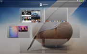
Managing the homescreen panes
The app drawer hasn't changed too much since the early days of Nature UX. The app shortcuts are presented as a customizable or alphabetized grid and you can view only those apps you've downloaded yourself . You can also disable some of the pre-installed apps so they won't take any RAM or appear in the app drawer, but not all apps can be hidden this way. Strangely the hide shortcuts feature has gone missing.
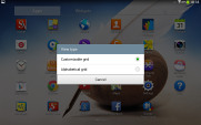
You can also maximize space in the app drawer by stacking apps into folders. You can either drag icons on top of each other in edit mode or you can check multiple app via the create folder option.
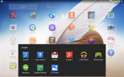
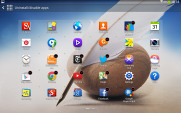
The app drawer and its options
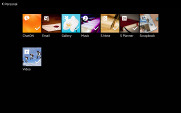
As before, widgets are in a separate tab in the drawer.
The widget drawer
Pinch to zoom in the app drawer works the same as on a homescreen - it gives you a glance overview of all panes as thumbnails. You can choose to have your app drawer ordering to custom, alphabetical grid or alphabetical list. There's a dedicated downloaded pane too, where all your downloaded apps go.
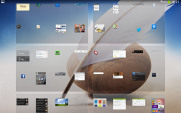
App and widget drawer at a glance
When you drag out shortcuts and widgets to the homescreen you get a tiny map of all the homescreen panes with the silhouettes of the widgets there so you can see how much space is available on each pane.
Placing and resizing widgets
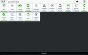
The App switcher interface is unchanged - there's a list of thumbnails of all the recent apps, apps can be swiped to dismiss and there are three buttons at the bottom, Task manager, Google Now and Kill all apps.
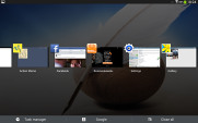
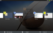
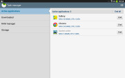
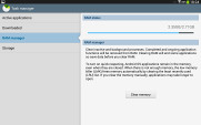
The app switcher and task manager
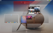
Naturally, the Galaxy Note 10.1 2014 Edition comes with Multi-window (running two apps side by side) which now even allows launching two instances of the same app - i.e. you can have two web browser windows next to each other. There is also dedicated shortcut that lets you switch the places of the two opened apps.
Copying stuff from one of the opened apps to the other is now available and is done in just three taps. It's a definite improvement and something the multi-window feature needed badly.
We noticed there is pretty decent app support for the multi-window service at launch with even more supported apps on the way. It's a feature that will be used really often, especially on a slate, and we are happy to see Samsung extending its support.
You can move the small arrow that brings up the drawer with the Multi-window apps to make it easier to reach with your thumb. You can also move the whole drawer to the other side of the screen.
Multi window
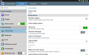
The settings menu has been redone in the latest TouchWiz version. Instead of a scrollable grid of icons and sections Samsung has went with a tabbed interface. On top you get four tabs - Connection, Device, Controls and General and you can find the relative features in their corresponding place - display, for instance, is in the Device tab.
It makes navigating the settings menu much faster and more intuitive.
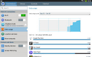
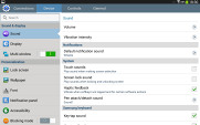
The tabbed Settings menu
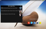
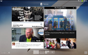
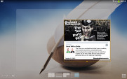
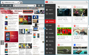
Finally, if you are on your default homescreen pane, a tap on the Home key will bring you to the Flipboard-like Samsung News full-screen app. It aggregates articles from a pre-defined set of sources - it supports popular topics such as sports, movies, food, music, games, science, etc. plus top picks of your social network accounts and S-App personal content. The feature premiered with the Galaxy Note 3 and reminds us a lot of the HTC's Blinkfeed. It looks cooler than the Blinkfeed, but you can't add your own topics as you can do with the latest version of the Blinkfeed in Sense 5.5.
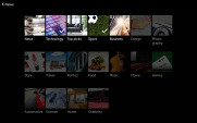
Samsung News
Samsung has used the latest iteration of TouchWiz to turn the Note 10.1 into a top-notch productivity tool. We really like the new Multi-window implementation, which makes multitasking faster and more convenient than it ever was on a tablet. It's also usually impressively responsive, thanks to the superb hardware inside. We did experience lag on a few occasions though, which is probably a result of some bugs that Samsung needs to squash as soon as possible.
The one thing we are not fond of is the notification area. It just doesn't look right on the massive screen and resolution. We feel like Samsung should have done better designing this part of the UI because now it looks like a huge waste of available space. Is it useful and user-friendly - yes, but it still looks like a lazy porting job from the smartphone UI to the tablet one.
Reader comments
- Nutty
- 13 Nov 2022
- NsB
Mine does support
- Anonymous
- 22 Sep 2022
- Nu7
I can't danwload app pls send me the latest update to upgrade
- udochukwu
- 28 Oct 2021
- Nue
Bought it (LTE version) back then in 2014. Still usable in it's 7th year. Can still handle my Real Racing 3 game like a champ. Still gives me a full day of normal usage (phone calls & web browsing) from it's battery. Have fallen almost ...