Samsung Galaxy Note 10.1 2014 review: Flying first class
Flying first class
Great phonebook
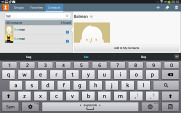
The Contacts app is pretty much the same as we left it on the previous generation Galaxy Note 10.1 - it uses split-screen view and has three tabs - Groups, Favorites and the default Contacts tab.
Since our Galaxy Note 10.1 2014 Edition doesn't support SIM cards, there is no Dialer or Messages app. If you tap on a number in the phonebook you will automatically redirected to the Skype app unless you've assigned a different one such as Viber.
The contact management is fairly straightforward on the Galaxy Note 10.1. Your contacts get automatically synced with your Google account unless you explicitly disable this and you can also let the Galaxy Note 10.1 sync your social network contacts if you want.
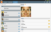
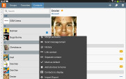
The Galaxy Note 10.1 contact manager
You get your contacts listed by either first or last name in the left part of the screen, while the details of the currently selected contact appear on the right. There is a handy search field in the top left corner, as well as a shortcut for adding a new contact or deleting the selected one at the opposite side.
The advanced menu offers a few more options: edit contact, import/export, join contacts, send or print namecards, get friends via social services, etc.
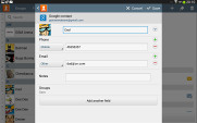
Editing a single contact is done in a popup window, where the available fields are displayed, with plus and minus signs on the right that let you remove or duplicate details.
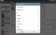
There's also an Add another field button at the bottom that lets you insert a field that hasn't existed so far for the specific contact.
Custom field names aren't available.
Samsung Email and Gmail
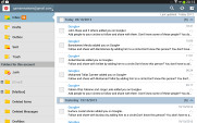
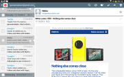
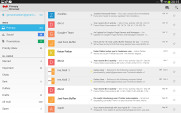
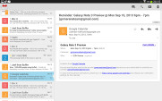
The Galaxy Note 10.1 2014 edition comes with two familiar email applications out of the box - one for your Gmail and a generic one to use with any POP3/IMAP account.
They both have a split-screen interface. Initially, your folders are listed on the left and the emails in the currently selected one appear on the right. Upon clicking on a single message, the list of emails moves to the left tab while the body of the selected one pops up on the right.
Bulk actions are supported too, so you will easily manage mailboxes that get tons of messages.
You can schedule automatic email retrieval or you can disable it completely and only check your mail manually. There's also a handy setting for the client to only download attachments automatically over Wi-Fi.
It's basically the same treatment you get on Android smartphones with a few further optimizations permitted by the larger screen.
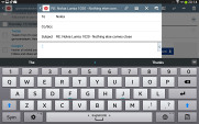
Writing emails is reasonably comfortable with the virtual Samsung QWERTY keyboard occupying about half of the screen. Now, this is no match for a hardware keyboard, but you won't notice any big difference when handling short emails. Samsung has added a fifth numeric row to the keyboard.
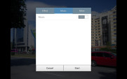
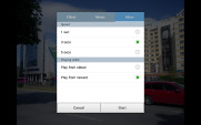
Samsung have thrown in two additional keyboard layouts to try and suit everyone's taste. You can opt for the small floating keyboard and a split keyboard from the dedicated key too. Choosing the latter allows you to quickly thumb-type while holding the tablet without stretching your thumbs too much.
The easiest way of typing is probably the handwriting because of Samsung's great support of languages for the S-Pen.
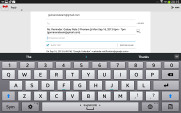
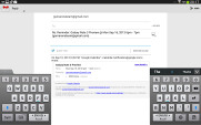
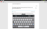
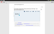
The big and small keyboards • handwriting is also supported
There's auto correction and auto capitalization available, and you can enable sounds on key presses. There's haptic feedback too.
The Gallery is great
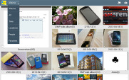
The gallery on the Galaxy Note 10.1 2014 Edition has a new layout. It can be sorted into albums, all photos and videos, time, location, etc. There's also a spiral option, which revamps the gallery into a Scalado-like spiral of images and video, which after a while might even get a bit nauseating.
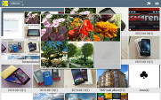
You can pinch to zoom in the gallery and thus manage the size of the thumbnails. Air view works in the gallery as well. You can hover your finger above an image and you'll get a bigger thumbnail preview of the image or you can use it to peek inside folders.
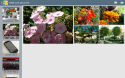
Upon choosing an album (for instance Camera) you're taken into that albums' stack of photos but a swipe to the right will reveal a bar on the left with all the albums. This means you can change albums without going through the gallery homescreen every time.
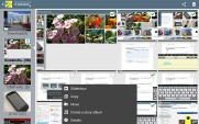
When a press and hold on a picture the gallery gives you the option to select multiple images, which you can then mass delete, share, copy or move.
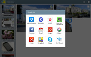
When viewing a single photo, you'll find several sharing shortcuts and a delete button above the photo, while below is a line of small thumbnails of all other photos in the album. You can tap those small thumbnails to move to other images or you can just swipe to the side.
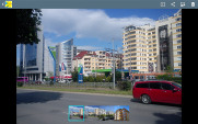
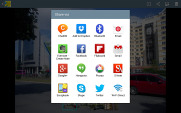
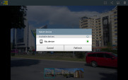
Viewing image • Sharing options
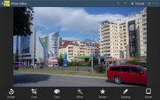
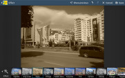
You can easily retouch photos right in the Gallery itself. The photo editor gives you options like crop, rotate, color and effects. You can also make a memo on top of the picture.
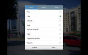
The Gallery also supports highly customizable slideshows with several effects to choose from, customizable music and speed. You can also highlight specific images to be included in the slideshow.
File manager
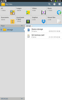
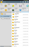
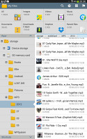
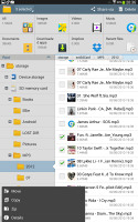
The My Files app hasn't changed a great deal - it is an efficient and simple to use file manager. It can move, copy, lock and rename files in bulk, even send multiple files to another phone. My files will only browse the memory card and the large internal storage (it can't access the system drive).
Reader comments
- Nutty
- 13 Nov 2022
- NsB
Mine does support
- Anonymous
- 22 Sep 2022
- Nu7
I can't danwload app pls send me the latest update to upgrade
- udochukwu
- 28 Oct 2021
- Nue
Bought it (LTE version) back then in 2014. Still usable in it's 7th year. Can still handle my Real Racing 3 game like a champ. Still gives me a full day of normal usage (phone calls & web browsing) from it's battery. Have fallen almost ...
