Samsung Galaxy Note 3 review: Jugger-note
Jugger-note
Superb phonebook
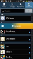
The phonebook on the Samsung Galaxy Note 3 packs an incredibly wide range of features. The four tabs on top are still present and provide access to the Phone app, Groups, Contacts and Favorites.
As usual, there are various options to filter contacts by phone numbers, groups and multiple sorting. You can import/export contacts to/from the SIM card but you can't display them alongside the phone memory entries.
Samsung has kept the swipes in the phonebook, enabling quick dialing (right swipe) or sending a text message (left swipe), which are really handy on the go.
The Quick contacts feature, upon a tap on the contact picture, shows a pop up menu with shortcuts to call, text, email or Google Talk.
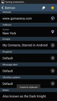
Tapping on a contact reveals all the details available. There are two tabs here - the first one is the About tab, which shows the person's photo on top. If configured, the right tab displays their latest updates from social networks or Google Talk.
Information is perfectly organized into different sections for phone, email, etc. You can use the back button to go to the full contact list, or tap in the top left corner, just like in vanilla Android. The top right corner has shortcuts to contact editing and favorites.
If the phone book finds duplicate contact entries, it'll prompt you to join them. Furthermore, there are a plethora of options once you hit the Menu button. You can view the call history, as well as join, unjoin and share contacts.
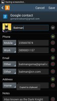
There's plenty of contact information you can assign to each contact and it still remains neatly organized. You have all the types listed (numbers, email addresses, etc.) and, just like the previous version of TouchWiz, there's a plus sign on the right - tapping it adds another item of that type. Pressing the minus sign under it deletes the unneeded field.
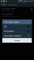
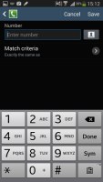
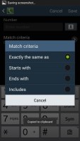
The reject list blocks certain numbers from calling you. It works great with preset numbers and you can also bar unknown numbers. There are third party blacklist apps in the Play Store but it's nice to have this out of the box.
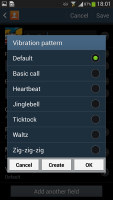
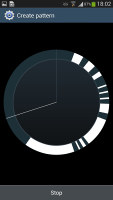
You can choose a specific vibration pattern as an incoming call alert, just like you would select a custom a ringtone. A set of predefined patterns is offered, but you can make your own too. You can also assign a custom vibration to specific contacts.
The phonebook app on the Galaxy Note 3 is really something. It's almost too advanced for some users but its interfaces is simple enough so you can only use the features you need. Once you find your feet around you will appreciate having cool extras like call barring, which stock and most other forms of Android lack.
Telephony with all the bells and whistles
The Samsung Galaxy Note 3 offers top notch quality and didn't run into any issues to sustain reception. Earpiece volume is great and voice quality was excellent with Samsung's in-call equalizer.
The phone app on the Galaxy Note 3 has been slightly redesigned but all the functionality is there. Smart Dial is available and works as advertised - it searches names and numbers simultaneously. Only one contact is shown (with contact photo) and you can tap the down arrow to view the rest (the number above the arrow indicates how many contacts have matched your query).


The dialer
Direct Call is here too and lets you dial a number by lifting the phone up to your ear while browsing contacts or reading/composing a message. If you use quick dial but forgot which contact is assigned to which number, you can use Air View as a quick reminder.
Voice dialing is available too and taken care of by the newly added S Voice, which activates on a double tap of the home button. All you need to say is "Hi Galaxy" and speak your command (e.g. "call Dexter").. It takes a while to process voice commands but it has more uses than other voice-recognition apps for Android. Another way to answer a call is to wave your hand over the phone (that's another Air Gesture).
The call log is the tab next to the dial pad. It displays all the dialed, received and missed calls in one list sorting your call history by contacts.
Thanks to the proximity sensor, your screen will automatically turn off when you hold it next to your ear during a call. The available options during a call include taking a note, using the keypad, muting, holding the call or adding another call to this conversation.
The dialer also offers quick shortcuts for making a video call or sending a message instead.


Dialing someone
Speaker test (old, new one below)
We put the Samsung Galaxy Note 3 through our loudspeaker test and were pleased with the results. It's extremely loud and even managed to slightly top the HTC One's dual front speakers. While the One produces deeper sound the Galaxy Note 3 is louder. You can find more about the testing process here.
| Speakerphone test | Voice, dB | Ringing | Overal score | |
| 60.1 | 58.3 | 61.6 | ||
| LG G2 | 65.7 | 62.2 | 66.2 | |
| Samsung Galaxy Note 3 | 70.5 | 66.6 | 78.0 | |
| Apple iPhone 5 | 66.8 | 66.1 | 67.7 | Below Average |
| Apple iPhone 5s | 68.7 | 66.3 | 69.2 | |
| 66.3 | 64.8 | 75.1 | ||
| HTC One | 69.3 | 66.6 | 75.9 | |
| HTC One mini | 68.0 | 68.7 | 78.1 | |
| Samsung I9505 Galaxy S4 | 70.6 | 66.2 | 77.3 | |
| 72.7 | 66.6 | 78.1 | ||
| 74.6 | 71.3 | 82.7 | Excellent |
Speaker test (new)
Use the Playback controls to listen to the phone sample recordings (best use headphones). We measure the average loudness of the speakers in LUFS. A lower absolute value means a louder sound. A look at the frequency response chart will tell you how far off the ideal "0db" flat line is the reproduction of the bass, treble, and mid frequencies. You can add more phones to compare how they differ. The scores and ratings are not comparable with our older loudspeaker test. Learn more about how we test here.
Messaging with room for customization
The messaging department is quite straightforward and hasn't been fiddled with too much in the latest TouchWiz version. The user interface is simple: there are no folders here, just a new message button. Under that button is a list of all your messages organized into threads.
Swiping on a message header will do exactly the same as in the phonebook - a left swipe starts a new message, while swiping to the right will start a call.
There's application-specific search that lets you quickly find a given message among all your stored SMS and MMS.
To add message recipients, just start typing the corresponding name or number and choose from the contacts offered.
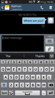
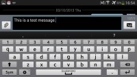
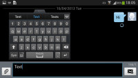
The keyboard of the Galaxy Note 3 is mostly the same as on the Galaxy Note II. It displays an additional row above the letters for numbers - kind of like a full-fledged computer keyboard does and we found that to be really convenient and a great way to leverage on the huge screen.
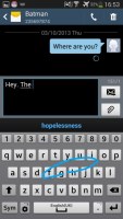
There's also a built-in Swipe-like mode which tracks your finger and guesses the word you're trying to type. This feature works great but has limited language support for now.
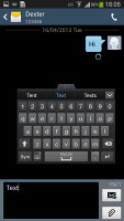
Another cool option is the floating keyboard that takes up less space on the screen and can be moved around.
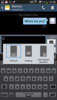
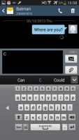
Choosing keyboard mode • One handed keyboard mode
If you're not too keen on on-screen keyboard, you can utilize the power of the S-Pen and use it for text input. Samsung has integrated a feature across the entire user interface, which enables any text field to accept handwriting.
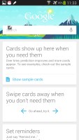
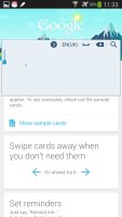

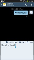
Handwriting is available on any text input field
Hovering with the S-Pen on any text field displays a handwriting icon; tap it, and use the S-Pen to write a message or put down a phone number.
Adding any multimedia content to the message automatically turns into an MMS. You can either quickly add a photo or an audio file to go with the text or compose an MMS using all the available features (like multiple slides, slide timing, layout, etc.). The multiple slides are all shown inside the compose box.
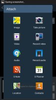
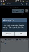


Sharing options • Sending an MMS message with the help of the S Pen
You can use S Voice to dictate your message or use Google's built-in voice recognition software if you don't feel like typing. Since this is a Jelly Bean device, you can also use voice typing without a data network connection, as long as you have downloaded the necessary language packs in advance. Samsung also provides the option to change the default input method.
Samsung has left a lot of room for customizing your messaging experience. You can choose from different bubbles and background and can use the volume button to increase or decrease the font in conversations.
However you don't get the option to choose your own colors for either the conversation bubble which we would've liked to see. The background can be changed according to your taste.
When you're composing a new message you can use the Translate option to translate it into another language. The same goes for messages you've received. This feature probably won't see much use but it's there you ever need it.
What might see more use, is the Direct call feature. When you are reading a message from someone, you can automatically call them back by just lifting the phone up to your ear.
Just like the dialer, the Messaging app has built-in blacklist. You can block some numbers (or all unknown numbers) and even add specific phrases to be blocked.

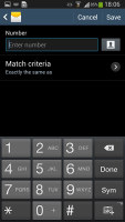

Scheduled messages • Spam filter
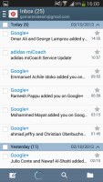
Moving on to email, the Gmail app has grown handy shortcuts at the bottom of the screen but is mostly unchanged. It supports batch operations, which allow multiple emails to be archived, labeled or deleted. The default app supports multiple Gmail accounts, but there's no unified inbox.
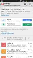

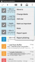

Gmail
A cool feature in Gmail is that you can swipe left or right to move between messages in your inbox.
Swiping on a specific message will archive it for you.
The Samsung Email app can handle multiple POP or IMAP inboxes. You have access to the messages in the original folders that are created online, side by side with the standard local ones such as inbox, drafts and sent items.
The Email app supports Air view, which upon a hover over an email gives you a peek into said email.
In the upper-left corner you'll find a context menu prompt, which lists all your folders. It's not accessible through a swipe from the side so you'll need to tap the mail icon each time you want to gain access to it.
Turning the phone landscape activates the split view - the left side of the screen shows the list of emails, while the right side shows a message. This is the same kind of interface we've seen on the Galaxy Tab though the bigger screen there made it actually useful - half of even a 5" screen isn't enough for comfortable reading.
Google Talk handles the Instant Messaging department. The G-Talk network is compatible with a variety of popular clients like Pidgin, Kopete, iChat and Ovi Contacts.
Reader comments
- Loli
- 09 Nov 2023
- 864
If you're still using stock firmware that's why. 4.X and even 5.0 (official maximum) is now passing the warning line of many apps. If you aren't familiar to (and don't want to bother with) XDA forum, just go to LineageOS website...
- kelvin
- 28 Oct 2023
- fuZ
Android virsion not support in my SamsungN9005 What's going on but am still needed to use this phone
- Anonymous
- 22 Sep 2023
- L5x
Using custom ROM


