Samsung Galaxy Note 3 Neo review: Neoclassic
Neoclassic
Neo runs on Android 4.3 Jelly Bean
The Samsung Galaxy Note 3 Neo comes with the same Android 4.3/TouchWiz combo as the one the Galaxy Note 3 launched with. We'd be surprised if Samsung didn't release an Android 4.4 KitKat update shortly after the launch, given that the original Note 3 has been enjoying it for a few weeks now, but there's no official confirmation of that just yet.
There goes our usual demo video to get you started.
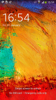
We start with the lockscreen, which supports widgets and shortcuts. You can assign either a live wallpaper, a static one or you can set TripAdvisor to display beautiful images from around the world. The default lockscreen shows the time along with a personal message overlaid on the wallpaper.
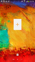
The lockscreen supports multiple panes, each containing one widget. The page to the right of the default one is special and can either be a list of favorite apps (the default TouchWiz setting) or a shortcut for the camera (as in pure Android).
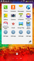
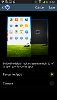
Favorite apps or camera shortcut
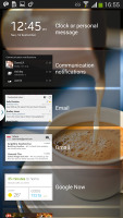
The pages to the left contain different widgets - email, Google Now, Messaging, music player, Yahoo! Finance, S Health, S Planner and you can download apps from the Play Store that add new widgets.
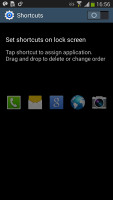
There are no app shortcuts at the bottom of the screen by default - the Favorite Apps widget to the right has taken over that role, but you can enable them and have up to five easily accessible shortcuts.
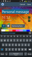
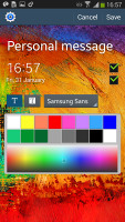
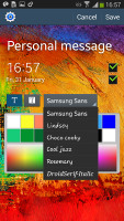
You can change the greeting message on the lockscreen by altering its text, font and color. You can also disable the personal message altogether and remove the time and date info.
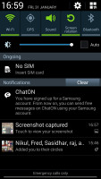
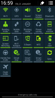
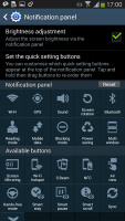
The notification area is business as usual and hasn't seen any changes. At the top there are five (or eight in landscape mode) toggles that can quickly enable and disable features. There are more than five toggles, of course, you can swipe horizontally to get to the others. Or you can tap the expand button, which reveals a grid of all the shortcuts, 21 in total. You can rearrange this grid (the top row toggles are always visible). A two finger swipe directly opens the grid of toggles.
Below the toggles is the display brightness slider complete with an Auto toggle. You can remove this slider to get more room for notifications.
The notifications themselves have not changed - they can be expanded to reveal more info and collapsed to save space or dismissed with a sideways swipe. Sometimes they also have helpful buttons on them like "Call back" and "Send SMS" on a missed call notification.
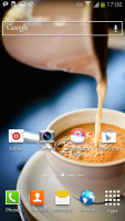
The homescreen looks mostly the same if you're coming from a Galaxy S4 or a Note 3. Samsung has provided many of its own custom widgets like Samsung Hub, S Travel, etc. There's wrap around feature, which lets you scroll homescreens infinitely by always going from the last to the first one.
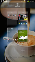
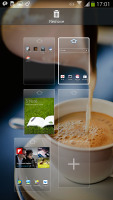
You can pinch zoom to get into the overview mode with all homescreen panes visible simultaneously. There can be up to 7 and you can easily add, remove and rearrange panes from here. One pane is marked as "home", that's the one you go to when you press the Home button - you can choose a different homescreen as the default quite easily.
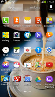
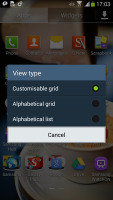
The app drawer is the same we saw it on the Galaxy S4, S4 mini and Note 3. The app shortcuts are presented as a customizable grid, alphabetized grid or list and you can hide shortcuts (good for bloatware you can't uninstall), view only downloaded apps, uninstall apps and add folders. You can also disable apps straight from the App drawer, which is a good feature because they won't take any RAM or appear unwanted in the Task manager.
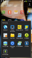
You can also maximize space in the app drawer by stacking apps into folders. You can either drag icons on top of each other in edit mode or you can check multiple app via the create folder option.
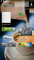
As before, widgets are in a separate tab in the drawer.
Pinch to zoom in the app drawer works the same as on a homescreen - it gives you a glance overview of all panes as thumbnails. You can choose to have your app drawer ordering to custom, alphabetical grid or alphabetical list. There's a dedicated downloaded pane too, where all your downloaded apps go.
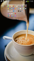
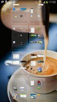
App and widget drawer at a glance
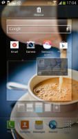
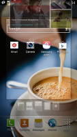
When you drag out shortcuts and widgets to the homescreen you get a list of small thumbnails of all the homescreen panes with the silhouettes of the widgets there so you can judge how much space is available on each pane.
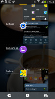
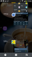
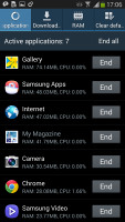
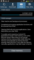
The App switcher interface is unchanged - there's a list of thumbnails of all the recent apps, apps can be swiped to dismiss and there are three buttons at the bottom, Task manager, Google Now and Kill all apps.
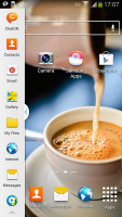
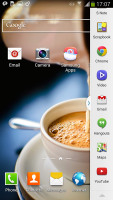
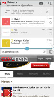
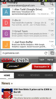
The Galaxy Note 3 Neo comes with the latest phablet version of the Multi-window multitasking feature, which allows you to have two apps running on your screen at the same time. You can even launch two instances of the same app - i.e. you can have two Internet browser windows next to each other. The two instances thing works only on select apps though - currently My Files, Internet browser and Hangouts are the only one to support it.
There is are dedicated shortcuts that let you switch the places of the two opened apps and copy stuff from one of the opened apps to the other.
We noticed there is pretty decent app support for the multi-window service at launch with even more supported apps on the wayYou can move the small arrow that brings up the drawer with the Multi-window apps to make it easier to reach with your thumb. You can also move the whole drawer to the other side of the screen.
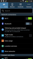
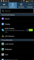
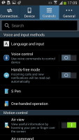
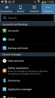
The settings menu features the familiar a tabbed interface. On top you get four tabs - Connection, My device, Accounts and More and you can find the relative features in their corresponding place - display, for instance, is in the My device tab. It makes navigating the settings menu much faster and more intuitive.
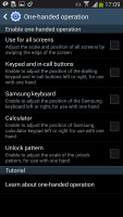
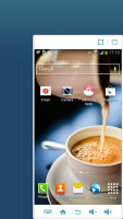
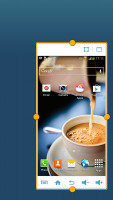
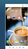
A particularly cool feature that we first saw on the Galaxy Note 3 and continues to live on the Note 3 Neo is the one-hand operation. It can minimize the whole interface with a simple double swipe and you are effectively making the Note 3 Neo use only a corner of its screen for its UI. The volume buttons are also brought to the tip of your fingers so you can operate the handset as if it was a 4" (or slightly more - custom resizing is available) rather than 5.5" screen.
That's a really useful feature and will be appreciated by all those that love the huge screen and its excellent multimedia performance, but need to be able to operate their smartphones with one hand frequently.
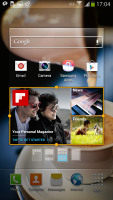
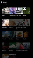
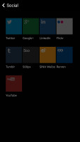
Finally, if you are on your default homescreen pane, a tap on the Home key will bring you to the Flipboard-like My Magazine full-screen app. It aggregates articles from a pre-defined set of sources - it supports popular topics such as sports, movies, food, music, games, science, etc. plus top picks of your social network accounts and S-App personal content.
The UI is very responsive, everything happens instantaneously and there is no lag to be spotted whatsoever.
Reader comments
- Anonymous
- 04 Apr 2024
- F0G
I have missed this phone it's the best phone I ever had so far. Please advise how I can find it again
- Anonymous
- 10 Feb 2023
- N3D
Gosh that phone 📱 Black Friday deals on wheels
- bob
- 25 Oct 2021
- M0$
nice mate
