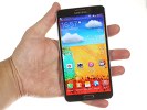
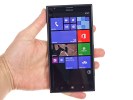
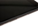
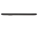
Samsung Galaxy Note 3 vs. Nokia Lumia 1520: Bigger, better, faster
Bigger, better, faster
Design and handling
Let's get something straight right from the start - we're dealing with two devices that are well above average in size. The Lumia 1520 and the Galaxy Note 3 are phablets that can't match the portability of the standard 5" flagships.
At 162.8 x 85.4 x 8.7 mm the Nokia Lumia 1520 is notably larger than the 151.2 x 79.2 x 8.3 mm Galaxy Note 3. The 0.3" difference in screen size partially explain the larger footprint, but there's no escaping the fact that the Galaxy Note 3 also has much slimmer bezels, particularly above and below its screen. Giant slabs like these two are particularly sensitive to that kind of thing and you can really feel the difference.
The Nokia phablet is also a lot heavier at 209 g compared to the far easier to swallow 168 g of the Samsung device.
While both smartphones opt for a plastic bodies they're very different in terms of styling and layout. The Nokia Lumia 1520 continues its maker's lineup of polycarbonate unibody designs. The clean lines and high-quality materials make this one a real looker and an instantly recognizable member of its family, but we have to admit at this point the design is starting to get a bit played-out. Introduced as far back as the summer of 2011 with the Nokia N9, the polycarbonate goodness has now lost its wow factor even if it still remains one of the better designs out there.
The Samsung Galaxy Note 3 on the other hand debuts a new soft-touch plastic back panel, which mimics leather with impressive ease. The faux stitches also contribute to the look and the overall result is quite pleasant and stands out. Had this been the first iteration for both designs, we'd probably have a hard time picking between them, but since the Galaxy Note 3 is the only one to bring a dash of novelty we are giving it the nod when it comes to looks.
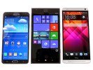
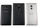
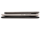
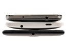
Nokia Lumia 1520 and Samsung Galaxy Note 3 side by side
Both hand over dominance at the front to the screens but while the Lumia 1520 features a seamless all-glass design with only capacitive buttons and a recessed speaker at the top, the Galaxy Note 3 has protruding home button and earpiece. And while the Lumia' screen feels like its sloping towards the edges the Note 3's ends with a sharp rendezvous with the faux metal rim.
If we were to assign a theme to each device we'd have to go with soft and rounded for the Nokia Lumia phablet and sharp and squarish for the Samsung one. However each device feels solid in the hand and overall solidly built.
The Nokia Lumia 1520, in its matte black finish, is more slippery than the Galaxy Note 3 and thanks to its bigger body isn't as comfortable to hold and operate with one hand. The Galaxy Note 3's textured backside adds a lot more grip and the smaller size and sharper edges help it fit better in the hand.
So let's talk controls for a bit. At its front, the Samsung Galaxy Note 3 has the standard layout to which we've got accustomed to. Under the 5.7" screen there are three buttons - a physical home button an two capacitive side-buttons for menu and back. The tow side keys are backlit when used, but when their backlighting is not on, they blend in and seemingly disappear.
Above the screen there's the protruding earpiece, proximity and ambient light sensors and a 2 MP 1080p-video-capable front-facing camera.
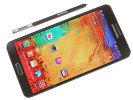
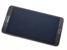
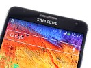
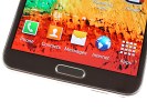
Samsung Galaxy Note 3 up front
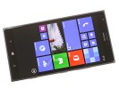
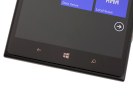
The Lumia 1520 has the majority of its frontal surface dedicated to the 6" screen. Under it there's the standard Windows Phone capacitive button trio - center-placed home button, and a Back and Search keys on its sides. Under them lies the main in-call microphone of the Lumia 1520.
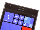
Above the display there is the earpiece, which also has the proximity sensor built-in, the ambient light sensor is located next to said earpiece and finally, there's a 1.2 MP 720p-video-capable front-facing camera. Given that the display on the Lumia 1520 has a resolution of around 2 MP it's unclear why Nokia went for a front-facing camera with such a low resolution.
The Samsung Galaxy Note 3 has the power button on the right side and the volume rocker on the left - there is nothing else on either side of the device. The microSIM and microSD card slots, along with the removable battery are located under the back panel.
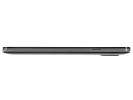
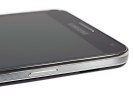
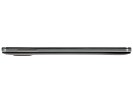
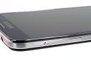
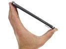
Samsung Galaxy Note 3 side view
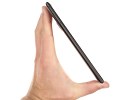
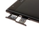
The nanoSIM and microSD card slots of the Lumia 1520 are located under lids on the left side of the device. You'd need the ejector tool Nokia provides in order to pop those lids open. The rest of the controls are located on the right side, as per Windows Phone usual. Those are, in order, the two-piece volume button, power button and two-step physical camera shutter button. The camera key is a rare find on modern day smartphones outside the Windows Phone realm.
A solid feature on the Nokia Lumia 1520 is that you can unlock the screen using a double tap, which saves you the need to reach for the power button. The help text warns that enabling that will eat into your battery life, though.
Both smartphones have buttons with good feedback and we can't pass judgment as to which ones are better. However the power button and volume rocker on the Samsung Galaxy Note 3 are tougher to reach as they are mounted too high up on the device, while those same keys on the Lumia 1520 come closer to the thumb, which in our minds makes the bigger Nokia Lumia 1520 easier to use, in regard to buttons.
The noise-reducing secondary microphone on the Samsung Galaxy Note 3 is placed on the top of the device next to the 3.5 mm headphone jack. Completing the tally, on top of the device lies the infrared blaster, which can be quite handy for controlling home appliances and TVs.
On the bottom lies the speaker under a small grille, the primary microphone, the S Pen holster and a microUSB 3.0 with a compatible microUSB 2.0 port built right into it.
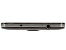
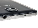
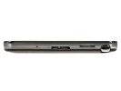
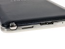
Samsung Galaxy Note 3 top and bottom
The Nokia Lumia 1520 does with only microUSB 2.0 and lacks the nifty IR blaster - there go two points from Nokia, but only if you care about those features.
The 3.5 mm headphone jack sits alone at the top of the gigantic Nokia, whereas the microUSB port is placed at the bottom.
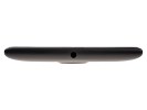
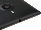
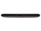
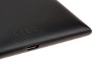
Nokia Lumia 1520 top and bottom
Anyway the 13 MP camera lens has its own protruding pedestal at the center of the top and shares it with the single LED flash. There's also a Samsung logo in the center.
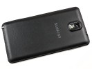
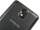
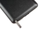
Samsung Galaxy Note 3 view from the back
The Nokia Lumia 1520 has a much bigger camera lens protruding from the back and it's accompanied by a double LED flash. The second microphone is above the camera and flash and the loudspeaker grille is at the bottom. The back of the Lumia 1520 lacks the textured finish of the Galaxy Note 3 but still feels just as elegant at your fingertips.
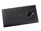
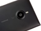
Nokia Lumia 1520 view from the back
Overall both devices are hard to handle single-handedly and reaching the top part of either display would be nearly impossible for the average Joe. The Lumia 1520 is undoubtedly the bigger device out of the two. It's slightly wider and noticeably taller but thanks to an intuitive placement of the controls on the right side it is a little easier to unlock it, set the volume level and operate the camera.
Winner: Samsung Galaxy Note 3. Although the Nokia Lumia 1520 has a friendlier button layout, a real camera key, and tap-to-wake up, there's no going around the fact that the Samsung Galaxy Note 3 is smaller, lighter and overall, easier to operate. Thanks to its textured plastic back panel it's also less slippery. However in terms of build quality we'd have to consider this round to be a tie.
Reader comments
- AnonD-399185
- 07 Aug 2015
- ntP
There is no fact supporting that. Get over it.
- AnonD-406649
- 15 Jun 2015
- fkn
completely agree with u
- AnonD-406649
- 15 Jun 2015
- fkn
I think u made this comparison unfairly , You just love samsung and no more . I used both phones and excuse me , a big difference between the lagging time consuming android phone" even in opening programs " and the superior windows phone...
