Samsung Galaxy Note 3 vs. Nokia Lumia 1520: Bigger, better, faster
Bigger, better, faster
General UIs
We're looking at two of the best smartphones, representing two well-respected platforms. The Samsung Galaxy Note 3 is among Android's flagships (even if it doesn't have Android 4.4 KitKat yet), while the Nokia Lumia 1520 is the first Windows Phone with a quad-core Snapdragon 800 and an extra large, FullHD screen.
While the Lumia 1520 runs the only version of Windows Phone available - purely stock - the Galaxy Note 3 runs on a heavily skinned Android 4.3 Jelly Bean, dubbed TouchWiz. If you're unfamiliar with how both are navigated you can check out our video walkthroughs for each below.
The Nokia Lumia 1520 in action
The Samsung Galaxy Note 3 in action
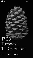
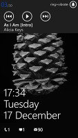
The lockscreen on the Lumia 1520 is pretty straight forward. You can swipe up to unlock or hold the camera button to jump straight to the camera app. A push on the unlock button or a double tap on the screen reveals the lockscreen, which displays the current time and date and shows calendar events, emails and missed calls. Pushing the volume rocker in either direction will bring the sound switch and music controls on top of the screen.
There's a reasonable level of flexibility and functionality to the lockscreen - the Live Apps service allows apps to display notifications and images. You can set one app to display big notifications ("detailed status") and up to five more apps to show a less detailed quick status. There are already apps in the Store that display the battery percentage on the lockscreen via those kind of notifications.
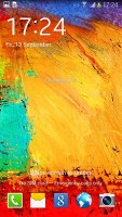
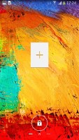
Samsung's lockscreen gives the user an option of five app shortcuts that will take you straight to the corresponding app. The lockscreen has multiple panes, each containing one widget. The page to the right of the default one is special and can either be a list of favorite apps (the default TouchWiz setting) or a shortcut for the camera (as in pure Android).
Unlocking the Lumia 1520 reveals the Modern UI, which is basically Windows Phone's start menu. It's comprised of live tiles, which are pinned to the homescreen. Almost anything can be pinned to the homescreen - apps, contacts, web pages and more.
The Lumia 1520 premiers a third column of live tiles, which brings up to six the total of the tiles you can place on any line. Upon a tap and hold, you'll get an extra resize button, next to the unpin one. You can opt between quarter, normal and double size. The third row of tiles really augments the experience of using a bigger display by giving you more room to work with.
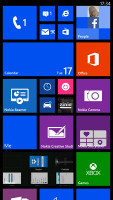
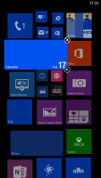
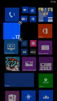
The Windows Phone start screen
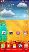
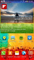
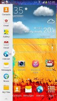
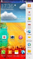
The homescreen on the Samsung Galaxy Note 3 doesn't feel as space efficient - you get the same room for apps and widgets as you would on a much smaller 5" Galaxy S4, which isn't ideal. The homescreen is comprised of two parts - the dock, which can support up to five icons, including the app drawer - and the rest is reserved for widgets and app shortcuts.
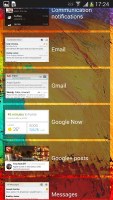
Widgets, like Windows Phone's tiles are actionable and give out glanceable information, but Samsung's preinstalled widgets are too large and could take up an entire homescreen, depending on the widget.
We critiqued the Samsung Galaxy Note 3 for bringing an upsized Galaxy S4 UI to the much bigger display but Samsung did make up for that in other areas of the software.
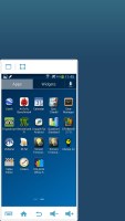
First off, you can shrink down the UI by performing an edge swipe. You can still use the Galaxy Note 3 as you'd normally would and the whole navigation process becomes usable with just one hand.
Another multi-tasking boost is Multi-window. It allows launching two instances of the same app - i.e. you can have two Chrome windows next to each other - or two different apps for that matter - side by side.
There's a pretty decent app support for the multi-window service at launch with even more supported apps on the way.
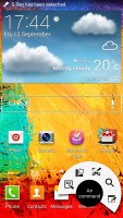
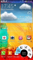
Samsung's Galaxy Note 3 has an ample screen not just for immersive viewing of content. The provided S Pen gives a whole new dimension to the experience. Once you pull the S-Pen out, the OS will pop up the new Air Command menu. The new menu is available everywhere throughout the UI too, you just need to press the side button on the S-Pen.
The Air Command menu is a virtual ring with five shortcuts - Action Memo, Scrap Booker, Screen Write, S Finder and Pen Window.
S Pen can be used with a myriad of provided apps. Action Memo pops up a memo on which you can white or doodle and it can be coupled with a variety of actions like calling a number you scribbled on, etc.
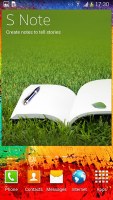
Scrap booker lets you highlight just about every part of the on-screen content and save it to your Scrapbook, Screen Write creates a screenshot of your screen and lets you write and draw on it, Pen Window allows you to open a set number of apps into a pre-selected area of the screen (using S Pen), which really improves multi-tasking. Then there's S Note, which is like a personalizable diary on your Galaxy Note 3.
Although different both mobile OSes are usable and give you diversity and variety of features and apps. Both are operated differently and targeted at different users. While Windows Phone wants to concentrate your interaction with apps and services to the Modern UI homescreen, Android is more about customizations, multi-tasking and productivity. The addition of the S Pen functionality and its related software Samsung has brought a whole new dimension of possibilities to the Note 3. You can draw and write and retain any on-screen content with a personalized touch.
Winner: Samsung Galaxy Note 3. The Samsung phablet deserves the win here as it offers much more in terms of multi-tasking (two app view mode) and productivity and fun (S Pen) than the Lumia 1520.
Telephony
A smartphone should be equally smart as it is a phone. So here goes a comparison of what it's like to use both devices as phones. First we take a look at their phonebooks.
We consider the Windows Phone People Hub to be the best phone/social book to date. The first tab shows you a list of all your contacts (phone contacts, social network friends, email contacts - everything). We appreciate the extra convenient Search feature that only allows you to punch letters that match your contacts names.
The What's New tab lists all the social network activity of your contacts in a neat scrollable fashion. You can also view a contact's activity, including photos, on social networks straight from their contact entry.
Finally, there are Rooms and Groups. Groups organizes your contacts and lets you text or email everyone in the group. Rooms is like a private social network of sorts - they allow group chats, sharing a private calendar, notes, to-do lists, photos and videos.
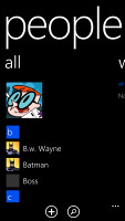
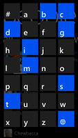
The WP phonebook and the excellent search interface
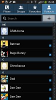
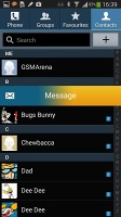
The TouchWiz phonebook found on the Samsung Galaxy Note 3 isn't as flashy and lists mainly contact information. If you link a Google contact with their Facebook page you'll get latest updates but not much more - there are no photos in their phonebook entry like on the Lumia.
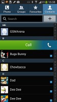
A neat feature in the TouchWiz phonebook is swiping on a contact listing - a swipe to the right will call the contact while a swipe to the left initiates a message.
The dialer on the Lumia 1520 is nothing special. It lacks smart dialing, which is a major no-no in our book. It basically gives you the option to enter a number and then either call it or save it as or to a contact.
The TouchWiz dialer is much more advanced. For starters you get smart dialing, or if you already have a contact at the top just raise the phone to your ear and the phone will automatically initiate a call (this works in the messaging app as well).
Sound quality was excellent on both handhelds with great noise suppression with each. Loudness was also great but we give the nod to the Nokia Lumia 1520 for voice clarity in both ways.
You can block calls and texts from preset numbers on the Lumia 1520 as well as the Galaxy Note 3. However the Samsung Galaxy Note 3 features an advanced Blocking Mode, which mutes notifications and calls from everyone except a group or contact you've chosen to exclude.
We performed our loudspeaker test on both devices and they came pretty much on par with each other with both scoring Good results. The Nokia Lumia 1520 was a little louder on the voice and pink noise tests and slightly inferior in the ringing phone test.
| Speakerphone test | Voice, dB | Ringing | Overal score | |
| Nokia Lumia 1520 | 73.7 | 67.7 | 74.7 | |
| Samsung Galaxy Note 3 | 70.5 | 66.6 | 78.0 |
Winner: Nokia Lumia 1520. Even though it doesn't have Smart dialing or Dial-on-pick-up, we enjoyed the Lumia 1520 phonebook better. It's a close call though and we would have called it a tie had it not been for the clearer voice quality in both call directions.
Messaging
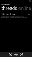
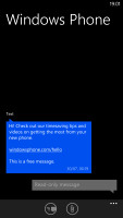
Messaging on the Nokia Lumia 1520 is pretty straightforward. The Messaging app is divided into threads - those are the threads of SMS conversations you've had - and online, which uses Facebook chat to connect with your contacts.
The Samsung messaging app also divides conversations into threads but lacks the online feature. ChatON is a Samsung app that comes preinstalled. Since a recent update it now supports SMS but the feature is heavily region-dependent and may not be operational where you live. A third option is Google's Hangouts app, which can also give you SMS and online chat support - you chat for free with online Hangouts users. Plus Android gives you the option to set just about any app to be the default messaging one, which is quite handy.

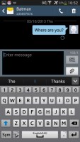
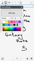
The Galaxy Note 3 messaging app
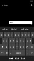
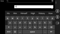
As for the keyboards - the Lumia 1520 has the standard Windows Phone keyboard at hand - and the only options you have are changing the language of the keyboard and resetting the dictionary that displays word suggestions.
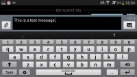
The Samsung keyboard on the Galaxy Note 3 is much niftier to use. It has a well-spaced design but also offers a numpad above the QWERTY keys, which really helps when typing letters and numbers. You can switch between letters and symbols with a swipe across the keyboard too.
Finally, you can enable trace typing - in this mode you slide your finger over the keys of the keyboard and it will recognize what word you're looking for.
Winner: Samsung Galaxy Note 3. The set number of options and the sole messaging app on the Lumia 1520 are great but the Samsung phablet offers much more versatility than its rival.
Reader comments
- AnonD-399185
- 07 Aug 2015
- ntP
There is no fact supporting that. Get over it.
- AnonD-406649
- 15 Jun 2015
- fkn
completely agree with u
- AnonD-406649
- 15 Jun 2015
- fkn
I think u made this comparison unfairly , You just love samsung and no more . I used both phones and excuse me , a big difference between the lagging time consuming android phone" even in opening programs " and the superior windows phone...
